![]()
Macro Letter – No 92 – 09-03-2018
Are we nearly there yet? Employment, interest rates and inflation
- Rising interest rates and inflation are spooking financial markets
- Unemployment data suggests that labour markets are tight
- Central Banks will have to respond to a collapse in the three asset bubbles
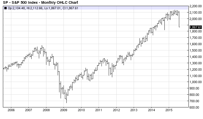
There are two factors, above all others, which are spooking asset markets at present, inflation and interest rates. The former is impossible to measure with any degree of certainty – for inflation is in the eye of the beholder – and the latter is divergent depending on whether you look at the US or Japan – with Europe caught somewhere between the two extremes. In this Macro Letter I want to investigate the long term, demand-pull, inflation risk and consider what might happen if stocks, bonds and real estate all collapse in tandem.
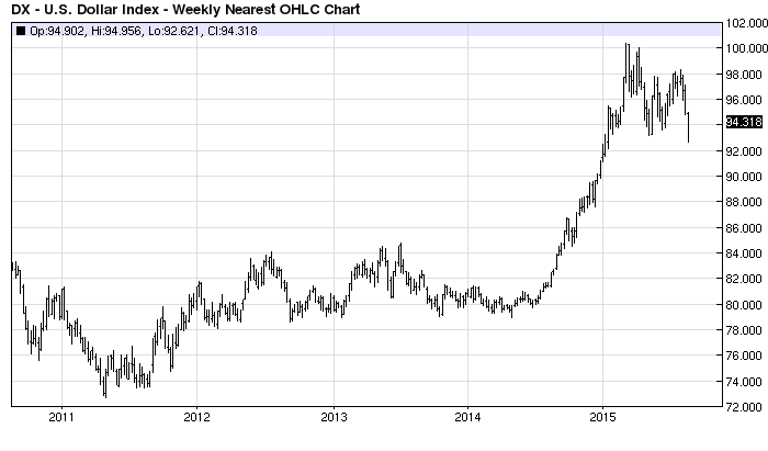
It is reasonable to assume that US rates will rise this year, that UK rates might follow and that the ECB (probably) and BoJ (almost certainly) will remain on the side-lines. An additional worry for export oriented countries, such as Japan and Germany, is the protectionist agenda of the current US administration. If their exports collapse, GDP growth is likely to slow in its wake. The rhetoric of retaliation will be in the air.
For international asset markets, the prospect of higher US interest rates and protectionism, spells lower growth, weakness in employment and a lowering of demand-pull inflationary pressure. Although protectionism will cause prices of certain goods to rise – use that aluminium foil sparingly, baste instead – the overall effect on employment is likely to be swift.
Near-term impact
Whilst US bond yields rise, European bond yields may fail to follow, or even decline, if export growth collapses. Stocks in the US, by contrast, may be buoyed by tax cuts and the short-term windfall effect of tariff barriers. The high correlation between equity markets and the international nature of multinational corporations, means global stocks may remain levitated a while longer. The momentum of recent economic growth may lead to increased employment and higher wages in the near-term – and this might even spur demand for a while – but the spectre of inflation at the feast, will loom like a hawk.
Longer-term effects
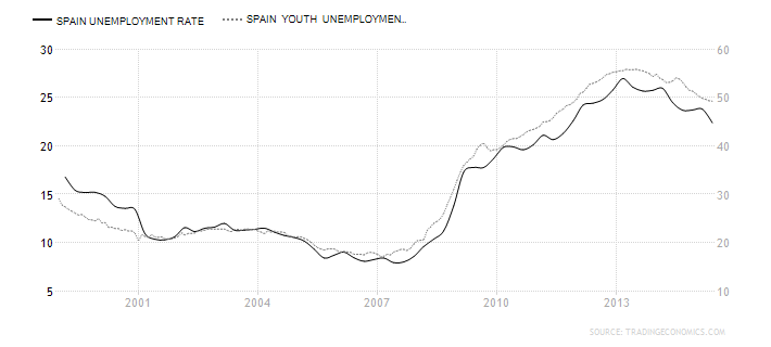
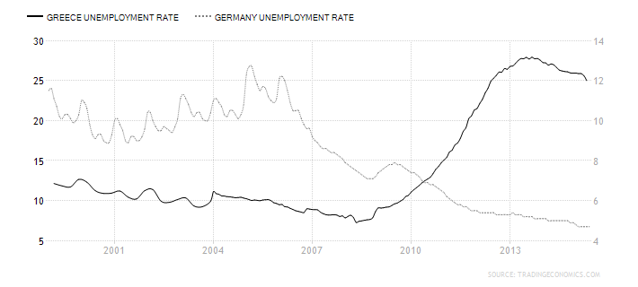
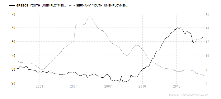
But is inflation really going to be a structural problem? In an attempt to answer this we must delve into the murky waters of the employment data. As a starting point, at what juncture can we be confident that the US and other countries at or near to full-employment? Let us start by looking at the labour force participation rate. It is a difficult measure to interpret. As the table below shows, in the US and Japan the trend has been downward whilst the UK and the EU are hitting record highs:-
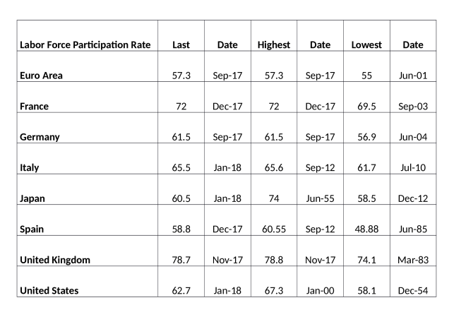
Source: Trading Economics
One possible reason for this divergence between the EU and the US/Japan is that the upward trend in European labour participation has been, at least partially, the result of an inexorable reduction in the scope and scale of the social safety net throughout the region.
More generally, since the Great Recession of 2008/2009 a number of employment trends have been evident across most developed countries. Firstly, many people have moved from full-time to part-time employment. Others have switched from employment to self-employment. In both cases these trends have exerted downward pressure on earnings. What little growth in earnings there has been, has mainly emanated from the public sector, but rising government deficits make this source of wage growth unsustainable in the long run.
The Record of Meeting of the CAC and Federal Reserve Board of Governors – published last November, stated the following in relation to US employment:-
The data indicate that despite the drop in unemployment, there has not been an increase in the number of quality jobs—those that pay enough to cover expenses and enable workers to save for the future. The 2017 Scorecard reports that one in four jobs in the U.S. is in a low-wage occupation, which means that at the median salary, these jobs pay below the poverty threshold for a family of four. For the first time, the 2017 Scorecard includes a measure of income volatility that shows that one in five households has significant income fluctuations from month to month. The percentage varies by state, from a low of 14.7 percent of households in Virginia to a stunning 29.8 percent of households in Wyoming. In addition, 40 percent of those experiencing volatility reported struggling to pay their bills at least once in the last year because of these income fluctuations. These two factors contribute significantly to the fact that almost 37 percent of U.S. households, and 51 percent of households of color, live in the financial red zone of “liquid asset poverty.” This means that they do not have enough liquid savings to replace income at the poverty level for three months if their main source of income is disrupted, such as from job loss or illness. This level of financial insecurity has profound implications for the security of households, and for the overall economic growth of the nation.
Another trend that has been evident is the increase in the number of people no longer seeking employment. Setting aside those who, for health related reasons, have exited the employment pool, early retirement has been one of the main factors swelling the ranks of the previously employable. For this growing cohort, inflation never went away. In particular, inflation in healthcare has been one of the main sources of increases in the price level over the past decade.
At the opposite end of the working age spectrum, education is another factor which has reduced the participation rate. It has also exerted downward pressure on wages; as more students enrol in higher education in order to gain, hopefully, better paid employment, the increased supply of graduates insures that the economic value of a degree diminishes. Whilst a number of corporations have begun to offer apprenticeships or in-work degree qualifications, in order to address the skill gap between what is being taught and what these firms require from their employees, the overall impact of increased demand for higher education has been to reduce the participation rate.
For a detailed assessment of the situation in the US, this paper from the Kansas City Federal Reserve – Why Are Prime-Age Men Vanishing from the Labor Force? provides some additional and fascinating insights. Here is the author’s conclusion:-
Over the past two decades, the nonparticipation rate among primeage men rose from 8.2 percent to 11.4 percent. This article shows that the nonparticipation rate increased the most for men in the 25–34 age group and for men with a high school degree, some college, or an associate’s degree. In 1996, the most common situation prime-age men reported during their nonparticipation was a disability or illness, while the least common situation was retirement. While the share of primeage men reporting a disability or illness as their situation during nonparticipation declined by 2016, this share still accounted for nearly half of all nonparticipating prime-age men. This result is in line with Krueger’s (2016) finding, as many of these men with a disability or illness are likely suffering from daily pain and using prescription painkillers.
I argue that a decline in the demand for middle-skill workers accounts for most of the decline in participation among prime-age men. In addition, I find that the decline in participation is unlikely to reverse if current conditions hold. In 2016, the share of nonparticipating prime-age men who stayed out of the labor force in the subsequent month was 83.8 percent. Moreover, less than 15 percent of nonparticipating prime-age men reported that they wanted a job. Together, this evidence suggests nonparticipating prime-age men are less likely to return to the labor force at the moment.
The stark increase in prime-age men’s nonparticipation may be the result of a vicious cycle. Skills demanded in the labor market are rapidly changing, and automation has rendered the skills of many less-educated workers obsolete. This lack of job opportunities, in turn, may lead to depression and illness among displaced workers, and these health conditions may become further barriers to their employment. Ending this vicious cycle—and avoiding further increases in the nonparticipation rate among prime-age men—may require equipping workers with the new skills employers are demanding in the face of rapid technological advancements.
For an even more nuanced interpretation of the disconnect between corporate profits and worker compensation this essay by Jonathan Tepper of Varient Perception – Why American Workers Aren’t Getting A Raise: An Economic Detective Story – is even more compelling:-
Rising industrial concentration is a powerful reason why profits don’t mean revert and a powerful explanation for the imbalance between corporations and workers. Workers in many industries have fewer choices of employer, and when industries are monopolists or oligopolists, they have significant market power versus their employees.
The role of high industrial concentration on inequality is now becoming clear from dozens recent academic studies. Work by The Economist found that over the fifteen-year period from 1997 to 2012 two-thirds of American industries were more concentrated in the hands of a few firms. In 2015, Jonathan Baker and Steven Salop found that “market power contributes to the development and perpetuation of inequality.”
One of the most comprehensive overviews available of increasing industrial concentration shows that we have seen a collapse in the number of publicly listed companies and a shift in power towards big companies. Gustavo Grullon, Yelena Larkin, and Roni Michaely have documented how despite a much larger economy, we have seen the number of listed firms fall by half, and many industries now have only a few big players. There is a strong and direct correlation between how few players there are in an industry and how high corporate profits are.
Tepper goes on to discuss monopolies and monopsonies. At the heart of the issue is the zombie company phenomenon. With interest rates at artificially low levels, companies which should have been liquidated have survived. Others have used their access to finance, gained from many years of negotiation with their bankers, to buy out their competitors. If interest rates were correctly priced this would not have been possible – these zombie corporations would have gone to the wall. I wrote a rather long two part essay on this subject in 2016 for the Cobden Centre – A history of Fractional Reserve Banking – or why interest rates are the most important influence on stock market valuations? This is about the long-run even by my standards but I commend it to those of you with an interest in economic history. Here is a brief quote from part 2:-
…This might seem incendiary but, let us assume that the rate of interest at which the UK government has been able to borrow is a mere 300bp below the rate it should have been for the last 322 years – around 4% rather than 7%. What does this mean for corporate financing?
There are two forces at work: a lower than “natural” risk free rate, which should make it possible for corporates to borrow more cheaply than under unfettered conditions. They can take on new projects which would be unprofitable under normal conditions, artificially prolonging economic booms. The other effect is to allow the government to crowd out private sector borrowing, especially during economic downturns, where government borrowing increases at the same time that corporate profitability suffers. The impact on corporate interest rates of these two effects is, to some extent, self-negating. In the long run, excessive government borrowing permanently reduces the economic capacity of the country, by the degree to which government investment is less economically productive than private investment.
To recap, more people are remaining in education, more people are working freelance or part-time and more people are choosing to retire early. The appreciation of the stock, bond and property markets has certainly helped those who are asset rich, choose to exit the ranks of the employable, but, I suspect, in many cases this is only because asset prices have been rising for the past decade. Pension annuity rates appear to have hit all-time lows, a reckoning for asset markets is overdue.
What happens come the next bust and beyond?
If inflation rises and Central Banks respond by raising interest rates, bond prices will fall and stocks will have difficulty avoiding the force of gravity. Once bond and stock markets fall, property prices are likely to follow, as the cost of financing mortgages increases. With all the major asset classes in decline, economic growth will slow and unemployment will rise. Meanwhile, the need to work, in order to supplement the reduction in income derived from a, no longer appreciating, pool of assets, will increase, putting downward pressure on average earnings. Here is the most recent wage, inflation and real wage data. For France, Germany and the UK, wages continue to lag behind prices. A 2% inflation target is all very well, just so long as wages can keep up:-
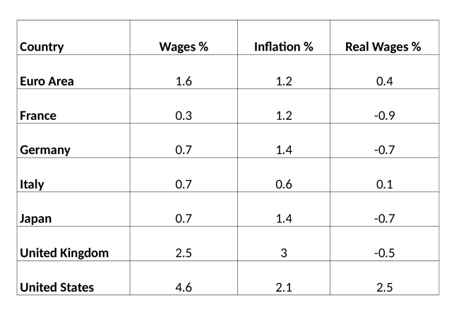
Source: Trading Economics
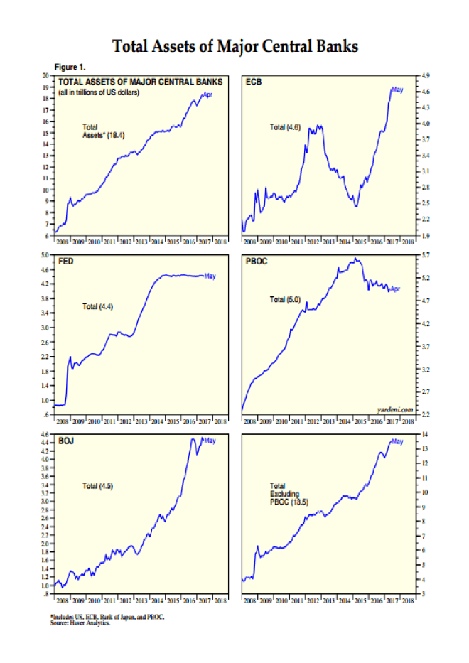
The first place where this trend in lower earnings will become evident is likely to be among freelance and part-time workers – at least they will still have employment. The next casualty will be the fully employed. Corporations will lay-off staff as corporate profit warnings force their hands. Governments will be beseeched to create jobs and, regardless of whether the inflation rate is still rising or not, Central Banks will be implored, cajoled (whatever it takes) to cut interest rates and renew their quest to purchase every asset under the sun.
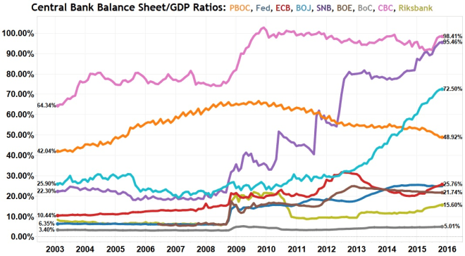
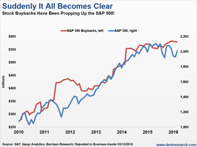
Wage deflation will, of course, continue, harming those who have no alternative but to work; those who lack sufficient unearned income to survive. Government debt will accelerate, Central Bank balance sheets will balloon and asset prices will eventually recover. Bond yields may even reach new record lows, prompting assets to flow into stocks – the ones Central Banks have not yet purchased as part of their QQE programmes – despite their inflated valuations. Corporate executives will no doubt take the view that interest rates are artificially low and conclude that they can best serve their shareholders by buying back their own stock – accompanied by the occasional special dividend to avoid accusations for impropriety.
As economic growth takes a nose drive, inflation will moderate, providing justification for the pre-emptive rate cutting and balance sheet expanding actions of the Central Banks. Articles will begin to appear, in esteemed journals, talking of a new era of low economic trend growth. Finally, after several years of QE, QQE and whatever the stage beyond that may be – helicopter money anyone? – the world economy will start to grow more rapidly and the labour force participation rate, increase once more. Inflation will start to rise, interest rates will be tightened, bond yields, increase. At this point, stocks will fall and the next downward leg of the economic cycle will have to be averted by renewed QQE and fiscal stimulus. If this is reminiscent of a scene from Groundhog Day, I regret to inform you, it is.
There will be a point at which the financialisation of the global economy and the nationalisation of the stock market can no longer deliver the markets from the deleterious curse of debt, but, sadly, I do not believe that moment has yet arrived. Are we nearly there yet? Not even close.