First In, First Out – China as a Leading Indicator
China was the first country to recover from the Covid-19 pandemic
The PBoC began tightening monetary conditions in May 2020
Chinese housing and stocks remain strong despite official policy
Chinese contagion remains a risk to the global recovery
Whilst there are many aspects of the Chinese command economy which differ radically from that of the US, it is worth examining the performance of China’s economy, fiscal and monetary policy, and its financial markets. They may afford some insight into the future direction of other developed and developing markets as we gradually emerge from the Covid crisis: –
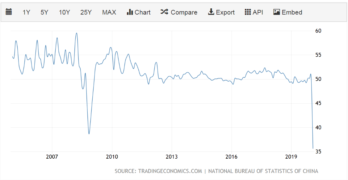
Source: Trading Economics
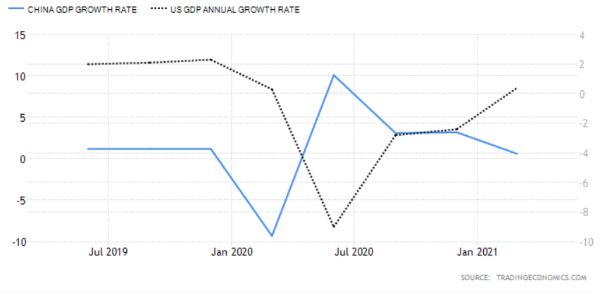
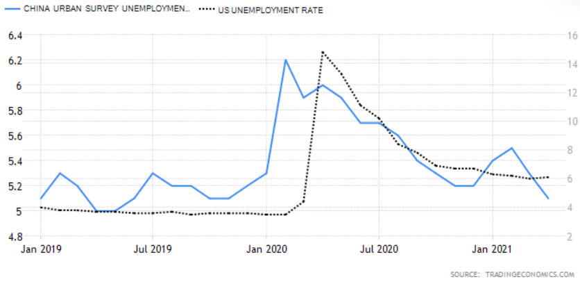
As can be seen from the chart above, whilst China was the first country to be struck by the Covid-19 pandemic it was also the first country to recover, however, a comparison of the Chinese and US bond markets provides a rather different picture: –
Source: Trading Economics
Chinese bond yields reached their lows at roughly the same time as those of the US, since when they have returned more rapidly to their pre-pandemic levels. If the US follows a similar trajectory the yield on US Treasuries is set to rise further.
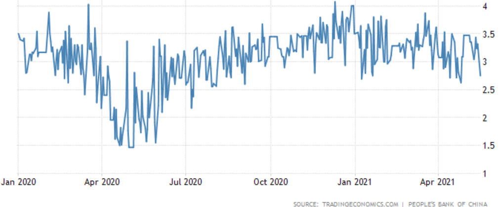
It can be argued, however, that the plight of the Chinese bond market is a function of the monetary stance of the People’s Bank of China (PBoC). When the crisis first erupted the PBoC cut its interest rate corridor by 0.3% and also drove down Chinese interbank rates by around 1.2% through its open market operations. By May 2020 that policy had changed, accommodation was replaced by a steady drain of liquidity.
The chart below shows the, rather volatile, 3 month Shibor rate, this is in marked contrast to the ‘lower for longer’ approach taken after the 2008 crisis. The Covid accommodation has been remarkably short-lived: –
Source: Trading Economics, PBoC
This PBoC tightening, which began in May 2020 and has been accompanied by official talk of the need for stability and the desire to avoid creating asset bubbles, is finally becoming evident in the money supply data: –
Source: Trading Economics
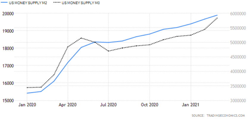
This contrasts with the continued expansion of US monetary aggregates: –
Source: Trading Economics
One of the challenges facing all central bankers is that interest rates are a blunt tool. Not all China’s asset markets have heeded the PBoC advice. The residential property market, for example, remains red hot despite the introduction of the three red lines policy – which aims to limit their liability-to-asset ratio (excluding advance receipts) to less than 70%, or their net gearing ratio to less than 100%, or their cash-to-short-term debt ratio to less than 1x, or a combination of all three. New home prices surged on regardless, gaining 4.8% in April, led by luxury real estate in Shenzhen, Shanghai and Guangzhou which is up 16% to 19% over the last year – a further tightening of regulation seems inevitable.
The PBoC has had greater influence elsewhere, Total Social Financing, their favoured measure of lending across the entire domestic financial system, rose by 12% in March, its slowest pace since April 2020:-
Source: Financial Times, CEIC
Another sign that official policy measures may be biting was seen in April’s retail sales which, whilst they rose by 17.7%, were down from a 34.2% in March, and came in well below the consensus forecast of 24.9%. Here again, China appears to be a leading indicator of the direction that the US economy might take: –
Source: Trading Economics
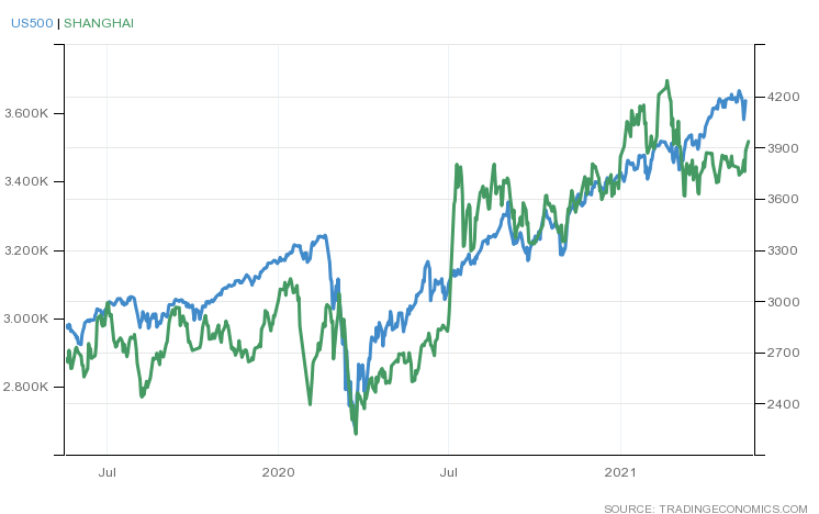
Interestingly, unlike 2015, the Chinese stock market has, thus far, reacted in a more measured way to the general tightening of monetary conditions. The next chart shows the relative performance of the Shanghai Composite versus the S&P 500 Index: –
Source: Trading Economics
As mentioned above, money supply data points to a slowing of the Chinese economy but, like so many other countries, China saw a sharp rise in its, already high, household saving rate. The Paulson Institute estimates that Chinese households saved 3% more of their income than prior to Covid; Pantheon Macroeconomics equate this pool of savings to roughly 3% of GDP. While many commentators suggest that in China’s case this is a pool of precautionary saving, consumption will likely resume its long-term growth, now that employment prospects have begun to improve. The chart below shows the lagged trajectory of unemployment in US compared to China: –
Source: Trading Economics
US unemployment remains elevated relative to its pre-Covid rate but the economic recovery continues to gather momentum.
In China, as elsewhere, that portion of excess savings not consumed will either be left on deposit, used to reduce debt or invested. Even though interest rates have risen, the liquidity of Chinese capital markets should remain plentiful for the next six months to a year, sufficient to cushion any sudden downturns in the post-Covid recovery.
Conclusions and Investment Opportunities
In the analysis above, I have produced a strew of charts suggesting that the US may follow the trajectory of China as the post-Covid recovery unfolds. This is almost certainly too simplistic. Above all else Beijing craves stability, it knows its pace of economic growth is slowing, this is structural. The investment-led growth model which has transformed the economy over the last four decades, requires the methadone of more credit to sustain even these lower rates of return. The policy of rebalancing towards domestic consumption offers longer-term hope, but China’s recovery from the Covid crisis was driven principally by investment and, to a much lesser extent, exports. The chart below, from George Friedman of Geopolitical Futures, shows the damage done to Chinese consumption by the pandemic and the subsequent rebound: –
Source: Geopolitical Futures, IMF, CEIC
The new(ish) US administration is also different from any we have seen for several decades. Markets believe in the arrival of a New New Deal fuelled by a gargantuan monetary and fiscal tonic which will heal-all. Asset prices continue to rise as The Everything Bubble inflates further.
We are still in the early stages of the economic recovery. Supply-chain constraints and labour shortages, even whilst under-employment remains elevated, have driven inflation expectations higher in the near-term, yet asset markets look beyond these shorter-term factors to the productivity gains, which have, in many cases, been a long overdue response to the crisis itself.
A few brave central bankers are seeking to temper the speculative frenzy. The majority, however, will place their emphasis on outcomes rather than the outlookas Federal Reserve Governor Lael Brainard recently stated. This politically expedient approach means fiat currencies will continue their race to the bottom, bond markets will remain neutered by the policy of QE; that leaves assets as the solitary safety-valve, somewhere between a store of wealth and thar she blows. They afford some protection against debasement and, with the advent of Decentralised Finance, there is a non-zero possibility that some of these assets might even become a means of exchange.
In the near-term we have seen the Norges Bank indicate that it may raise rates in H2 2021. The Bank of Canada has announced a tapering of government bond purchases, inking in a potential rate increase for late 2022, meanwhile the Bank of Japan, whilst it has made no bald statements, has moderated its ETF purchases and stands accused of taper by stealth because the scale of its bond-buying has actually slowed since it adopted yield curve control in 2016. These isolated actions are but clouds in a blue sky of endless liquidity but financial markets prefer to travel rather than to arrive. Choppier markets are likely over the next few months, there may be some excellent asset buying opportunities on sharp corrections.
Source: Peter Boockvar, Pinnacle Data, Haver Analytics, Citi
Macro Letter – No 136 – 19-02-2021
A Review of Stock Market Valuations – Part 1
As global stock markets continue to rise, commentators talk of a bubble
Longer-term indicators present mixed signals about valuation
Expectations about the speed of economic recovery from the pandemic are key
A recovery in productivity growth relies on saving and investment in innovation
This is the first of a two part letter reviewing the current valuation of stocks. The focus is US-centric and will investigate both long-run valuation (Part 1) and shorter term factors which may be warning signs of irrational exuberance (Part 2).
During the last 12 months we have seen stock markets around the world, decline rapidly and then rebound. Technically the longest bull-market in history ended in March of 2020 but the recovery was so swift that many commentators are calling it merely a sharp correction, simply an aberration. Since March the US stock market, fuelled by aggressive monetary and fiscal easing, has shot to new all-time highs. Q4 of 2020 witnessed the approval of the first Covid-19 vaccines, sending markets higher still.
Equity markets are forward-looking, the economic woes of today are discounted, expectations of recovery, backed by further fiscal support, make the prospects for future earnings appear relatively rosy. In this, the first part of my, letter I want to examine the arguments for a continued rise in equity prices together with the counter-claim that a repeat of the performance of the past decade is simply inconceivable.
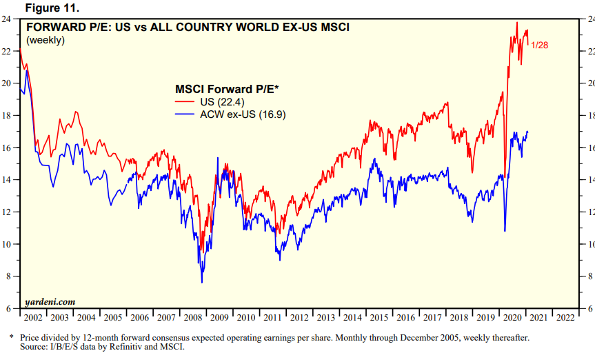
Every stock index is different but, for the purposes of this research, I will focus on the US rather than the rest of the world, since it is the US market which has tended, historically, to set the global tone. The chart below looks at the forward PE ratio of the US (in red) and the MSCI World – Ex-US (in blue): –
Source: Yardeni
Looking at the evolution of earnings per share and incorporating the recent forecasts for 2020 and 2021, we get a picture of a market which might just have got a little ahead of itself: –
Source: Crestmont Research
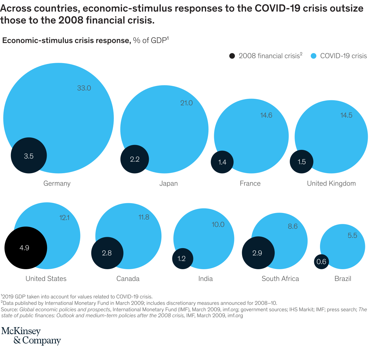
Part of the explanation for the substantial outperformance of the US has been the scale of the fiscal and monetary response of the US administration and its notionally independent central bank, yet, as the infographic below reveals, the US response whilst substantive is relatively less dramatic than that of some other countries: –
Source: McKinsey
Many commentators are concerned that the stock market (especially in the US) is over-valued, however a more nuanced view is provided by veteran equity market practitioner, Gregory van Kipnis. Writing at the beginning of last month in AIER, he makes a number of important observations in his article – Angst Over High Price-Earnings Levels Likely Misplaced. Stating from the outset that his purpose is not to provide valuation advice but a perspective on approaches to earnings valuation, the author looks at a variety of alternative valuation methodologies before reaching his conclusion: –
Market pundits who focus on PE, PE[-12], PE[+12] have come to the conclusion that the US stock market, as measured by the S&P 500, is overvalued and due for correction. Some believe we are in a bubble and there will be a sharp correction. Others opine that from current levels we are headed for a low rate of market performance for the next 10 years. These views may turn out to be correct.
However, a more formal analysis of classic valuation theory that relates the current price level to the present value of the future stream of expected income suggests otherwise; that is, the market is more fairly valued and in keeping with its historical norms. From a statistical point of view, there is uncertainty around such a conclusion. Market returns routinely fluctuate. Two thirds of the time total returns realized in the market fluctuate by plus or minus 4.4%. Nonetheless, there is analytical support for the conclusion that from both a market efficiency point of view and from the perspective of long-term valuation theory, the market is roughly aligned with long-term norms.
The chart below shows the S&P500 cumulative compounded total return at constant rate. The blue dotted line shows theoretical ‘fair-value’ derived from the author’s Total Return Model.
Source: AIER
Van Kipnis continues: –
At the risk of seeming repetitive, it should be stressed that the market trades within a range around its long-term fair value norms. For sure prices have trended for long periods below and above the historical norm. But it cannot be dismissed lightly that those historical norms are real and give every appearance of remaining intact for the foreseeable future.
Value amid the Growth
I have written on a number of occasions about the return of the Value investor, however, we are in a different environment from the 1980’s, where small cap stocks outperformed. The evolution is best explained by Robert Zuccaro, CIO of Target QR Strategies, who made the following observation in his January investor letter: –
Major differences are apparent between the economies of 1980 and 2020. Most companies in 1980 were industrial in nature and domestic in scope. In acknowledgement of the heavy influence of industrial companies in economic activity, the S&P 400 in this era was comprised solely by industrial stocks. Globalization has dramatically altered both the economy and the stock market. Whereas business activities were principally domestic in scope in the past, globalization offers an opportunity that is five times greater than the domestic market. Secondly, tech companies possess the capability to ramp up sales and profits faster than ever before. For example, it took Apple 31 years to reach a market cap of $100 billion. DoorDash which just came public did this in just 7 years. Forty years ago, some small companies starting from a small sales base were able to generate sales and profits growth up to 30-40% each year. Today, large cap tech companies with global reach can generate growth rates of 100%.
Vitaliy Katsenelson discusses the Growth versus Value debate in greater detail in – Value & Growth Demagogues– the author begins: –
I have a problem with both growth and value demagogues.
Growth demagogues will argue that valuation is irrelevant for high-growth companies because the price you pay for growth doesn’t matter. They usually say this after a very extended move in growth stocks, where these investors look like gods that walk on water. They call value investors “accountants.”
Katsenelson goes on to explain that he analyses corporate earnings looking four years ahead in order to capture the value in high growth stocks, nonetheless he believes many growth stocks as insanely overvalued.
On February 4th, Goldman Sachs, chief global equity strategist, Peter Oppenheimer expressed a more sanguine opinion on growth: –
We believe that we are still in the early stages of a new bull market, transitioning from the ‘hope’ phase (which typically starts during a recession, led by rising valuations) to a longer ‘growth’ phase as strong profit growth emerges.
The client note went on to discuss six areas which could benefit from capital inflows if investors start to price in higher inflation expectations: –
Equities relative to bonds
Value relative to growth
Cyclicals relative to defensive
Banks relative to staples
High volatility relative to low volatility
Dividends
To date, roughly 70% of US companies have reported Q4 results, of these, around 85% have beaten expectations. Before you rush to buy remember the stock market is much happy travelling than arriving, the good earnings news is largely contained in the current price.
The Overvaluation Argument
Notwithstanding the analysis of van Kipnis and the forecasts of Goldman Sachs, the arguments for irrational exuberance are compelling. The catastrophic damage caused by the pandemic has yet to be fully revealed and a long-term secular stagnation remains a clear and present danger.
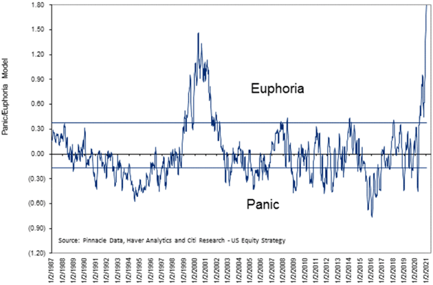
We all know the stock market was up significantly last year, and even more so around year-end, but you may not know how historically wild this is.
Citi Research has a “Euphoria/Panic” index that combines a bunch of market mood indicators. Since 1987, the market has typically topped out when this index approached the Euphoria line. The two exceptions were in the turn-of-the-century technology boom, when it spent about three years in the euphoric zone, and right now.
Source: Peter Boockvar, Pinnacle Data, Haver Analytics, Citi
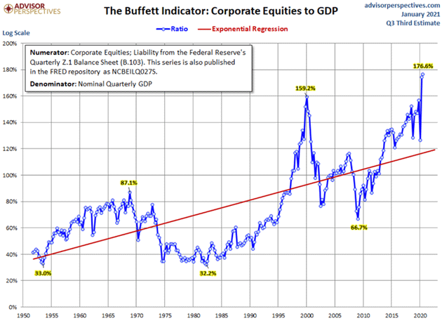
Another measure of overvaluation is the ratio of Equity Market Capitalisation to GDP, often referred to as the Buffett Ratio, since it is favoured by the Sage of Omaha: –
Source: Advisor Perspectives
I have a couple of issues with this ratio; firstly, as interest rates fall, so the attractiveness of debt relative to equity capital increases, and secondly, as a result of this fall in the cost of borrowing, less equity is issued and more equity is retired through mergers, de-listings and share buy-backs.
In the aftermath of the pandemic a number of governments prohibited share buybacks by key institutions, in the September 2020 quarterly review from the BIS – Mind the buybacks, beware of the leverage the authors concluded: –
…share buybacks affect firms’ performance and financial resilience mostly through leverage… There is, however, clear evidence that companies make extensive use of share repurchases to meet leverage targets. The initial phase of the pandemic fallout in March 2020 put the spotlight on leverage: irrespective of past buyback activity, firms with high leverage saw considerably lower returns than their low-leverage peers. Thus, investors and policymakers should be mindful of buybacks as a leverage management tool, but they should particularly beware of leverage, as it ultimately matters for economic activity and financial stability.
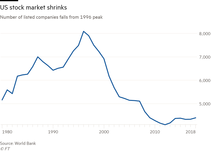
The recent pick-up in the number and size of equity financings, despite historically low interest rates may be the beginning of a reversal of the 25 year decline of listed market breadth.
This chart shows how the number of listed US equities has waxed and waned since interest rates peaked in the early 1980’s: –
Source: FT, World Bank
This shrinking pool of listed securities is somewhat deceptive, the number of securities that trade on OTC Markets, colloquially referred to as the Pink Sheets (although it includes more than 4,000 names listed on Nasdaq’s OTCBB) currently stands at 11,943, more than double the total of 2010.
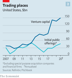
This is not simply to do with the onerous nature of listing requirements for the major exchanges, the preference for private over public also shows up in the value of IPOs versus Venture Funds: –
Source: The Economist
There is also a rising preference for debt financing, rather than equity issuance, a more direct effect of the financial repression of artificially low interest rates, which is evident, not just in the US but, at a global level: –
Source: The Economist, Refinitive
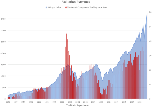
A number of other equity valuation metrics are in the top percentile of their historic ranges: –
Source: Crescat Capital, Doug Kass, Bloomberg, Yale, John Hussman
For the author, this is redolent of the Dotcom bubble of 1999. As for the title of his recent blog?
“What were you thinking?” That is the rhetorical question Scott McNealy, CEO of SunMicrosystems, asked of investors paying a “ridiculous” ten times revenues for his stock at the height of the Dotcom Mania. The incredulity in his voice is amplified by the benefit of hindsight as McNealy gave the interview this quote was taken from in the wake of the Dotcom Bust, after his stock price had lost over 90% of its value.
The Yield Dilemma
Another way to look at the valuation of stocks is to chart the earnings yield: –
Source: Meanwhile in the Markets, MLTPL
However, to get a more realistic picture you need to compare the earnings yield of stocks against the yield of US Treasuries, after all, investors need to put their money somewhere: –
By this measure, the S&P is the most attractive against bonds since 2014. Nobel-prize winning economist Robert Shiller—who came up with the CAPE ratio—wrote in a recent paper:
“With rates so low, the excess CAPE yield across all regions is almost at all-time highs, indicating that relative to bonds, equities appear highly attractive.”
If the Federal Reserve are toying with the idea of introducing yield-curve control – a policy currently adopted by the Bank of Japan – then stocks become the onlyliquid game in town. If you think the idea of the Fed following the Japanese model is anathema, this Federal Reserve article – How the Fed Managed the Treasury Yield Curve in the 1940s – might give you pause for thought: –
By mid-1942 the Treasury yield curve was fixed for the duration of the war, anchored at the front end with a ⅜ percent bill rate and at the long end with a 2½ percent long-bond rate. Intermediate yields included ⅞ percent on 1-year issues, 2 percent on 10-year issues, and 2¼ percent on 16-year issues…
In late November 1950, facing the prospect of another major war, the Fed, for the first time, sought to free itself from its commitment to keep long-term Treasury yields below 2½ percent. At the same time, Secretary of the Treasury John Snyder and President Truman sought a reaffirmation of the Fed’s commitment to the 2½ percent ceiling.
The impasse continued until mid-February 1951, when Snyder went into the hospital and left Assistant Secretary William McChesney Martin to negotiate what has become known as the “Treasury-Federal Reserve Accord.” Alan Meltzer has observed that the Accord “ended ten years of inflexible [interest] rates” and was “a major achievement for the country.”
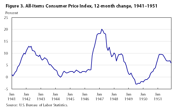
Given that the Covid-19 pandemic has had a war-like impact on the global economy, it is not unreasonable to anticipate a decade of near-zero US interest rates. Perhaps the Fed Hawks will prevail, but here is what US inflation did between 1941 and 1951: –
Source: BLS
After the inflationary experience of the 1970’s and 1980’s, the Federal Reserve may not have quite the tolerance for inflation that they had in the 1940’s, but when the least painful solution to the current debt crisis is inflation, the Fed may turn out to be far more tolerant of a rising price level than the markets are thinking at present.
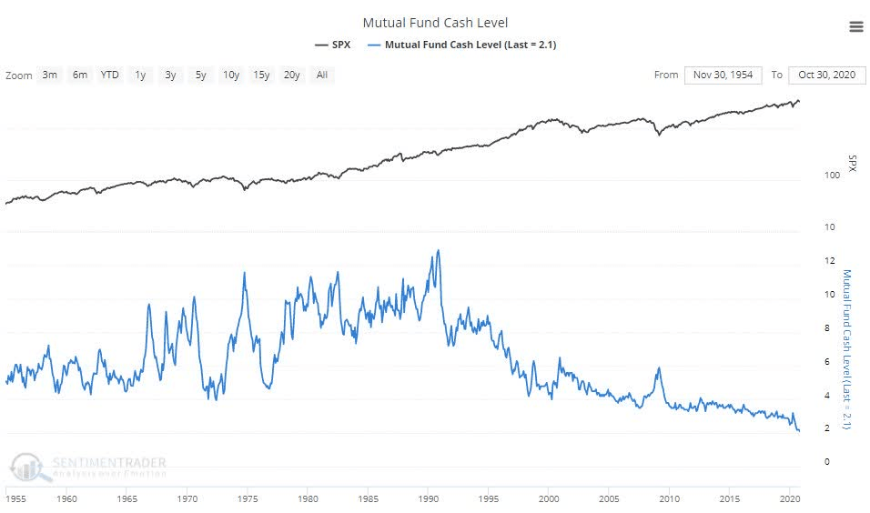
A final factor when considering the performance of the US stock market is the amount of cash available for investment. When we look at the Mutual Fund market there is cause for concern, but the record low levels of cash available to mutual fund managers is itself a function of the poor return available on cash. This post from Lance Roberts – Why There Is Literally No “Cash On The Sidelines” – elaborates on the topic, but the chart below suggests that this trend is by no means new: –
Source: Real Investment Advice, Sentiment Trader
The other side of the cash debate concerns the rapid increase in the US personal savings rate which has accompanied the lockdown restrictions. This post fromtheFederal Reserve Bank of Kansas City – Why Are Americans Saving So Much of Their Income?– looks at the topic in more detail, however,the chart below supports my supposition that, as savings have risen, so too has the percentage of windfall payments which are invested rather than saved or consumed: –
Source: BEA, Haver Analytics, KC Fed
The author, A. Lee Smith is, of course, concerned with direction of consumption spending, concluding: –
As fiscal support lapses and forbearances expire, the strength of U.S. consumption is likely to be tested in the coming months. Recent increases in the personal savings rate have stirred hope that consumption will remain resilient. However, I find that such optimism may be misplaced, as past increases in the savings rate have failed to predict future consumption behavior.
An important caveat to this conclusion is that the unprecedented nature of this crisis could lead to departures from historical patterns. The sheer size and scope of recent government transfers, for example, could support spending once the pandemic recedes. However, the scarring nature of the crisis and previously unimaginable income risk could just as easily have given consumers a lasting desire to increase their liquidity buffers and guard against future income losses. After the Great Recession, for instance, Gallup surveys show a persistent increase in the share of consumers who prefer to save rather than spend (Saad 2019).
The uneven imprint of this crisis across the economy, which my aggregate analysis overlooks, could also lead to a departure from historical savings and consumption patterns. While many consumers may now have the desire to save more, only those that remain employed have the ability to actually save more. This distinction between desired and actual savings is important, as a pullback in consumption by employed households could amplify income losses for unemployed households in hard-hit sectors. This sectoral dynamic leaves little reason to be optimistic about future spending based on the elevated savings rate. In particular, if employed households are forgoing vacations and travel, forgone consumption today is unlikely to be made up in the future, creating a lasting income loss for many households.
If the author is correct, the likelihood of Federal Reserve tapering is very low indeed.
Conclusions
To arrive at a conclusion about current the value and near-term future prospects for equities, we also need to look at a range of shorter-term factors. This will be the focus of the second part of this letter.
After the flood – Beyond fiscal and monetary intervention
Monetary and fiscal stimulus to ameliorate the effect of the pandemic has exceeded $9trln
Stock markets have recovered, although most are below their February highs
The combined supply and demand shock of Covid-19 is structural
A value-based investment approach is critical to navigate the transition
In my last Macro Letter – A Brave New World for Value Investing – I anticipated the beginning of a new phase for equity investment. In this Letter I look at the existing business and economic trends which have been accelerated by the pandemic, together with the new trends ignited by this sea-change in human behaviour.
In economic terms, the Covid pandemic began with a supply-shock in China as they were forced to lockdown the Wuhan region. This exacerbated strains which had already become evident in trade negotiations between China and the US, but also revealed weaknesses in the global supply chains. A kind of ‘Mexican Wave’ has followed, with a variant on the initial supply-shock occurring in successive countries as the virus spreads from region to region and governments responded with lockdowns.
The supply-shock has gone hand in hand with a global demand-shock. The key difference between this recession and previous crises is the degree to which it has impacted the service sector. According to 2017 data, the service sector represents 65% of global GDP, whilst Industrial/Manufacturing accounts for 25%, Agriculture represents only 3.43%. Over time, Agriculture and Manufacturing has become more increasingly automated, the principle growth sector for employment is Services. The ILO Monitor: COVID-19 and the world of work. Fourth edition states: –
As at 17 May 2020, 20 per cent of the world’s workers lived in countries with required workplace closures for all but essential workers. An additional 69 per cent lived in countries with required workplace closures for some sectors or categories of workers, and a further 5 per cent lived in countries with recommended workplace closures.
The latest ILO estimate for Q2, 2020 indicates a 10.7% decline in working hours – equivalent to 305mln lost jobs worldwide. 60% of these job losses have been in four industries, leisure, retail, education and, perhaps counter-intuitively, healthcare. The knock-on effects have been felt almost everywhere.
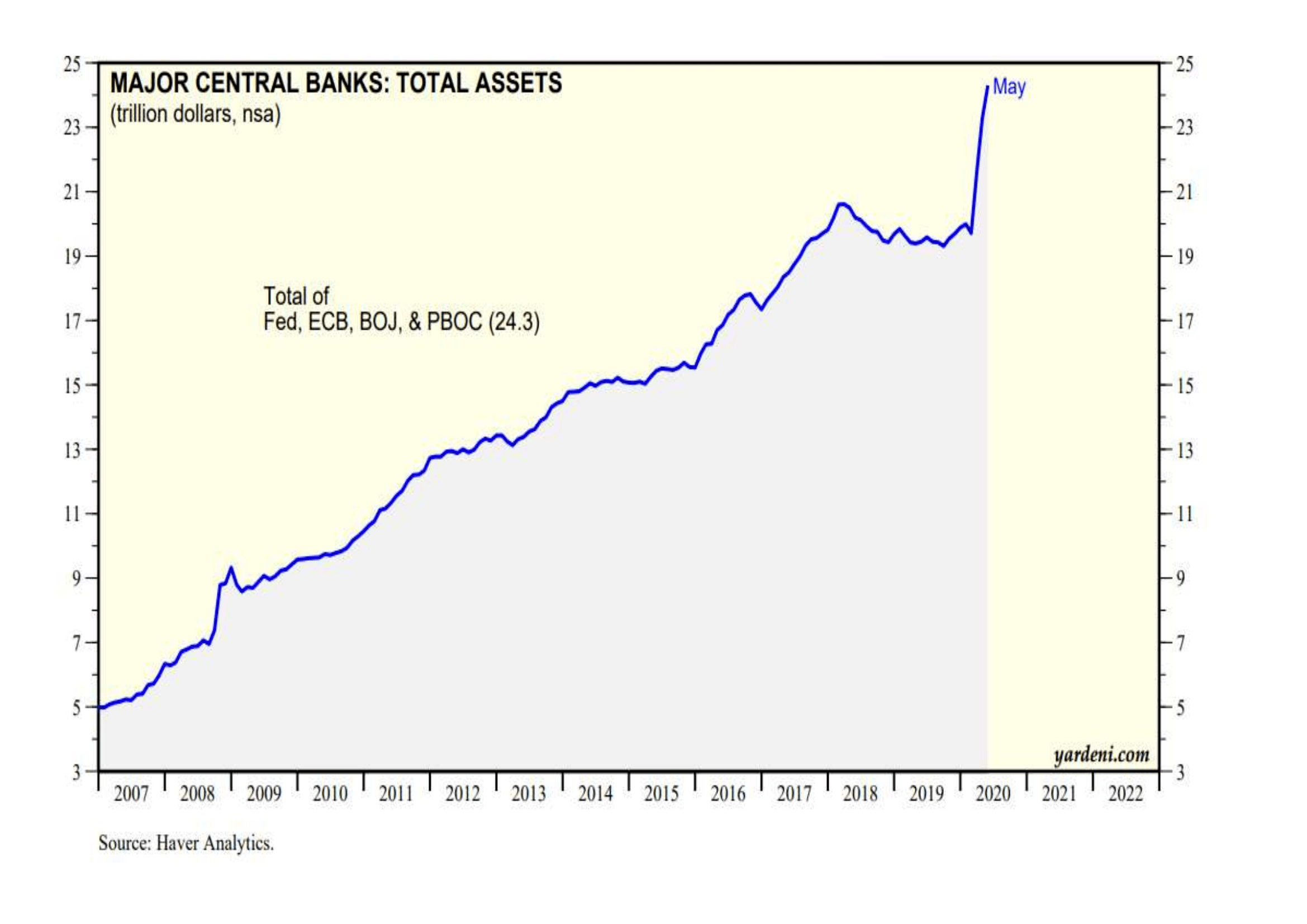
Governments and central banks have responded. The chart below shows the rapid expansion in central bank balance sheets: –
Source: Yardeni, Haver Analytics
The Federal Reserve began their latest round of quantitative easing in August 2019, well before the onset of the pandemic. They have added $3.3tlrn in nine months, seeing their balance sheet balloon to $7.1trln.
Around the world, governments have also reacted with vigour; on May 20th the IMF updated their estimate of the global fiscal response to $9trln, of which $8trln has emanated from G20 countries. The geographic breakdown as a percentage of GDP can be seen in the table below: –
Source: IMF
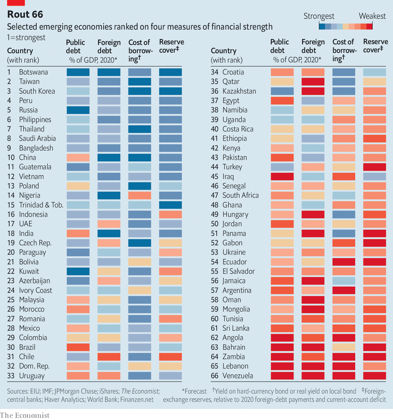
The majority of global stimulus has come from the richer developed nations. Assuming this pattern continues, emerging market equities are likely to lag. The table below ranks a selection of emerging economies by four measures of financial strength, public debt, foreign debt, cost of borrowing and reserve cover: –
Source: The Economist, IMF, JP Morgan, iShares
Overall, whilst the flood may subside, global expenditure should continue to rise as the pandemic sweeps on across the globe. Whilst loan forbearance and forgiveness, together with state guarantees, will help to maintain the solvency of many existing corporations, new spending will be aimed at stimulating employment. Infrastructure projects will be legion.
Impact on Industry Sectors
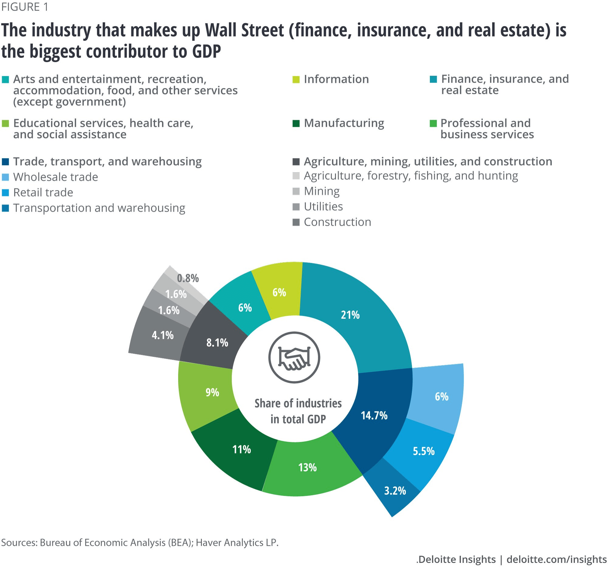
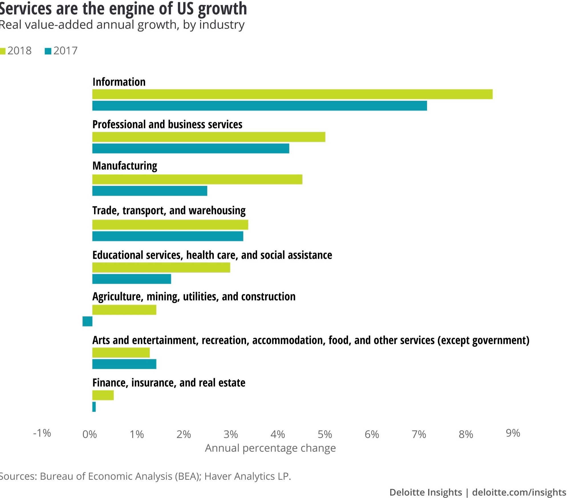
For investors, the abrupt changes in supply and demand, combined with the impact of the fiscal and monetary response, make navigating today’s stock markets especially challenging. To begin, here is a chart from 2019 showing a breakdown of industry sectors in the US by their contribution to GDP: –
Source: Deloitte, BEA, Haver Analytics
This tells us that finance, insurance and real estate are the largest sector but it fails to tell us which sectors are thriving and which are not: –
Source: Deloitte, BEA, Haver Analytics
Here we see the continued march of digital transformation, but also the ever increasing share of healthcare services in GDP; near to four decades of asset price appreciation has created an asset rich aging cohort in developed economies which, if not healthier then definitely wealthier. Looking ahead, developed nations are better equipped to weather the crisis better than their developing nation peers. Within developed nations, however, smaller businesses, especially those which cannot access capital markets, will fail, whilst larger firms will fare far better. Private Equity funds will also find rich pickings among the plethora of distressed private market opportunities.
Since the outbreak of Covid-19, several trends have accelerated, others have been truncated or reversed. Social behaviour has had a negative impact on travel, leisure and retail. Declining demand for travel has damaged a range of industries including airlines, autos, oil and gas. The leisure sector has been hit even harder with hotels, restaurants and bars closed, in many cases forever. The sports industry has been severely undermined. Meanwhile the decline in retail has accelerated into a downward spiral.
Nonetheless, several industries have benefitted. Within retail, online sales have hit new records, grocery sales have ballooned. Healthcare has gone digital, from consulting to dispensing productivity gains have been evident. The home improvements industry has benefitted even as commercial real estate has suffered. Working from home will be a permanent feature for many office workers. Every existing home owner will need to create a permanent office space, every new home buyer will need more space to incorporate an office. Longer, occasional, commutes will lead people to move further from the city. Some workers will move to more clement climes, requiring less energy. Structural changes in where we live and how we live present threats and opportunities in equal measure. For example, every house will require better communications infrastructure, high speed connectivity and broad, broadband will become the norm.
Changes in the delivery of goods (direct to homes rather than to retail outlets) means more inventory will held in out-of-town locations. Inner city retail and commercial property businesses will consolidate as out-of-town commercial thrives. New out-of-town property demand will also emerge from the manufacturing sector. The on-shoring of production was already in train, with robots replacing cheap labour from developing countries, now, concern about the robustness of supply chains, especially for critical manufactures such as pharmaceuticals, will encourage a wave of old industries in developing countries to be reborn. Whereas in retail, larger inventory may become more prevalent, in manufacturing, ‘just-in-time’ delivery and lower transportation costs will compensate for higher fixed production costs.
The energy sector has suffered a medium-term setback, for example, 28% of all US gasoline is consumed in the daily commute. After the lockdown, some commuters will choose to travel alone rather than by public transport, many more will now work permanently from home. Yet whilst gasoline demand falls, demand for diesel, to fuel the home delivery revolution, will rise. Home heating (and cooling) is also set to rise and, with it, demand for heating oil and natural gas. Overall demand may be lower but there will be many investment opportunities.
In healthcare, aside from tele-medicine, which is forecast to capture between one third and half of consultation demand, there is also increased appetite for bio-sensors to measure multiple aspects of health. Hospital consolidation will continue in an attempt to drive efficiency. On-shoring of drug manufacture may well be mandated, online delivery is likely to become the new normal, especially to the elderly and infirm who are advised to shelter-in-place. On-shoring creates domestic jobs, government favour will focus on these companies.
Airlines will be forced to diversify or merge; I envisage a mixture of both strategies. A diversification into car hire, travel insurance and hotels seems likely. Many airlines are national carriers, they possess an implicit government guarantee, their financing costs will remain lower, their low-budget competitors will diminish, fare discounts will become fewer and, thereby, their fortunes may conceivably rebound.
The automobile industry remains in a state of turmoil, but new technology will continue to determine its fortune. If de-urbanisation continues, whilst commuting will decline, there will be an increased demand for individual car ownership, especially electric vehicles. In the fullness of time, the industry will transform again with the adoption of driverless transportation.
Technology will, of course, be ubiquitous. The fortunes of the cybersecurity sector have been ascendant since the crisis began, but even relatively ‘non-tech’ businesses will benefit. Commercial real estate will gain as tech firms seek out ever larger data centres to support their cloud computing needs. The auto industry will benefit from improvements in battery storage and charging times. This will also change the economics of electricity for homes and factories. Green energy will come of age.
Tourism will recover, the human race has not lost the desire to travel. In Europe tourism is down between 30% and 40% – it accounts for 10% of GDP. The rebound will be gradual but the travellers will return. More consumers will buy on-line.
Banking and finance will evolve to meet the challenges and needs of the industrial and services sector. Certain trends will continue, bricks and mortar will give way to on-line solutions, branch networks will consolidate. With government support, or threat, existing loans will be extended, new loans made. As household savings rise, new credit will be granted to new and existing entities, few questions will be asked.
Insurance companies will consolidate, once claims are paid, premiums will rise and competition lessened. As with banking more consumers will move on-line.
Employment
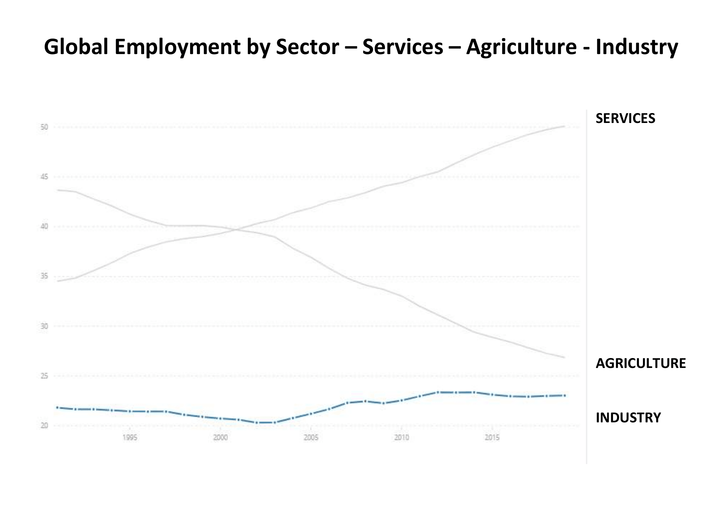
Looking beyond the business potential of different industry sectors and the technological advances which will support them, we should remember that governments around the globe will direct fiscal policy to alleviate unemployment, the initial flood of fiscal aid may moderate but if the tide goes out the ebb will be gradual, this is one of the benefits of a fiat currency system. According to the ILO, in 2019, employment in services accounted for 50%, Industry 23% and Agriculture 27%. The chart below shows how employment by sector has evolved over the last 28 years: –
Source: World Bank, ILO
The services sector has embraced employees leaving agriculture, whilst industry has grown without significant employment growth. The leisure industry, including hotels, restaurants and bars, is one of the largest employers of low-skilled, part-time employment. Consolidation within the hotels sector is inevitable. Larger, better capitalised groups will benefit as smaller enterprises fail. Corporations from beyond the leisure sector will diversify and private equity will fill the gaps which public companies step aside.
Conclusions and Investment Opportunities
In my previous Macro Letter I concluded that value-based analysis would be the best approach to equity investment. On closer examination, one can find risk and opportunity in almost every industry sector. In the last three month, stock markets have risen, but stock return dispersion remains heightened. A prudent, value-oriented, framework should yield the best results in the next few years.
Epidemics, Economic Growth and Stock-market Performance – An Historical Perspective
As the COVID-19 pandemic gathers momentum, history offers too few data points
The Spanish Flu is the nearest comparison – similarities are matched by differences
Clinical trials have started, but the rise in new cases is slowing in China already
Global economic growth will suffer, but monetary and fiscal stimulus should support stocks
As I write this article I am conscious that the Coronavirus is a very real and global tragedy. In all that follows I do not wish to detract from the dreadful human cost of this disaster in any way.
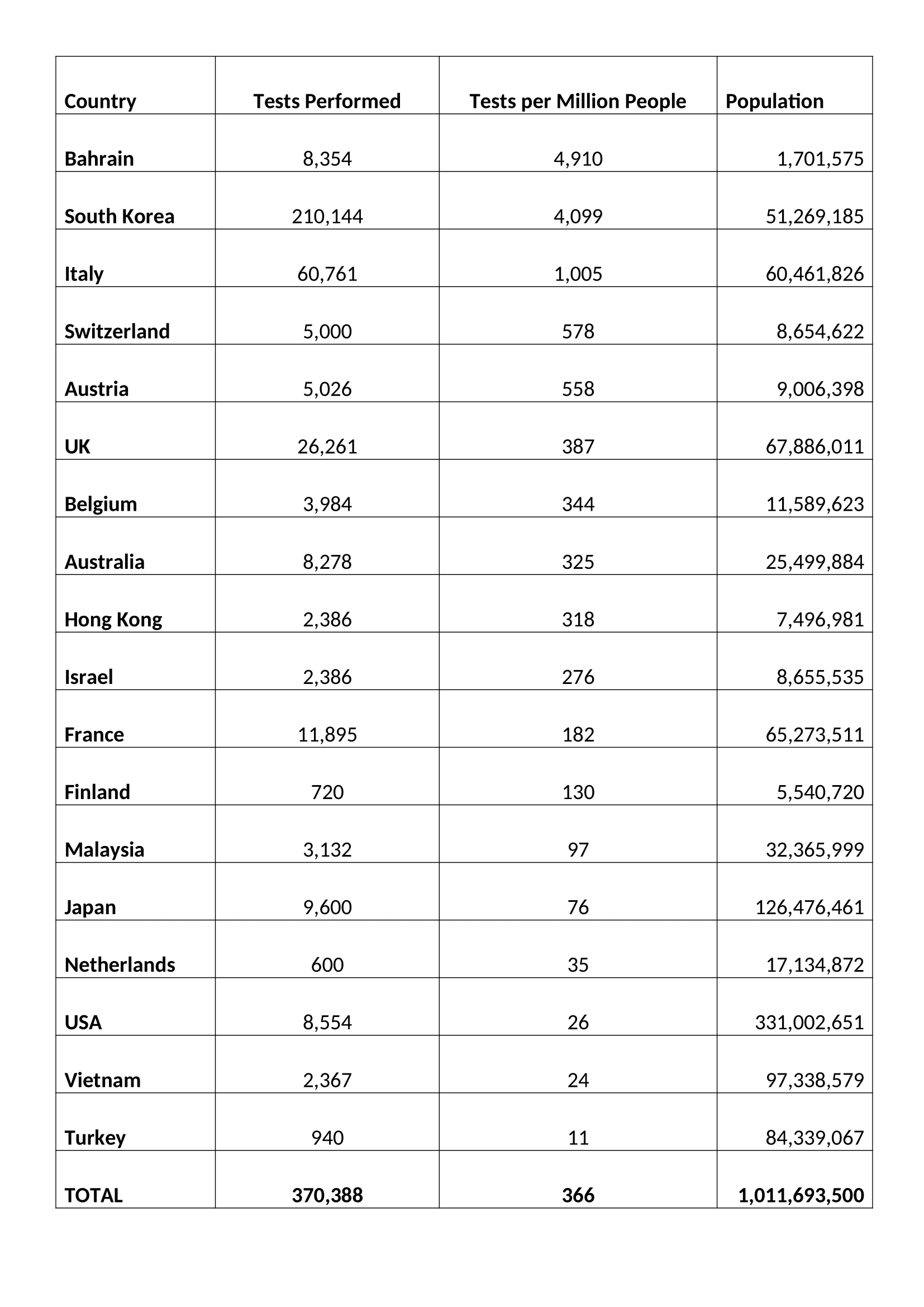
Putting the current pandemic in perspective, according to a 2017 estimate from the US Center for Disease Control, in a normal year, seasonal flu kills 291,000 to 646,000 globally. By contrast, the fatality rate for coronavirus seems to have stabilised at around 3.6% of those diagnosed. Of course, a more heartening figure of 0.79% can be found in South Korea which has tested almost 10 times more of its population than other country:-
Source: Worldometer.com
Suffice to say the current statistics are still confusing at best, but they are all we have to work with.
In a recent interview Dr Soumaya Swaminathan of the World Health Organisation (WHO) provided some insights (emphasis is mine): –
Of 44,000 Wuhan patients 80% had very mild symptoms, 15% of cases are severe and 5% critical. In terms of transmission rates, the R0 is still just an estimate of between 2 and 3 – in other words for every carrier between two and three people are infected.
…Two drugs, an antiretroviral called Lopinavir-ritonavir and an experimental drug used in the treatment of Ebola – Remdesivir, manufactured by Gilead (GILD) – are being tested in China where more than 80 clinical trials are already underway. The development of an effective vaccine it several months away.
It was reported today (11-3-2020) that Gilead has begun trails with US nationals and signed a deal with the US military.
Market Impact
Given the continued lack of clarity about COVID-19 in terms of numbers infected and numbers suffering, it may seem futile to attempt to gauge the potential economic impact of the current Coronavirus outbreak. History, however, may be able to provide some guidance to investors who might otherwise be tempted to liquidate and hibernate, especially after the dramatic decline this week in the wake of Saudi Arabia’s decision to turn its back on the OPEC cartel.
In order to begin this assessment, there are a vast array of factors which need to be considered. Here are just a few: –
Speed of spread – higher in urban areas due to population density
Urban versus rural population – generally a function of GDP per capita
Likelihood of a cure or vaccine – the majority of estimates range from three months to a year (hopefully it was be sooner)
Health of demographic cohorts by country – a function of average age and GDP per capita
Average income – also a function of GDP per capita
Extent of healthcare coverage – generally a function of GDP (although European welfare arrangements are more developed than those of the US)
Each of these factors are complex and warrant an essay to themselves. Suffice to say, the economic impact is already becoming evident. Schools, factories and offices are closing. Those workers that can are beginning to work remotely. At the extreme, entire cities, towns and countries are being subjected to lock-downs. In these conditions, economic activity inevitably suffers, this is a supply and demand shock combined. The price of crude oil has already responded, encouraged by the actions of Saudi Arabia, it has collapsed. Transportation activity has been substantially reduced. Economic indicators from China point to a pronounced contraction in 2020 GDP growth. Will the pattern seen in China be repeated elsewhere? Are the nascent indications of a resumption of economic activity now evident in China a reliable indication of the speed of recovery to be expected elsewhere? The jury is still out.
For G20 countries the effect of the 2008/2009 financial crisis still lingers. According to a BIS report more than 12% of developed nation firms generate too little income to cover their interest payments. Meanwhile, at the individual level, the Federal Reserve estimates that more than 10% of American adults would be unable to meet a $400 unexpected expense, equivalent to around two days’ work at average earnings. There is concern among governments that people may start to hoard cash if the crisis deepens.
Where the viral epidemic began, in China, the Purchasing Managers Index for February was the lowest since the series began in 2004. According to China Beige Book’s flash survey for February, 31% of companies were still closed and many of those that have reopened lacked staff or materials. Other estimates suggest that between 40% and 50% of the China’s truck fleet remains idle – those essential materials are unlikely to be delivered anytime soon. This supply-shock slowdown has inevitably fuelled expectations of an actual contraction in the size of the Chinese economy, the first shrinkage since the death of Mao Zedong in 1976: –
Source: Trading Economics
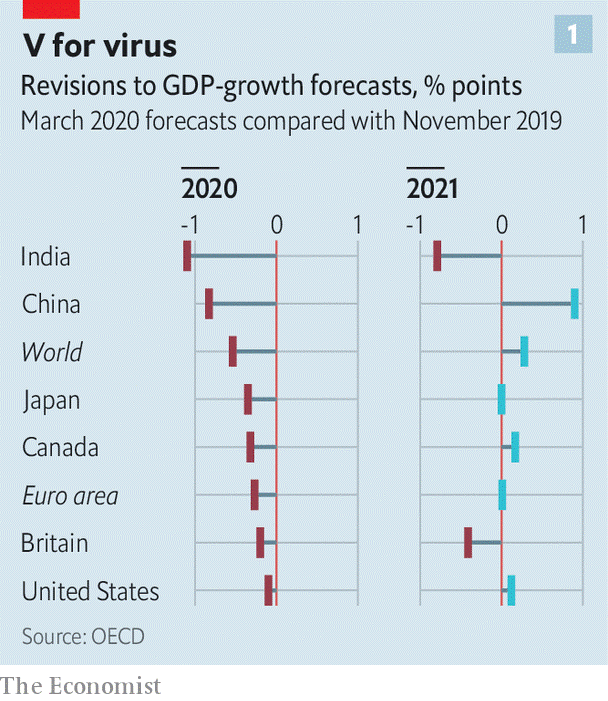
Everywhere GDP forecasts are being revised lower: –
Source: Economist
Policy Response
For the world’s governments there are essentially three policy responses: –
Provision of credit via banks and money markets – central banks are doing what they can
Aid to corporates to meet fixed costs, such as rent and tax bills
Protection of workers by subsidising wage costs
Central banks are limited in their ability to lend directly to firms, meanwhile the banking system, petrified by the recent widening of credit spreads for sub-investment grade debt, is likely to become a bottleneck. It will take more than gentle persuasion to force banks to lend new funds and reschedule existing non-performing loans. Other aid to corporates and individuals requires varying degrees of fiscal stimulus. Governments need to act quickly (today’s UK budget is an indication of the largesse to follow) it would also help if there were a coordinated global policy response.
A first step is to lock in adequate public funding. In 2014, emergency funding of about $5.4 billion was provided to fight the Ebola outbreak. Much more than that should be provided today, given the apparently greater transmissibility of COVID-19 and the fact that it has already appeared in many locations around the United States and more than 60 countries around the globe.
…A classic recession involves a shortfall of demand relative to supply. In that more ordinary situation, economic policymakers know how to help fill in the missing demand. But this case is more complicated because it involves negative hits to both supply and demand.
…No one knows how serious the economic damage from COVID-19 will be, so a key challenge is to design a fiscal countermeasure that clicks on when it’s needed and clicks off when it’s not. One approach that would fit that description would be to move immediately to pre-position a temporary cut in the payroll taxes that fund the Social Security and Medicare programs…
The final suggestion is a US-centric proposal, it is different from the income tax cut alluded to by President Trump and will directly benefit lower-income families, since healthcare costs will be a larger proportion of their after tax income. The authors’ propose a similar mechanism to click in when the unemployment rates rises and click off when re-employment kicks back in.
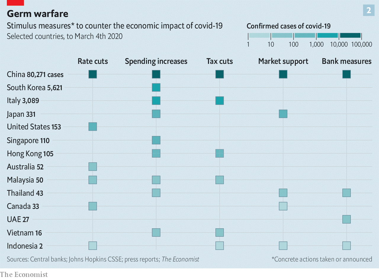
The table below shows actions taken by 4th March: –
Source: Economist
It is worth mentioning that Hong Kong, still reeling from the civil unrest of last year, has pressed ahead with ‘helicopter money’ sending cheques to every tax payer. This approach may be more widely adopted elsewhere over the coming weeks.
The Spanish Flu
In an attempt to find an historical parallel for the current Corona outbreak, there are only two episodes which are broadly similar, the Black Death of 1347 to 1351 and the Spanish Flu of 1918 to 1919. Data from the middle ages is difficult to extrapolate but it is thought that the Plague wiped out between 20% and 40% of Europe’s population. The world population is estimated to have fallen from 475mnl to between 350mln and 375mln. The world economy shrank, but, if data for England is any guide, per capita economic activity increased and the economic wellbeing of the average individual improved. For more on this topic I would recommend a working paper from the Federal Trade Commission –The English Economy Following the Black Death by Judith R. Gelman -1982.
The Spanish Flu of 1918 was the next global pandemic. It began in August of 1918, three month prior to the end of the First World War, and, by the time it had ended, in March of 1919, it had infected 500mln out of a global population of 1.8bln. The fatality rate was high, 40mln people lost their lives. Following the war, which cost almost 20mln lives, the combined loss of life was similar in absolute terms to the Black Death although in percentage terms the fatality rate was only 2%.
The possibility of a worldwide influenza pandemic… is of growing concern for many countries around the globe. The World Bank estimates that a global influenza pandemic would cost the world economy $800 billion and kill tens-of-millions of people. Researchers at the U.S. Centers for Disease Control and Prevention calculate that deaths in the United States could reach 207,000 and the initial cost to the economy could approach $166 billion, or roughly 1.5 percent of the GDP. Longrun costs are expected to be much greater. The U.S. Department of Health and Human Services paints a more dire picture—up to 1.9 million dead in the United States and initial economic costs near $200 billion.
…Despite technological advances in medicine and greater health coverage throughout the 20th century, deaths from a modern-day influenza pandemic are also likely to be related to race, income and place of residence.
The Spanish-flu was different from COVID-19 in that the highest mortality was among those aged 18 to 40 years and was often found among those with the strongest immune systems.
Garrett goes on to assess the economic impact with the aid stories from newspapers and the limited amount of previously published (and some unpublished) research. National statistics on unemployment and economic activity had yet to be compiled, but the simultaneous supply and demand shocks were broadly similar to the patterns we are witnessing today.
…One research paper examines the immediate (short-run) effect of influenza mortalities on manufacturing wages in U.S. cities and states for the period 1914 to 1919. The testable hypothesis of the paper is that
influenza mortalities had a direct impact on wage rates in the manufacturing sector in U.S. cities and states during and immediately after the 1918 influenza. The hypothesis is based on a simple economic model of the labor market: A decrease in the supply of manufacturing workers that resulted from influenza mortalities would have had the initial effect of reducing manufacturing labor supply, increasing the marginal product of labor and capital per worker, and thus increasing real wages. In the short term, labor immobility across cities and states is likely to have prevented wage equalization across the states, and a substitution away from relatively more expensive labor to capital is unlikely to have occurred.
The empirical results support the hypothesis: Cities and states having greater influenza mortalities experienced a greater increase in manufacturing wage growth over the period 1914 to 1919.
Another study explored state income growth for the decade after the influenza pandemic using a similar methodology. In their unpublished manuscript, the authors argue that states that experienced larger numbers of influenza deaths per capita would have experienced higher rates of growth in per capita income after the pandemic. Essentially, states with higher influenza mortality rates would have had a greater increase in capital per worker, and thus output per worker and higher incomes after the pandemic. Using state-level personal income estimates for 1919-1921 and 1930, the authors do find a positive and statistically significant relationship between state-wide influenza mortality rates and subsequent state per capita income growth.
Aside from wages, however the author concludes: –
…Most of the evidence indicates that the economic effects of the 1918 influenza pandemic were short-term. Many businesses, especially those in the service and entertainment industries, suffered double-digit losses in revenue. Other businesses that specialized in health care products experienced an increase in revenues.
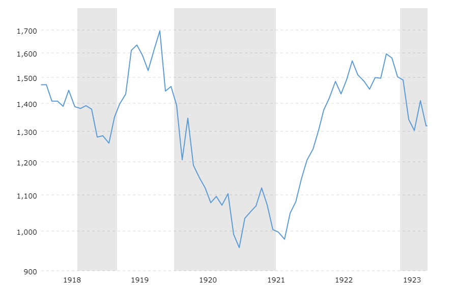
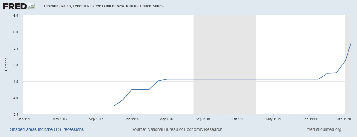
How did financial markets react? The chart below shows the Dow Jones Industrial Average over the period from 1918 to 1923. The shaded areas indicate recessions: –
Source: Macrotrends
When reinvested dividends are included, the total return of the Dow Jones Industrial Average in 1918 was 10.5%, despite influenza wiping out 0.4% of the US population. Fears about a slowdown in economic activity, resulting from the end of WWI, were the underlying cause of the brief recession which coincided with the pandemic, the stock market had already reacted, dipping around 10% earlier in the year. The subsequent recession of 1920 had other causes.
As is evident from the chart below, the newly created (1913) Federal Reserve felt no compunction to cut interest rates: –
Source: Federal Reserve Bank of St Louis
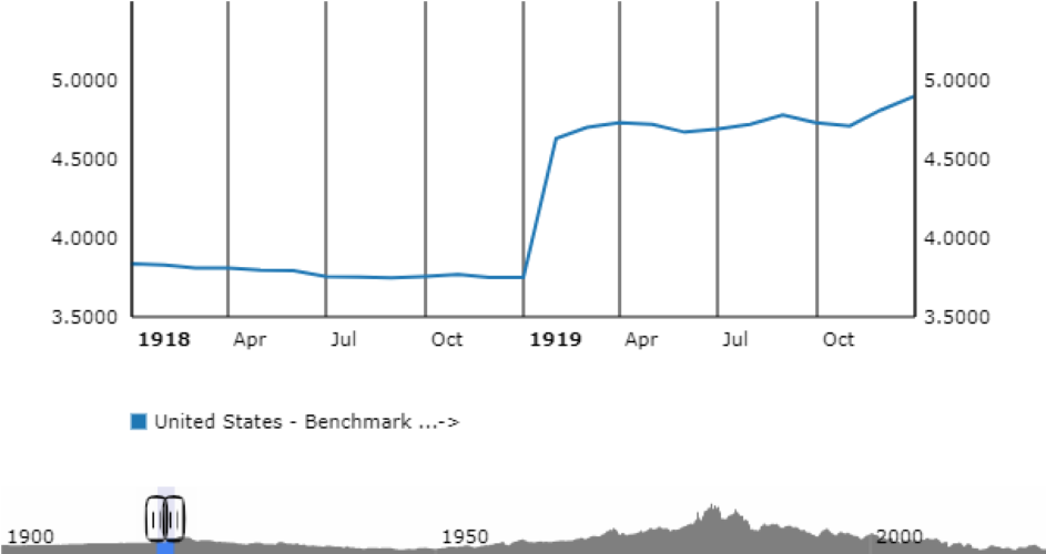
US 10 year Treasury Bonds simply reflected the actions of the Federal Reserve: –
Source: ECB
One is forced to concede, financial markets behaved in a very different manner 100 years ago, but they may yet have something to teach us about the global impact of a pandemic – that it is an economic interruption rather than a permanent impediment to progress.
Conclusions and investment opportunities
Whilst there are similarities between the Spanish Flu of 1918 and the COVID-19 pandemic of today, there are also profound differences. Urban areas, for example, are expected to suffer higher fatalities than rural areas today. In 1919 only 51% of the population of the US was urban, today it is above 80%. Population density has also increased three-fold over the last century, if 500mln were infected in 2018/2019 then the comparable figure today would be 1.5bln. Changes in the ease of transportation mean that the spread of a pandemic will be much more rapid today than in the first quarter of the 20th century. Tempering this gloom, for many people, communications have transformed the nature of work. Many aspect of business can now be transacted remotely. Unlike in 1918 self-isolation will not bring commerce to a standstill.
The economic impact will also be felt more rapidly. Supply chains have been optimised for efficiency, they lack resilience. Central banks have already begun to cut interest rates (where they can) and provide liquidity. Governments have picked up the gauntlet with a range of fiscal measures including tax cuts and benefit payments.
Many commentators are calling the COVID-19 pandemic a Black Swan event, yet SARS (2003), H1N1 (2009), and MERS (2012) preceded this outbreak. Predictions that just such an event would occur have been circulating for more than a decade.
Financial markets have behaved predictably. The oil price has collapsed as Saudi Arabia has broken with the OPEC cartel, stocks have fallen (especially those related to oil) and government bonds have rallied. Gold, which saw significant inflows during the last few years, has vacillated as holders have liquidated to meet commitments elsewhere even as new buyers have embraced the time-honoured ‘safe haven.’ Looking ahead, we do not know how long this pandemic will last nor how widespread it will become. The two prior pandemics of a similar stature provide little useful guidance, the Spanish Flu lasted seven months, the Black Death, by contrast, spread over more than four years and was still flaring up into the 17th century.
Expectations of a cure and a vaccine remain a matter of conjecture, but epidemiologists suggest that within a year we will have a viable solution. At the time of writing (Wednesday 11th March) the total number of infections has reached 120,588, there have been 4,365 deaths while 66,894 patients have recovered – a 55.47% recovery rate, although the Chinese recovery rate has been steadily rising and now stands at 76.22%. The global fatality rate is 3.62%, whilst individual country fatality rates range from Italy at 6.22% to South Korea (where 210,000 people have been tested – ten times the per capita global average) at a heartening 0.79%. The WHO still expect the fatality rate to stabilise at around 1% which implies that 99% should eventually recover.
Whilst a larger correction in stocks should not be ruled out, the relative lack of selling pressure suggests that investors are prepared to reappraise their estimates of what price to earnings they will accept – remember interest rates have been cut and will probably be cut again. Where rates can be lowered no further, quantitative easing (including the purchase of stocks) and fiscal stimulus will aim to preserve value.
The historical evidence of the Spanish Flu suggests this pandemic will be short-lived. The recent market correction may prove sufficient but, with only two data points in more than 600 years, it is unwise to assume that it will not be different this time. Defensive equity strategies which focus on long-term value have been out of favour for more than a decade. Good companies with strong balance sheets and low levels of debt are well placed to weather any protracted disruption. They may also benefit from rotation out of index funds. When markets stabilise, the reduced level of interest rates will see a renewed wave of capital pouring into stocks. The only question today is whether there will be another correction or whether now is the time to buy.
The Beginning of the End of Uncertainty for the UK
The UK election result was a clear mandate for Brexit
A UK/EU free-trade agreement may not be ready by December 2020
Uncertainty remains but real economic progress can now begin
For traders and investors in financial markets, risk and reward are two sides of a single coin. There are, of course, exceptions and geopolitical risk is one of them. The difficulty with geopolitical risk is that it is really geopolitical uncertainty. As Frank Knight observed back in 1921 in Risk, Uncertainty and Profit – risk is can be measured and forecast, uncertainty, cannot: –
Uncertainty must be taken in a sense radically distinct from the familiar notion of Risk, from which it has never been properly separated…. The essential fact is that ‘risk’ means in some cases a quantity susceptible of measurement, while at other times it is something distinctly not of this character; and there are far-reaching and crucial differences in the bearings of the phenomena depending on which of the two is really present and operating…. It will appear that a measurable uncertainty, or ‘risk’ proper, as we shall use the term, is so far different from an unmeasurable one that it is not in effect an uncertainty at all.
I have kept this in mind throughout my investing career and it is for this reason that I have avoided investing in the UK stock market since the Brexit referendum. The uncertainty surrounding Brexit has not disappeared, but I now have sufficient confidence in the decisiveness of the incumbent administration to believe that progress can at last be made. To judge by the immediate reaction of financial markets in the wake of the UK election result, I am not alone in my optimism.
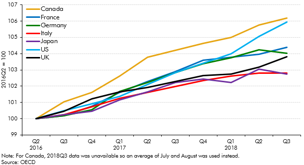
To begin, here is a chart of G7 GDP since Q2 2016: –
Source: OECD
The UK has fared better than Japan and Italy but its momentum has diminished relative to the remainder of G7.
A more nuanced view of the relative underperformance of the UK is revealed by comparison with Eurozone growth. The chart below, which starts in 2014, shows the switch from UK outperformance to underperformance which began even before the Brexit referendum in mid-2016: –
Source: Eurostat, Full Fact
Whilst there are many factors which have contributed to this change in the UK growth rate, the principal factor has been uncertainty relating to Brexit.
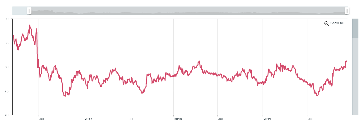
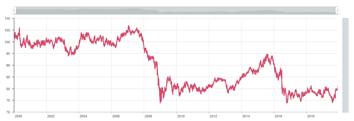
Of course, the direct impact of the Brexit referendum was felt by Sterling. The chart below shows the (Trade-weighted) Sterling Effective Exchange Rate since 2016: –
Source: Bank of England
The rise since August 2019 appears to predict the outcome of the election, but the currency still has far to rise if it is to return to pre-financial crisis levels, as this 20 year chart reveals: –
Source: Bank of England
The strong upward momentum which began in 2012 was swiftly terminated by the political morass which culminated in the UK referendum. The unexpected outcome of the 2016 Brexit vote only served to exacerbate the malaise.
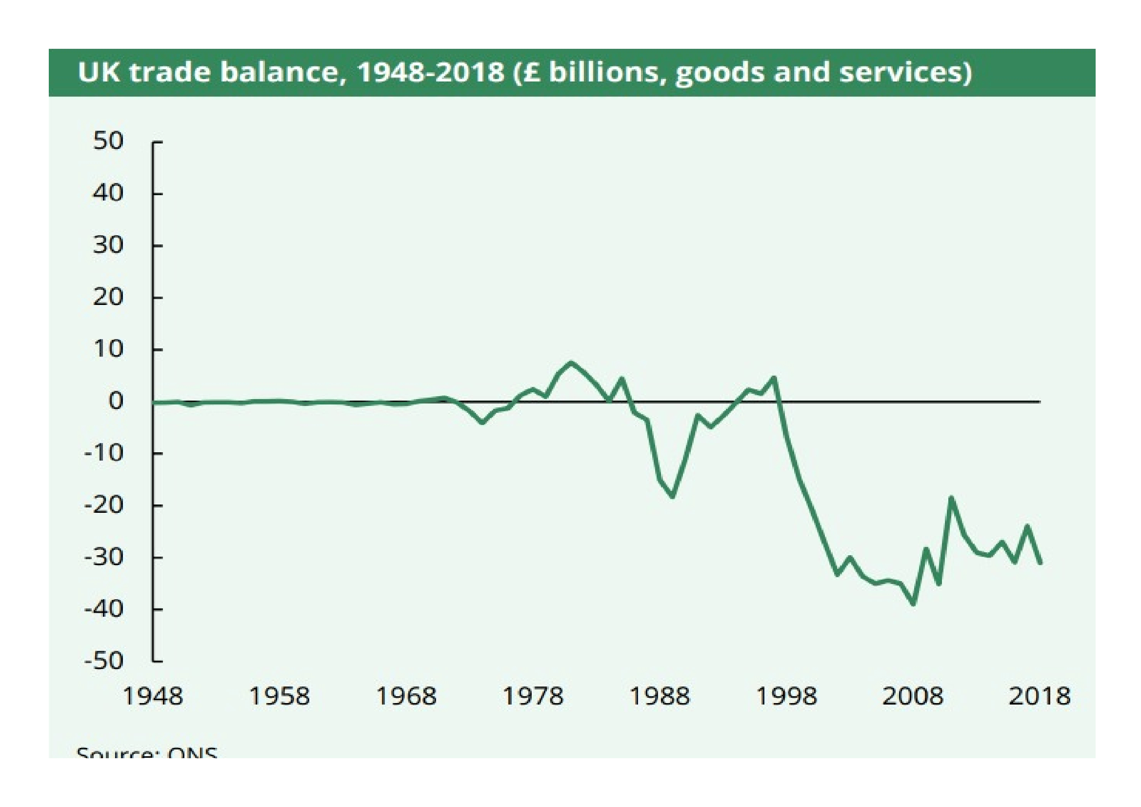
The weakness of Sterling merely accelerated the deterioration in the UK terms of trade. The UK has run a continuous trade deficit since 1998 but, as the chart below reveals, the deficit has become structural: –
Source: ONS
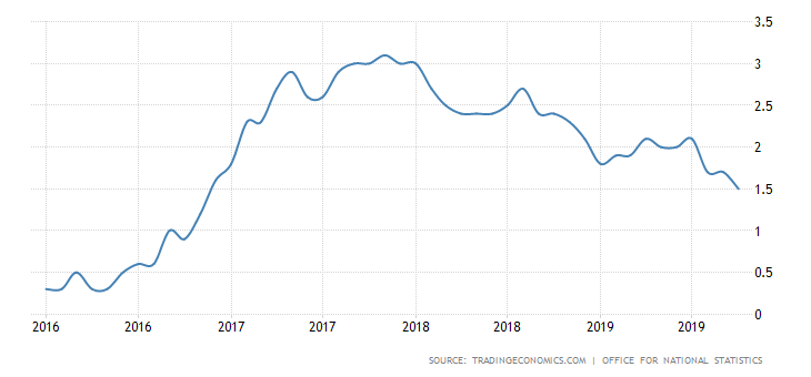
Any significant imbalance in trade makes an economy sensitive to changes in the value of its currency. The fall in Sterling since 2016 has had a knock on effect on the rate of UK inflation: –
Source: ONS, Trading Economics
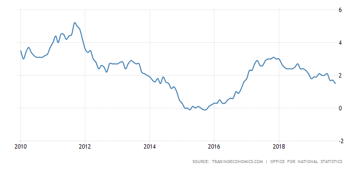
Viewed from a 10 year perspective, the reversal is even more pronounced. UK interest rates would probably have been substantially lower during the last four years had it not been for the uncertainty surrounding Brexit: –
Source: ONS, Trading Economics
Is optimism now justified?
Aside from the trade balance, the charts above are a reflection of the discount financial markets have imposed on the UK. This month’s election justifies a rerating. Whilst the markets have not been overly enamoured with the latest Tory Brexit deal they have been craving certainty. A working majority of 80 allows room for any Conservative dissenters to be quashed. Then there is the ‘Corbyn Factor.’ Promises of widespread nationalisation, without clarity about the price with which private investors would be compensated, did not sit well. Neither did the proposed tax increases required to fuel the £80bln increase in fiscal spending. That threat has now passed.
Finally there was clarification of the nation’s opinion on Brexit itself. Labour lost ground almost everywhere; to Tories and the Brexit party in England and Wales, whilst in Scotland they ceded ground to the SNP.
This summation of the UK situation is an over-simplification, but from a financial market perspective the UK political landscape has improved. Suffice to say, there remain many challenges ahead, not least the Brexit transition period (end 2020) during which a free-trade agreement (FTA) needs to be agreed to avert unnecessary trade disruption. After four years, one might hope there has been behind the scenes preparation and that much of the deal will be a slight amendment to current access arrangements. In reality to complete a deal by year-end 2020 it will have to be an ‘FTA-lite’ affair, which may prove less than satisfactory. A swift trade deal should, nonetheless, reduce uncertainty which is also in the interests of the EU. I remain sceptical, there may be many a slip twixt cup and lip.
Conclusions and Investment Opportunities
Four years of deferred investment and consumption will now gradually be unleashed. This should bolster Sterling. As the Pound rises inflation should fall. Assuming they do not give up on their inflation target, currency strength should prompt the Bank of England to ease monetary conditions. Gilt yields will decline, forcing investors to seek longer duration bonds or higher credit risk to compensate for the shortfall in returns. Companies will find it easier to issue debt in order to fuel capital expenditure: although I expect it may lead to more share buybacks too. UK equity markets will rise, driven by an improved outlook for inflation, a lowering of interest rates and expectations of stronger economic growth.
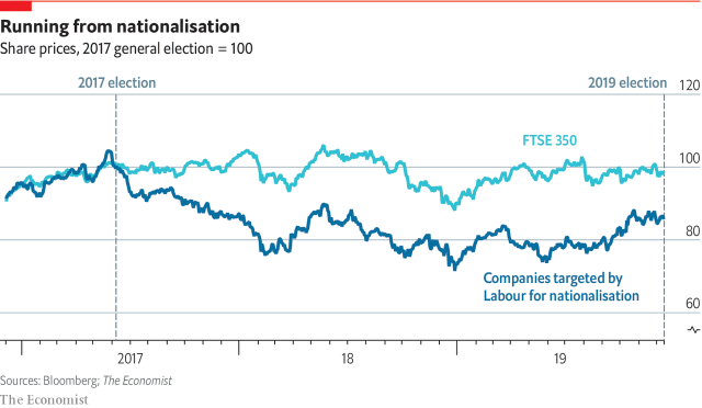
For equity investors, this rising tide will float most ships, but not all companies will benefit equally. Those firms which were at risk of nationalisation have been immediate beneficiaries. The chart below tracks their relative underperformance: –
Source: Bloomberg, The Economist
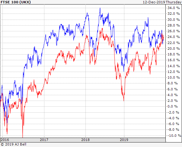
A longer term investment opportunity should be found in the FTSE 250. The four year picture is found below (FTSE 100 in blue, FTSE 250 in red): –
Source: AJ Bell
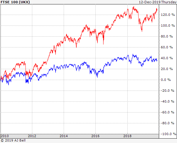
It might appear as if the FTSE 250 has already caught up with the FTSE 100, but this next chart reveals a rather different picture: –
Source: AJ Bell
The FTSE 250 is much more closely entwined with the fortunes of the domestic UK economy. For the past four years many business plans in the UK have been on hold, awaiting clarity on Brexit. Now that a deal will be done and an FTA with the EU will follow, we may have finally reached the beginning of the end of uncertainty.
Despite three Federal Reserve rate cuts, leveraged loan credit quality is rapidly declining
Covenant-lite issues now account for more than 80% of US$ issues
CLO managers, among others, may need to sell, but few buyers are evident
For those of you who have not read Michael Lewis’s, The Big Short, the great financial crisis of 2008/2009 was caused by too much debt. The sector which precipitated the great unravelling was the US mortgage market and the particular instrument of mass destruction was the collateralised debt obligation, a security that turned out to be far from secure.
Today, more than a decade on from the crisis, interest rates are close to historic lows throughout much of the developed world. The problem of too much debt has been solved with even more debt. The nature of the debt has changed, so too has the make-up of debtors and creditors, but the very low level of interest rates, when compared to 2008, means that small changes in interest rates have a greater impact the price of credit.
Here is a hypothetical example, to explain the changed relationship between interest rates and credit. Back in 2008 a corporate borrower might have raised capital by issuing debt paying 6%, today the same institution can borrow at 3%. This means they can double the amount of capital raised by debt financing without any change in their annual interest bill. Put another way, apart from the repayment of the principal, which can usually be rolled over, the cost of debt financing has halved over the course of the decade. Firms can raise capital by issuing equity or debt, but, as interest rates decline, debt has become cheaper than equity finance.
In the example above, however, assuming the corporation chooses to double its borrowings, it becomes twice as sensitive to changes in interest rates. A rise from 3% to 4% increases its interest payments by one third, whereas, previously, a rise from 6% to 7% amounted to an increase of just one sixth.
So much for the borrower, but what about the lender? Bonds and other interest bearing securities are generally purchased by investors who need to secure a stable, long-term, stream of fixed income. As interest rates fall they are faced with a dilemma, either accept a lower return or embrace greater risk of default to achieve the same income. At the heart of the financial crisis was the illusion of the free lunch. By securitising a diversified portfolio of high-risk debt, the individual default risk was supposed to be ameliorated. The supposition was that non-correlated investments would remain non-correlated. There is a saying in financial markets, ‘during a crisis, correlations all rise to one.’ In other words, diversification seldom works when you really need it because during a crisis every investor wants the same thing, namely liquidity. Even if the default risk remains unchanged, the market liquidity risk contrives to wipe the investor out.
An alternative to a fixed-income security, which may be especially attractive in a rising interest rate environment (remember the Fed was tightening for a while prior to 2019), is a floating-rate investment. In theory, as short-term interest rates rise the investor can reinvest at more attractive rates. If the yield curve is essentially flat, floating rate investments will produce similar income streams to longer maturity investments, but they will be less sensitive to systemic market risk because they have shorter duration. In theory, credit risk should be easier to manage.
What’s new?
More than ten years into the recovery, we are witnessing one of the longest equity bull-markets in history, but it has been driven almost entirely by falling interest rates. The bond market has also been in a bull-trend, one which commenced in the early 1980’s. For investors, who cannot stomach the uncertainty of the equity market, the fixed income market is a viable alternative, however, as government bond yields have collapsed, income-yielding investments have been increasingly hard to find. With fixed income losing its lustre, credit products have sought to fill the void. Floating-rate leveraged loans, often repackaged as a collateralised loan obligation (CLO), are proving a popular alternative source of income.
The typical CLO is a floating-rate tradable security backed by a pool of, usually, first-lien loans. Often these are the debt of corporations with poor credit ratings, such as the finance used by private equity firms to facilitate leveraged buyouts. On their own, many of these loans rank on the margins of investment grade but, by bundling them together with better rated paper, CLO managers transform base metal into gold. The CLO manager does not stop there, going on to dole out tranches, with different credit risks, to investors with differing risk appetites. There are two general types of tranche; debt tranches, which pay interest and carry a credit rating from an independent agency, and equity tranches, which give the purchaser ownership in the event of the sale of the underlying loans. CLOs are hard to value, they are actively managed meaning their risk profile is in a constant state of flux.
CLOs are not new instruments and studies have shown that they are subject to lower defaults than corporate bonds. This is unsurprising since the portfolios are diversified across many businesses, whilst corporate bonds are the debt of a single issuer. CLO issuers argue that corporations are audited unlike the liar loans of the sub-prime mortgage debacle and that banks have passed ‘first loss’ risk on to third parties. I am not convinced this will save them from a general collapse in confidence. Auditors can be deceived and the owners of the ‘first loss’ exposure will need to hedge. CLOs may be diversified across multiple industry sectors but the market price of the underlying loans will remain highly dependent on that most transitory of factors, liquidity.
Where are we now?
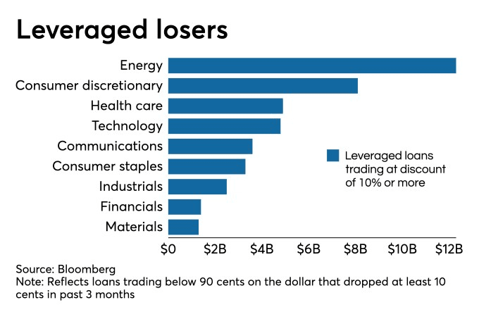
Enough of the theory, in practice many CLOs are turning toxic. According to an October article in the American Banker – A $40 billion pile of leveraged loans is battered by big losses – the loans of more than 50 companies have seen their prices decline by more than 10%. The slowing economy appears to be the culprit, credit rating agencies are, as always, reactive rather than proactive, so the risk that many CLOs may soon cease to be investment grade is prompting further selling, despite the absence of actual credit downgrades. The table below shows magnitude of the problem as at the beginning of last month: –
Source: Bloomberg
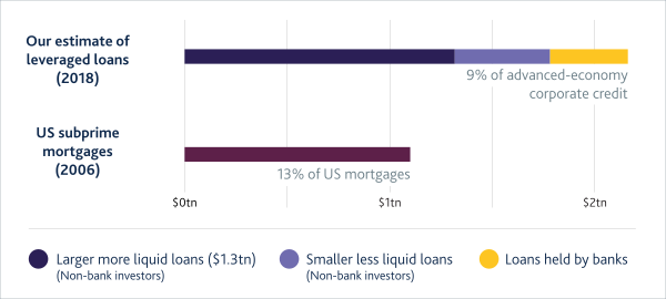
It is generally agreed that the notional outstanding issuance of US$ leveraged loans is around $1.2trln, of which some $660bln (55%) are held in CLOs, however, a recent estimate from the Bank of England – How large is the leveraged loan market? suggests that the figure is closer to $1.8trln. The authors go on to state: –
We estimate that there is more than US$2.2 trillion in leveraged loans outstanding worldwide. This is larger than the most commonly cited estimate and comparable to US subprime before the crisis.
As global interest rates have declined the leveraged loan market has more than doubled in size since its post crisis low of $497bln in 2010. Being mostly floating-rate structures, enthusiasm for US$ loans accelerated further in the wake of Federal Reserve (Fed) tightening of short-term rates. This excess demand has undermined quality, it is estimated that around 80% of US$ and 90% of Euro issues are covenant-lite – in other words they have little detailed financial information, often relying on the EBITDA adjustments calculated by the executives of the corporations issuing the loans. Those loans not held by CLOs sit on the balance sheet of banks, insurance companies and pension funds together with mutual funds and ETFs. Several more recent issues, failing to find a home, sit on the balance sheets of the underwriting banks.
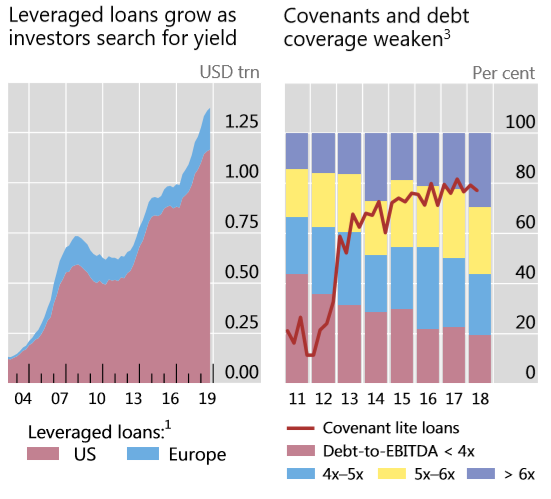
Here is a chart showing the evolution of the leveraged loan market over the last decade: –
Source: BIS
Whilst the troubled loans in the first table above amount to less than 4% of the total outstanding issuance, there appears to be a sea-change in sentiment as rating agencies begin to downgrade some issues to CCC – a notch below investment grade. This grade deflation is important because most CLO’s are not permitted to hold more than 7.5% of CCC rated loans in their portfolios. Some estimates suggest that 29% of leveraged loans are rated just one notch above CCC. Moody’s officially admits that 40% of junk-debt issuers rate B3 and lower. S&P announced that the number of issuers rated B- or lower, referred to as ‘weakest links’, rose from 243 in August to 263 in September, the highest figure recorded since 2009 when they peaked at 300. S&P go on to note that in the largest industry sector, consumer products, downgrades continue to outpace upgrades.
As the right-hand of the two charts above reveals, the debt multiple to earnings of corporate loans is at an all-time high. Not only has the number of issuer downgrades risen but the number of issuers has also increased dramatically. At the end of 2010 there were 658 corporate issuers, by October 2019 the number of issuers had swelled 56% to 1025.
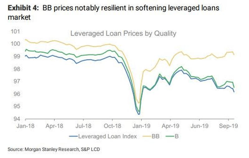
The credit spread between BB and the Leveraged Loan Index has been widening throughout the year despite three rate reductions from the Fed: –
Source: Morgan Stanley, FTSE
Q4 2018 saw a sharp decline in prices as the effect of previous Fed tightening finally took its toll. Then the Fed changed tack, higher grade credit recovered but the Leveraged Loan Index never followed suit.
Despite a small inflow into leveraged loan ETFs in September, the natural buyers of sub-investment grade paper have been unnaturally absent of late. Leveraged loan mutual funds have seen steady investment outflows for almost a year.
The inexperience of the new issuers is matched by the inexperience of the investor base. According to data from Prequin, between 2013 and 2017 a total of 322 funds made direct lending investments of which 71 had never entered the market before, during the previous five year only 85 funds had made investments of which just 19 were novices.
Inexperienced investors often move as one and this is evident in the recent absence of liquidity. The lack of willing buyers also highlights another weakness of the leveraged loan market, a lack of transparency. Many of the loans are issued by private companies, information about their financial health is therefore only available to existing holders of their equity or debt. Few existing holders are inclined to add to their exposure in the current environment. New purchasers are proving reticence to fly blind, as a result liquidity is evaporating further just at the moment it is most needed.
If the credit ratings of leveraged loans deteriorate further, contagion may spill over into the high-yield bond market. Whilst the outstanding issuance of high-yield bonds has been relatively stable, the ownership, traditionally insurers and pension funds, has been swelled by mutual fund investors and holders of ETFs. These latter investors prize liquidity more highly than longer-term institutions: the overall high-yield investor base has become less stable.
Inevitably, commentators are beginning to draw parallels with mortgage and CDO crisis. The table below, from the Bank of England report, compares leveraged loans today with sub-prime mortgages in 2006: –
Source: Bank of England
The comparisons are disquieting, the issuers and underlying assets of the leveraged loan market may be more diversified than the mortgages of 2006, but, with interest rates substantially lower today, the sensitivity of the entire market, to a widening of credit spreads, is considerably greater.
…the deteriorating credit quality of CLOs’ underlying assets; the opacity of indirect exposures; the high concentration of banks’ direct holdings; and the uncertain resilience of senior tranches, which depend crucially on the correlation of losses among underlying loans.
These are all factors to watch closely. The authors’ remain sanguine, however, pointing out that CLOs are generally less complex than CDOs, containing little credit default swap or resecuritisation exposure. They also note that CLOs are less frequently used as collateral in repurchase agreements rendering them less likely to be funded by short-term capital. This last aspect is a double-edge sword, if a security has a liquid repo market it can easily be borrowed and lent. A liquid repo market allows additional leverage but it also permits short-sellers to provide essential liquidity during a buyers strike, in the absence of short-sellers there may be no one to provide liquidity at all.
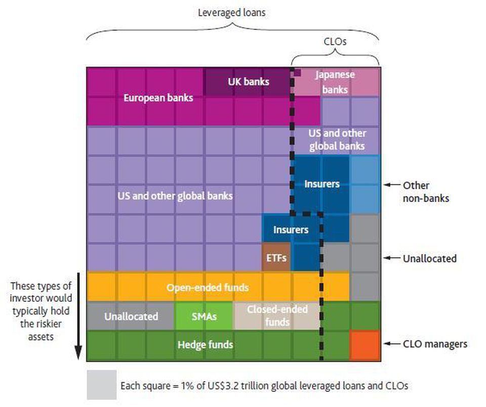
In terms of counterparties, the table below shows which institutions have the largest exposure to leveraged loans: –
Source: Bank of England
Bank exposure is preeminent but the flow from CLOs will strain bank balance sheets, especially given the lack of repo market liquidity.
Conclusions and Investment Opportunities
The CLO and leveraged loan market has the capacity to destabilise the broader financial markets. Rate cuts from the Fed have been insufficient to support prices and economic headwinds look set to test the underlying businesses in the next couple of years. A further slashing of rates and balance sheet expansion by the Fed may be sufficient to stave off a 2008 redux but the warning signs are flashing amber. Total financial market leverage is well below the levels that preceded the financial crisis of 2008, but as Mark Twain is purported to have said, ‘History doesn’t repeat but it rhymes.’
Until the US election in November 2020 is past, equity markets should remain supported. Government bond yields are unlikely to rise and, should signs of economic weakness materialise, may plumb new lows. Credit spread widening, however, even as government bond yields decline, is a pattern which will become more prevalent as the cash-flow implications of floating-rate borrowing instil some much needed sobriety into the market for leveraged loans. With interest rates close to historic lows credit markets are, once again, the weakest link.