Macro Letter – No 79 – 16-6-2017
Central Bank balance sheet adjustment – a path to enlightenment?
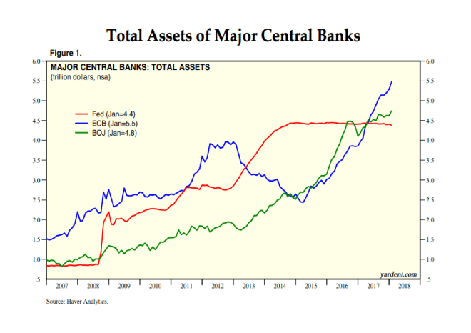
- The balance sheets of the big four Central Banks reached $18.4trln last month
- The Federal Reserve will commence balance sheet adjustment later this year
- The PBoC has been in the vanguard, its experience since 2015 has been mixed
- Data for the UK suggests an exit from QE need not precipitate a stock market crash
The Federal Reserve (Fed) is about to embark on a reversal of the Quantitative Easing (QE) which it first began in November 2008. Here is the 14th June Federal Reserve Press Release – FOMC issues addendum to the Policy Normalization Principles and Plans. This is the important part:-
For payments of principal that the Federal Reserve receives from maturing Treasury securities, the Committee anticipates that the cap will be $6 billion per month initially and will increase in steps of $6 billion at three-month intervals over 12 months until it reaches $30 billion per month.
For payments of principal that the Federal Reserve receives from its holdings of agency debt and mortgage-backed securities, the Committee anticipates that the cap will be $4 billion per month initially and will increase in steps of $4 billion at three-month intervals over 12 months until it reaches $20 billion per month.
The Committee also anticipates that the caps will remain in place once they reach their respective maximums so that the Federal Reserve’s securities holdings will continue to decline in a gradual and predictable manner until the Committee judges that the Federal Reserve is holding no more securities than necessary to implement monetary policy efficiently and effectively.
On the basis of their press release, the Fed balance sheet will shrink until it is nearer $2.5trln versus $4.4trln today. If they stick to their schedule that should take until the end of 2021.
The Fed is likely to be followed by the other major Central Banks (CBs) in due course. Their combined deleveraging is unlikely to go unnoticed in financial markets. What are the likely implications for bonds and stocks?
To begin here are a series of charts which tell the story of the Central Bankers’ response to the Great Recession:-
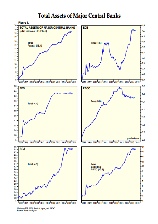
Source: Yardeni Research, Haver Analytics
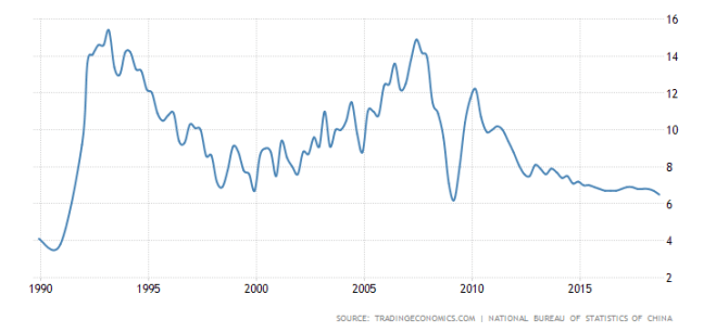
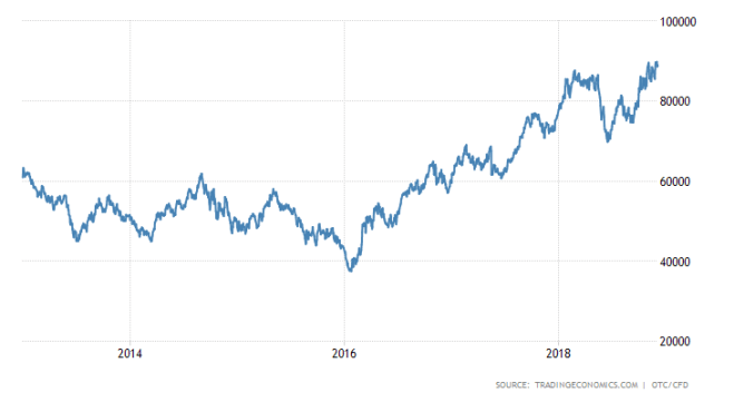
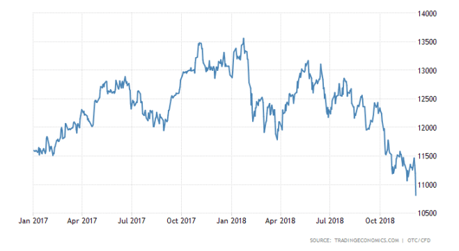
Since 2008 the balance sheets of the four major CBs have grown from around $6.5trln to $18.4trln. In the case of the People’s Bank of China (PBoC), a reduction began in 2015. This took the form of a decline in its foreign exchange reserves in order to support the weakening RMB exchange rate against the US$. The next chart shows the path of Chinese FX reserves and the Shanghai Stock index since the beginning of 2014. Lagged response or coincidence? Your call:-
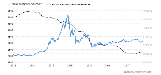
Source: Trading Economics
At a global level, the PBoC balance sheet reduction has been more than offset by the expansion of the balance sheets of the Bank of Japan (BoJ) and European Central Bank (ECB), however, a synchronous balance sheet contraction by all the major CBs is likely to be of considerable concern to financial market participants globally.
An historical perspective
Have CB balance sheets ever been as large as they are today? Indeed they have. The chart below which terminates in 2011, shows the evolution of the Fed balance sheet since its inception in 1913:-
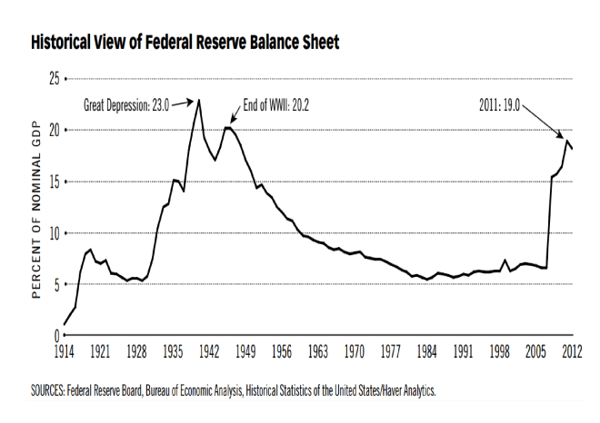
Source: Federal Reserve, Haver Analytics
The increase in the size of the Fed balance sheet during the period of the Great Depression and WWII was related to a number of factors including: gold inflows, what Friedman and Schwartz termed “precautionary demand” for reserves by commercial banks, lack of alternative assets, changes in reserve requirements, expansion of income and war financing.
For a detailed review of all these factors, this paper from 2016 – How was the Quantitative Easing Program of the 1930s Unwound? By Matthew Jaremski and Gabriel Mathy – makes fascinating reading, here’s the abstract:-
Outside of the recent past, excess reserves have only concerned policymakers in one other period: The Great Depression of the 1930s. This historical episode thus provides the only guidance about the Fed’s current predicament of how to unwind from the extensive Quantitative Easing program. Excess reserves in the 1930s were never actively unwound through a reduction in the monetary base. Nominal economic growth swelled required reserves while an exogenous reduction in monetary gold inflows due to war embargoes in Europe allowed banks to naturally reduce their excess reserves. Excess reserves fell rapidly in 1941 and would have unwound fully even without the entry of the United States into World War II. As such, policy tightening was at no point necessary and likely was even responsible for the 1937-1938 recession.
During the period from April 1937 to April 1938 the Dow Jones Industrial Average fell from 194 to 100. Monetarists, such as Friedman, blamed the recession on a tightening of money supply in 1936 and 1937. I don’t believe Friedman’s censure is lost on the FOMC today: past Fed Chair, Ben Bernanke, is regarded as one of the world’s leading authorities on the causes and policy errors of the Great Depression.
But is the size of a CB balance sheet a determinant of the direction of the stock market? A richer data set is to be found care of the Bank of England (BoE). They provide balance sheet data going back to 1694, although the chart below, care of FRED, starts in 1701:-
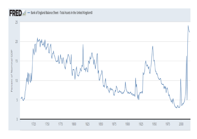
Source: Federal Reserve, Bank of England
The BoE really only became a CB, in the sense we might recognise today, as a result of the Banking Act of 1844 which granted it a monopoly on the issuance of bank notes. The chart below shows the performance of the FT-All Share Index since 1700 (please ignore the reference to the Pontifical change, this was the only chart, offering a sufficiently long history, which I was able to discover in the public domain):-
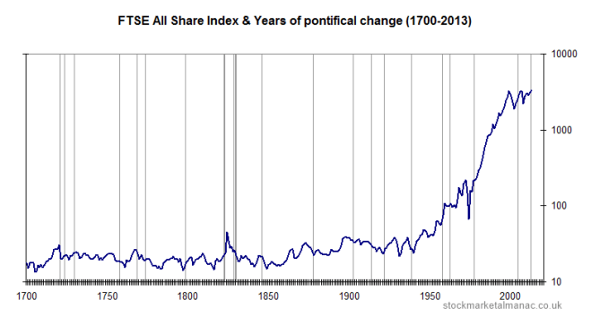
Source: The Stock Almanac
The first crisis to test the Bank’s resolve was the panic of 1857. During this period the UK stock market barely changed whilst the BoE balance sheet expanded by 21% between 1857 and 1859 to reach 10.5% of GDP: one might, however, argue that its actions were supportive.
The next crisis, the recession of 1867, was precipitated by the end of the American Civil War and, of more importance to the financial system, the demise of Overund and Gurney, “the Bankers Bank”, which was declared insolvent in 1866. Perhaps surprisingly, the stock market remained relatively calm and the BoE balance sheet expanded at a more modest 20% over the two years to 1858.
Financial markets became a little more interconnected during the Panic of 1873. This commenced with the “Gründerzeit” or “Founders” crash on the Vienna Stock Exchange. It sent shockwaves around the world. The UK stock market declined by 31% between 1873 and 1878. The BoE may have exacerbated the decline, its balance sheet contracted by 14% between 1873 and 1875. Thereafter the trend reversed, with an expansion of 30% over the next four years.
I am doubtful about the BoE balance sheet contraction between 1873 and 1875 being a policy mistake. 1873 was in fact the beginning of the period known as the Long Depression. It lasted until 1896. Nine years before the end of this 20 year depression the stock market bottomed (1887). It then rose by 74% over the next 11 years.
The First World War saw the stock market decline, reaching its low in 1917. From juncture it rallied, entirely ignoring the post-war recession of 1919 to 1921. Its momentum was only curtailed by the Great Crash of 1929 and subsequent Great Depression of 1930-1931.
Part of the blame for the severity of the Great Depression may be levelled at the BoE, its balance sheet expanded by 77% between 1928 and 1929. It then remained relatively stable despite Sterling’s departure from the Gold Standard in 1931 and only began to expand again in 1933 and 1934. Its balance sheet as a percentage of GDP was by this time at its highest since 1844, due to the decline in GDP rather than any determined effort to expand the balance sheet on the part of the Old Lady of Threadneedle Street. At the end of 1929 its balance sheet stood at £537mln, by the end of 1934 it had reached £630mln, an increase of just 17% over five traumatic years. The UK stock market, which had bottomed in 1931 – the level it had last traded in 1867 – proceeded to rally for the next five years.
Adjustment without tightening
History, on the basis of the data above, is ambivalent about the impact the size of a CB’s balance sheet has on the financial markets. It is but one of the factors which influences monetary conditions, the others are the availability of credit and its price.
George Selgin described the Fed’s situation clearly in a post earlier this year for The Cato Institute – On Shrinking the Fed’s Balance Sheet. He begins by looking at the Fed pre-2008:-
…the Fed got by with what now seems like a modest-sized balance sheet, the liabilities of which consisted mainly of circulating Federal Reserve notes, supplemented by Treasury and GSE deposit balances and by bank reserve balances only slightly greater than the small amounts needed to meet banks’ legal reserve requirements. Because banks held few excess reserves, it took only modest adjustments to the size of the Fed’s balance sheet, achieved by means of open-market purchases or sales of short-term Treasury securities, to make credit more or less scarce, and thereby achieve the Fed’s immediate policy objectives. Specifically, by altering the supply of bank reserves, the Fed could influence the federal funds rate — the rate banks paid other banks to borrow reserves overnight — and so keep that rate on target.
Then comes the era of QE – the sea-change into something rich and strange. The purchase of long-term Treasuries and Mortgage Backed Securities is funded using the excess reserves of the commercial banks which are held with the Fed. As Selgin points out this means the Fed can no longer use the federal funds rate to influence short-term interest rates (the emphasis is mine):-
So how does the Fed control credit now? Instead of increasing or reducing the availability of credit by adding to or subtracting from the supply of Fed deposit balances, the Fed now loosens or tightens credit by controlling financial institutions’ demand for such balances using a pair of new monetary control devices. By paying interest on excess reserves (IOER), the Fed rewards banks for keeping balances beyond what they need to meet their legal requirements; and by making overnight reverse repurchase agreements (ON-RRP) with various GSEs and money-market funds, it gets those institutions to lend funds to it.
Between them the IOER rate and the implicit ON-RRP rate define the upper and lower limits, respectively, of an effective federal funds rate target “range,” because most of the limited trading that now goes on in the federal funds market consists of overnight lending by GSEs (and the Federal Home Loan Banks especially), which are not eligible for IOER, to ordinary banks, which are. By raising its administered rates, the Fed encourages other financial institutions to maintain larger balances with it, instead of trading those balances for other interest-earning assets. Monetary tightening thus takes the form of a reduced money multiplier, rather than a reduced monetary base.
Selgin goes on to describe this as Confiscatory Credit Control:-
…Because instead of limiting the overall availability of credit like it did in the past, the Fed now limits the credit available to other prospective borrowers by grabbing more for itself, which it then passes on to the U.S. Treasury and to housing agencies whose securities it purchases.
The good news is that the Fed can adjust its balance sheet with relative ease (emphasis mine):-
It’s only because the Fed has been paying IOER at rates exceeding those on many Treasury securities, and on short-term Treasury securities especially, that banks (especially large domestic and foreign banks) have chosen to hoard reserves. Even today, despite rate increases, the IOER rate of 75 basis points exceeds yields on most Treasury bills. Were it not for this difference, banks would trade their excess reserves for Treasury securities, causing unwanted Fed balances to be passed around like so many hot-potatoes, and creating new bank deposits in the process. Because more deposits means more required reserves, banks would eventually have no excess reserves to dispose of.
Phasing out ON-RRP, on the other hand, would eliminate the artificial boost that program has been giving to non-bank financial institutions’ demand for Fed balances.
Because phasing out ON-RRP makes more reserves available to banks, while reducing IOER rates reduces banks’ own demand for such reserves, both policies are expansionary. They don’t alter the total supply of Fed balances. Instead they serve to raise the money multiplier by adding to banks’ capacity and willingness to expand their own balance sheets by acquiring non-reserve assets. But this expansionary result is a feature, not a bug: as former Fed Vice Chairman Alan Blinder observed in December 2013, the greater the money multiplier, the more the Fed can shrink its balance sheet without over-tightening. In principle, so long as it sells enough securities, the Fed can reduce its ON-RRP and IOER rates, relative to prevailing market rates, without missing its ultimate policy targets.
Selgin expands, suggesting that if the Fed decide to announce a fixed schedule for adjustment (which they have) then they may employ another tool from their armoury, the Term Deposit Facility:-
…to the extent that the Fed’s gradual asset sales fail to adequately compensate for a multiplier revival brought about by its scaling-back of ON-RRP and IOER, the Fed can take up the slack by sufficiently raising the return on its Term Deposits.
And the Fed’s federal funds rate target? What happens to that? In the first place, as the Fed scales back on ON-RRP and IOER, by allowing the rates paid through these arrangements to decline relative to short-term Treasury rates, its administered rates will become increasingly irrelevant. The same changes, together with concurrent assets sales, will make the effective federal funds rate more relevant, by reducing banks’ excess reserves and increasing overnight borrowing. While the changes are ongoing, the Fed would continue to post administered rates; but it could also revive its pre-crisis practice of announcing a single-valued effective funds rate target. In time, the latter target could once again be more-or-less precisely met, making it unnecessary for the Fed to continue referring to any target range.
With unemployment falling and economic growth steady the Fed are expected to tighten monetary policy further but the balance sheet adjustment needs to be handled carefully, conditions may look benign but the Fed ultimately holds more of the nation’s deposits than at any time since the end of WWII. Bank lending (last at 1.6%) is anaemic at best, as the chart below makes clear:-
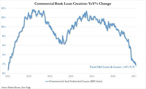
Source: Federal Reserve, Zero Hedge
The global perspective
The implications of balance sheet adjustment for the US have been discussed in detail but what about the rest of the world? In an FT Article – The end of global QE is fast approaching – Gavyn Davies of Fulcrum Asset Management makes some projections. He sees global QE reaching a plateau next year and then beginning to recede, his estimate for the Fed adjustment is slightly lower than the schedule announced last Wednesday:-

Source: FT, Fulcrum Asset Management
He then looks at the previous liquidity injections relative to GDP – don’t forget 2009 saw the world growth decline by -0.8%:-
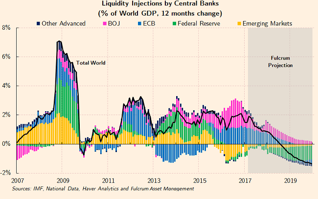
Source: IMF, National Data, Haver Analytics, Fulcrum Asset Management
It is worth noting that the contraction of Emerging Market CB liquidity during 2016 was principally due to the PBoc reducing their foreign exchange reserves. The ECB reduction of 2013 – 2015 looks like a policy mistake which they are now at pains to rectify.
Finally Davies looks at the breakdown by institution. The BoJ continues to expand its balance sheet, rising above 100% of GDP, whilst eventually the ECB begins to adjust as it breaches 40%:-
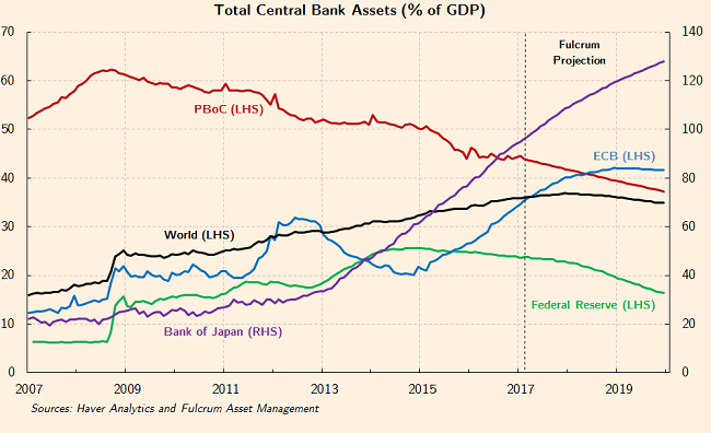
Source: Haver Analytics, Fulcrum Asset Management
I am not as confident as Davies about the ECB’s ability to reverse QE. They were never able to implement a European equivalent of the US Emergency Economic Stabilization Act of 2008, which incorporated the Troubled Asset Relief Program – TARP and the bailout of Fannie Mae and Freddie Mac. Europe’s banking system remains inherently fragile.
ProPublica – Bailout Costs – gives a breakdown of cost of the US bailout. The policies have proved reasonable successful and at little cost the US tax payer. Since initiation in 2008 outflows have totalled $623.4bln whilst the inflows amount to $708.4bln: a net profit to the US government of $84.9bln. Of course, with $455bln of troubled assets still outstanding, there is still room for disappointment.
The effect of TARP was to unencumber commercial banks. Freed of their NPL’s they were able to provide new credit to the real economy once more. European banks remain saddled with an abundance of NPL’s; her governments have been unable to agree on a path to enlightenment.
Conclusions and Investment Opportunities
The chart below shows a selection of CB balance sheets as a percentage of GDP. It is up to the end of 2016:-
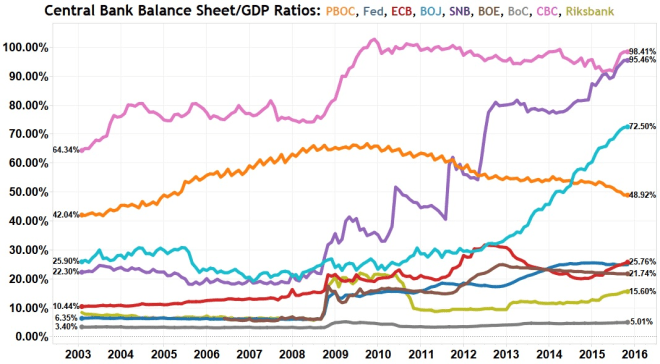
SNB: Swiss National Bank, BoC: Bank of Canada, CBC: Central Bank of Taiwan, Riksbank: Swedish National Bank
Source: National Inflation Association
The BoJ has since then expanded its balance sheet to 95.5% and the ECB, to 32%. With the Chinese economy still expanding (6.9% March 2017) the PBoC has seen its ratio fall to 45.4%.
More important than the sheer scale of CB balance sheets, the global expansion has changed the way the world economy works. Combined CB balance sheets ($22trln) equal 21.5% of global GDP ($102.4trln). The assets held are predominantly government and agency bonds. The capital raised by these governments is then invested primarily in the public sector. The private sector has been progressively crowded out of the world economy ever since 2008.
In some ways this crowding out of the private sector is similar to the impact of the New Deal era of 1930’s America. The private sector needs to regain pre-eminence but the transition is likely to be slow and uneven. The tide may be about to turn but the chance for policy mistakes, as flows reverse, is extremely high.
For stock markets the transition to QT – quantitative tightening – may be neutral but the risks are on the downside. For government bond markets there are similar concerns: who will buy the bonds the CBs need to sell? If interest rates normalise will governments be forced to tighten their belts? Will the private sector be in a position to fill the vacuum created by reduced public spending, if they do?
There is an additional risk. Yield curve flattening. Banks borrow short and lend long. When yield curves are positively sloped they can quickly recapitalise their balance sheets: when yield curves are flat, or worse still inverted, they cannot. Increases in reserve requirements have made government bonds much more attractive to hold than other securities or loans. The Commercial Bank Loan Creation chart above may be seen as a warning signal. The mechanism by which CBs foster credit expansion in the real economy is still broken. A tapering or an adjustment of CB balance sheets, combined with a tightening of monetary policy, may have profound unintended consequences which will be magnified by a severe shakeout in over-extended stock and bond markets. Caveat emptor.