First In, First Out – China as a Leading Indicator
China was the first country to recover from the Covid-19 pandemic
The PBoC began tightening monetary conditions in May 2020
Chinese housing and stocks remain strong despite official policy
Chinese contagion remains a risk to the global recovery
Whilst there are many aspects of the Chinese command economy which differ radically from that of the US, it is worth examining the performance of China’s economy, fiscal and monetary policy, and its financial markets. They may afford some insight into the future direction of other developed and developing markets as we gradually emerge from the Covid crisis: –
Source: Trading Economics
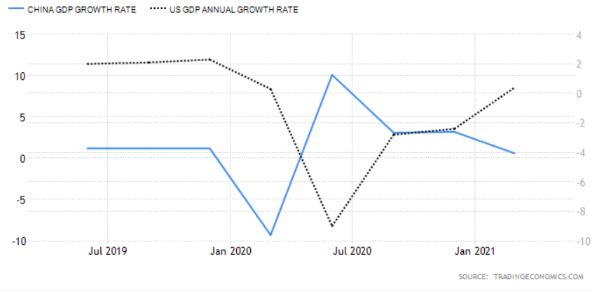
As can be seen from the chart above, whilst China was the first country to be struck by the Covid-19 pandemic it was also the first country to recover, however, a comparison of the Chinese and US bond markets provides a rather different picture: –
Source: Trading Economics
Chinese bond yields reached their lows at roughly the same time as those of the US, since when they have returned more rapidly to their pre-pandemic levels. If the US follows a similar trajectory the yield on US Treasuries is set to rise further.
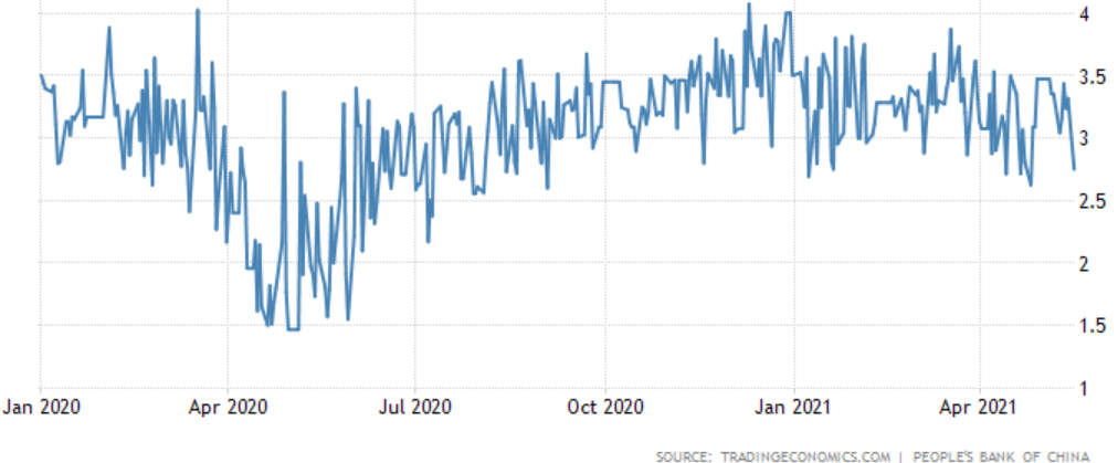
It can be argued, however, that the plight of the Chinese bond market is a function of the monetary stance of the People’s Bank of China (PBoC). When the crisis first erupted the PBoC cut its interest rate corridor by 0.3% and also drove down Chinese interbank rates by around 1.2% through its open market operations. By May 2020 that policy had changed, accommodation was replaced by a steady drain of liquidity.
The chart below shows the, rather volatile, 3 month Shibor rate, this is in marked contrast to the ‘lower for longer’ approach taken after the 2008 crisis. The Covid accommodation has been remarkably short-lived: –
Source: Trading Economics, PBoC
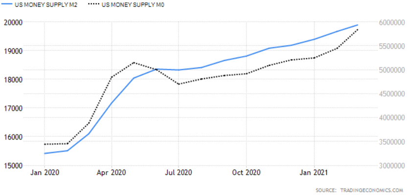
This PBoC tightening, which began in May 2020 and has been accompanied by official talk of the need for stability and the desire to avoid creating asset bubbles, is finally becoming evident in the money supply data: –
Source: Trading Economics
This contrasts with the continued expansion of US monetary aggregates: –
Source: Trading Economics
One of the challenges facing all central bankers is that interest rates are a blunt tool. Not all China’s asset markets have heeded the PBoC advice. The residential property market, for example, remains red hot despite the introduction of the three red lines policy – which aims to limit their liability-to-asset ratio (excluding advance receipts) to less than 70%, or their net gearing ratio to less than 100%, or their cash-to-short-term debt ratio to less than 1x, or a combination of all three. New home prices surged on regardless, gaining 4.8% in April, led by luxury real estate in Shenzhen, Shanghai and Guangzhou which is up 16% to 19% over the last year – a further tightening of regulation seems inevitable.
The PBoC has had greater influence elsewhere, Total Social Financing, their favoured measure of lending across the entire domestic financial system, rose by 12% in March, its slowest pace since April 2020:-
Source: Financial Times, CEIC
Another sign that official policy measures may be biting was seen in April’s retail sales which, whilst they rose by 17.7%, were down from a 34.2% in March, and came in well below the consensus forecast of 24.9%. Here again, China appears to be a leading indicator of the direction that the US economy might take: –
Source: Trading Economics
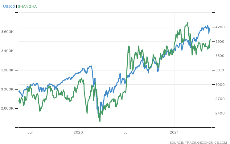
Interestingly, unlike 2015, the Chinese stock market has, thus far, reacted in a more measured way to the general tightening of monetary conditions. The next chart shows the relative performance of the Shanghai Composite versus the S&P 500 Index: –
Source: Trading Economics
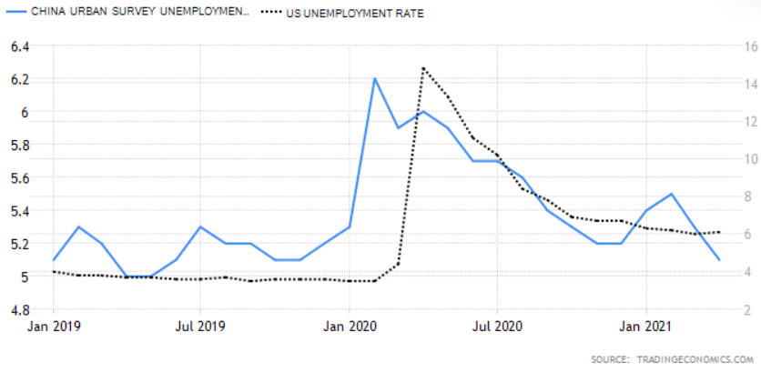
As mentioned above, money supply data points to a slowing of the Chinese economy but, like so many other countries, China saw a sharp rise in its, already high, household saving rate. The Paulson Institute estimates that Chinese households saved 3% more of their income than prior to Covid; Pantheon Macroeconomics equate this pool of savings to roughly 3% of GDP. While many commentators suggest that in China’s case this is a pool of precautionary saving, consumption will likely resume its long-term growth, now that employment prospects have begun to improve. The chart below shows the lagged trajectory of unemployment in US compared to China: –
Source: Trading Economics
US unemployment remains elevated relative to its pre-Covid rate but the economic recovery continues to gather momentum.
In China, as elsewhere, that portion of excess savings not consumed will either be left on deposit, used to reduce debt or invested. Even though interest rates have risen, the liquidity of Chinese capital markets should remain plentiful for the next six months to a year, sufficient to cushion any sudden downturns in the post-Covid recovery.
Conclusions and Investment Opportunities
In the analysis above, I have produced a strew of charts suggesting that the US may follow the trajectory of China as the post-Covid recovery unfolds. This is almost certainly too simplistic. Above all else Beijing craves stability, it knows its pace of economic growth is slowing, this is structural. The investment-led growth model which has transformed the economy over the last four decades, requires the methadone of more credit to sustain even these lower rates of return. The policy of rebalancing towards domestic consumption offers longer-term hope, but China’s recovery from the Covid crisis was driven principally by investment and, to a much lesser extent, exports. The chart below, from George Friedman of Geopolitical Futures, shows the damage done to Chinese consumption by the pandemic and the subsequent rebound: –
Source: Geopolitical Futures, IMF, CEIC
The new(ish) US administration is also different from any we have seen for several decades. Markets believe in the arrival of a New New Deal fuelled by a gargantuan monetary and fiscal tonic which will heal-all. Asset prices continue to rise as The Everything Bubble inflates further.
We are still in the early stages of the economic recovery. Supply-chain constraints and labour shortages, even whilst under-employment remains elevated, have driven inflation expectations higher in the near-term, yet asset markets look beyond these shorter-term factors to the productivity gains, which have, in many cases, been a long overdue response to the crisis itself.
A few brave central bankers are seeking to temper the speculative frenzy. The majority, however, will place their emphasis on outcomes rather than the outlookas Federal Reserve Governor Lael Brainard recently stated. This politically expedient approach means fiat currencies will continue their race to the bottom, bond markets will remain neutered by the policy of QE; that leaves assets as the solitary safety-valve, somewhere between a store of wealth and thar she blows. They afford some protection against debasement and, with the advent of Decentralised Finance, there is a non-zero possibility that some of these assets might even become a means of exchange.
In the near-term we have seen the Norges Bank indicate that it may raise rates in H2 2021. The Bank of Canada has announced a tapering of government bond purchases, inking in a potential rate increase for late 2022, meanwhile the Bank of Japan, whilst it has made no bald statements, has moderated its ETF purchases and stands accused of taper by stealth because the scale of its bond-buying has actually slowed since it adopted yield curve control in 2016. These isolated actions are but clouds in a blue sky of endless liquidity but financial markets prefer to travel rather than to arrive. Choppier markets are likely over the next few months, there may be some excellent asset buying opportunities on sharp corrections.
With a new administration installed in the US and a $1.9trln relief package approved, attention has now turned to how this fiscal largesse will be paid for. I thought this article from September 2020 might add to the debate.
Contributing to euphoria are two further factors little noted in our time or in past times. The first is the extreme brevity of the financial memory. In consequence, financial disaster is quickly forgotten. In further consequence, when the same or closely similar circumstances occur again, they are hailed by a new, often youthful, and always supremely self-confident generation as a brilliantly innovative discovery. There can be few fields of human endeavor in which history counts for so little as in the world of finance. Past experience, to the extent that it is part of memory at all is dismissed as the primitive refuge of those who do not have the insight to appreciate the incredible wonders of the present.
JK Galbraith – A short history of financial euphoria (1990)
This is the second of a two part letter reviewing the current valuation of stocks. The focus is US-centric and looks at both long-run valuation (Part 1) and shorter term factors which may be warning signs of irrational exuberance (Part 2).
During the last year we have seen stock markets around the world, decline rapidly and then rebound. Technically the longest bull-market in history ended in March of 2020, but the recovery was so swift that many commentators are calling it merely a sharp correction, simply an aberration. Since March the US stock market, fuelled by aggressive monetary and fiscal easing, has shot to new all-time highs. 2020 ended with the approval of the first Covid-19 vaccines, sending markets higher still.
Equity markets are forward-looking, the economic woes of today are discounted, expectations of recovery, backed by further fiscal support, make the prospects for future earnings appear relatively rosy. In this, the second part of my letter, I want to examine some shorter-term indicators which may or may not be cause for concern that current valuations are a triumph of hope of reality.
I once gave a speech entitled The Trouble with Alpha the gist of which contained my observation that Alpha – that portion of an investment managers returns which are not the result of the performance of the underlying assets was, was simply timing. To arrive at this conclusion I looked at 24 definitions of Alpha, finding that – once I had accounted for factors such as leverage, the ability to be long or short and (of particular importance) the choice of the index which was supposed to represent Beta – all that remained was timing.Suffice to say the speech was not received with acclaim by the audience – who were primarily investment managers. I mention this because, for the majority of investors, the investment time-horizon is finite. It is all very well for me to write about the Long Run and for Warren Buffet to describe his favourite investment horizon being forever, but for most investors, volatility, liquidity and mortality are key.
The economic historian Charles Kindleberger published Manias, Panics and Crashes: A History of Financial Crises in 1978, in which he observed patterns of fear and greed stretching back centuries, however, personally, I think Jesse Livermore sums-up the behaviour of financial markets best in the opening pages of Reminiscences of a Stock Operator, published in 1923: –
There is nothing new in Wall Street. There can’t be because speculation is as old as the hills. Whatever happens in the stock market today has happened before and will happen again.
In trading especially, but in investment too, timing is (almost) everything.
Show me the signs
There are times when making money from the stock market is hard, and times when it is easy, the latter periods are few and far between, but one of the tell-tale signs that a market has become excessively speculative is when retail investors pile in.
Stock market folk-lore tells of how Joseph Kennedy (although others attribute it to James Pierpont Morgan) decided to sell his stock portfolio ahead of the market crash of 1929. Kennedy figured that when he found himself in receipt of stock tips from his shoeshine boy, the market bubble was very well advanced. The table below shows the uptick in retail stock broker accounts between Q1 2019 and Q1 2020: –
Source: Factset, CNBC
Robinhood is not on the list above, but more on that topic later.
The researchers observed the behavior of a few thousand of them. After six months, 90% of them had given up. After a year, the 1% who were left barely had enough money to cover their daily expenses.
Dillian believes the biggest risk is of the Federal Reserve becoming more hawkish as the pandemic is brought to heel by the process of mass-vaccination. He concludes: –
That is a real risk. In fact, it is really the only risk, because people correctly point out that the economy will recover strongly in the second half, once most of the vaccines have been distributed.
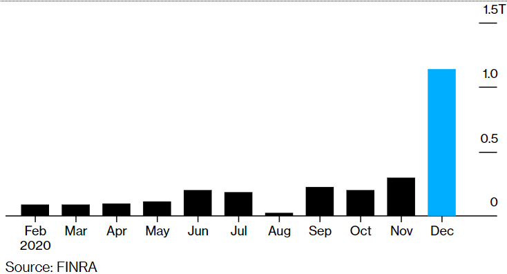
Aside from the proliferation of retail stock-trading accounts, there are several indicators of excessive speculative activity in the US stock market. Firstly, record OTC/Pink Sheet trading volume – these are stocks not listed on the main exchanges: –
Source: Finra, Bloomberg
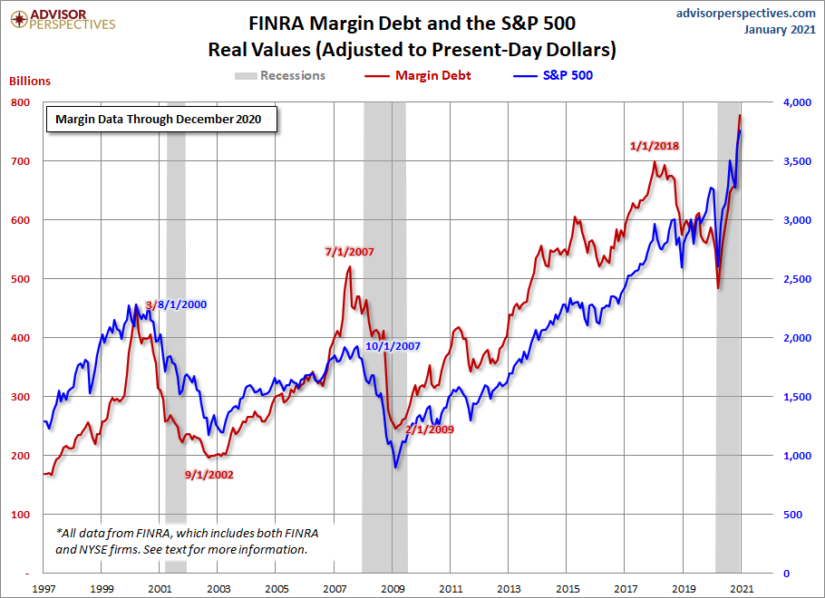
Another bubble warning sign is the record high levels of equity margin trading. The chart below shows the evolution of margin balances and the direction of the S&P 500 index up to December 2020: –
Source: Advisor Perspectives
A further worrying sign of excess is the rise of the SPAC – Special Purpose Acquisition Company. This is a blank cheque shell corporation designed to take a company public without going through the traditional IPO process. SPACs allow retail investors to gain access to private equity type opportunities, particularly leveraged buyouts. A slightly tongue-in-cheek description of the difference between a SPAC and a traditional IPO is that, an IPO is a company in search of capital, whilst a SPAC is capital in search of an investment.
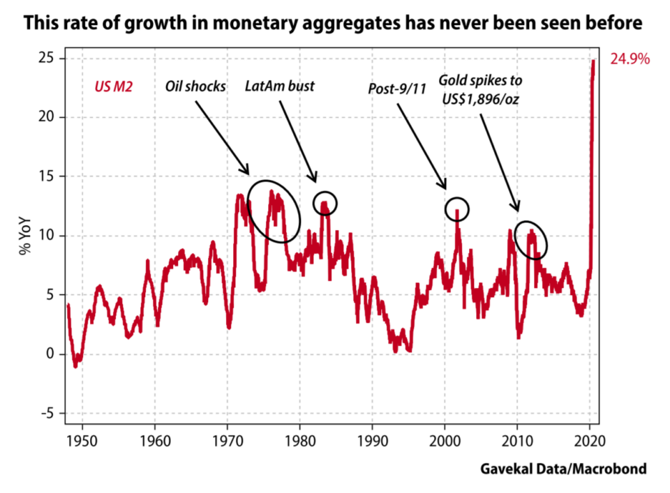
This chart of the ballooning of US money supply growth may help to explain the allure of the SPAC, along with many other signs of speculation: –
Source: Gavekal/Macrobond
In 2020, SPACs accounted for most of the growth in the US IPO market, raising $80bln from 237 listings. This surpassed the previous record of $13.6 billion raised from 59 IPOs in 2019. The trend has entered a new phase with $38bln raised from 128 listings in the first six weeks of 2021.
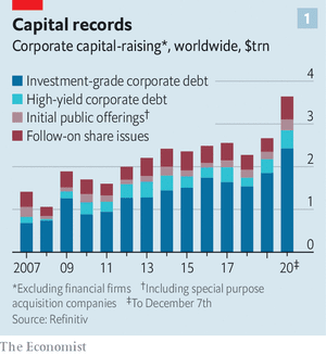
Another outcome of the rapid expansion in money supply can be observed in corporate capital raising. Last December The Economist – A year of raising furiously – noted that corporations globally raised more capital in 2020 than ever before: –
According to Refinitiv, a data provider, this year the world’s non-financial firms have raised an eye-popping $3.6trn in capital from public investors Issuance of both investment-grade and riskier junk bonds set records, of $2.4trn and $426bn, respectively. So did the $538bn in secondary stock sales by listed stalwarts, which leapt by 70% from last year, reversing a recent trend to buy back shares rather than issue new ones.
Here is a chart from the first part of this Macro Letter showing the composition of global corporate capital raising in 2020: –
Source: The Economist
This brings us to the story of GameStop (GME) a video gaming retailer with dismal earnings expectations that was trading at less than $5/share in August of 2020 and peaked at $347/share during a frenzy of hedge fund short covering last month. An excellent description of the time-line and the players involved in the saga can be found in – How Main Street stormed the Financial Capital – the GameStop Story – Vijar Kohli. The GameStop effect spilt over into many small-cap names and pushed the Russell 2000 index to new highs.
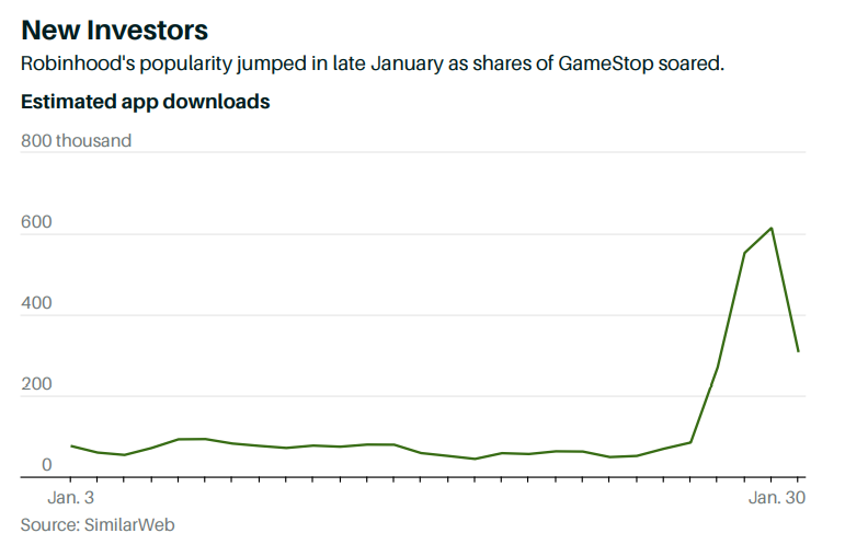
Robinhood has been the fintech darling of Silicon Valley, founded by Vladimir Tenev and Baiju Bhatt in 2013. The app has amassed 13 million user accounts and led the way for zero-commission fee trading. In no time, it has created brand awareness and popularity unlike that of the legacy brokerages such as Charles Schwab and Fidelity, or its app-first competitors like Webull and Dough.
Despite Robinhood being forced to suspend customer purchases of GameStop, together with some other securities – precipitating an SEC investigation and string of Class Action law suits – the company has continued to take on new clients. According to Rainmaker Securities, the latest private bids for Robinhood shares puts the company’s valuation around $40bln. This February 2021 article from Yahoo Finance – Robinhood is still the app of choice for retail investors: new data– provides more colour. Here is a chart showing the downloads of the Robinhood App last month: –
There will likely be future limitations placed by brokerage platforms, greater calls for government regulation of the markets, more instances of hysteric market actions, and a general scramble for the next Gamestop style speculation. Federal Reserve Chairman Jerome Powell was quick to deflect blame for this week’s market volatility, but this could be just the beginning of more upcoming economic turbulence.
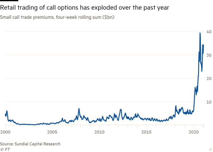
Another feature of the Robinhood Effect has been the dramatic increase in call option trading on single stocks: –
Source: FT, Sundial Capital Research
A common claim is that 90% of options expire worthless, but this is based on the fact that only 10% of option contracts are exercised. According to the CBOE, between 55% and 60% of options contracts are closed out prior to expiration. A more reasonable estimate is therefore that 30-35% of contracts that actually expire worthless. Nonetheless, retail investors have still paid option market-makers a vastly increased amount of option premium during the past year.
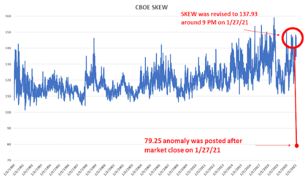
The traded options market is also an important indicator of risk. When the stock market falls, price volatility tends to rise, but option prices can anticipate changes in risk appetite. Without delving too deeply into the dark arts of option trading, in stable market conditions, call options tend to have lower prices (and therefore lower implied volatility) than put options, since investors tend to sell call options against their underlying portfolios but purchase put options to protect themselves from sudden market declines. There is a lot more to option pricing and trading than we can discuss here, suffice to say the Chicago Board Options Exchange (CBOE) calculate a SKEW Index – the difference between the relative price of different call and put options. SKEW values generally range between 100 and 150 – the higher the value, the higher the perceived tail risk. A reading of 100 should represent its lower bound (low tail-risk). For a further explanation I defer to David Kotok of Cumberland Advisors – GameStop And SKEW: –
Source: CBOE, Cumberland Advisors
When you examine the SKEW methodology closely, you realize that a 79.25 price is practically impossible. It would mean that the stock market is paying you to take a tail-risk. In other words, such a price means that a trade can be constructed in which the investor cannot lose significantly. This is never supposed to happen. But we see that there is evidence that such a trade may have occurred on the same day as the wild swings of short covering and GameStop trading. That price suggests a market distortion that was quickly multiplied by many times.
The Robinhood Effect – a lethal mixture of work from home, stay at home and getting a government relief cheque – has been mirrored among other online brokers: –
Source: Horizon Fintex
A similar rise in first-time retail customers is evident in the Cryptocurrency and Foreign Exchange markets.
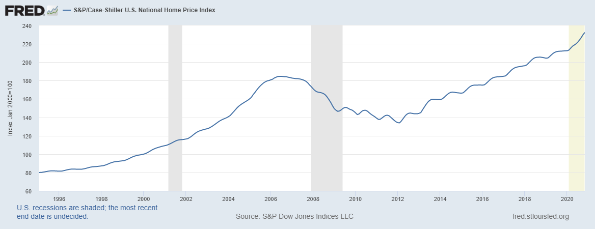
Another sign of assets being in bubble territory is the performance of the housing market. Now, it goes without saying, all property is local, but looking at the US, where the fiscal and monetary response has been the largest, we find yet another asset market at an all-time high: –
Source: Federal Reserve
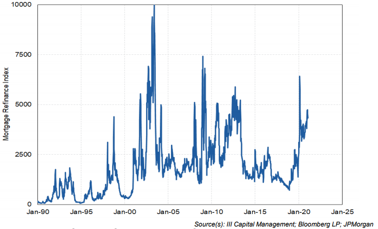
The rise in house prices has been fuelled by cheap money: –
Source: III Capital Management, Bloomberg, JP Morgan
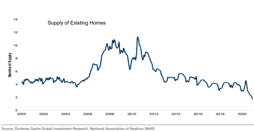
Combined with a shortage of supply: –
Source: III Capital Management, Goldman Sachs, NAR
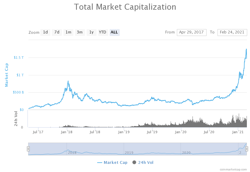
Finally, fiscal and monetary expansion is akin to fiat currencies have debasement, it is scant surprise, therefore, to see Cryptocurrencies resurgent. The chart below shows the combined market capitalisation of all the listed digital currencies: –
Source: Coinmarketcap.com
Of course the principal focus of the media has been on Bitcoin (BTC) access to which was made available to Paypal customers from October 2020. This month’s big stories include Telsa (TSLA) purchasing $1.5bln of BTC during January and Mastercard indicating that they intend to accept BTC as a form of payment later this year. The next chart shows the rising dominance of BTC (61%) compared to the previous peak in 2017: –
Source: Coinmarketcap.com
Ethereum (ETH) is second with a mere 12.7%. Putting digital assets in perspective, however, the market capitalisation of BTC, which just topped $1trln last week, is still less than 10% of the total market capitalisation of gold.
Whether or not one regards digital assets as an alternative store of value, soon to displace what Keynes dubbed thebarbarous relic (gold), it is incontrovertible that the digital asset industry is in its infancy whilst the underlying technologies – DL, Blockchain and DeFi – have the potential to disrupt the entire financial system – who needs banks or other financial intermediaries in this brave new decentralised world? Coinbase, which has been described as the Robinhood of the Crypto world, is planning an IPO for later this year. The current indication is that it will achieve a capitalisation of $77bln.
What is of concern is that the Crypto charts above wreak of euphoria. Traders and investors with no prior experience, have jumped on the trend and now command cult-like status among the ingénue. Some of their followers will be lucky, but these price patterns are the tell-tale traits of a greater fool’s marketplace.
Even in the liquid, large-cap names, echoes of the DotCom bubble are apparent. Apple (AAPL) and Tesla (TSLA) stock rose more than 50% in the days after they announced stock splits. Apple created more value for shareholders by announcing a stock split in 2020 than through its new product launches, Tesla, which declared the first profit in its 18 year existence in 2020 ($721mln) has made more from its purchase of Bitcoin than it has made in its lifetime.
Meanwhile, the actions necessary to fix some of these bubbles are mutually exclusive. A stock market or housing bust requires much lower interest rates and bigger government deficits, while a currency crisis brought on by rising inflation requires higher interest rates and government spending cuts. Let everything blow up at once and there will be literally no fixing it. And the “everything bubble” will become the “everything bust.”
John’s website is called Dollar Collapse, of the two end-games he outlines above, letting the US$ slide is the least painful short-term solution, no wonder the US administration keep labelling other countries currency manipulators.
The Stock Market’s Nemesis
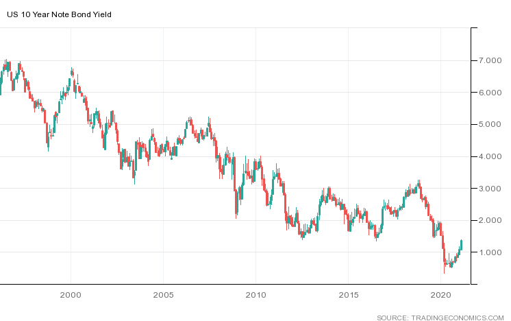
Having lain dormant for so long, its return to prominence may come as a shock to newer participants in the stock market: I am of course referring to the US Treasury Bond market. The chart below shows the 10yr yield over the last quarter century: –
Source: Trading Economics
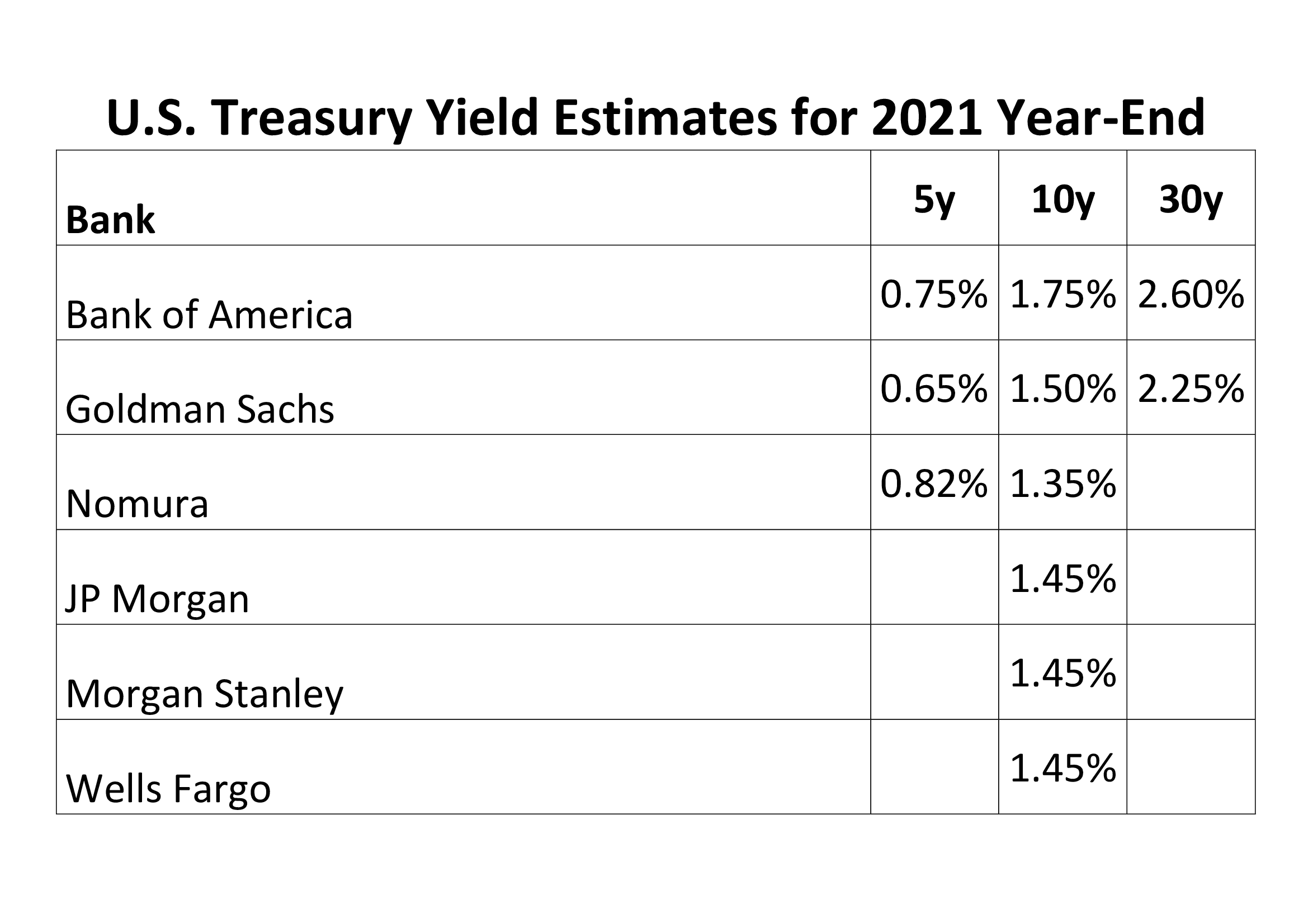
10yr yields hit their all-time low at 32bp last March, today (24th February) they have risen to 1.39%. The table below shows a selection of forecasts for year-end yields: –
Source: III Capital Management
Central Bankers are holding short-term rates near to zero but the longer end of the yield-curve is being permitted to express concerns about the inflationary consequences of excessively accommodative fiscal and monetary policy. Meanwhile, central bank buying of corporate bonds has insured that credit spreads have shown a muted response to the recent increase in yields. At some point there will be an inflection point and credit will reprice violently. For those adventuring in the stock market, these words attributed to James Carville – a political adviser to President Clinton – remain worthy of careful reflection: –
I used to think that if there was reincarnation, I wanted to come back as the president or the pope or as a .400 baseball hitter. But now I would like to come back as the bond market. You can intimidate everybody.
Unless, as I expect, the world’s leading central banks intervene to fix the price of government bonds, the bond market, left to its own devices, will bring the stock market back to reality with a crash.
Conclusion and Investment Opportunities
Having written more than 6,000 words in this two part Macro Letter I still feel as if I have merely scratched the surface of the conflicting and contrasting factors which support the bull and bear case. Taking a step back, I encourage you to read Five Lessons From History By Morgan Housel, The Collaborative Funda short-ish article which presents five lessons which can be applied to investing and to life in general. In the interests of brevity: –
Lesson #1: People suffering from sudden, unexpected hardship are likely to adopt views they previously thought unthinkable.
Lesson #2: Reversion to the mean occurs because people persuasive enough to make something grow don’t have the kind of personalities that allow them to stop before pushing too far.
Lesson #3: Unsustainable things can last longer than you anticipate.
Lesson #4: Progress happens too slowly for people to notice; setbacks happen too fast for people to ignore.
Lesson #5: Wounds heal, scars last.
Reflecting on the current great viral crisis (GVC) and its aftermath, I see many signs of irrational exuberance but remain cognisant of the low likelihood of any sudden policy reversals by developed nation governments or their central banks, this is primarily due to the fragility of the current global economy. The scars of Covid will take many years to heal, unsustainable things may last longer than anticipated and, as JM Keynes famously observed: –
The markets can remain irrational longer than you can remain solvent.
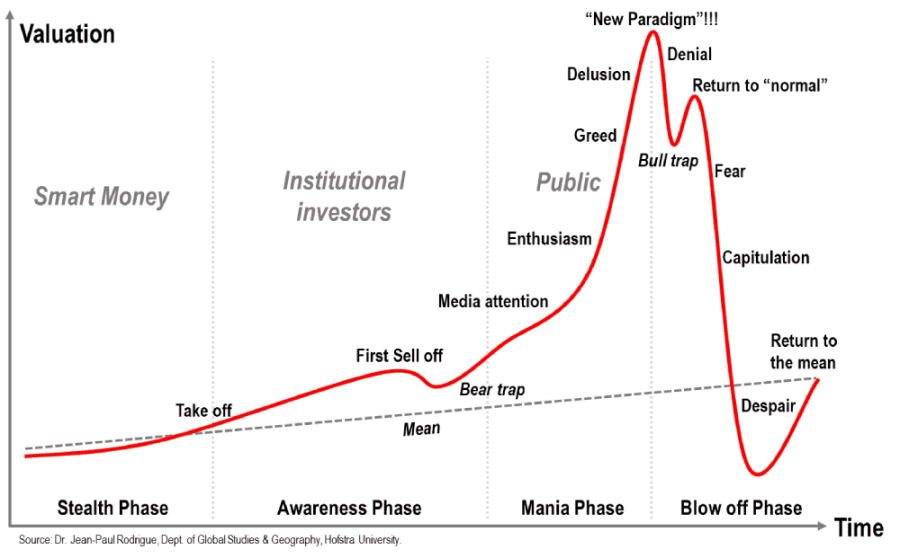
The cult of the personality, personified by the likes of Elon Musk, remains ascendant, so reversion to mean may be postponed a while. There is widespread evidence of what the French philosopher Rene Girard dubbed mimetic desire; the idea that, because people imitate one another’s desires, they tend to desire the same things; in the process this desire creates rivalry and increases the fear of missing out. In the classic evolution of a bubble mimetic desire leads from the momentum or awareness phase to the hallowed halls of mania and euphoria: –
Source: Dr Jean-Paul Rodrigue – Holstra University
Now is not the time to be rushing headlong into the stock market, but the upward trend remains firmly in tact. Alan Greenspan observed irrational exuberance in 1996, it took the market another four years to reach its high, mimetic desire makes it hard for investors to risk taking profit for fear of missing an exponential rise. There are several risk reduction strategies, but these statements, attributed to two of the most successful investors of all time are always worth keeping in mind: –
Be fearful when others are greedy. Be greedy when others are fearful.
Warren Buffett
The time of maximum pessimism is the best time to buy and the time of maximum optimism is the best time to sell.
With another $1.9trln of US fiscal relief set to be voted through, attention is likely to switch back to Europe. This article from August 2020 seems relevant to the debate.
With US elections over and a vaccine in sight, financial market uncertainty has declined
Rotation has seen a resurgence in those stocks battered by the onset of the pandemic
Monetary and fiscal spending will continue until inflation returns
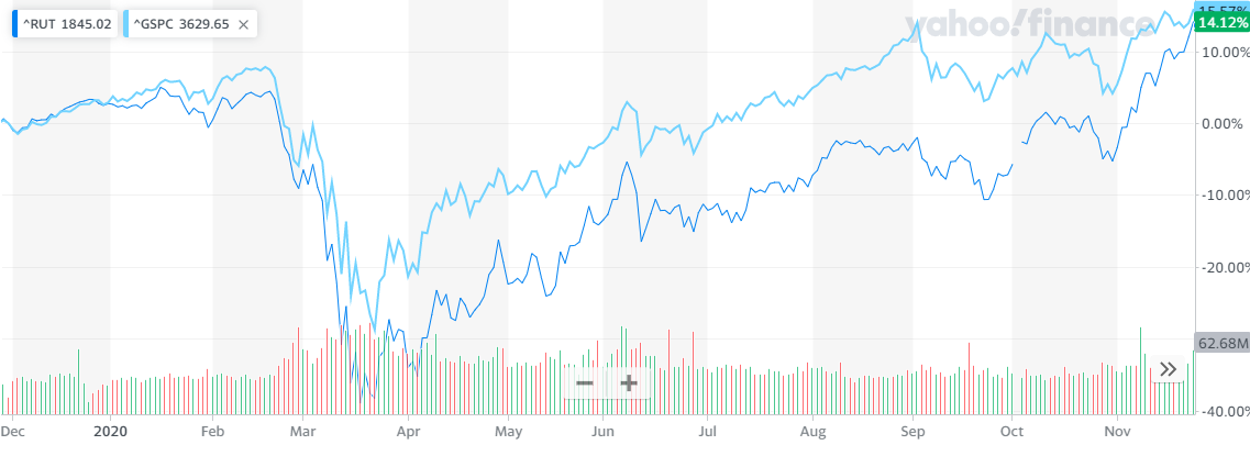
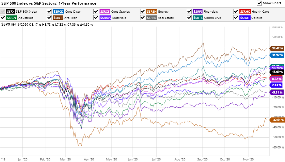
November has been an interesting month for financial markets around the world. The US Presidential election came and went and with its passing financial market uncertainty diminished. This change of administration is undeniably important, but its effect was overshadowed by the arrival of three vaccines for Covid-19. As I write (Thursday 26th) the S&P 500 Index is within 30 points of its all-time high, amid a chemical haze of pharmaceutical hope, whilst the VIX Index has tested its lowest level since February (20.8%). The Nasdaq Composite is also near to its peak and the Russell 2000 Index (an index of smaller capitalisation stocks) burst through its highs from February 2020 taking out its previous record set in September 2018. The chart below shows the one year performance of the Russell 2000 versus the S&P500 Index: –
Source: Yahoo Finance, S&P, Russell
It is worth remembering that over the very long term Small Caps have outperformed Large Caps, however, during the last decade the rapid growth of index tracking investments such as ETFs has undermined this dynamic, investment flows are a powerful force. I wrote about this topic in June in – A Brave New World for Value Investing – in which I concluded: –
Stock and corporate bond markets have regained much of their composure since late March. Central banks and governments have acted to ameliorate the effects of the global economic slowdown. As the dust begins to settle, the financial markets will adjust to a new environment, one in which value-based stock and bond market analysis will provide an essential aid to navigation.
The geopolitics of trade policy, already a source of tension before the pandemic struck, has been turbo-charged by the simultaneous supply and demand shocks and their impact on global supply chains. Supply chains will shorten and diversify. Robustness rather than efficiency will be the watch-word in the months and years ahead. This sea-change in the functioning of the world economy will not be without cost. It will appear in increased prices or reduced corporate profits. Value-based investment analysis will be the best guide in this brave new world.
To date, evidence of a return to Value Investing seems premature, Growth still dominates and the structural acceleration of technology trends seems set to continue – one might say, ‘there is Value in that.’
The vaccine news led to a rotation out of technology stocks but this was more to do with profit taking, new ‘Tech’ buyers quickly emerged. The rotation into Small Caps was also echoed among a number of out of favour sectors such as Airlines and Energy. It was enough to prompt the creation of a new acronym – BEACHs – Booking, Entertainment, Airlines, Cruises and Hotels.
Source: Barchart.com, S&P
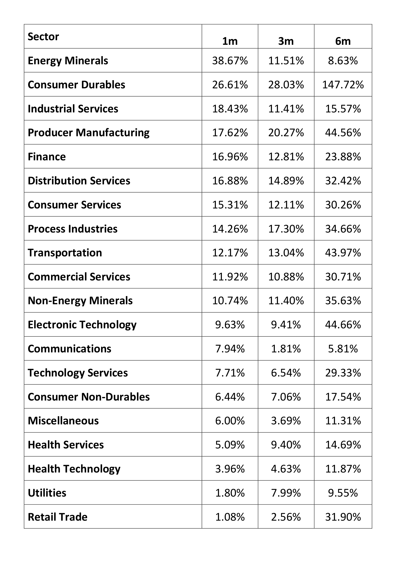
Above is the one year performance of the 11 S&P 500 industry sectors. Information Technology remains the leader (+38%) with Energy bringing up the rear (-32%) however the level of dispersion of returns is unusually which has presented an abundance of trading opportunities. The table below shows the one, three and six month performance for an expanded selection of these sectors: –
Source: Tradingview
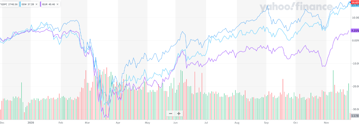
Beyond the US, news of the vaccines encouraged both European and emerging markets, but the latter (EEM), helped by the strong performance of Chinese stocks, have tracked the US quite closely throughout the year, it is Europe (IEUR) which has staged the stronger recovery of late, although it has yet to retest its February highs: –
Source: Yahoo Finance, S&P, MSCI
In the aftermath of the US election, US bond yields have inched higher. From an all-time low of 32bp in March, 10yr yields tripled, testing 97bp in the wake of the Democrat win. Putting this in perspective, the pre-Covid low was seen at 1.32% in July 2016. The current concern is partly about the ‘socialist’ credentials of President-elect, Biden, but the vaccine announcement, together with the prospect of a return to some semblance of normality, has also raised the spectre of a less accommodative stance from the Fed. There was initial fear they might ‘take away the punch-bowl’ before the global economy gets back on its knees, let alone its feet. Governor Powell, quickly dispelled bond market fears and yields have since stabilised.
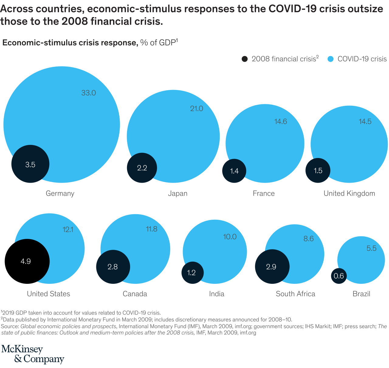
Longer-term, these bond market concerns may be justified, as this infographic from the McKinsey Institute reveals, combined central bank and government fiscal stimulus in 2020 has utterly eclipsed the largesse witnessed in the wake of the 2008 crisis: –
Source: McKinsey
Bond watchers can probably rest easy, however, should the global economy stage the much vaunted ‘V’ shaped recovery economists predicted back in the spring, only a fraction of the fiscal stimulus will actually materialise. Nonetheless, prospects for mass-vaccination, even in developed countries, remains some months away, both monetary and fiscal spigots will continue to spew for the present.
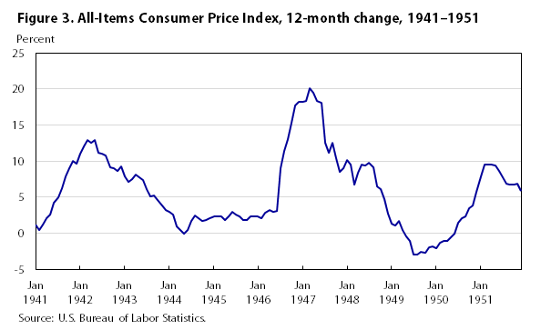
On the topic of monetary policy it is worth noting that the Federal Reserve previously employed ‘yield curve control,’ though it was not called by that name, back in April 1942, five months after the attack on Pearl Harbor. Under this arrangement the Fed committed to peg T-Bills at 3/8th and implicitly cap long-dated T-Bonds at 2.5%. The aim was to stabilize the securities market and allow the government to engage in cheaper debt financing during the course of WWII. This arrangement only ended with the Treasury – Fed Accord of 1951in response to a sharp peace-time resurgence in inflation. This chart shows the period from 1941 (when the US entered WWII) up to the middle of the Korean War: –
Source: US BLS
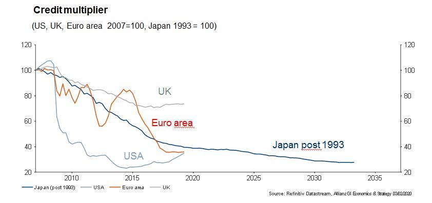
I believe we will need to see several years of above target inflation before the Fed to feel confident in raising rates aggressively. The experience of Japan, where deflation has been lurking in the wings for decades, will inform Fed decision making for the foreseeable future.
Returning to the present environment; away from the stock and bond markets, oil prices also basked in the reflected light shining from the end of the pandemic tunnel. West Texas Intermediate, which tested $33.64/bbl on 2nd, reached $46.26/bbl on 25th. The energy sector remains cautious, nonetheless, even the recent resurgence leaves oil prices more than $15/bbl lower than they were at the start of the year.
Looking ahead, the stock market may take a breather over the next few weeks. A vaccine is coming, but not immediately. US politics also remains in the spotlight, the Republicans currently hold 50 Senate seats to the Democrats 48. If Democrats secure the two seats in Georgia, in the runoff election on 5th January, VP Elect, Harris, will be able to use her ‘tie-break’ vote to carry motions, lending the Biden Presidency teeth and hastening the expansion of US fiscal policy.
The stock market has yet to make up its mind about whether Biden’s ‘New New Dealers’ are a positive or a negative. Unemployment and under-employment numbers remain elevated as a result of the pandemic: and, whilst bankruptcies are lower than at this time last year, the ending of the myriad schemes to prolong the existence of businesses will inevitably see those numbers rise sharply. Does the stock market benefit more from the fiscal spigot than the tax increase? This is a question which will be mulled, chewed and worried until long after Biden’s inauguration on January 20th.
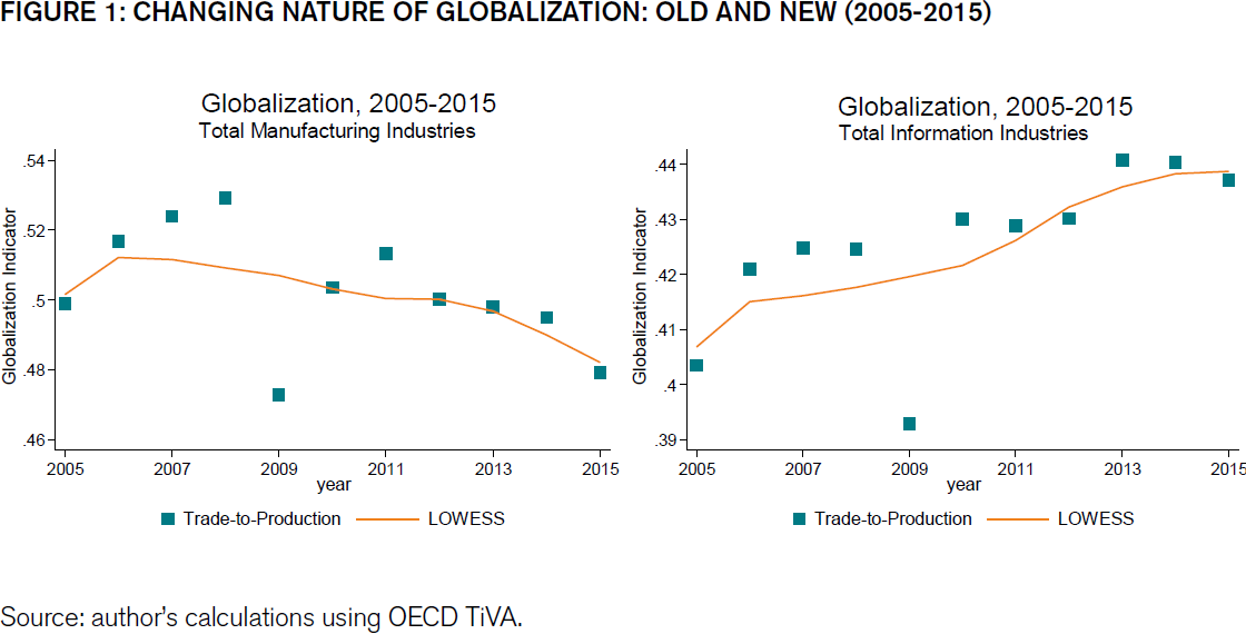
Meanwhile the trend accelerations in technology which I discussed in – The prospects for Emerging and Frontier Markets in the post-Covid environment– earlier this month, continue. The chart below shows how information industries have been transforming the makeup of global trade ever since the great financial crisis: –
Source: ECIPE, OECD, TiVA, van der Marel
Manufacturing trade is in retreat, trade in digital services is accelerating. The chart above stops at 2015, when we have the data to incorporate the period of the current pandemic, I expect the pace of growth in information industries to have gain even greater momentum.
Back in 1987, MIT economist and Nobel Laureate, Robert Solow, observed that the computer age was everywhere except for the productivity statistics. During the 1990’s technology productivity growth was finally observed, but the past decade has seen a string of disappointing productivity growth statistics, yet they have coincided with digitisation transforming vast swathes of the global economy, perhaps the next decade will see the fruit of these labours. I believe we can look forward to significant productivity improvements in the coming years. Stock prices, however, are forward looking, their valuations may seem extended but this may be entirely justified if technology ushers in a new golden age.
The Federal Reserve has changed the emphasis of their dual mandate
Inflation targeting will become more flexible in the long-run
Full employment has become the Bank’s priority
Asset markets will be the immediate beneficiaries
In a speech entitled – New Economic Challenges and the Fed’s Monetary Policy Review – given on August 27th, at the Jackson Hole, Kansas City Federal Reserve Economic Policy Symposium, Federal Reserve Chairman, Jerome Powell, announced a change in the emphasis of the dual mandate. The new focus is on promoting full-employment even at the expense of price stability.
The policy review was, of course, more nuanced. Past policy decisions were analysed and found wanting – especially the rate increases witnessed between 2015 and 2018. The extraordinary flatness of the Phillips Curve was noted; the lower trend rate of economic growth, contemplated; the stickiness of inflation expectations, contextualised: and the ever rising, pre-pandemic participation rate, considered. What the speech omitted was any discussion of forward guidance or expectations of the change in size, composition or direction of the Fed’s, already historically large, balance sheet.
For financial markets the key change is contained in this paragraph: –
Our statement emphasizes that our actions to achieve both sides of our dual mandate will be most effective if longer-term inflation expectations remain well anchored at 2 percent. However, if inflation runs below 2 percent following economic downturns but never moves above 2 percent even when the economy is strong, then, over time, inflation will average less than 2 percent. Households and businesses will come to expect this result, meaning that inflation expectations would tend to move below our inflation goal and pull realized inflation down. To prevent this outcome and the adverse dynamics that could ensue, our new statement indicates that we will seek to achieve inflation that averages 2 percent over time. Therefore, following periods when inflation has been running below 2 percent, appropriate monetary policy will likely aim to achieve inflation moderately above 2 percent for some time.
The initial market response saw stocks rally whilst 10yr T-bond yields rose – testing 0.79%. During the week which followed, 10yr yields slipped back to 0.62%. Equity markets subsequently switched focus and moved on, returning to their obsession with the ever rising tide of technology stock earnings expectations. Even the Dow Jones Industrials Average Index has been effected by the tech boom, as reported by S&P – Dow Jones Industrial Average: 124 Years and It Keeps Changing – the index changes, announced on August 31st included, Salesforce.com (CRM) replacing Exxon Mobil (XOM), Amgen (AMGN) replacing Pfizer (PFE), and a tech switch with Honeywell International (HON) replacing Raytheon Technologies (RTX).
If the average for Total PCE over the last decade has been less than 1.5%, allowing it to rise above 3% for a few years is just what is needed for the Fed to get back on track.
Setting aside the vexed questions of whether an Inflation Target is appropriate or, deflation, a good or bad phenomenon, we need to investigate the structural cause of the decline in inflation. Here I will resort to the monetary equation of exchange: –
MV = PQ
Where: –
M is the total nominal amount of money supply in circulation on average in an economy.
V is the velocity of money, or the average frequency with which a unit of money is spent.
P is the price level.
Q is an index of real expenditures for newly produced goods and services.
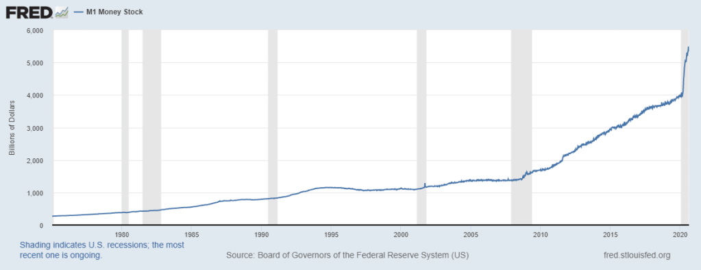
The basic problem for the Fed is that, despite their success in expanding money supply (see below): –
Source: Federal Reserve Bank of St Louis
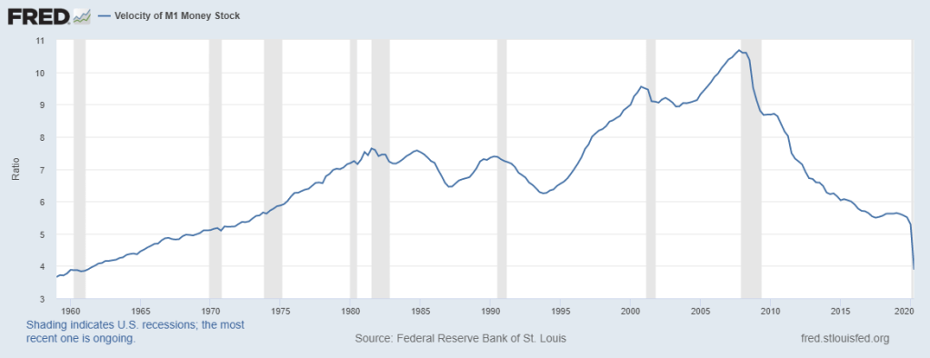
The velocity of circulation has continued to plummet: –
I suspect, fearful of repeating the mistakes made by the Bank of Japan, that once the inflation genie is finally out of the bottle, central bankers will forsake the hard-learned lessons of the 1970’s and 1980’s and allow inflation to conjure away the fiscal deficits of their governments at the expense of pensioners and other long-term investors.
Of course, consumer price inflation may not return, even with such egregious debasement as we have seen thus far, as Michel Santi suggests in Japan: a sleeping beauty: –
A global battle has thus been raging on pretty much since the deflationary episodes of the 2010s in an attempt to relaunch economies by dint of inflation. In this respect, the Japanese experiment, or rather multiple experiments, remains a case study to show that inflation is still proving a difficult spectre to revive.
Santi, points to demographic decline, a trend in which Japan is a world leader, together with, what he considers to be, an irrational fear of debt and deficits, which renders people unwilling to spend. In this scenario, government, corporate and consumer debt cannot be inflated away and sits like a giant toad atop all the animal spirits that might reignite economic growth. He also alludes to the profound changes in the nature of work – from permanent to temporary, from employed to self-employed, from office based to remote. These changes have rendered the Phillips Curve redundant.
The dual mandate of full employment and price stability has never been so easy for the Federal Reserve to achieve. That, at least, was the case until the global pandemic unknit the fabric of the global market economy. Now, the Federal Reserve – and central bankers in general – are faced with the prospect that printed money, whether it be sterilised or not, will either be invested or hoarded. In this scenario, the greater the debt the less likely prices are to rise as a result of demand-pull inflation. On the opposite side of the inflation equation, the shortening of global supply chains and the need for dual-redundancy, agin another unwelcome and unexpected lockdown, has created the classic bottlenecks which lead to product scarcity, personified in cost-push inflation.
Interest Rates, Global Value Chains and Bank Reserve Requirements– published in June of last year, notes that Global Value Chains have suffered and shortened since 2009; that, despite low interest rates, financing costs remain too high and yet, at the same time, bank profitability has not recovered from the damage caused by the great financial recession. Nonetheless, those same banks, which were supposed to have been broken up or dramatically deleveraged, remain still too big to fail. My conclusion looks dismally prescient: –
The logical solution to the problem of the collapse of global value chains is to create an environment in which the credit cycle fluctuates less violently. A gradual normalisation of interest rates is the first step towards redemption. This could be accompanied by the removal of the moral hazard of central bank and government intervention. The reality? The societal pain of such a gargantuan adjustment would be protracted. It would be political suicide for any democratically elected government to commit to such a meaningful rebalancing. The alternative? More of the same. Come the next crisis central banks will intervene, if they fail to avert disaster, governments’ will resort to the fiscal spigot.
US interest rates will converge towards those of Europe and Japan. Higher stock/earnings multiples will be sustainable, leverage will increase, share buy-backs will continue: and the trend rate of economic growth will decline. Economics maybe the dismal science, but this gloomy economic prognosis will be quite marvellous for assets.
Conclusion and Investment Opportunities
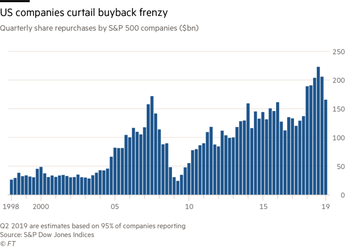
According to data from S&P, US share buybacks were lower for the second quarter in a row in Q2, 2020. They amounted to $166bln, versus $205bln in Q1 and $190bln in Q2, 2019 – this is still the seventh highest quarterly amount ever recorded. The chart below shows the evolution of buybacks over the last two decades: –
Source: S&P, FT
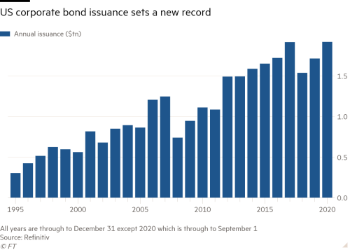
The consolidation of the US equity market continues – from a high of 7,562 on July 31, 1998, the Wilshire 5000 Index list of constituents has shrunk to just 3,473 names. This is a side effect of the fact that debt finance remains cheaper than equity finance. According to a recent article published by the Financial Times – US corporate bond issuance hits $1.919tn in 2020, beating full-year record corporate issuers have raised more capital in the first eight months of 2020 than in any previous full year. Low rates going to no rates, thanks to the actions of the Fed, is said to have driven this step-change in activity. The reticence of commercial banks to extend finance, despite the favourable interest rate and liquidity environment, is a contributing factor: –
Source: Refinitiv, FT
The Covid pandemic has accelerated many of the economic and financial market trends which have been in train since the end of the 2008/2009 financial crisis. Lower interest rates, more quantitative easing, further share buy-backs and greater debt issuance – by borrowers’ individual, corporate and national – look set to continue.
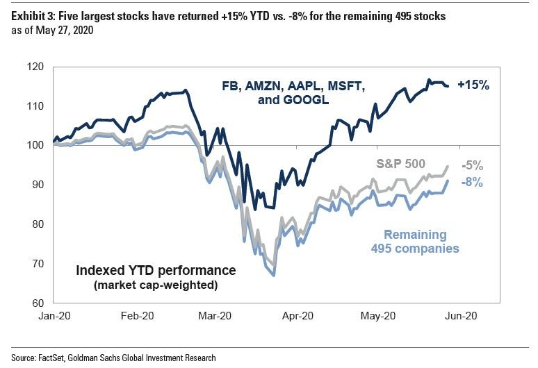
A global economic depression is looming, yet the price of many assets continues to rise. In a similar manner to the Tech bubble of the late 1990’s, today’s valuations rely more on the willing suspension of disbelief than on any sober assessment of earnings potential. The US stock market has outperformed partly due to the high proportion of technology stocks, as the chart below (from May) shows: –
Source: FactSet, Goldman Sachs
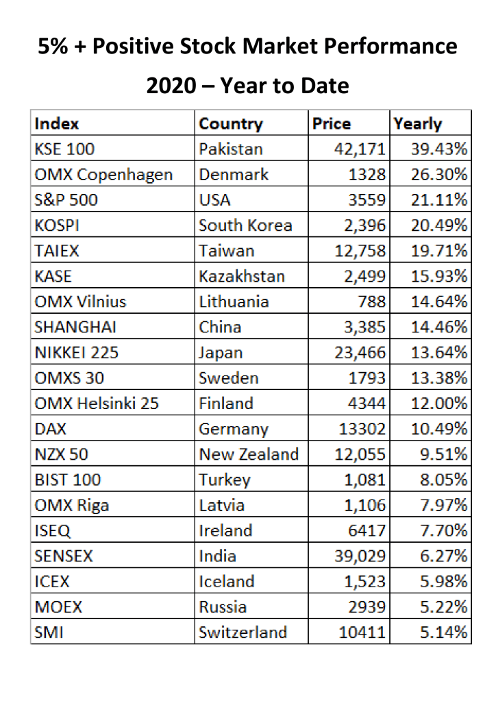
The magnitude of this fiscal and monetary response has already reached far beyond the United States. The table below shows those national stock markets with a positive year to date performance exceeding 5%: –
Source: Trading Economics, Local Stock Exchanges
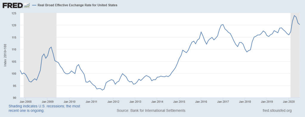
I have deliberately excluded the Nasdaq 100 which is currently up more than 57%. Other countries will catch up. The US$ has weakened, since February, on a trade weighted basis: –
Source: BIS, Federal Reserve Bank of St Louis
In a competitive race to the bottom, other central banks (and their governments) will expand monetary (and fiscal) policy to stop their currencies appreciating too fast.
Global bond yield convergence will continue, stock market strength will endure. Inflation will creep into consumer prices gradually and the central banks will turn a blind eye until it is too late. The world economy may be on its knees but, in general, asset prices will continue to reach for the stars.
A Rose by Any Other Name – Corona Bonds and the Future of the Eurozone
A European fiscal spending package worth Euro 540bln has been agreed
Eurozone bonds have crashed and recovered
Corona Bonds have been found unnecessary
The issue of Eurozone backed Eurobonds will not go away
On April 9th the Eurogroup of Finance Ministers eventually agreed upon a three-pronged package to avert some of the economic impact of the Covid-19 pandemic. For financial markets this was a relief, had the Eurogroup broken up, for the second time in a week, without a deal markets would have reacted badly. The three-pronged package included health expenditure funding from the European Stability Mechanism (ESM), loans for businesses from the European Investment Bank (EIB) and further funding from the European Commission’s unemployment fund. The total package is a modest Euro 540bln, the political ramifications are much less so.
What was not agreed, despite the unprecedented circumstances surrounding the pandemic, was a collective pooling of Eurozone (EZ) resources in the form of ‘Eurobonds,’ deftly renamed ‘Corona Bonds,’ by their advocates. For the fiscally responsible countries of Northern Europe, even the current crisis was insufficient for them to contemplate underwriting the prodigal South.
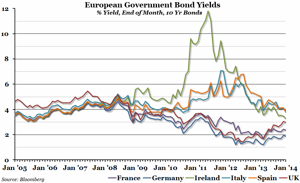
The compromise, agreed last week, included the use the ESM. The ESM itself, together with the outright monetary transactions (OMT) undertaken by the ECB, were forged in the 2010/2012 Eurozone crisis. At that time the convergence of Eurozone government bond yields, which had begun long before the advent of the Euro, was unravelling as investors realised that Europe would not collectively underwrite any individual state’s obligations. The North/South divide became a chasm, with Greek, Portuguese, Italian and Spanish bond yields rising sharply whilst German, Dutch and Finnish yields declined. The potential default of a Eurozone government was only averted by the actions of the then President of the ECB, Mario Draghi, when he stated that the central bank would do, ‘Whatever it takes.’
Based on the empirical results, there is some clear evidence of strong monetary policy convergence for each of the Czech Republic, Lithuania and Slovakia to Germany. Alternatively, under the UIP and ex-ante relative PPP conditions, the expected inflation rate of these three countries has converged to the expected inflation rate of Germany. This is an expected result not only because Lithuania and Slovakia are already Eurozone members, but also because Germany plays a very important role in the economies of these three countries. Furthermore, the empirical results provide evidence of weak monetary policy convergence for each of Croatia and Romania to Germany. In contrast, for the remaining seven new EU countries, namely Bulgaria, Cyprus, Hungary, Latvia, Malta, Poland and Slovenia, the empirical evidence suggests yields’ divergence for each of these countries in relation to Germany. For Cyprus, Latvia and Slovenia, which as Eurozone members they have common monetary policy with Germany, the empirical evidence could probably be attributed to the increased sovereign default risk of these countries, which in turn led to large and persistent risk premia.
In summary, the empirical evidence indicates that in the context of the Eurozone debt crisis, even though Germany has established its dominance and sets the macroeconomic policies in the Eurozone, several new EU countries are unable to follow these policies. And this conclusion addresses once more the issue of core-periphery in the Eurozone and, thus, the Eurozone’s future prospects.
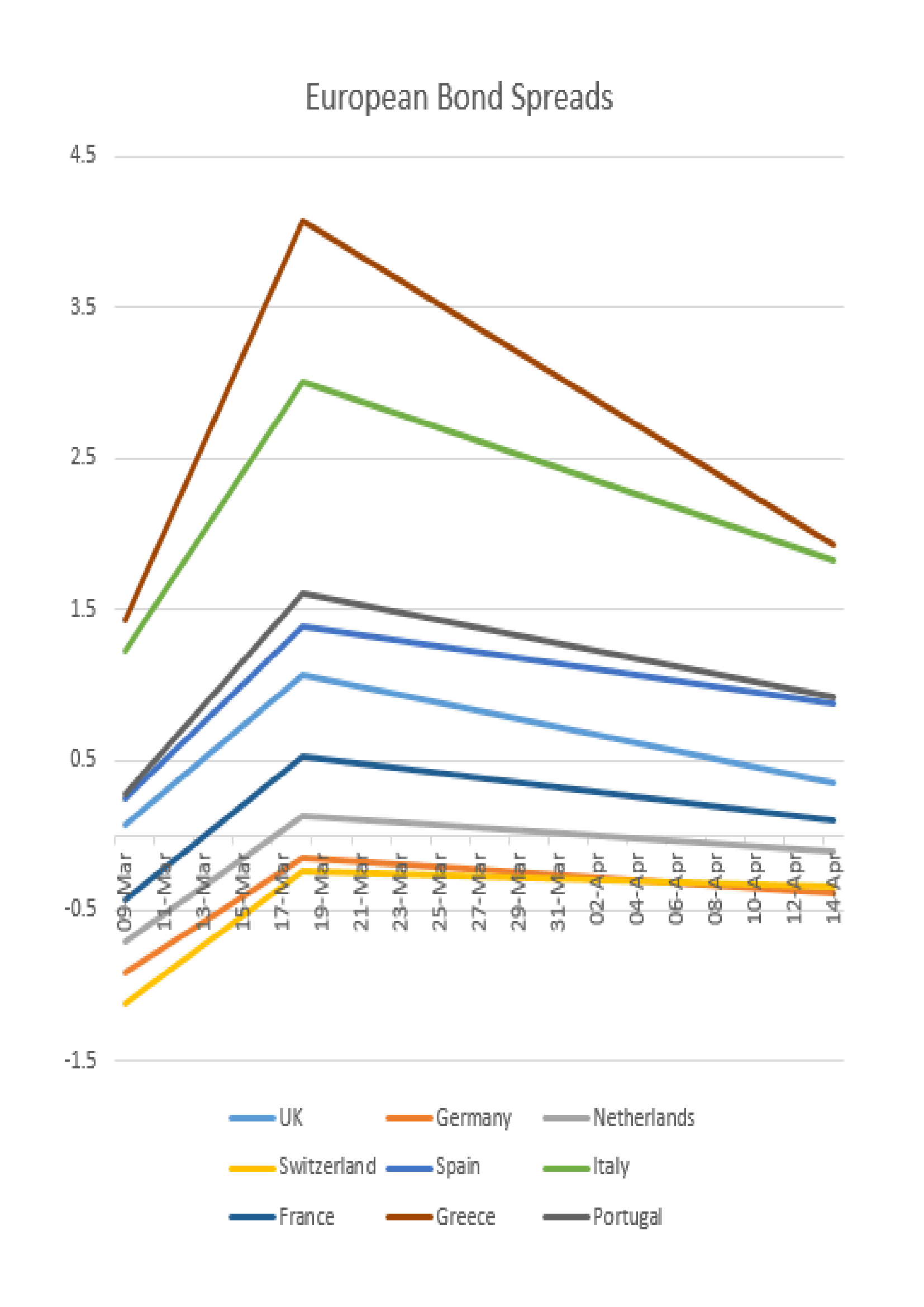
The past six weeks has seen a global fiscal response to the pandemic. Stock markets have declined and credit spreads in corporate bond markets have widened. In European government bonds the pattern has been similar, the migratory flight to quality saw flocks of investors head north, especially into Switzerland and Germany. The simplified chart below shows three data points;
March 9th, when German Bund yields reached their recent nadir,
March 18th, the date investors became spooked by the sheer magnitude of the fiscal response required by EZ governments: and
April 14th, the day on which Italy and Spain announced the first relaxation their lockdown restrictions: –
Source: Trading Economics, Investing.com
There are several observations; firstly, even as the lockdown comes towards its end, bond yields are higher, reflecting concerns about the impact of fiscal spending on government budgets as tax receipts collapse. Secondly, German Bund yields are now lower than Swiss Confederation bonds, despite expectations that Germany may end up footing the bill for the lion’s share of government borrowing across the EZ. This may be a reflection of the lower percentage fatality rate in Germany – 2.5% versus 4.4% in Switzerland – or simply a function of the greater liquidity available in the German bond market.
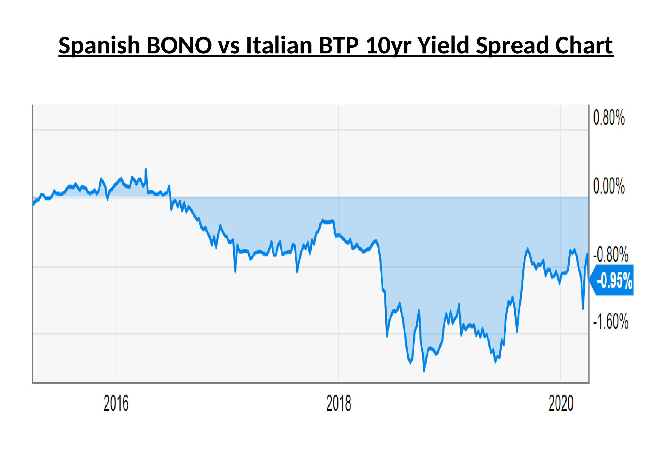
A third observation concerns the higher yielding countries of Greece, Italy, Portugal and Spain. Despite a larger number of Covid-19 infections, Spanish Bonos have maintained their lower yield relative to Italian BTPs, meanwhile, Greek bonds have converged towards Italy and Portuguese bonds trade within 4bp of Spain.
Full Banking Union and further federalisation of Europe
Full Banking Union but limitation of federalisation
Eurozone break-up
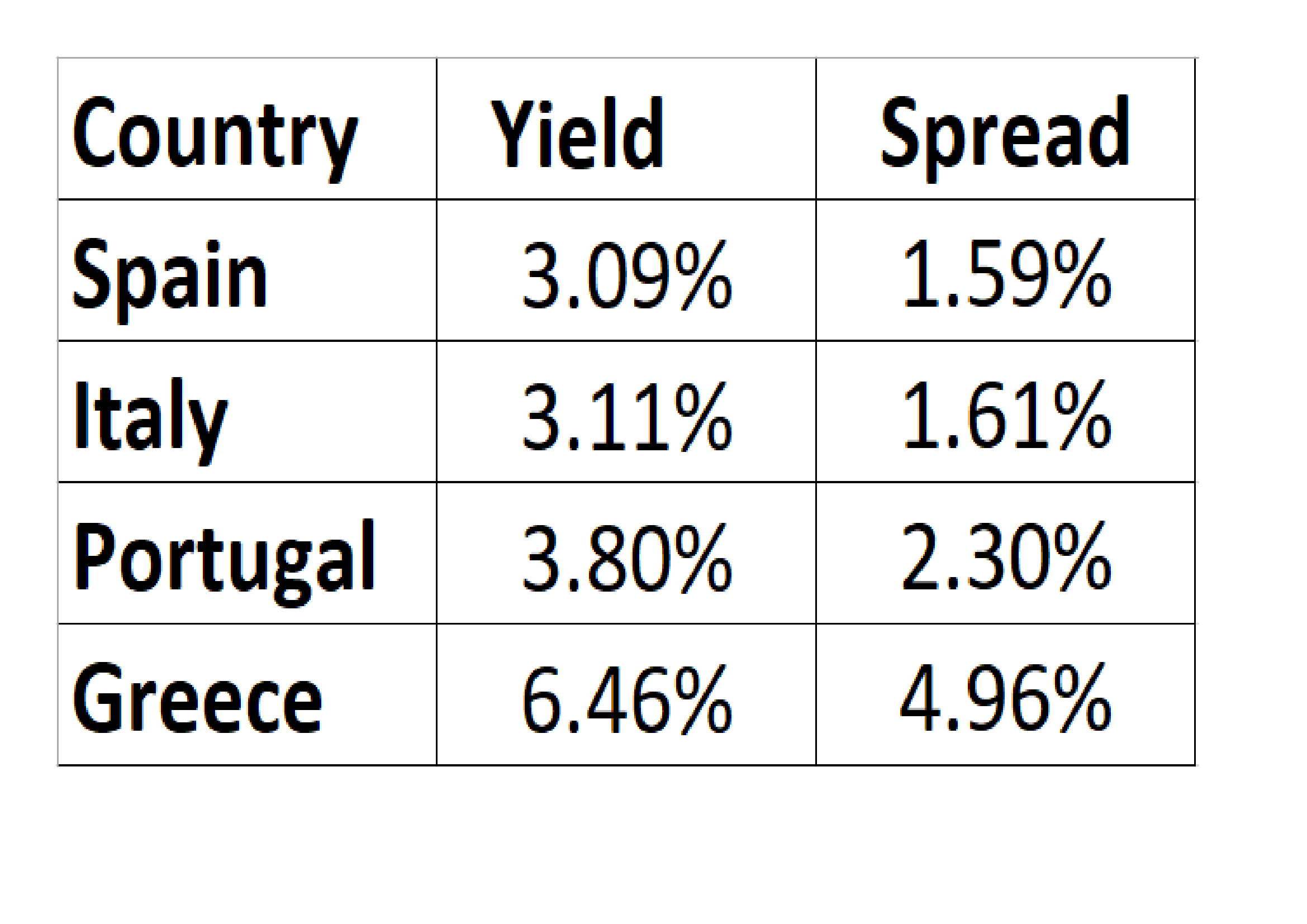
The EZ crisis had finally disapated but the full impact of QE had not yet been appreciated, the table below shows the yield to maturity and spread over German Bunds of the 10 year bonds of Italy, Spain, Greece and Portugal traded on 24th April 2014 (roughly six years ago): –
Source: Bloomberg
In April 2014 I saw the second scenario as most likely. I anticipated limited ‘Eurobond’ issuance, this has not yet come to pass, but last week’s stimulus looks like a federal bail-out by any other name. Last month, as the Covid-19 pandemic took hold, the spread between German Bunds and Spanish Bonos touched 1.54%, whilst the spread against Greek bonds reached 4.22% and Portugal, 1.75%. Only Italy fared less well, the Bund/BTP spread reached 3.15; a marked deterioration since 2014.
Spanish 10yr Bonos represents a better prospect than Italian 10yr BTPs, but one would have to endure negative carry to set up this spread trade: look for opportunities if the spread narrows towards zero.
Eurobonds are still not on the agenda even in a time of pandemic, therefore, Italian indebtedness remains the single greatest risk to the stability of the EZ. The convergence trade is fraught with geopolitical risk as cracks in the European Project are patched and papered over. Now is not the time for revolution, but the ongoing fiscal strain of the pandemic means the policy of issuing Eurobonds backed by a European guarantor will not go away. I expect EZ government bond yield compression accompanied by occasional violent reversals to become the pattern during the next few years, together with increasing political tension between European countries north and south.
Epidemics, Economic Growth and Stock-market Performance – An Historical Perspective
As the COVID-19 pandemic gathers momentum, history offers too few data points
The Spanish Flu is the nearest comparison – similarities are matched by differences
Clinical trials have started, but the rise in new cases is slowing in China already
Global economic growth will suffer, but monetary and fiscal stimulus should support stocks
As I write this article I am conscious that the Coronavirus is a very real and global tragedy. In all that follows I do not wish to detract from the dreadful human cost of this disaster in any way.
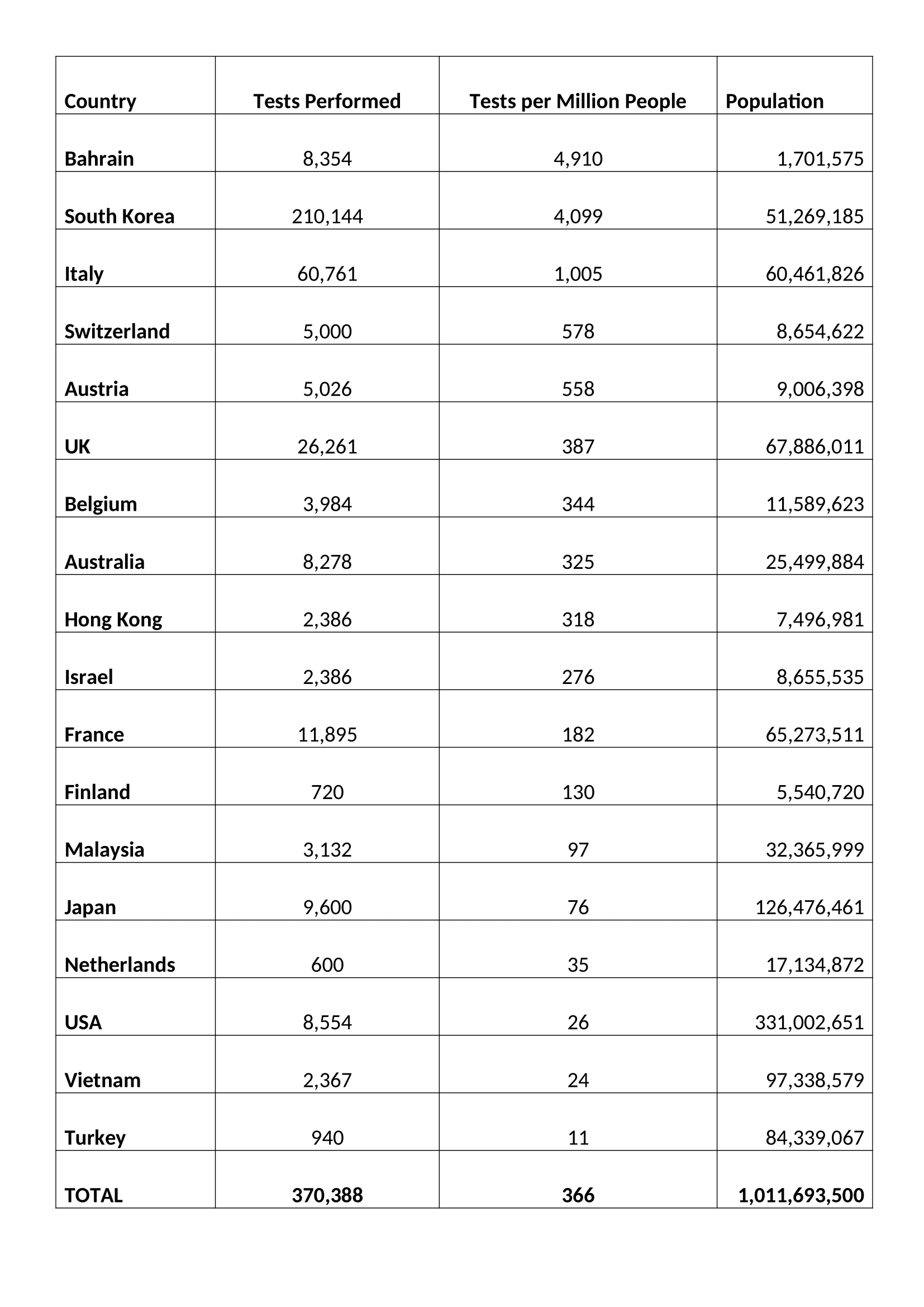
Putting the current pandemic in perspective, according to a 2017 estimate from the US Center for Disease Control, in a normal year, seasonal flu kills 291,000 to 646,000 globally. By contrast, the fatality rate for coronavirus seems to have stabilised at around 3.6% of those diagnosed. Of course, a more heartening figure of 0.79% can be found in South Korea which has tested almost 10 times more of its population than other country:-
Source: Worldometer.com
Suffice to say the current statistics are still confusing at best, but they are all we have to work with.
In a recent interview Dr Soumaya Swaminathan of the World Health Organisation (WHO) provided some insights (emphasis is mine): –
Of 44,000 Wuhan patients 80% had very mild symptoms, 15% of cases are severe and 5% critical. In terms of transmission rates, the R0 is still just an estimate of between 2 and 3 – in other words for every carrier between two and three people are infected.
…Two drugs, an antiretroviral called Lopinavir-ritonavir and an experimental drug used in the treatment of Ebola – Remdesivir, manufactured by Gilead (GILD) – are being tested in China where more than 80 clinical trials are already underway. The development of an effective vaccine it several months away.
It was reported today (11-3-2020) that Gilead has begun trails with US nationals and signed a deal with the US military.
Market Impact
Given the continued lack of clarity about COVID-19 in terms of numbers infected and numbers suffering, it may seem futile to attempt to gauge the potential economic impact of the current Coronavirus outbreak. History, however, may be able to provide some guidance to investors who might otherwise be tempted to liquidate and hibernate, especially after the dramatic decline this week in the wake of Saudi Arabia’s decision to turn its back on the OPEC cartel.
In order to begin this assessment, there are a vast array of factors which need to be considered. Here are just a few: –
Speed of spread – higher in urban areas due to population density
Urban versus rural population – generally a function of GDP per capita
Likelihood of a cure or vaccine – the majority of estimates range from three months to a year (hopefully it was be sooner)
Health of demographic cohorts by country – a function of average age and GDP per capita
Average income – also a function of GDP per capita
Extent of healthcare coverage – generally a function of GDP (although European welfare arrangements are more developed than those of the US)
Each of these factors are complex and warrant an essay to themselves. Suffice to say, the economic impact is already becoming evident. Schools, factories and offices are closing. Those workers that can are beginning to work remotely. At the extreme, entire cities, towns and countries are being subjected to lock-downs. In these conditions, economic activity inevitably suffers, this is a supply and demand shock combined. The price of crude oil has already responded, encouraged by the actions of Saudi Arabia, it has collapsed. Transportation activity has been substantially reduced. Economic indicators from China point to a pronounced contraction in 2020 GDP growth. Will the pattern seen in China be repeated elsewhere? Are the nascent indications of a resumption of economic activity now evident in China a reliable indication of the speed of recovery to be expected elsewhere? The jury is still out.
For G20 countries the effect of the 2008/2009 financial crisis still lingers. According to a BIS report more than 12% of developed nation firms generate too little income to cover their interest payments. Meanwhile, at the individual level, the Federal Reserve estimates that more than 10% of American adults would be unable to meet a $400 unexpected expense, equivalent to around two days’ work at average earnings. There is concern among governments that people may start to hoard cash if the crisis deepens.
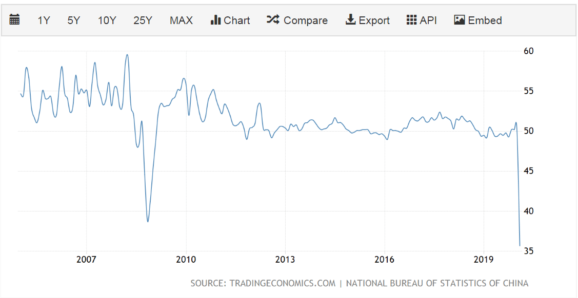
Where the viral epidemic began, in China, the Purchasing Managers Index for February was the lowest since the series began in 2004. According to China Beige Book’s flash survey for February, 31% of companies were still closed and many of those that have reopened lacked staff or materials. Other estimates suggest that between 40% and 50% of the China’s truck fleet remains idle – those essential materials are unlikely to be delivered anytime soon. This supply-shock slowdown has inevitably fuelled expectations of an actual contraction in the size of the Chinese economy, the first shrinkage since the death of Mao Zedong in 1976: –
Source: Trading Economics
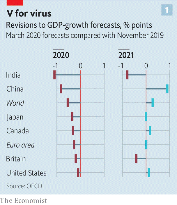
Everywhere GDP forecasts are being revised lower: –
Source: Economist
Policy Response
For the world’s governments there are essentially three policy responses: –
Provision of credit via banks and money markets – central banks are doing what they can
Aid to corporates to meet fixed costs, such as rent and tax bills
Protection of workers by subsidising wage costs
Central banks are limited in their ability to lend directly to firms, meanwhile the banking system, petrified by the recent widening of credit spreads for sub-investment grade debt, is likely to become a bottleneck. It will take more than gentle persuasion to force banks to lend new funds and reschedule existing non-performing loans. Other aid to corporates and individuals requires varying degrees of fiscal stimulus. Governments need to act quickly (today’s UK budget is an indication of the largesse to follow) it would also help if there were a coordinated global policy response.
A first step is to lock in adequate public funding. In 2014, emergency funding of about $5.4 billion was provided to fight the Ebola outbreak. Much more than that should be provided today, given the apparently greater transmissibility of COVID-19 and the fact that it has already appeared in many locations around the United States and more than 60 countries around the globe.
…A classic recession involves a shortfall of demand relative to supply. In that more ordinary situation, economic policymakers know how to help fill in the missing demand. But this case is more complicated because it involves negative hits to both supply and demand.
…No one knows how serious the economic damage from COVID-19 will be, so a key challenge is to design a fiscal countermeasure that clicks on when it’s needed and clicks off when it’s not. One approach that would fit that description would be to move immediately to pre-position a temporary cut in the payroll taxes that fund the Social Security and Medicare programs…
The final suggestion is a US-centric proposal, it is different from the income tax cut alluded to by President Trump and will directly benefit lower-income families, since healthcare costs will be a larger proportion of their after tax income. The authors’ propose a similar mechanism to click in when the unemployment rates rises and click off when re-employment kicks back in.
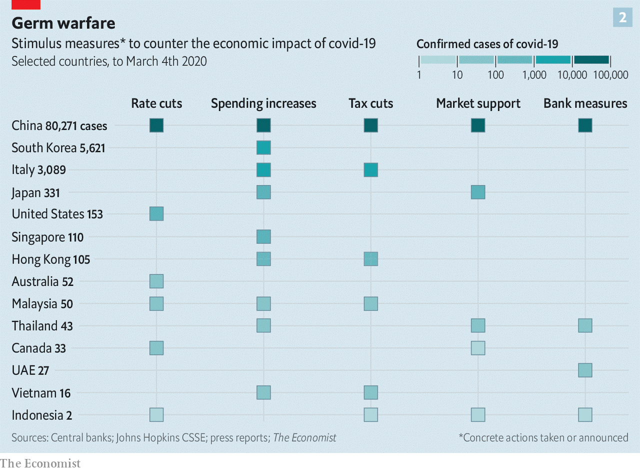
The table below shows actions taken by 4th March: –
Source: Economist
It is worth mentioning that Hong Kong, still reeling from the civil unrest of last year, has pressed ahead with ‘helicopter money’ sending cheques to every tax payer. This approach may be more widely adopted elsewhere over the coming weeks.
The Spanish Flu
In an attempt to find an historical parallel for the current Corona outbreak, there are only two episodes which are broadly similar, the Black Death of 1347 to 1351 and the Spanish Flu of 1918 to 1919. Data from the middle ages is difficult to extrapolate but it is thought that the Plague wiped out between 20% and 40% of Europe’s population. The world population is estimated to have fallen from 475mnl to between 350mln and 375mln. The world economy shrank, but, if data for England is any guide, per capita economic activity increased and the economic wellbeing of the average individual improved. For more on this topic I would recommend a working paper from the Federal Trade Commission –The English Economy Following the Black Death by Judith R. Gelman -1982.
The Spanish Flu of 1918 was the next global pandemic. It began in August of 1918, three month prior to the end of the First World War, and, by the time it had ended, in March of 1919, it had infected 500mln out of a global population of 1.8bln. The fatality rate was high, 40mln people lost their lives. Following the war, which cost almost 20mln lives, the combined loss of life was similar in absolute terms to the Black Death although in percentage terms the fatality rate was only 2%.
The possibility of a worldwide influenza pandemic… is of growing concern for many countries around the globe. The World Bank estimates that a global influenza pandemic would cost the world economy $800 billion and kill tens-of-millions of people. Researchers at the U.S. Centers for Disease Control and Prevention calculate that deaths in the United States could reach 207,000 and the initial cost to the economy could approach $166 billion, or roughly 1.5 percent of the GDP. Longrun costs are expected to be much greater. The U.S. Department of Health and Human Services paints a more dire picture—up to 1.9 million dead in the United States and initial economic costs near $200 billion.
…Despite technological advances in medicine and greater health coverage throughout the 20th century, deaths from a modern-day influenza pandemic are also likely to be related to race, income and place of residence.
The Spanish-flu was different from COVID-19 in that the highest mortality was among those aged 18 to 40 years and was often found among those with the strongest immune systems.
Garrett goes on to assess the economic impact with the aid stories from newspapers and the limited amount of previously published (and some unpublished) research. National statistics on unemployment and economic activity had yet to be compiled, but the simultaneous supply and demand shocks were broadly similar to the patterns we are witnessing today.
…One research paper examines the immediate (short-run) effect of influenza mortalities on manufacturing wages in U.S. cities and states for the period 1914 to 1919. The testable hypothesis of the paper is that
influenza mortalities had a direct impact on wage rates in the manufacturing sector in U.S. cities and states during and immediately after the 1918 influenza. The hypothesis is based on a simple economic model of the labor market: A decrease in the supply of manufacturing workers that resulted from influenza mortalities would have had the initial effect of reducing manufacturing labor supply, increasing the marginal product of labor and capital per worker, and thus increasing real wages. In the short term, labor immobility across cities and states is likely to have prevented wage equalization across the states, and a substitution away from relatively more expensive labor to capital is unlikely to have occurred.
The empirical results support the hypothesis: Cities and states having greater influenza mortalities experienced a greater increase in manufacturing wage growth over the period 1914 to 1919.
Another study explored state income growth for the decade after the influenza pandemic using a similar methodology. In their unpublished manuscript, the authors argue that states that experienced larger numbers of influenza deaths per capita would have experienced higher rates of growth in per capita income after the pandemic. Essentially, states with higher influenza mortality rates would have had a greater increase in capital per worker, and thus output per worker and higher incomes after the pandemic. Using state-level personal income estimates for 1919-1921 and 1930, the authors do find a positive and statistically significant relationship between state-wide influenza mortality rates and subsequent state per capita income growth.
Aside from wages, however the author concludes: –
…Most of the evidence indicates that the economic effects of the 1918 influenza pandemic were short-term. Many businesses, especially those in the service and entertainment industries, suffered double-digit losses in revenue. Other businesses that specialized in health care products experienced an increase in revenues.
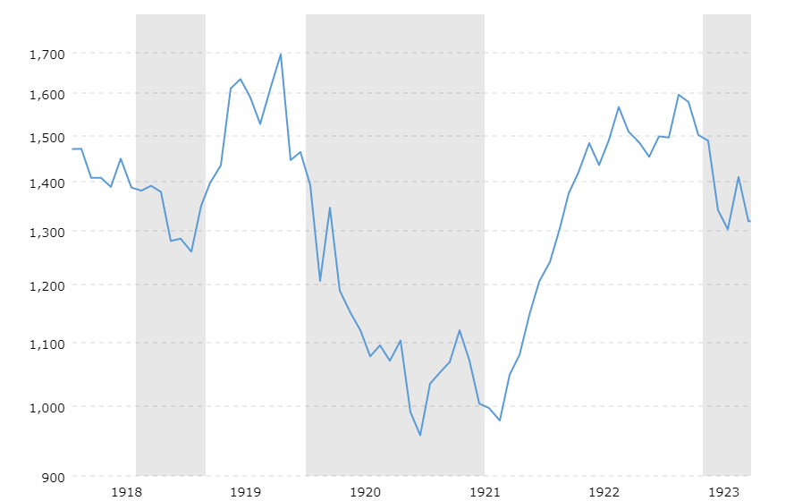
How did financial markets react? The chart below shows the Dow Jones Industrial Average over the period from 1918 to 1923. The shaded areas indicate recessions: –
Source: Macrotrends
When reinvested dividends are included, the total return of the Dow Jones Industrial Average in 1918 was 10.5%, despite influenza wiping out 0.4% of the US population. Fears about a slowdown in economic activity, resulting from the end of WWI, were the underlying cause of the brief recession which coincided with the pandemic, the stock market had already reacted, dipping around 10% earlier in the year. The subsequent recession of 1920 had other causes.
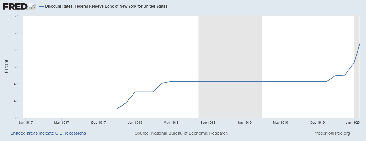
As is evident from the chart below, the newly created (1913) Federal Reserve felt no compunction to cut interest rates: –
Source: Federal Reserve Bank of St Louis
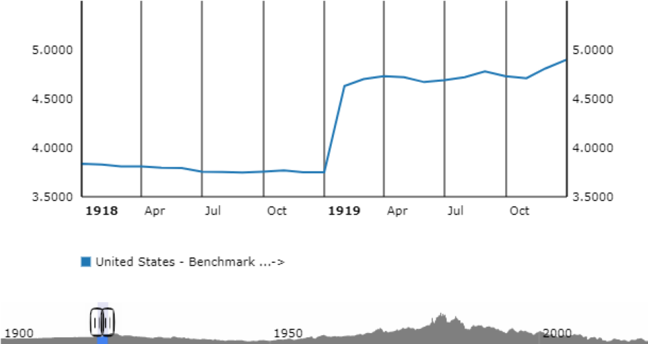
US 10 year Treasury Bonds simply reflected the actions of the Federal Reserve: –
Source: ECB
One is forced to concede, financial markets behaved in a very different manner 100 years ago, but they may yet have something to teach us about the global impact of a pandemic – that it is an economic interruption rather than a permanent impediment to progress.
Conclusions and investment opportunities
Whilst there are similarities between the Spanish Flu of 1918 and the COVID-19 pandemic of today, there are also profound differences. Urban areas, for example, are expected to suffer higher fatalities than rural areas today. In 1919 only 51% of the population of the US was urban, today it is above 80%. Population density has also increased three-fold over the last century, if 500mln were infected in 2018/2019 then the comparable figure today would be 1.5bln. Changes in the ease of transportation mean that the spread of a pandemic will be much more rapid today than in the first quarter of the 20th century. Tempering this gloom, for many people, communications have transformed the nature of work. Many aspect of business can now be transacted remotely. Unlike in 1918 self-isolation will not bring commerce to a standstill.
The economic impact will also be felt more rapidly. Supply chains have been optimised for efficiency, they lack resilience. Central banks have already begun to cut interest rates (where they can) and provide liquidity. Governments have picked up the gauntlet with a range of fiscal measures including tax cuts and benefit payments.
Many commentators are calling the COVID-19 pandemic a Black Swan event, yet SARS (2003), H1N1 (2009), and MERS (2012) preceded this outbreak. Predictions that just such an event would occur have been circulating for more than a decade.
Financial markets have behaved predictably. The oil price has collapsed as Saudi Arabia has broken with the OPEC cartel, stocks have fallen (especially those related to oil) and government bonds have rallied. Gold, which saw significant inflows during the last few years, has vacillated as holders have liquidated to meet commitments elsewhere even as new buyers have embraced the time-honoured ‘safe haven.’ Looking ahead, we do not know how long this pandemic will last nor how widespread it will become. The two prior pandemics of a similar stature provide little useful guidance, the Spanish Flu lasted seven months, the Black Death, by contrast, spread over more than four years and was still flaring up into the 17th century.
Expectations of a cure and a vaccine remain a matter of conjecture, but epidemiologists suggest that within a year we will have a viable solution. At the time of writing (Wednesday 11th March) the total number of infections has reached 120,588, there have been 4,365 deaths while 66,894 patients have recovered – a 55.47% recovery rate, although the Chinese recovery rate has been steadily rising and now stands at 76.22%. The global fatality rate is 3.62%, whilst individual country fatality rates range from Italy at 6.22% to South Korea (where 210,000 people have been tested – ten times the per capita global average) at a heartening 0.79%. The WHO still expect the fatality rate to stabilise at around 1% which implies that 99% should eventually recover.
Whilst a larger correction in stocks should not be ruled out, the relative lack of selling pressure suggests that investors are prepared to reappraise their estimates of what price to earnings they will accept – remember interest rates have been cut and will probably be cut again. Where rates can be lowered no further, quantitative easing (including the purchase of stocks) and fiscal stimulus will aim to preserve value.
The historical evidence of the Spanish Flu suggests this pandemic will be short-lived. The recent market correction may prove sufficient but, with only two data points in more than 600 years, it is unwise to assume that it will not be different this time. Defensive equity strategies which focus on long-term value have been out of favour for more than a decade. Good companies with strong balance sheets and low levels of debt are well placed to weather any protracted disruption. They may also benefit from rotation out of index funds. When markets stabilise, the reduced level of interest rates will see a renewed wave of capital pouring into stocks. The only question today is whether there will be another correction or whether now is the time to buy.
The coronavirus is a human tragedy, but the markets remain sanguine
A slowing of global growth is already factored into market expectations
Further central bank easing is expected to calm any market fears
A pick up in import price inflation has been discounted before it arrives
My title is the first part of JM Keynes famous remark, ‘When the facts change, I change my mind.’ This phrase has been nagging at my conscience ever since the Coronavirus epidemic began to engulf China and send shockwaves around the world. From an investment perspective, have the facts changed? Financial markets have certainly behaved in a predictable manner. Government bonds rallied and stocks declined. Then the market caught its breath and stocks recovered. There have, of course been exceptions, while the S&P 500 has made new highs, those companies and sectors most likely to be effected by the viral outbreak have been hardest hit.
Is the impact of Covid-19 going to be seen in economic data? Absolutely. Will economic growth slow? Yes, though it will be felt most in Wuhan and the Hubei region, a region estimated to account for 4.5% in Chinese GDP and 7% of autopart manufacture. The impact will be less pronounced in other parts of the world, although Korea’s Hyundai has already ceased vehicle production at its factories due to a lack of Chinese car parts.
Will there be a longer-term impact on the global supply chain and will this affect stock and bond prices? These are more difficult questions to answer. Global supply chains have been shortening ever since the financial crisis, the Sino-US trade war has merely added fresh impetus to the process. As for financial markets, stock prices around the world declined in January but those markets farthest from the epicentre of the outbreak have since recovered in some cases making new all-time highs. The longer-term impact remains unclear. Why? Because the performance of the stock market over the last decade has been driven almost entirely by the direction of interest rates, whilst economic growth, since the financial crisis, has been anaemic at best. As rates have fallen and central banks have purchased bonds, so bond yields have declined making stocks look relatively more attractive. Some central banks have even bought stocks to add to their cache of bonds, but I digress.
Returning to my title, from an investment perspective, have the facts changed? Global economic growth will undoubtedly take a hit, estimates of 0.1% to 0.2% fall in 2020 already abound. In order to mitigate this downturn, central banks will cut rates – where they can – and buy progressively longer-dated and less desirable bonds as they work their way along the maturity spectrum and down the credit-structure. Eventually they will emulate the policy of the Japanese and the Swiss, by purchasing common stocks. In China, where the purse strings have been kept tight during the past year, the PBoC has already ridden to the rescue, flooding the domestic banking system with $173bln of additional liquidity; it seems, the process of saving the stock market from the dismal vicissitudes of a global economic slow-down has already begun.
Growth down, profits down, stocks up? It sounds absurd but that is the gerrymandered nature of the current marketplace. It is comforting to know, the central banks will not have to face the music alone, they can rely upon the usual allies, as they endeavour to keep the everything bubble aloft. Which allies? The corporate executives of publically listed companies. Faced with the dilemma of expanding capital expenditure in the teeth of an economic slowdown – which might turn into a recession – the leaders of publically listed corporations can be relied upon to do the honourable thing, pay themselves in stock options and buyback more stock.
At some point this global Ponzi scheme will inflect, exhaust, implode, but until that moment arrives, it would be unwise to step off the gravy-train. The difficulty of staying aboard, of course, is the same one as always, the markets climb a wall of fear. If there is any good news amid the tragic Covid-19 pandemic, it is that the January correction has prompted some of the weaker hands in the stock market to fold. When markets consolidate on a high plateau, should they then turn down, the patient investor may be afforded time to exit. This price action is vastly preferable to the hyperbolic rise, followed by the sharp decline, an altogether more cathartic and less agreeable dénouement.
Other Themes and Menes
As those of you who have been reading my letters for a while will know, I have been bullish on the US equity market for several years. That has worked well. I have also been bullish on emerging markets in general – and Asia in particular – over a similar number of years. A less rewarding investment. With the benefit of hindsight, I should have been more tactical.
Looking ahead, Asian economies will continue to grow, but their stock markets may disappoint due to the uncertainty of the US administrations trade agenda. The US will continue to benefit from low interest rates and technological investment, together with buy-backs, mergers and privatisations. Elsewhere, I see opportunity within Europe, as governments spend on green infrastructure and other climate conscious projects. ESG investing gains more advocates daily. Socially responsible institutions will garner assets from socially responsible investors, while socially responsible governments will award contracts to those companies whose behaviour is ethically sound. It is a virtuous circle of morally commendable, albeit not necessarily economically logical, behaviour.
The UK lags behind Europe on environmental issues, but support for business and three years of deferred capital investment makes it an appealing destination for investment, as I explained last December in The Beginning of the End of Uncertainty for the UK.
Conclusions
Returning once more to my title, the facts always change but, unless the Covid-19 pandemic should escalate dramatically, the broad investment themes appear largely unchanged. Central banks still weld awesome power to drive asset prices, although this increasingly fails to feed through to the real economy. The chart below shows the diminishing power of the credit multiplier effect – Japan began their monetary experiment roughly a decade earlier than the rest of the developed world: –
Source: Allianz/Refinitiv
Like an addictive drug, the more the monetary stimulus, the more the patient needs in order to achieve the same high. The direct financial effect of lower interest rates is a lowering of bond yields; lower yields spur capital flows into higher yielding credit instruments and equities. However, low rates also signal an official fear of recession, this in turn prompts a reticence to lend on the part of banking intermediaries, the real-economy remains cut off from the credit fix it needs. Asset prices keep rising, economic growth keeps stalling; the rich get richer and the poor get deeper into debt. Breaking the market addiction to cheap credit is key to unravelling this colossal misallocation of resources, a trend which has been in train since the 1980’s, if not before. The prospect of reserving course on subsidised credit is politically unpalatable, asset owners, especially indebted ones, will suffer greatly if interest rates should rise, they will vote accordingly. The alternative is more of the same profligate policy mix which has suspended reality for the past decade. From an investment perspective, the facts have not yet changed and I have yet to change my mind.