Given what has happened this month, this video might seem out of date but this was my roundup from 6th February.

Given what has happened this month, this video might seem out of date but this was my roundup from 6th February.
![]()
Macro Letter – No 91 – 16-02-2018
A safe place to hide – inflation and the bond markets
US Bonds
I used to think if there was reincarnation, I wanted to come back as the president or the pope or a .400 baseball hitter. But now I want to come back as the bond market. You can intimidate everybody – James Carville 1993
Back in the May 1981 US official interest rates hit 20% for the third time in 14 months, the yield on US 10yr Treasury Bond yields lagged somewhat and only reached their zenith in September of that year, at 15.82%. In those days the 30yr Bond was the global bellwether for fixed income securities; its yield high was only 15.20%, the US yield curve was inverted and America languished in the depths of a deep recession.
More than a decade later in 1993 James Carville, then advisor to President Bill Clinton, was still in awe of the power of the bond market. But is that still the case today? Back then, inflation was the genie which had escaped from the bottle with the demise of the Bretton Woods agreement. Meanwhile, Paul Volker, then Chairman of the Federal Reserve was putting into practice what William McChesney Martin, one of his predecessors, had only talked about, namely taking away the punch bowl. Here, for those who are unfamiliar with the speech, is an extract; it was delivered, by Martin, to the New York Bankers Association on 19th October 1955:-
If we fail to apply the brakes sufficiently and in time, of course, we shall go over the cliff. If businessmen, bankers, your contemporaries in the business and financial world, stay on the sidelines, concerned only with making profits, letting the Government bear all of the responsibility and the burden of guidance of the economy, we shall surely fail. … In the field of monetary and credit policy, precautionary action to prevent inflationary excesses is bound to have some onerous effects–if it did not it would be ineffective and futile. Those who have the task of making such policy don’t expect you to applaud. The Federal Reserve, as one writer put it, after the recent increase in the discount rate, is in the position of the chaperone who has ordered the punch bowl removed just when the party was really warming up.
Back in the October 1955 the Discount rate was 2.30% and the 10yr yield was 2.88%. The economy had just emerged from a recession and would not embark on its next downturn until mid-1957.
Today the US yield curve is also unusually flat, especially by comparison with the inflationary era of the 1970’s, 1980’s and 1990’s. In some ways, however, (barring the inflationary blip in 1951-52) it looks similar to the 1950’s. Here is a chart showing the 10yr yield (blue – LHS) and US inflation (dotted – RHS):-
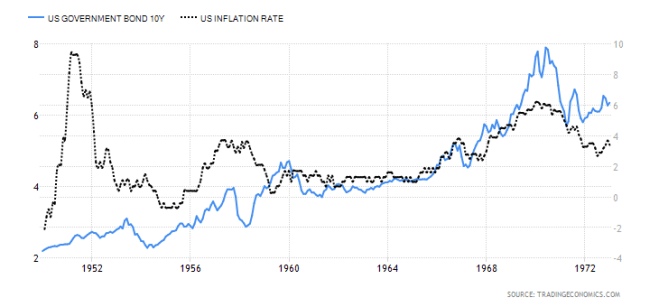
Source: Trading Economics
I believe that in order to protect the asset markets (by which I mean, principally, stocks and real estate) the Federal Reserve (charged as it is with the twin, but not mutually exclusive, objectives of full-employment and stable prices) may decide to focus on economic growth and domestic harmony at the expense of a modicum of, above target, inflation. When Fed Chairman, Martin, talked of removing the punch bowl back in 1955, inflation had already subsided from nearly 10% – mild deflation was actually working its way through the US economy.
Central Bank balance sheets
Today there are several profound differences with the 1950’s, not least, the percentage of the US bond market which is held by Central Banks. As the chart below shows, Central Banks balance sheet expansion continues, at least, at the global level: it now stands at $14.6trn:-
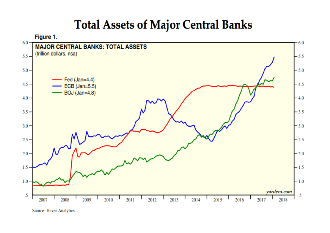
Source: Haver Analytics, Yardeni Research
Like the Fed, the BoJ and ECB have been purchasing their own obligations, by contrast the PBoC’s modus operandi is rather different. The largest holders of US public debt (principally T-Bonds and T-Bills) are foreign institutions. Here is the breakdown as at the end of 2016:-
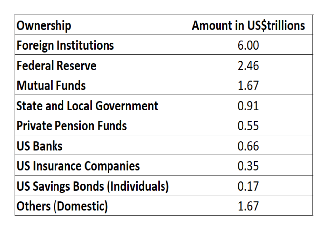
Source: US Treasury
As of November 2017 China has the largest holding of US debt – US$1.2trn (a combination of the PBoC and state owned enterprises), followed by Japan -US$1.1trn, made up of both private and public pension fund investments. It is not in the interests of China or Japan to allow a collapse in the US bond market, nor is it in the interests of the US government; their ability borrow at historically low yields during the last few years has not encouraged the national debt to decline, nor the budget to balance.
Bond Markets in Europe and Japan
The BoJ continues its policy of yield curve control – targeting a 10bp yield on 10yr JGBs. Its balance sheet now stands at US$4.8trn, slightly behind the ECB and PBoC which are vying for supremacy mustering US$5.5trn apiece. Thanks to the persistence of the BoJ, JGB yields have remained between zero and 10bp since November 2016. As of December 2017 the BoJ owned 46.2% of the total issuance. The ECB, by contrast, holds a mere 19.2% of Eurozone debt.
Another feature of the Eurozone bond market, during the last couple of years, has been the continued convergence in yields between the core and periphery. The chart below shows the evolution of the yield of 10yr Greek Government Bonds (LHS) and German Bunds (RHS). The spread is now at almost its lowest level ever. This may be a reflection of the improved performance of the Greek economy but it is more likely to be driven by fixed income investors continued quest for yield:-
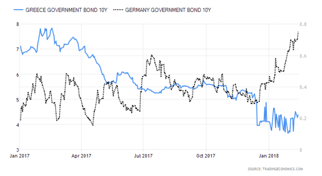
Source: Trading Economics
By contrast with Greece (where yields have fallen) and Germany (where they are on the rise) 10yr Italian BTPs and Spanish Bonos have remained broadly unchanged, whilst French OATs have seen yields rise in sympathy with Germany. Hopes of a Eurobond backed by the EU, to replace the obligations of peripheral nation states, whilst vehemently denied in official circles, appears to remain high.
Japanese and European economic growth, which has surprised on the upside over the past year, needs to prove itself more than purely cyclical. Both regions are reliant on the relative strength of US the economic recovery, together with the continued structural expansion of China and India. The jury is out on whether either Japan or the EU can achieve economic terminal velocity without strong export markets for their goods and services.
The one country in the European area which is behaving differently is the UK; yields have risen but, it stands apart from the rest of the Eurozone; UK Gilts dance to a different tune. Uncertainty about Brexit caused Sterling to decline, especially against the Euro, import prices rose in response, pushing inflation higher. 10yr Gilt yields bottomed in August 2016 at 50bp. Since then they have risen to 1.64% – this is still some distance from the highs of January 2014 when they tested 3.09%. 2yr Gilts are different matter, with a current yield of 71bp they are 63bp from their lows but just 22bp away from the 2014 high of 93bp.
Conclusions and Investment Opportunities
From a personal investment perspective, I have been out of the bond markets since 2013. My reasoning (which proved expensive) was that the real-yields on the majority of markets was already extremely negative and the notional yields were uncomfortably close to zero. Of course these markets went much, much further than I had anticipated. Now I am tempted by the idea of reallocating, despite yields being lower than they were when I exited previously. Inflation in the US is 2.1%, in the Euro Area it is 1.3% whilst in Japan it is still just 1%.
As a defensive investment one should look for short duration bonds, but in the US this brings the investor into conflict with the hawkish policy stance of the Fed; that is, what my friend Ben Hunt of Epsilon Theory dubs, the Inflation Narrative. For a contrary view this Kansas City Fed paper may be of interest – Has the Anchoring of Inflation Expectations Changed in the United States during the Past Decade?
In Japan yields are still too near the zero bound to be enticing. In Germany you need to need to go all the way out to 6yr maturity Bunds before you receive a positive yield. There is an alternative to consider – 2yr Gilts:-
Source: Trading Economics
UK inflation is running at 3% – that puts it well above the BoE target of 2%. Rate increases are anticipated. 2yr Gilt yields have recently followed the course steered by the US and Germany, taking out the highs last seen in December 2015, however, if (although I really mean when) a substantial stock market correction occurs, 2yr Gilt yields have the attraction of being near the top of their five year range – unlike 2yr Schatz which are nearer the bottom of theirs. 2yr Gilts will benefit from a slowdown in Europe and any uncertainty surrounding Brexit. The BoE will be caught between the need to quell inflation and the needs of the economy as a whole. 2yr Gilts also offer the best roll-down on the UK yield curve. The 1yr maturity yields 49bp, whilst the 3yr yields 83bp.
With inflation fears are on the rise, especially in the US and UK, 2yr Gilts make for an uncomfortable investment today, however, they are a serious contender as a safe place to hide, come the real stock market correction.

![]()
Macro Letter – No 90 – 02-02-2018
A warning knell from the housing market – inciting a riot?
As anyone who owns a house will tell you, all property markets are, ‘local.’ Location is key. Nonetheless, when looking for indicators of a change in sentiment with regard to asset prices in general, residential real estate lends support to equity bull markets. Whilst it usually follows the performance of the stock market, this time it may be a harbinger of austerity to come.
The most expensive real estate is to be found in areas of limited supply; as Mark Twain once quipped, when asked what asset one should invest in, he replied, ‘Buy land, they’re not making it anymore.’ Mega cities are a good example of this phenomenon. They are a sign of progress. As Ian Stewart of Deloittes put it in this week’s Monday Briefing – How distance survived the communication revolution:-
In 2014, for the first time, more of the world’s population, some 54%, lived in urban than rural areas. The UN forecasts this will rise to 66% by 2050. Businesses remain wedded to city locations. More of the UK’s top companies are headquartered in London than a generation ago. The lead that so-called mega cities, those with populations in excess of 10 million, such as Tokyo and Delhi, have over the rest of the country has increased.
Proximity matters, and for good reasons. Cities offer business a valuable shared pool of resources, particularly labour and infrastructure. Bringing large numbers of people and businesses together increase the chances of matching the right person with the right job. The scale of cities improves matching in other areas, from restaurants to education and the choice of a partner. Scale, in terms of the number of businesses, tend to stimulate competition and productivity. Nor has technology fulfilled its promise to work equally well everywhere. By and large, technology tends to work better in urban areas than the country.
Urbanisation facilitates learning and the diffusion of knowledge, two vital processes for the modern economy. Workers in cities can more easily change jobs without changing homes, enabling the transfer of ideas across businesses. On-line learning has supplemented, but shows few signs of usurping the classroom, lecture theatre or face to face contact. Despite the collapsing cost of communication, competition for entry to the best schools and universities has intensified in the last three decades.
For all the transformative effects of the communication revolution the lead that cities have over the rest of the country seems to be widening. The LSE reports that in the UK workers in urban areas earn 8% more than those elsewhere; in London the premium is 24%. Buoyant property prices in major cities underscore the gap.
The world’s mega-cities have seen the highest house price inflation but at the national level the momentum of house price increases has begun to slow as prices approach the 2008 highs once more. The chart below, care of the IMF, shows the strength of momentum still increasing in Q2 2017:-
Source: IMF
By Q3 2017 Global Property Guide analysis suggested a sea-change had begun:-
During the year to the third quarter of 2017:
House prices rose in 24 out of the 46 world’s housing markets which have so far published housing statistics, using inflation-adjusted figures.
The more upbeat nominal figures, more familiar to the public, showed house price rises in 38 countries, and declines in 8 countries.
Upwards price momentum is weakening.
Europe, Canada, Hong Kong, and Macau continue to experience strong price rises. But most of the Middle East, Latin America, New Zealand and some parts of Asia are experiencing either house price falls – or a sharp deceleration of house price rises.
The five strongest housing markets in our global house price survey for the third quarter of 2017 were: Iceland (+18.76%), Hong Kong (+13.14%), Macau (+10.53%), Canada (+9.69%), and Romania (+9.36%).
The biggest y-o-y house-price declines were in Egypt (-8.68%), Kiev, Ukraine (-6.81%), Russia (-6.69%), Mongolia (-5.7%), and Qatar (-2.85%).
Only 15 of the 46 markets analysed showed increased upward momentum. Hardly cause for concern, one might think; after all, during the nine year equity bull-market, stock momentum has waxed and waned. However, one market in particular (which, incidentally, is not covered by Global Property Guide analysis) has seen falling prices during the past quarter – Australia.
As the chart below shows, Australian house prices were among the fastest rising in Q2:-

Source: IMF
Sydney has been even more extreme:-

Source: Core Logic
On the basis that, what goes up must, inevitably, come back down, one could argue that a price correction is needed, however, unlike the stock market, house prices have a much stronger impact on the spending habits of the consumer.
The consumer is impacted by the cost of financing mortgage borrowing and their ability to remortgage, relies on a steady increase in the value of housing stock. Rising bond yields, led by the US, where 10yr yields have broken through 2.62% to the upside this week, are likely to be a cause for concern. In Australia, however, fixed rate deals (where they exist) tend to be only two to three years in duration. The remainder of mortgages are variable rate. 1yr Australian bond yields are higher – touching 1.78% this month – but they are still only 40bp off their August 2016 lows.
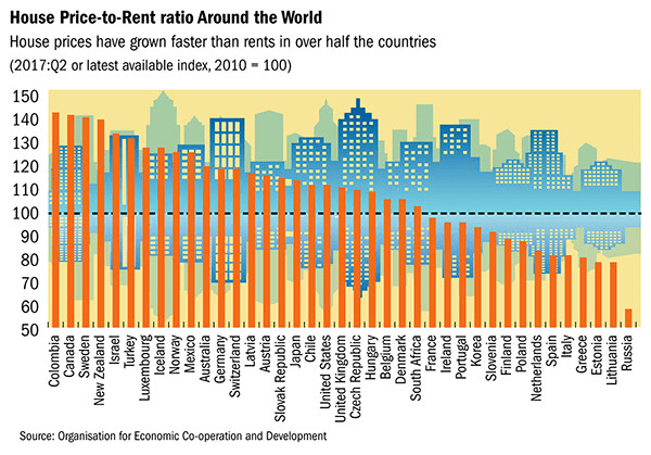
Housing affordability is also a function of price to income and price to rent:-
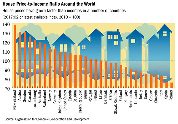
Source: IMF
Australia remains one of the most expensive places to buy a house, although their planning constrained neighbour New Zealand is even less affordable, which helps to explain the 1.24% fall in prices for Q3.
Source: IMF
Australia is not the most expensive market on a price to rent basis either, yet, despite relatively low interest rates (and rising commodity prices which have supported the currency) residential real estate prices have begun to decline. The table below shows the quarter on quarter and year on year price change for the five major cities as at 31st January:-
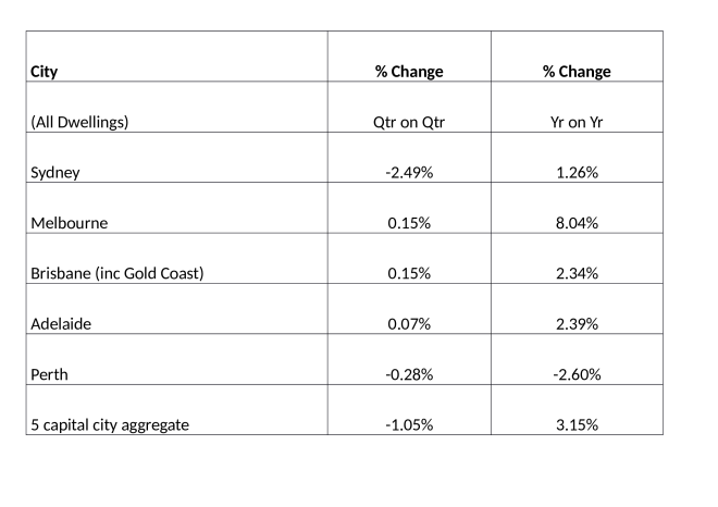
Source: CoreLogic
The residential real estate market in Perth has been depressed for several years, but Sydney (led by high-end central Sydney apartments) has begun to follow its western neighbour.
Conclusions and Investment Opportunities
The residential real estate market often reacts to a fall in the stock market with a lag. As commentators put it, ‘Main Street plays catch up with Wall Street.’ The Central Bank experiment with QE, however, makes housing more susceptible to, even, a small rise in interest rates. The price of Australian residential real estate is weakening but its commodity rich cousin, Canada, saw major cities price increases of 9.69% y/y in Q3 2017. The US market also remains buoyant, the S&P/Case-Shiller seasonally-adjusted national home price index rose by 3.83% over the same period: no sign of a Federal Reserve policy mistake so far.
As I said at the beginning of this article, all property investment is ‘local’, nonetheless, Australia, which has not suffered a recession for 26 years, might be a leading indicator. Contagion might seem unlikely, but it could incite a riot of risk-off sentiment to ripple around the globe.
![]()
Macro Letter – No 89 – 19-01-2018
The risk of a correction in the equity bull market
Since March 2009, the US stock market has been trending broadly higher. If we can continue to make new highs, or at least, not correct to the downside by more than 20%, until August of this year it will be the longest equity bull-market in US history.
The optimists continue to extrapolate from the unexpected strength of 2017 and predict another year of asset increases, but by many metrics the market is expensive and the risks of a significant correction are become more pronounced.
Equity volatility has been consistently low for the longest period in 60 years. Technical traders are, of course, long the market, but, due to the low level of the VIX, their stop-loss orders are unusually close the current market price. A small correction may trigger a violent flight to the safety of cash.
Meanwhile in Japan, after more than two decades of under-performance, the stock market has begun to play catch-up with its developed nation counterparts. Japanese stock valuation is not cheap, however, as the table below, which is sorted by the CAPE ratio, reveals:-

Source: Star Capital
Global economic growth surprised on the upside last year. For the first time since the great financial crisis, it appears that the Central Bankers experiment in balance sheet expansion has spilt over into the real-economy.
An alternative explanation is provided in this article – Is Stimulus Responsible for the Recent Improved Trends in the U.S. and Japan? – by Dent Research – here are some selected highlights:-
Since central banks began their B.S. back in 2001, when the Bank of Japan first began Quantitative Easing efforts, I’ve warned that it wouldn’t be enough… that none of them would be able to commit to the vast sums of money they’d ultimately need to prevent the Economic Winter Season – and its accompanying deflation – from rolling over us.
Demographics and numerous other cycles, in my studied opinion, would ultimately overwhelm central bank efforts…
Are such high levels of artificial stimulus more important than demographic trends in spending, workforce growth, and productivity, which clearly dominated in the real economy before QE? Is global stimulus finally taking hold and are we on the verge of 3% to 4% growth again?…Fundamentals should still mean something in our economy…
And my Generational Spending Wave (immigration-adjusted births on a 46-year lag), which predicted the unprecedented boom from 1983 to 2007, as well as Japan’s longer-term crash of the 1990s forward, does point to improving trends in 2016 and 2017 assuming the peak spending has edged to 47 up for the Gen-Xers.
The declining births of the Gen-X generation (1962 – 1975) caused the slowdown in growth from 2008 forward after the Baby Boom peaked in late 2007, right on cue. But there was a brief, sharp surge in Gen-X births in 1969 and 1970. Forty-seven years later, there was a bump… right in 2016/17…
Source: Dent Research
The next wave down bottoms between 2020 and 2022 and doesn’t turn up strongly until 2025. The worst year of demographic decline should be 2019.
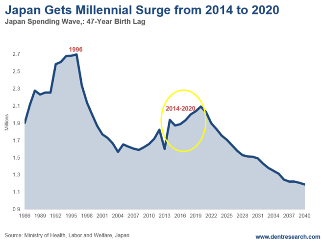
Japan has had a similar, albeit larger, surge in demographics against a longer-term downtrend.
Its Millennial generation brought an end to its demographic decline in spending in 2003. But the trends didn’t turn up more strongly until 2014, and now that they have, it’ll only last through 2020 before turning down dramatically again for decades…
Source: Dent Research
Prime Minister Abe is being credited with turning around Japan with his extreme acceleration in QE and his “three arrows” back in 2013. All that certainly would have an impact, but I don’t believe that’s what is most responsible for the improving trends. Rather, demographics is the key here as well, and this blip Japan is enjoying won’t last for more than three years!..
If demographics does still matter more, we should start to feel the power of demographics in the U.S. as we move into 2018.
If our economy starts to weaken for no obvious reason, and despite the new tax reform free lunch, then we will know that demographics still matter…
A different view of the risks facing equity investors in 2018 is provided by Louis-Vincent Gave of Gavekal, care of Mauldin Economics – Questions for the Coming Year – he begins with Bitcoin:–
…a recent Bloomberg article noted that 40% of bitcoins are owned by around 1,000 or so individuals who mostly reside in the greater San Francisco Bay area (the early adopters). Sitting in Asia, it feels as if at least another 40% must be Chinese investors (looking to skirt capital controls), and Korean and Japanese momentum traders. After all, the general rule of thumb in Asia is that when things go up, investors should buy more.
Asia’s fondness for chasing rising asset prices means that it tends to have the best bubbles. To this day, nothing has topped the late 1980s Taiwanese bubble, although perhaps, left to its own devices, the bitcoin bubble may take on a truly Asian flavor and outstrip them all? Already in Japan, some 1mn individuals are thought to day-trade bitcoins, while 300,000 shops reportedly have the capacity to accept them for payment. In South Korea, which accounts for about 20% of daily volume in bitcoin and has three of the largest exchanges, bitcoin futures have now been banned. For its part, Korea’s justice ministry is considering legislation that would ban payments in bitcoin all together.
At the very least, it sounds like the Bank of Korea’s recent 25bp interest rate hike was not enough to tame Korean animal spirits. So will the unfolding bitcoin bubble trigger a change of policy from the BoK and, much more importantly, from the Bank of Japan in 2018?
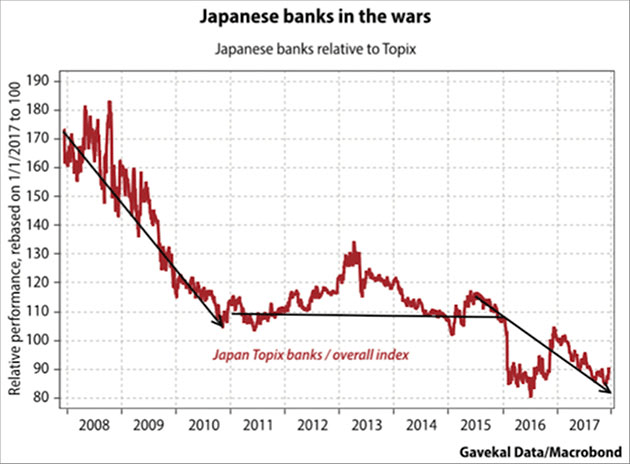
Mr Gave then goes on to highlight the risks he perceives as under-priced for 2018, starting with the Bank of Japan:-
In recent years, the BoJ has been the most aggressive central bank, causing government bond yields to stay anchored close to zero across the curve, while acting as a “buyer of last resort” for equities by scooping up roughly three quarters of Japanese ETF shares. Yet, while equities have loved this intervention, Japanese insurers and banks have had a tougher time. Indeed, a chorus of voices is now calling for the BoJ to let the long end of the yield curve rise, if only to stop regional banks hitting the wall.
Source: Gavekal/Macrobond
So could the BoJ tighten monetary policy in 2018? This may be more of an open question than the market assumes. Indeed, the “short yen” trade is popular on the premise that the BoJ will be the last central bank to stop quantitative easing. But what if this isn’t the case?
The author then switches to highlight the pros and cons. It’s the cons which interest me:-
I doubt the risk of BoJ tightening is very great – they made the mistake of tightening too early on previous occasions to their cost. In any case, raising short-term rates will more likely lead to a yield curve inversion making the banks position even worse. The trade surplus remains small and the Yen remains remarkably strong by long-term comparisons.
This brings us to the author’s next key risk (which, given Gavekal’s deflationist credentials, is all the more remarkable) that inflation will surprise on the upside:-
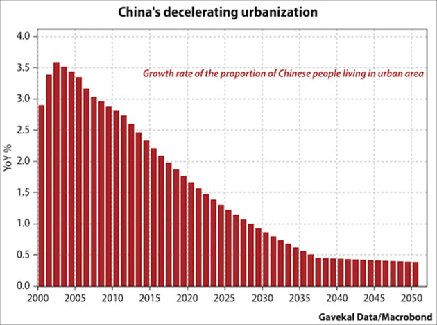
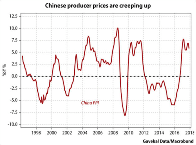
Migrant workers are no longer pouring into Chinese cities. With about 60% of China’s citizens now living in urban areas, urbanization growth was always bound to slow. Combine that with China’s aging population and the fact that a rising share of rural residents are over 40 (and so less likely to move), and it seems clear that the deflationary pressure arising from China’s urban migration is set to abate.
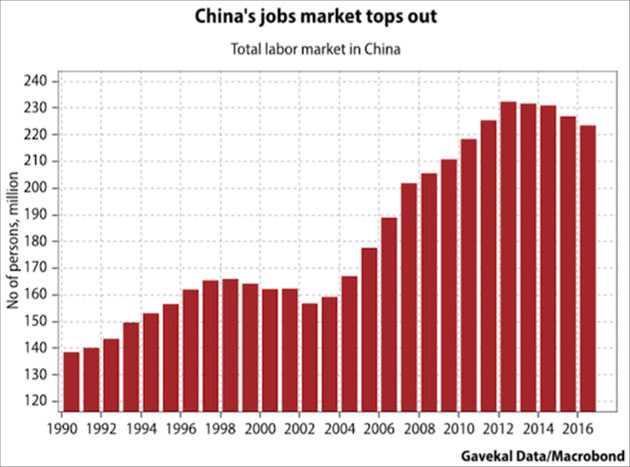
Reduced excess capacity in China is real: from restrictions on coal mines, to the shuttering of shipyards and steel mills, Xi Jinping’s supply-side reforms have bitten. At the very least, some 10mn industrial workers have lost their jobs since Xi’s took office (note: there are roughly 12.5m manufacturing workers in the US today!).
Source: Gavekal/Macrobond
Source: Gavekal/Macrobond
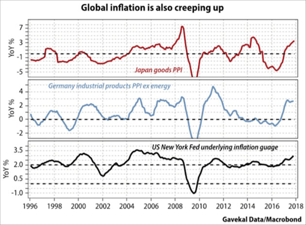
To say that most “excess investment” China unleashed with its 2015-16 monetary and regulatory policy stimulus went into domestic real estate is only a mild exaggeration. Very little went into manufacturing capacity, which may explain why the price of goods exports from China has, after a five-year period, shown signs of breaking out on the upside. Another part of the puzzle is that Chinese producer prices are also rising, so it is perhaps not surprising that export prices have followed suit. The point is, if China’s export prices do rise in a concerted manner, it will happen when inflation data in the likes of Japan, the US and Germany are moving northward…
Source: Gavekal/Macrobond
Source: Gavekal/Macrobond
…The real reason I worry about inflation today is that inflation has the potential to seriously disrupt the happy policy status quo that has underpinned markets since the February 2016 Shanghai G20 meeting.
Mr Gave recalls the Plaza and Louvre accords of 1985 and ‘87, reminding us that the subsequent rise in bond yields in the summer of 1987 brought the 1980’s stock market bubble to an abrupt halt.
…for the past 18 months, I have espoused the idea that, after a big rise in foreign exchange uncertainty – triggered mostly by China with its summer 2015 devaluation, but also by Japan and its talk of helicopter money, and by the violent devaluation of the euro that followed the eurozone crisis – the big financial powers acted to calm foreign exchange markets after the February 2016 meeting of the G20 in Shanghai.
…as in the post-Louvre accord quarters, risk assets have broadly rallied hard. It’s all felt wonderful, if not quite as care-free as the mid-1980s. And as long as we live under this Shanghai accord, perhaps we should not look a gift horse in the mouth and continue to pile on risk?
This brings me to the nagging worry of “what if the Shanghai agreement comes to a brutal end as in 1987?”
Again the author is at pains to point out that, for the bubble to burst an inflation hawk is required. A Central Bank needs to assume the mantle of the Bundesbank of yesteryear. He anticipates it will be the PBoC:-
…(let’s face it: the last two upswings in global growth, namely 2009 and 2016, were triggered by China more than the US). Indeed, the People’s Bank of China may well be the new Bundesbank for the simple reason that most technocrats roaming the halls of power in Beijing were brought up in the Marxist church. And the first tenet of the Marxist faith is that historical events are shaped by economic forces, with inflation being the most powerful of these. From Marx’s perspective, Louis XVI would have kept his head, and his throne, had it not been for rapid food price inflation the years that preceded the French Revolution. And for a Chinese technocrat, the Tiananmen uprising of 1989 only happened because food price inflation was running at above 20%. For this reason, the one central bank that can be counted on to be decently hawkish against rising inflation, or at least more hawkish then others, is the PBoC.
Mr Gave foresees inflation delivering a potential a triple punch; lower valuations for asset markets, followed by tighter monetary and fiscal policy in China, which will then trigger an incendiary end to the unofficial ‘Shanghai Agreement’. In 1987 it was German Bunds which offered the safe haven, short-dated RMB bonds may be their counterpart in the ensuing crisis.
This brings our author to the vexed question of the way in which the Federal Reserve will respond. The consensus view is that it will be business as usual after the handover from Yellen to Powell, but what if it’s not?
…imagine a parallel universe, such that within a few months of being sworn in, Powell faces a US economy where:-
Unemployment is close to record lows and government debt stands at record highs, yet the federal government embarks on an oddly timed fiscal stimulus through across-the-board tax cuts.
Shortly afterwards, the government further compounds this stimulus with a large infrastructure spending bill.
As inflationary pressures intensify around the world (partly due to this US stimulus), the PBoC, BoJ and ECB adopt more hawkish positions than have been discounted by the market.
The unexpected tightening by non-US central banks leads other currencies higher, and the US dollar lower.
The combination of low interest rates, expansionary fiscal policy and a weaker dollar causes the US economy to properly overheat, forcing the Fed to tighten more aggressively than expected.
Gave proposes four scenarios:-
…In the first two scenarios, the US dollar will likely rise, either a little, or a lot. In the latter two scenarios, the dollar would likely be very weak. So if this analysis is broadly correct, shorting the dollar should be a good “tail risk” policy. If the global economy rolls over and/or a shock appears, the dollar will weaken. And if global nominal GDP growth accelerates further from here, the dollar will also likely weaken. Being long the dollar is a bet that the current investment environment is sustained.
The final risk which the author assesses is the impact of rising oil prices. It has often been said that a rise in the price of oil is a tax on consumption. Louis-Vincent Gave gives us an excellent worked example:-
…assume that the world consumes 100mn barrels of oil a day…Then further assume that about 100 days of inventory is kept “in the system”… if the price of oil is US$60/bbl, then oil inventories will immobilize around US$600bn in working capital. But if the price drops to US$40/bbl, then the working capital needs of the broader energy industry drops by US$200bn.
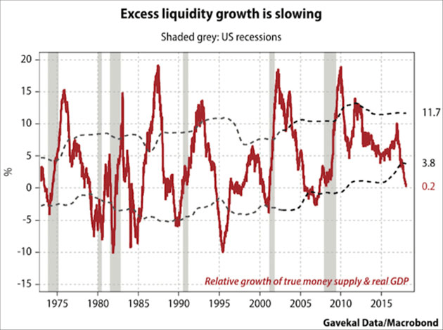
The chart below shows the decline in true money supply:-
Source: Gavekal/Macrobond
The Baker Hughes US oil rig count jumped last week from 742 to 752 but it is still below the highs of last August and far below the 1609 count of October 2014. The break-even oil price for US producers is shown in the chart below:-
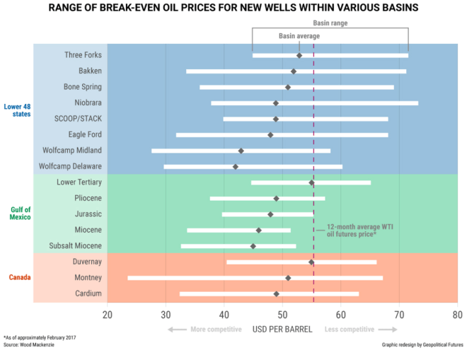
Source: Geopolitical Futures
If the global price of oil were entirely dependent on the marginal US producer, there would be little need to worry but the World Rig Count has also been slow to respond and Non-US producers are unable to bring additional rigs on-line as quickly, in response to price rises, as their US counterparts:-
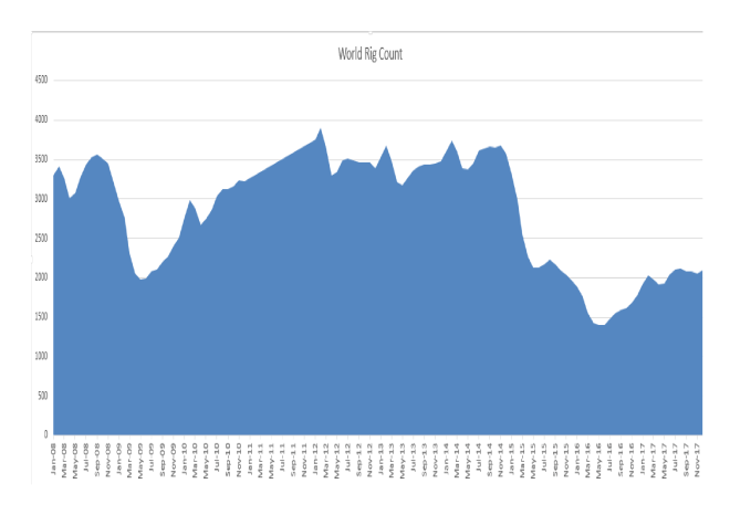
Source: Baker Hughes
An additional concern for the oil price is the lack of capital investment over recent years. Many of the recent fracking wells in the US are depleting more rapidly. This once dynamic sector may have become less capable of reacting to the recent price increase. I’m not convinced, but a structurally higher oil price is a risk to consider.
Conclusion and investment opportunities
As Keynes famously said, ‘The markets can remain irrational longer than I can remain solvent.’ Global equity markets have commenced the year with gusto, but, after the second longest bull-market in history, it makes sense to be cautious. Growth stocks and Index tracking funds were the poster children of 2017. This year a more defensive approach is warranted, if only on the basis that lightening seldom strikes twice in the same place. Inflation may not become broad-based but industrial metals prices and freight rates have been rising since 2016. Oil has now broken out on the upside, monetary tightening and balance sheet reduction as the watch words of the leading Central Banks – even if most have failed to act thus far – these actions compel one to tread carefully.
A traditional value-based approach to stocks should be adopted. Japan may continue to play catch up with its developed nation peers – the demographic up-tick, mentioned by Dent research, suggests that the recent breakout may be sustained. The Federal Reserve is leading the reversal of the QE experiment, so the US stock market is probably most vulnerable, but the high correlations between global stock markets means that, if the US stock market catches a cold, the rest of the world is unlikely to avoid infection.
High-yield bonds have been the alternative to stocks for investors seeking income for several years. Direct lending and Private Debt funds have raised a record amount of assets in the past couple of years. If the stock market declines, credit spreads will widen and liquidity will diminish. In the US, short dated government bond yields have been rising steadily and yield curves have been flattening, nonetheless, high grade floating rate notes and T-Bills may be the only place to hide, especially if inflation should rise even as stocks collapse.
There will be a major stock market correction at some point, there always is. When, is still in doubt, but we are nearer the end of the bull-market than the beginning. Technical analysis suggests that one must remain long, but in the current low volatility environment it makes sense to use a trailing stop-loss to manage the potential downside risk. Many traders are adopting a similar strategy and the exit will be crowded when you reach the door. Expect slippage on your stop-loss, it’s a price worth paying to capture the second longest bull-market in history.
With best wishes to all my readers for the holiday season.
Col

![]()
Macro Letter – No 87 – 24-11-2017
Bull market breather or beginning of the end?
Stock markets have finally taken a breather over the last fortnight, although the S&P 500 has made a new, marginal, high this week. Cause for concern has been growing, however, in the bond markets where 2yr US bonds have seen a stately rise in yields. The chart below shows the constant maturity 2yr (blue) and 10yr (red) Treasury Note since January 2016:-
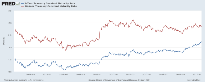
Source: Federal Reserve Bank of St Louis
The flattening of the yield curve has led many commentators to predict an imminent recession. Looking beyond the Treasury market, however, the picture looks rather different. The next chart shows the spread of Moody’s Aaa and Baa corporate bond yields over 10yr Treasuries:-
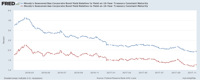
Source: Federal Reserve Bank of St Louis, Moody’s
Spreads have continued to tighten despite the rise in short-term rates. In absolute terms their yields have risen since the beginning of November but this is from record lows. The High Yield Index (purple) shows this more clearly in the chart below:-
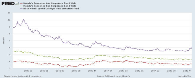
Source: Federal Reserve Bank of St Louis, Moody’s, Merrill Lynch
A similar spike in yields was evident in November 2016. I believe, in both cases, this may be due to position squaring ahead of the Thanksgiving holidays and the inevitable decline in liquidity typical of December trading. There are differences between 2016 and this year, however, the strength of the high-yield bond bull market was even more pronounced last year but Treasury 2yr Note yields had only bottomed in July, it was too soon to predict a bear market and the Federal Reserve were assuming a less hawkish stance. This year the rising yield of 2yr Notes has been more clear-cut, which may encourage further liquidation over the next few weeks, however, with economic growth forecasts being revised higher, rating agencies have upgraded many corporate issuers. Credit quality appears to be improving even as official interest rates rise and the US Treasury yield curve flattens.
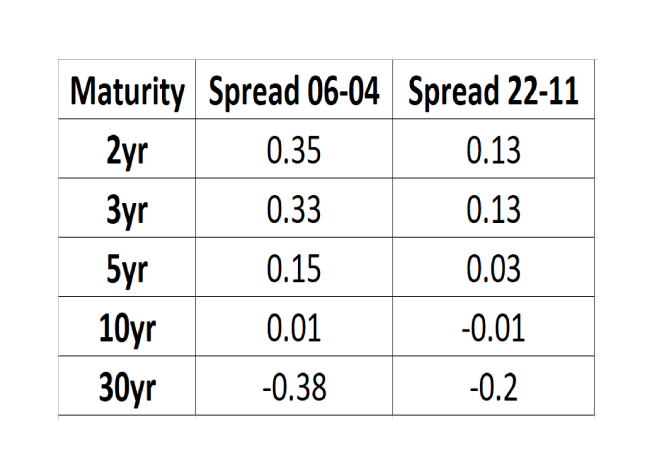
In Macro Letter – No 74 – 07-04-2017 – US 30yr Swaps have yielded less than Treasuries since 2008 – does it matter? I examined the evolution of the interest rate swap (IRS) market over the last few years. I’ve updated the table showing the spread between T-Bonds and IRS across maturities:-
Source: Investing.com, The Financials.com
At the 10yr maturity the differential between IRS and Treasuries has barely changed, but elsewhere along the yield curve, compression has occurred, with maturities of less than 10 years narrowing whilst the 30yr IRS negative spread has also compressed, from nearly 40 basis points below Treasuries to just 20 basis points today. In other words, the flattening of the IRS yield curve has been much less dramatic than that of the Treasury yield curve – 2yr/30yr IRS has flattening by 36 basis points since early April, whilst 2yr/30yr Treasuries has flattened by 76 basis points over the same period.
It is important to note that while the IRS curve has been flattening less rapidly it still remains flatter than the Treasury curve (IRS 2’s/30’s = 0.67% Treasury 2’s/30’s = 1.00%). One interpretation is that the IRS curve has been reflecting the weakness of economic growth for a protracted period while the Treasury curve has been artificially steepened by the zero interest rate policy of the Federal Reserve.
Conclusions and Investment Opportunities
Many commentators have pointed to the flattening of the Treasury yield curve as evidence of an imminent recession, the IRS curve, however, has flattened by far less, partly because it was flatter to begin with. Perhaps the IRS curve reflects the lower trend growth of the US economy since the great recession. An alternative explanation is that it is a response to investment flows and changes in the regulatory regime (as discussed in Macro letter – No74). One thing appears clear, the combination of unconventional central bank policies, such as quantitative easing (QE) and the relentless, investor ‘quest for yield’ over the last decade has distorted the normal signalling power of the bond market.
Economic growth forecasts continue to be revised upwards, prompting central banks to begin reducing the quantum of QE in aggregate. Corporate earnings have generally been rising, credit quality improving. We are nearer the end of the bull market than the beginning, but it is much too soon to predict the end, on the basis of the recent rise in corporate bond yields.

An overview on financial and commodity markets for last month
TRANSCRIPT
Linear Talk – Macro Roundup – 17th October 2017
Financial market liquidity returned after the thin trading which is typical of August. Stocks and crude oil were higher and the US$ made new lows. But a number of individual markets are noteworthy.
Stocks
The S&P 500 and the Nasdaq 100 both achieved record highs last month (2519 and 6013 respectively). In the case of the S&P this is the sixth straight month of higher closes, even as flow of funds data indicates a rotation into international equity markets.
The Eurostoxx 50 took comfort from the US move, closing the month at its high (3595) yet it remains below the level seen in May (3667) tempered, no doubt, by the strength of the Euro.
German Elections, showing a rise in support for the nationalist AfD and the prospect of an unconstitutional independence referendum in Catalonia, made little impression on European equity markets. The DAX also closed at its high (12,829) but, it too, failed to breach its record for the year of 12,952 witnessed in June.
Spain’s IBEX 35 was more susceptible to the political fracas in its north eastern region, but with other markets rising, it traded in a narrow range, closing at 10,382 on the eve of the referendum, having actually begun the month lower, at 10,329.
The Japanese Nikkei 225 remained well supported but still failed to breach resistance, making a high of 20,481 on the 18th. It has since taken out the old high. This move is supported by stronger economic data and revised growth forecasts from the IMF (released after month end).
Currencies
Currency markets have been dominated by the weakness of the US$ since January. Last month was no exception. The US$ Index made a new low for the year at 90.99 on the 8th but swiftly recovered, testing 93.80 on the 28th. Technically, this low breached the 50% correction of the move from the May 2014 low of 78.93 to the January 2017 high of 103.81. Further support should be found at 88.43 (61.8% retracement) but price action in EURUSD suggests that we may be about to see a reversal of trend.
EURUSD made a new high for the year at 1.2094 on the 8th, amid rumours of ECB intervention. By month end it had weakened, testing 1.1721 on 28th. This has created a technical ‘outside month’ – a higher high and lower low than the previous month. For this pattern to be negated EURUSD must trade back above 1.2094.
EURGBP also witnessed a sharp correction the initial Sterling weakness which was a feature of the summer months. From an opening high of 0.9235 Sterling steadily strengthened to close at 0.8819. Nonetheless, Sterling remains weaker against the Euro than in 2013, amid fears of a ‘No Deal’ on Brexit and continued expectations of an economic slowdown due to the political uncertainty of that exit.
Bonds
US 10yr Treasuries made a new low yield for the year at 2.02% on 8th. This is the lowest yield since the November 2016 election, however, expectations of another rate hike and the announcement of a planned balance sheet reduction schedule from the Federal Reserve, tempered the enthusiasm of the bond bulls. By month end, yields had risen 32bp to close at 2.34%.
In Germany 10yr Bund yields followed a similar trajectory to the US. Making a low of 0.29% on 8th only to increase to 0.52% by 28th. Increasing support for the AfD in the election, was largely ignored.
A trade which has been evident during 2017 has been the convergence of core and peripheral European bond yields. The larger markets such as Italy and Spain have mostly mirrored the price action of Bunds, their spreads widening moderately in the process. The yield on Portuguese and Greek bonds, by contrast has declined substantially, although there was a slight widening during September. Greek 10yr bonds, which yielded 8.05% at the end of January, closed the month at 5.67%. Over the same period 10yr Bunds have seen yields rise by 6bp.
UK 10yr Gilts also had an interesting month. From a low of 0.97% on 7th they reached 1.42% on 28th amid concerns about Brexit, the recent weakness in Sterling (which appears to have been temporarily reversed) and expectations that Bank of England Governor, Carney, will raise UK interest rates for the first time since June 2007. It is tempting to conceive that either the rise in Gilt yields or the recent rise in Sterling is wrong, these trends might both continue. Long Sterling and Short Gilts might be a trade worthy of consideration.
Commodities
Perhaps anticipating the IMF – World Economic Outlook – October update, in which they revised their world growth forecasts for 2017 and 2018 upwards, the price of Brent Crude rallied to a new high for the year on 26th – $59.49/bbl. Aside from expectations of an increase in demand, the effect of two hurricanes in the US and a strengthening of resolve on the part of OPEC to limit production, may be contribution factors.
Copper also hit a new high for the year, trading $3.16/lb on 4th. Technically, however, it made an outside month (higher high and lower low than August) a break above $3.16/lb will negate this bearish formation. I remain concerned that Chinese growth during 2017 has been front-loaded. Industrial metal markets may well consolidate, with a vengeance, before deciding whether increased demand is seasonal or structural.


Macro Letter – No 81 – 21-07-2017
Has Bitcoin come of age?
Bitcoin (BTC) came into existence in January 2009. It was not the first ‘cryptocurrecny’ and there are now an estimated 950 competitors, with new ICO’s ‘Initial Coin Offerings’ appearing almost daily.
BTC’s closest rival in terms of coins in circulation is Ethereum (ETH). The chart below shows how these currencies % of total market capitalisations has waxed and waned:-
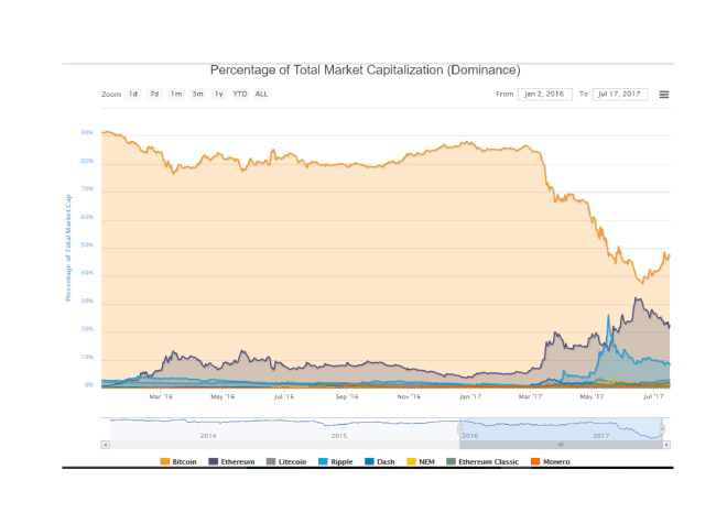
Source: coinmarketcap.com
I want to concentrate on BTC since it remains the market leader with a total circulation of $33bln (reference BTCUSD 2000) whilst the outstanding issuance of its nearest rival ETH is $16bln.
Below is a four month chart of BTCUSD, its price has fallen by almost one third in just over a month:-
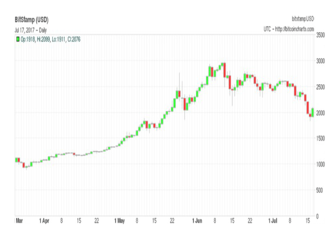
Source: Bitcoincharts.com
The recent price action needs to be seen in a broader context. The price has increased from less than BTCUSD 1000 in late March. On April 1st the Japanese authorities officially recognised BTC for the first time: perhaps, this was the catalyst for its spectacular rise.
The subsequent precipitous decline in price may be related to a proposed software change to be introduced on 21st July, known as SegWit, which is discussed in Cryptocurrency Value: Growing Pains or Something More? By Ryan Shea – here’s the rub:-
SegWit2x software, which introduces SegWit while doubling the block size to 2MB, will be released on July 21. More than 80% of the network hash rate has agreed to run the SegWit2x code, which suggests that the solution to increasing bitcoin’s scalability will be enacted smoothly.
However, it is also possible that the hard fork required to increase the block size leads to a bifurcation of bitcoin into two separate currencies –something that would unquestionably trigger a sharp price correction by undermining the bitcoin brand. (The key date by which a split can be avoided is August 1 when BIP148 activates – this represents the last opportunity for miners to accept Segwit2x and thereby avoid a chain split resulting in the creation of two parallel bitcoins.)
There have been victories and defeats during the evolution of BTC, as it has evolved from an obscure novelty to a serious contender for investors seeking a store of value. The price volatility reflects these uncertainties but it is not demonstrably different from the volatility seen in several commodity markets.
Financial deepening
For a security, commodity or a currency to gain credence, among financial market operators, it needs to offer a store of value, liquidity and convertibility. If can achieve these attributes it should have collateral value, by which I mean, BTC should be capable of being borrowed or lent. This is already happening. Some cryptocurrency exchanges are offering a rate of interest on term deposits and others offer the opportunity for holders of BTC to lend their currency to traders who wish to borrow it, primarily to sell the currency short. Whilst there is not really a ‘risk-free rate’ for BTC an interest rate term structure is beginning to emerge as the table below, derived from a number of exchanges, shows:-
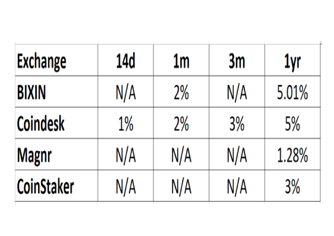
There may well be other exchanges offering a variety of differing interest rates. but this, I hope, provides a snapshot of the current environment.
The other aspect of financial deepening which will help BTC come of age is the development of a derivatives market. I believe the arrival of exchanges for BTC futures and options is a very positive signal.
The futures exchanges include Okex, CryptoFacilties, BitMEX, BitVC, Coinut and Deribit which also offers options – there may be several others. Today (Monday 17th July) I have taken some snap shots of the futures and options pricing from Deribit.
With the BTCUSD spot price at 2027, the July future (expiration 28th July) traded at a discount of $12 ($2015) this is known in futures parlance as a backwardation. The September contract (expiration 29th September) was, by contrast, trading at a premium, or contango ($2070). Because of high demand from leveraged traders to borrow US$ to buy BTC the forward/futures price of BTCUSD normally trades at a premium (contango). The current environment is unusual, the forced liquidation which has fuelled the recent collapse in the price has led to, what is likely to be a temporary, backwardation. John Jansen – CEO of Deribit – explained the anomaly during a recent interview:-
…when the market is bullish, US$ interest rates spike up and BTC interest rates go down: uses want to borrow USD to buy BTC. In other words, short USD and go long BTC…there is an overall tendency for speculators to be long, therefore, the arbitrage traders are short BTC (lending out their USD) or short the future. USD interest rates are, therefore, normally higher than BTC rates which explains the contango in BTCUSD futures prices.
…on BTC platforms, annualized interest rates on US$ are on average maybe 20%…which would imply that the future should trade at a 20% annualized contango. Arbitrage traders take the other side of the trade…but get paid for their trouble.
Over time I expect the BTC market to become more efficient and the natural relationship for BTC futures should (other things equal) eventually become a small backwardation, reflecting the 1.5% differential between lower US$ and higher BTC interest rates. There are a number of arbitrage opportunities for those who want to dig deeper, but remember credit risk, both in terms of counterparties and exchanges, together with risks surrounding convertibility are nuanced. It may not be the free-lunch you perceive it to be.
This brings me to the BTC option market. The prices in the table below are again from Deribit:-
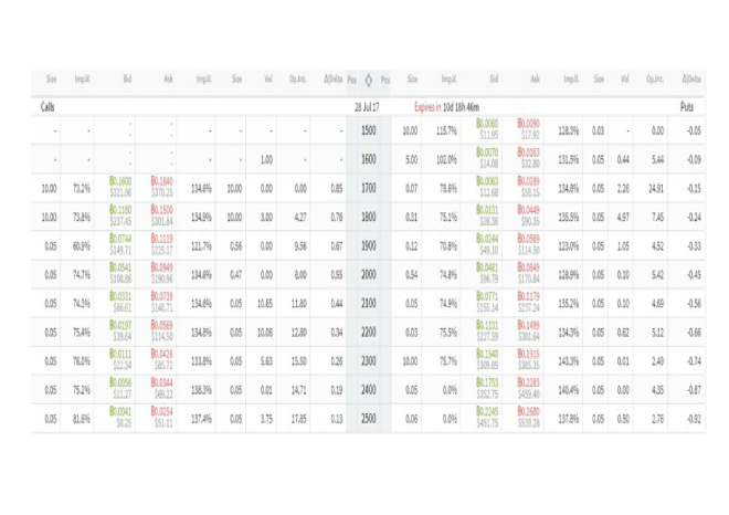
Source: Deribit
I regret the resolution this table is less than I’d like but it shows some important features. Firstly, implied volatility is trading at a substantial premium to historic volatility. The chart below shows the evolution of historic volatility and the BTC price over the last three months:-
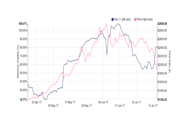
Source: Deribit
The July option series expires on 28th but the mid-market implied volatility for the September 29th expiration is not significantly lower – implied call volatility stands at 97%, for puts it is 85%. At this stage in the development of the BTC options market, I suspect the majority of the buyers are speculative traders rather than desperate hedgers, but option market-makers are wise to build in a margin of safety given the tendency of the underlying market price to gap lower or higher: delta and gamma hedging is challenging with these price swings. The bid/offer spreads on the options are also wide, another reflection of the nascent nature of the marketplace.
A final measure of immaturity – or perhaps I should say, opportunity – which the option market reveals, may be found in the shape of the volatility surface. The chart below is extrapolated from the mid-market implied volatilities in the table above:-
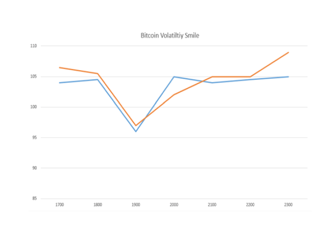
Source: Deribit
In a liquid options market one would normally expect the lowest implied volatility to be at-the-money – around the $2000 strike price. In the chart above the nadir of volatility is around the $1900 strike, a level breached briefly last weekend.
Conclusions and investment opportunities
Cryptocurrencies have captured the imagination of many new participants, from geeks to gold bugs, but, as BTC achieves greater legitimacy, the market will deepen and mature. The adoption of scalable technology to deal with the exponential increases in trading volume is a part of this process. The acceptance of distributed ledger technology across other parts of the financial services sector will also be supportive.
From a technical perspective the price of BTC has corrected by around 50% – since March it has risen from under $1000 to $3000 and is now back around $2000 (Monday 17th July). In absolute terms it has fallen by just over one third. This is a healthy price correction, typical of the price action witnessed from time to time in more liquid and established commodity markets: US Natural Gas springs to mind.
As an investment, the argument for holding BTC is more tenuous. It is a currency with no government or central bank to underwrite its value, however, the expansion of the BTC monetary base is strictly controlled, making it more like a hard currency, such as we had during the Bretton Woods era, as opposed to the endlessly debased fiat currencies we are inveigled to consider of value today.
Currencies have no implicit yield but BTCUSD currently offers a theoretical positive carry of around 1.5%. As mentioned above, this relationship is currently distorted by the demand to borrow US$ to buy BTC by leveraged traders. Any investment in an asset which has no earnings and pays no dividend/coupon/interest must by its nature be a trading asset. However, strategies such as high frequency, robotic, liquidity provision and long term, trend following, are among a number of exciting trading opportunities for the active BTC operator.
The fundamentals driving BTC investment revolve around: investor distrust in fiat currencies, loathing of government intervention in asset markets and belief in the tenability of cryptocurrencies as a lasting store of value both from a technical and regulatory perspective. These fundamental drivers of valuation have, in the past and will in the future, cause sudden repricing’s. Outside of these seismic episodes, the price of BTC will be driven by capital flows. With liquid currency pairs like EURUSD, the economic fundamentals of both geographic regions are of equal importance. This is unlikely to be the case for BTC for the foreseeable future. BTC volatility eclipses the majority of its developed currency peers; its true value, whilst it is becoming gradually clearer, will remain ephemeral for some time to come.