Podcast with Max Gottlich – 22-01-2021
A 30 minute podcast interview covering stocks, crypto assets and thoughts about monetary and fiscal policy for the year ahead.

Podcast with Max Gottlich – 22-01-2021
A 30 minute podcast interview covering stocks, crypto assets and thoughts about monetary and fiscal policy for the year ahead.

With another $1.9trln of US fiscal relief set to be voted through, attention is likely to switch back to Europe. This article from August 2020 seems relevant to the debate.

Macro Letter – No 135 – 31-12-2020
US Stocks in 2020 and the prospects for 2021
The US stock market is making all-time highs (as at 29th December). It has been a torrid year. The 35% shakeout in the S&P 500, seen in March, turned out to be the best buying opportunity in several years. The market recovered, despite the human tragedy of the pandemic, fuelled by a cocktail of monetary and fiscal stimulus. When news of the rollout of a vaccine finally arrived in November, apart from a renewed rise in the broad market, there was an abrupt rotation from Growth to Value stocks. Value ETFs saw $8bln of inflows during November, there was also a weakening of the US$ and resurgence of European stocks. This was not necessarily the sea-change anticipated by many commentators, by the start of December technology stocks had resumed their upward march.
November marked some market records. It was the strongest month for the Dow since 1987 and the best November since 1928. European stocks rose 14%, their best monthly gain since April 2009 – that headline grabbing performance needs to be qualified, European indices remain lower than they began the year. For Japan’s Nikkei 255, the 15% rise marked its most positive monthly performance since January 1994, whilst for Global Equities, which returned 12.7%, it was the best month since January 1975.
Other financial and commodity markets also reacted to the vaccine news. OPEC agreed supply reductions helping oil prices higher, although Brent Crude remains around 22% lower than it started the year. The larger issue for stock markets is the logistical challenge of delivering the vaccination, this will test the healthcare systems of every country on the planet. The OPEC deal may fray at the edges, demand for oil could arrive later than anticipated. Nonetheless, risk assets have generally benefitted whilst both gold and silver have remained range-bound. After their strong rally in the summer, precious metals seem to have had their time in the sun. Interestingly, Bitcoin appears to be dancing to a different tune. Over the past two months it has risen more than 120%, breaking the previous highs of December 2017 to breach $28,000.
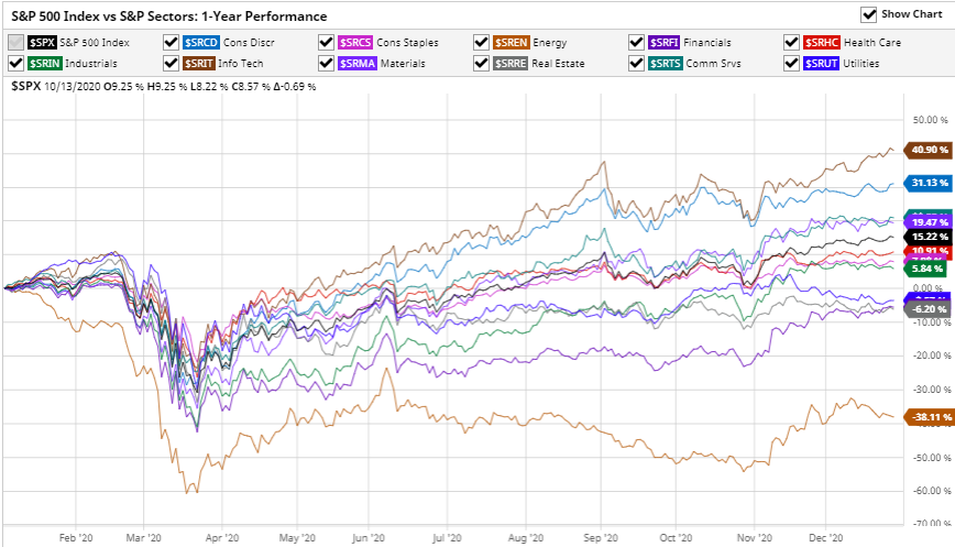
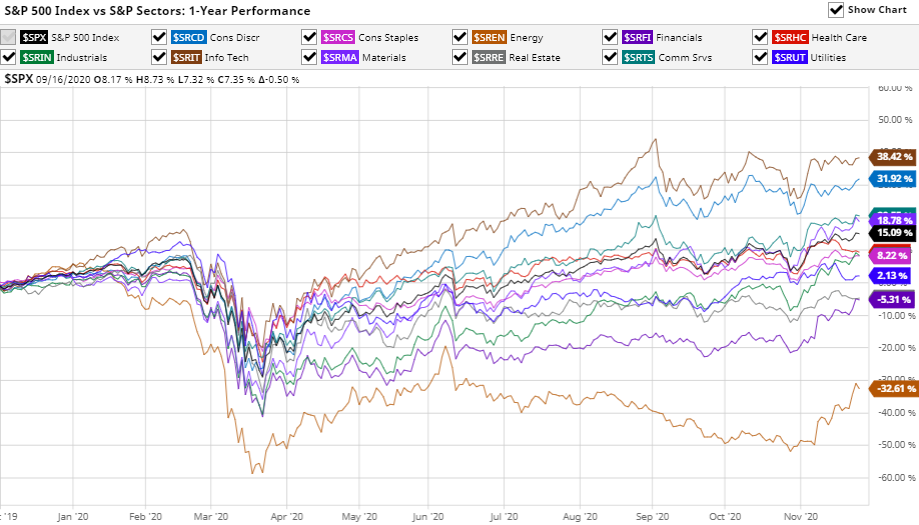
Looking ahead, Covid sensitive stocks should continue to recover, this chart shows the relative performance by industry sector over the last year (to 29th December): –

Source: Barchart.com, S&P
Energy, November’s top performing sector, remains more than 38% down over the last 12 months, whilst Information Technology is up almost 41% over the same period.
Prospects for 2021
Central bank monetary policy and developed nation fiscal policy will be key to deciding the direction of stocks next year. This infographic from McKinsey shows the gargantuan scale of the fiscal response compared to the Great Financial Crisis of 2008: –
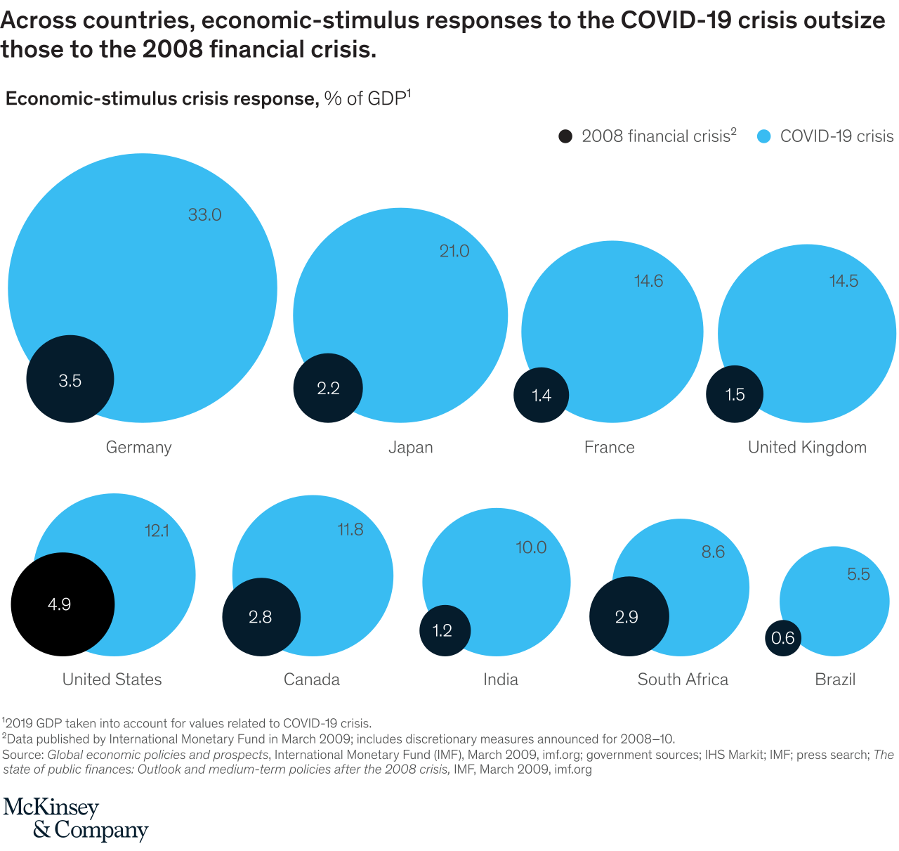
Source: McKinsey, IMF
The degree of largesse needs to be qualified, more than half of government support has been in the form of guarantees, designed to help companies avoid insolvency. Added to which, other stimulus measures have been announced, but that capital has yet to be been committed. The eventual bill for the pandemic might not be quite the strain on collective international government finances the McKinsey infographic portends. This chart from the IMF shows the composition of fiscal support as at mid-May: –

Source: IMF
A more important factor for global stocks is the enormous injection of liquidity which has been pumped into the world economy: –
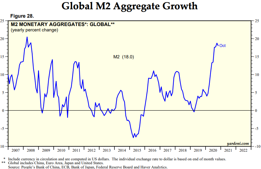
Source: Yardeni
This global picture disguises the variance between countries: –

Source: Federal Reserve, National Central Banks, Haver Analytics, Globalization Institute
With the exception of the US, money supply growth has been relatively muted thus far, although it has been broadly comparable to the expansion undertaken in the aftermath of the sub-prime crisis of 2008. The vast expansion of the US monetary base is unprecedented by comparison with its developed nation peers, but even more so when seen in the context of US policy since WWII: –
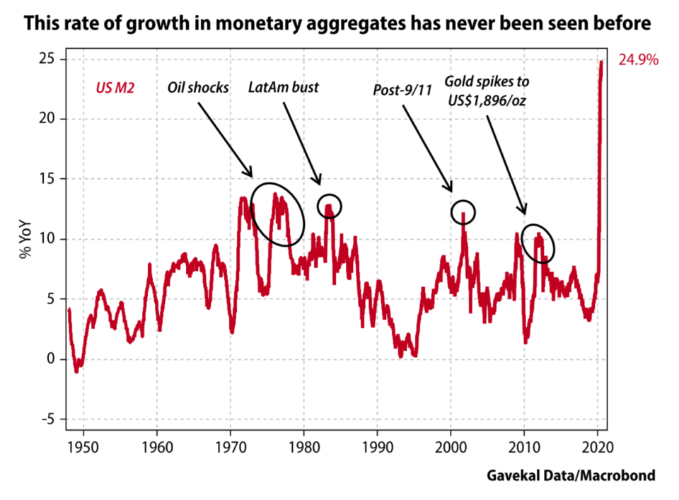
Source: Gavekal/Macrobond
Money supply growth cannot be ignored when seeking a reason for the rise in US stocks. North American asset markets, such as stocks and real estate, will continue to benefit even if some of that liquidity seeps away to international investment opportunities. The Cantillon Effect, named after 18th century Irish economist, Richard Cantillon, remains very much alive and well. In Cantillon’s – Essai sur la Nature du Commerce en General – which was published posthumously in 1755 – he observed that those who were closest to the minting of money benefitted most.
Today, with unemployment sharply higher and lockdown restrictions curtailing consumption, the US savings rate has risen sharply. Even after hitting a peak in April it remains well above the levels seen since the 1970’s. The chart below does not account for the effect of the recent relief package which will release a further $900bln, including cheques to many individuals of $600 each: –
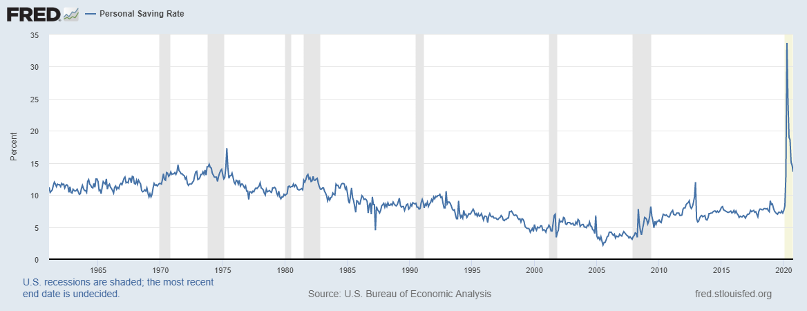
Source: Federal Reserve Bank of St Louis
Whilst the unemployment rate remains elevated, that excess liquidity will either be hoarded or flow into the stock market, in these uncertain times it is unlikely to fuel a consumption boom. This chart shows how unemployment rates have increased across the US, EU and OECD countries in aggregate: –
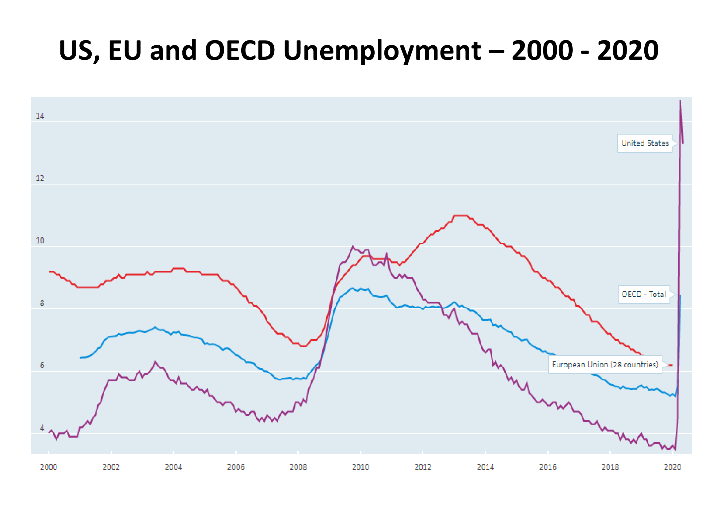
Source: OECD
Aside from a short-lived boom in the grocery sector at the start of the crisis, US consumer spending remained muted running into the summer: –
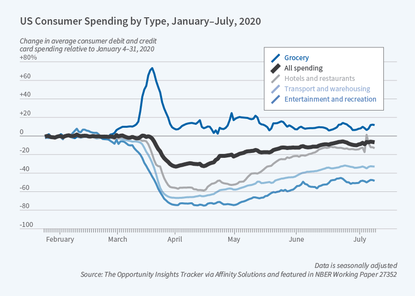
Source: NEBR
The situation improved in Q3 as the inforgraphic below reveals: –

Source: Deloitte, BEA, Haver Analytics
Real personal consumer expenditure grew by 8.9% in Q3 compared to Q2. The nature of consumer spending has also changed as a result of the pandemic, with many consumers buying relatively more goods than services. Without reliable data it is difficult to assess the picture for Q4, but the second wave of Corona cases appears to be a worldwide phenomenon, a repeat of the April/May lockdown may yet defer the much anticipated recovery in consumption.
Investment Opportunities for 2021
Looking ahead, the first important test of US political sentiment will be the runoff Senate race in Georgia on January 5th. Nonetheless, for the coming year, with government bond yields still miserably low, excess liquidity will continue to flow into stocks. The recent weakening of the US$ may lend additional support to international markets, especially if Europe stops its squabbling and embraces fiscal expansion. Dollar bulls might just be rescued by the US bond market, 10yr yields reached 99bps at the beginning of December, the highest since the pandemic struck in March, yields have remained elevated with a fresh stimulus package to finance, but an economic recovery remains some way off, a real bond bear-market needs a significant inflation catalyst.
As Milton Friedman famously observed, ‘Inflation is always and everywhere a monetary phenomenon.’ Even allowing for a strong rebound in demand for goods and services in 2021, the consumer will remain cautious until mass-vaccination has proved to be effective. Meanwhile, that excess liquidity will have to go somewhere, all other things equal, asset markets will rise with liquid, listed equities in the vanguard.

Macro Letter – No 134 – 27-11-2020
Relax, Rotate, Reflate
November has been an interesting month for financial markets around the world. The US Presidential election came and went and with its passing financial market uncertainty diminished. This change of administration is undeniably important, but its effect was overshadowed by the arrival of three vaccines for Covid-19. As I write (Thursday 26th) the S&P 500 Index is within 30 points of its all-time high, amid a chemical haze of pharmaceutical hope, whilst the VIX Index has tested its lowest level since February (20.8%). The Nasdaq Composite is also near to its peak and the Russell 2000 Index (an index of smaller capitalisation stocks) burst through its highs from February 2020 taking out its previous record set in September 2018. The chart below shows the one year performance of the Russell 2000 versus the S&P500 Index: –
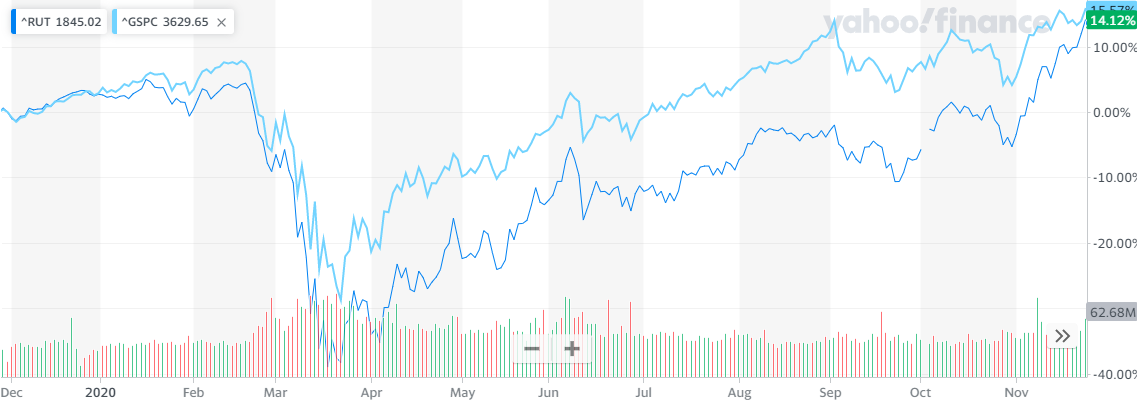
Source: Yahoo Finance, S&P, Russell
It is worth remembering that over the very long term Small Caps have outperformed Large Caps, however, during the last decade the rapid growth of index tracking investments such as ETFs has undermined this dynamic, investment flows are a powerful force. I wrote about this topic in June in – A Brave New World for Value Investing – in which I concluded: –
Stock and corporate bond markets have regained much of their composure since late March. Central banks and governments have acted to ameliorate the effects of the global economic slowdown. As the dust begins to settle, the financial markets will adjust to a new environment, one in which value-based stock and bond market analysis will provide an essential aid to navigation.
The geopolitics of trade policy, already a source of tension before the pandemic struck, has been turbo-charged by the simultaneous supply and demand shocks and their impact on global supply chains. Supply chains will shorten and diversify. Robustness rather than efficiency will be the watch-word in the months and years ahead. This sea-change in the functioning of the world economy will not be without cost. It will appear in increased prices or reduced corporate profits. Value-based investment analysis will be the best guide in this brave new world.
To date, evidence of a return to Value Investing seems premature, Growth still dominates and the structural acceleration of technology trends seems set to continue – one might say, ‘there is Value in that.’
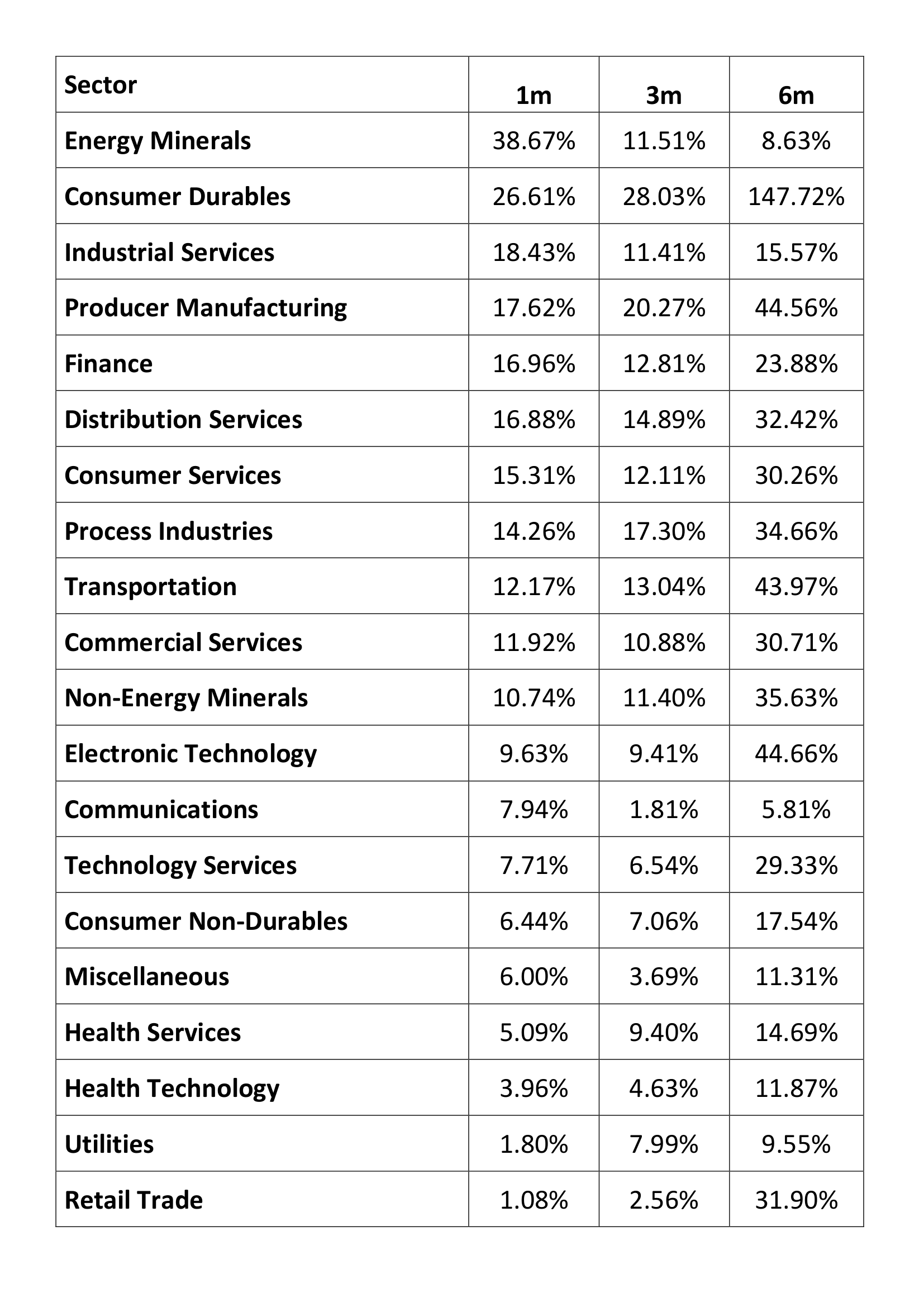
The vaccine news led to a rotation out of technology stocks but this was more to do with profit taking, new ‘Tech’ buyers quickly emerged. The rotation into Small Caps was also echoed among a number of out of favour sectors such as Airlines and Energy. It was enough to prompt the creation of a new acronym – BEACHs – Booking, Entertainment, Airlines, Cruises and Hotels.
Source: Barchart.com, S&P
Above is the one year performance of the 11 S&P 500 industry sectors. Information Technology remains the leader (+38%) with Energy bringing up the rear (-32%) however the level of dispersion of returns is unusually which has presented an abundance of trading opportunities. The table below shows the one, three and six month performance for an expanded selection of these sectors: –
Source: Tradingview
Beyond the US, news of the vaccines encouraged both European and emerging markets, but the latter (EEM), helped by the strong performance of Chinese stocks, have tracked the US quite closely throughout the year, it is Europe (IEUR) which has staged the stronger recovery of late, although it has yet to retest its February highs: –
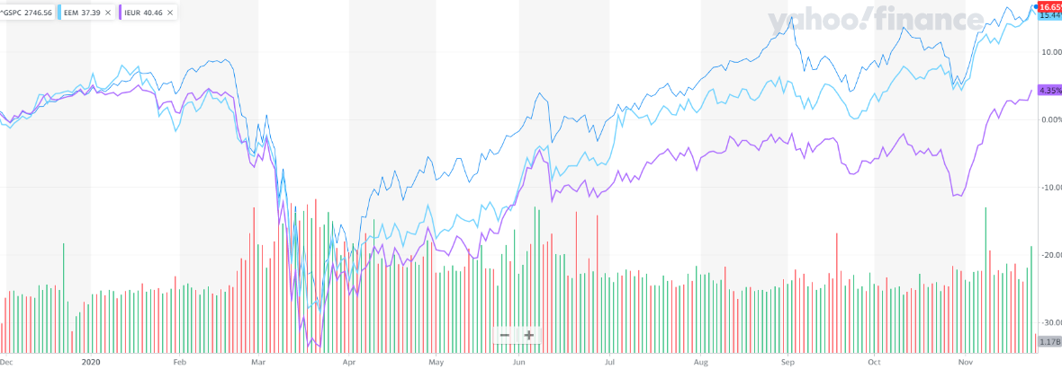
Source: Yahoo Finance, S&P, MSCI
In the aftermath of the US election, US bond yields have inched higher. From an all-time low of 32bp in March, 10yr yields tripled, testing 97bp in the wake of the Democrat win. Putting this in perspective, the pre-Covid low was seen at 1.32% in July 2016. The current concern is partly about the ‘socialist’ credentials of President-elect, Biden, but the vaccine announcement, together with the prospect of a return to some semblance of normality, has also raised the spectre of a less accommodative stance from the Fed. There was initial fear they might ‘take away the punch-bowl’ before the global economy gets back on its knees, let alone its feet. Governor Powell, quickly dispelled bond market fears and yields have since stabilised.
Longer-term, these bond market concerns may be justified, as this infographic from the McKinsey Institute reveals, combined central bank and government fiscal stimulus in 2020 has utterly eclipsed the largesse witnessed in the wake of the 2008 crisis: –

Source: McKinsey
Bond watchers can probably rest easy, however, should the global economy stage the much vaunted ‘V’ shaped recovery economists predicted back in the spring, only a fraction of the fiscal stimulus will actually materialise. Nonetheless, prospects for mass-vaccination, even in developed countries, remains some months away, both monetary and fiscal spigots will continue to spew for the present.
On the topic of monetary policy it is worth noting that the Federal Reserve previously employed ‘yield curve control,’ though it was not called by that name, back in April 1942, five months after the attack on Pearl Harbor. Under this arrangement the Fed committed to peg T-Bills at 3/8th and implicitly cap long-dated T-Bonds at 2.5%. The aim was to stabilize the securities market and allow the government to engage in cheaper debt financing during the course of WWII. This arrangement only ended with the Treasury – Fed Accord of 1951 in response to a sharp peace-time resurgence in inflation. This chart shows the period from 1941 (when the US entered WWII) up to the middle of the Korean War: –
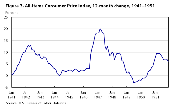
Source: US BLS
I believe we will need to see several years of above target inflation before the Fed to feel confident in raising rates aggressively. The experience of Japan, where deflation has been lurking in the wings for decades, will inform Fed decision making for the foreseeable future.
Returning to the present environment; away from the stock and bond markets, oil prices also basked in the reflected light shining from the end of the pandemic tunnel. West Texas Intermediate, which tested $33.64/bbl on 2nd, reached $46.26/bbl on 25th. The energy sector remains cautious, nonetheless, even the recent resurgence leaves oil prices more than $15/bbl lower than they were at the start of the year.
Looking ahead, the stock market may take a breather over the next few weeks. A vaccine is coming, but not immediately. US politics also remains in the spotlight, the Republicans currently hold 50 Senate seats to the Democrats 48. If Democrats secure the two seats in Georgia, in the runoff election on 5th January, VP Elect, Harris, will be able to use her ‘tie-break’ vote to carry motions, lending the Biden Presidency teeth and hastening the expansion of US fiscal policy.
The stock market has yet to make up its mind about whether Biden’s ‘New New Dealers’ are a positive or a negative. Unemployment and under-employment numbers remain elevated as a result of the pandemic: and, whilst bankruptcies are lower than at this time last year, the ending of the myriad schemes to prolong the existence of businesses will inevitably see those numbers rise sharply. Does the stock market benefit more from the fiscal spigot than the tax increase? This is a question which will be mulled, chewed and worried until long after Biden’s inauguration on January 20th.
Meanwhile the trend accelerations in technology which I discussed in – The prospects for Emerging and Frontier Markets in the post-Covid environment – earlier this month, continue. The chart below shows how information industries have been transforming the makeup of global trade ever since the great financial crisis: –
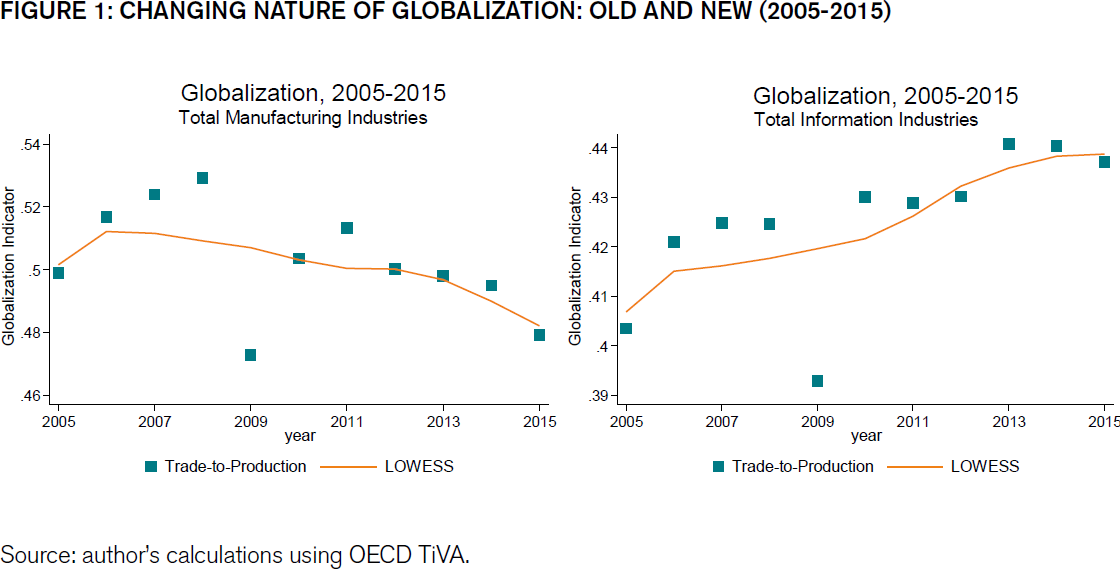
Source: ECIPE, OECD, TiVA, van der Marel
Manufacturing trade is in retreat, trade in digital services is accelerating. The chart above stops at 2015, when we have the data to incorporate the period of the current pandemic, I expect the pace of growth in information industries to have gain even greater momentum.
Back in 1987, MIT economist and Nobel Laureate, Robert Solow, observed that the computer age was everywhere except for the productivity statistics. During the 1990’s technology productivity growth was finally observed, but the past decade has seen a string of disappointing productivity growth statistics, yet they have coincided with digitisation transforming vast swathes of the global economy, perhaps the next decade will see the fruit of these labours. I believe we can look forward to significant productivity improvements in the coming years. Stock prices, however, are forward looking, their valuations may seem extended but this may be entirely justified if technology ushers in a new golden age.

Macro Letter – No 131 – 21-08-2020
When does a recession become a depression?
There is a tide in the affairs of men
Which, taken at the flood, leads on to fortune.
William Shakespeare (Julius Caesar)
When your neighbour loses their job, it’s a recession.
When you lose your job, that’s a depression!
Harry S. Truman (33rd President of the Unites States)
The common knowledge definition above is grim and highly specific, but its banality serves to highlight the fact that the recession/depression question is not that simple to answer. Back in 2007 The Federal Reserve Bank of San Francisco – What is the difference between a recession and a depression? – attempted to reach a conclusion. They embraced the NBER definition of a recession: –
A recession is a significant decline in economic activity spread across the economy, lasting more than a few months, normally visible in real GDP, real income, employment, industrial production, and wholesale-retail sales. A recession begins just after the economy reaches a peak of activity and ends as the economy reaches its trough. Between trough and peak, the economy is in an expansion. Expansion is the normal state of the economy; most recessions are brief and they have been rare in recent decades.
And turned to Gregory Mankiw to distinguish between the two states of economic contraction: –
There are repeated periods during which real GDP falls, the most dramatic instance being the early 1930s. Such periods are called recessions if they are mild and depressions if they are more severe.
Despite the Federal Reserve’s valiant efforts, the simpler and more commonly accepted definition of a recession is a consecutive two quarters of decline in GDP. When it comes to depressions, however, there is little consensus; the two most common descriptions are: –
Whilst the two definitions are not mutually exclusive, they are broadly different. I believe the difference between a recession and a depression is more nuanced. A recession is a natural part of the business (or perhaps we should say credit) cycle, a depression, by contrast, involves the physical destruction of the economy – businesses are irreparably broken, employment opportunities terminally destroyed, investment has to be totally written off.
An alternative approach is to examine previous great depressions. Alas, this method proves equally inconsistent, for example the Great Depression of the 1930’s is generally considered to have lasted from 1929 to 1941 and yet, as the chart below reveals, there were only two distinct periods of declining GDP growth between 1930 and 1933 and again between 1937 and 1938: –
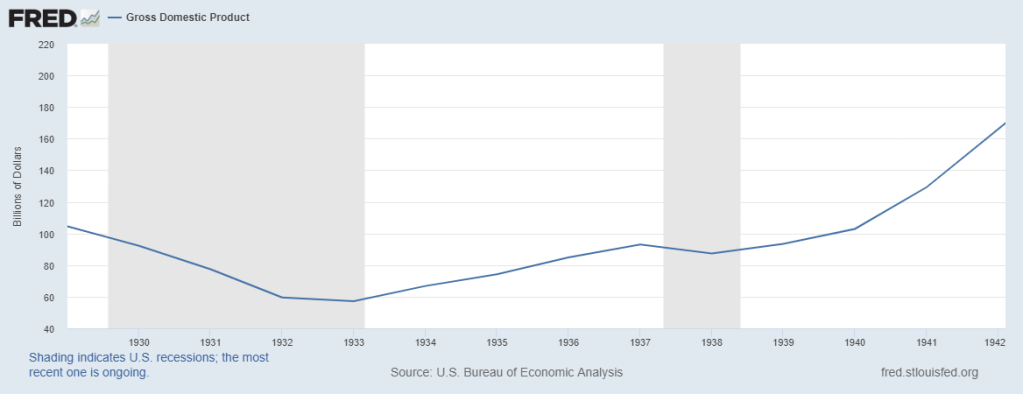
Source: Federal Reserve Bank of St Louis
Notwithstanding my more prosaic definition above, I favour the two year plus definition over that of a sharp decline in GDP. A recession hurts some parts of an economy, a depression is more widespread.
Another factor often associated with recessions and depressions is a rise in the rate of unemployment. Historically, rising unemployment has preceded the onset of recessions and only once recessions have become protracted have they been dubbed depressions.
A further differentiator relates to the absolute level of inflation. In general, as inflation rises, central banks respond by raising short-term interest rates. This helps to cool overheating economies, however, if they tighten too aggressively they may prompt a recession as the credit cycle is forced into a sharp contraction. By contrast a depression is often accompanied by an absolute fall in the price level, caused by an excessive overhang of domestic or corporate debt.
As an investor, why does a depression definition matter? Because financial markets are forward looking. If investors believe the recovery from the Covid-19 pandemic will be ‘V’ Shaped, then, even a 20% decline in GDP, together with zero interest rates, price support for government bonds and a fiscal expansion on a scale not witnessed since the ‘New Deal’ of FDR, will rapidly translate inot a sharply rising stock market. If, by contrast, it becomes clear that a tsunami of creative destruction is sweeping away entire industries, then even the most lavish of New New Deals may be insufficient to hold back the tide of stock liquidation as market participates rush to the safety of cash.
So far the official policy response has been sufficient to convince investors that a depression will be avoided. Scratch the surface of the S&P 500, however, and a rather different picture appears. The chart below shows market performance up to the end of May. The same five technology stocks have continued to drive S&P 500 index performance since then: –
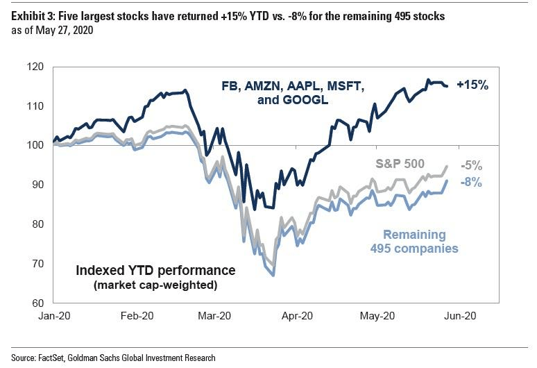
Source: FactSet, Goldman Sachs
Technology has been the top performing sector. One argument for such elevated valuations rests on the premise that the pandemic has accelerated a wide range of technology trends bringing with it the potential for much swifter profits. In finance parlance, the net present value of future technology cash-flows has been brought forward by, some analysts suggest, several years. No wonder, they argue, that these stocks have broken to new all-time highs: and will continue, higher.
Since May, the broader stock market has hung of tech coattails (at the time of writing – 19-8-2020 -the MSCI World Index is up 1.73% YTD). For the present, hope triumphs over fear, yet vaccines remain many months from being widely available, meanwhile, for the Northern hemisphere, autumn – and fears of a second wave of infections – draws imminently near.
For emerging markets the situation is worse still. As Carmen and Vincent Reinhart, writing in Foreign Affairs – The Pandemic Depression– put it: –
Although dubbed a “global financial crisis,” the downturn that began in 2008 was largely a banking crisis in 11 advanced economies. Supported by double-digit growth in China, high commodity prices, and lean balance sheets, emerging markets proved quite resilient to the turmoil of the last global crisis. The current economic slowdown is different. The shared nature of this shock—the novel coronavirus does not respect national borders—has put a larger proportion of the global community in recession than at any other time since the Great Depression. As a result, the recovery will not be as robust or rapid as the downturn. And ultimately, the fiscal and monetary policies used to combat the contraction will mitigate, rather than eliminate, the economic losses, leaving an extended stretch of time before the global economy claws back to where it was at the start of 2020.
The World Bank estimates globally more than 60mln people will be pushed into severe poverty. Meanwhile, in developed countries, bankruptcies, which have been postponed by government intervention, may meet their personal epiphanies as fiscal largesse is suddenly withdrawn. Unless the lockdown restrictions are lifted and people feel safe, both medically and financially, to venture out and spend, the destruction of large swathes of developed market economies has simply been deferred.
By next month we will have experienced two quarters of diminished growth – this is a deep recession already. Swathes of the economy have been permanently altered, making a depression highly likely. Millions of workers have been displaced, it will take more than a handful of months for them to be retrained. Without the consumption demand from these erstwhile workers, it will be difficult for new and existing companies to create the growth they need to hire new employees.
Fiscal spending will need to be undertaken on a much larger scale, and for much longer, than has been envisaged so far. In all the major financial crises since 1850, the average time for per capita GDP to recover to the pre-crisis level was eight years. To date it is estimated that the G20 response to the pandemic has amounted to $11trln. Most of these measures have been ‘temporary’ or ‘short-term.’ It is quickly becoming clear, the disruption to employment, business and sectors of the economy will be protracted and, in many cases, permanent, The IMF estimate that for advanced economies the deficit-to-GDP ratio will rise from 3.3% in 2019 to 16.6% this year. For emerging economies, where the capacity for fiscal expansion is more limited, the ratio is expected to swell from 4.9% last year to 10.6% in 2020. Whilst for advanced economies the cost of borrowing has remained low in emerging markets financing costs have risen. The burden of fiscal stimulus will inevitably fall most heavily upon the treasuries of the advanced economies.
Conclusion
As Sir Winston Churchill once said: –
Now this is not the end. It is not even the beginning of the end. But it is, perhaps, the end of the beginning.
In the aging societies of the West (and elsewhere) the individual need for income remains key. Developed nation governments are fortunate in their ability to borrow more cheaply than at any time in economic history. Whilst it is at odds with my Austrian, free-market instincts, I am forced to admit that fiscal policy is the least panful weapon available to combat the economic catharsis created by the pandemic. Economically, there will be a heavy price to pay, but the alternative is a dangerous cocktail of political fragmentation and polarisation.
For investors the task of securing steady real income remains challenging. Private debt and asset backed lending, which offers high yield, comes with both default and liquidity risk. The chart below looks at some of the public market options, financial repression is rife across the credit spectrum: –
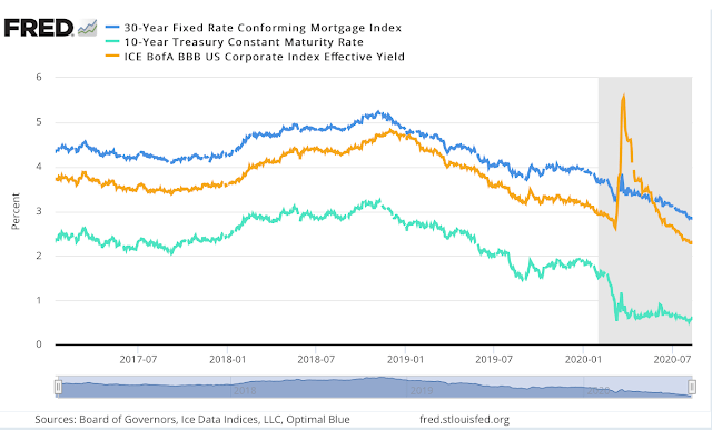
Source: Federal Reserve Bank of St Louis
High income stocks might be an alternative but they offer no guarantee, no matter how ‘blue-chip’ the name. An addition to the acceleration in technology trends, growth stocks in general are benefitting from the exceptionally low interest environment, but there will be a greater number of failures because the cost of speculative finance is also at an historical low. Active management has been unfashionable for at least a decade but looking ahead preservation of capital is going to be more important than capturing out-sized gains.
I wrote about value investing back in June in – A Brave New World for Value Investing – concluding that: –
Stock and corporate bond markets have regained much of their composure since late March. Central banks and governments have acted to ameliorate the effects of the global economic slowdown. As the dust begins to settle, the financial markets will adjust to a new environment, one in which value-based stock and bond market analysis will provide an essential aid to navigation.
The geopolitics of trade policy, already a source of tension before the pandemic struck, has been turbo-charged by the simultaneous supply and demand shocks and their impact on global supply chains. Supply chains will shorten and diversify. Robustness rather than efficiency will be the watch-word in the months and years ahead. This sea-change in the functioning of the world economy will not be without cost. It will appear in increased prices or reduced corporate profits. Value-based investment analysis will be the best guide in this brave new world.
I would add an additional strategy to the investment armoury, a momentum overlay. With fiscal and monetary policy continuing to support economies as they transition to the new world order, capital flows will be a powerful arbiter of investment return. Technology stocks may look expensive by most normal metrics but the trend is patently clear. Do not emulate Cnut The Great, but do as Brutus advises in the opening quote, after all, financial market liquidity flows like tide.


Macro Letter – No 66 – 25-11-2016
Protectionism: which countries have room for fiscal expansion?
…But now I only hear
Its melancholy, long, withdrawing roar…
Matthew Arnold – Dover Beach
Over the course of 2016 the world’s leading central banks have subtly changed their approach to monetary policy. Although they have not stated that QE has failed to stimulate global growth they have begun to pass the baton for stimulating the world economy back to their respective governments.
The US election has brought protectionism and fiscal stimulus back to the centre of economic debate: but many countries are already saddled with uncomfortably high debt to GDP ratios. Which countries have room for manoeuvre and which governments will be forced to contemplate fiscal expansion to offset the headwinds of protectionism?
Anti-globalisation – the melancholy, long, withdrawing roar
The “Elephant” chart below explains, in economic terms, the growing political upheaval which has been evident in many developed countries:-
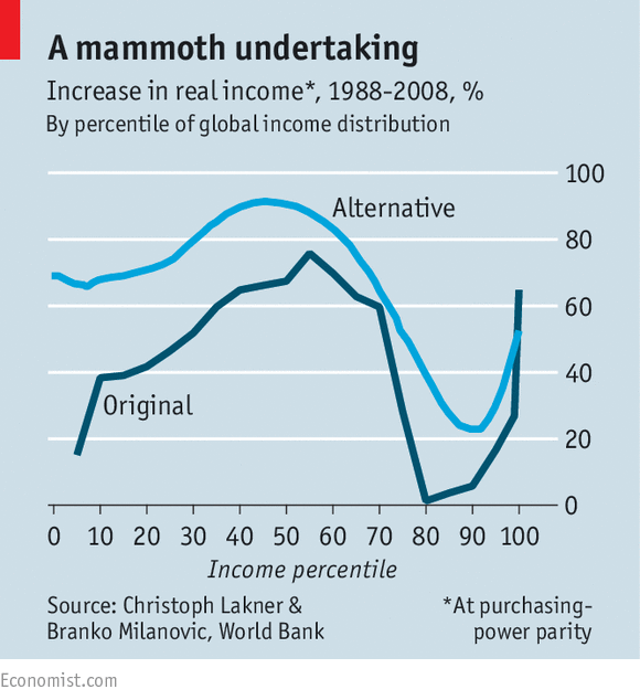
Source: The Economist, World Bank, Lakner and Milanovic
This chart – or at least the dark blue line – began life in a World Bank working paper in 2012. It shows the global change in real-income, by income percentile, between 1988 and 2008. The Economist – Shooting an elephant provides more information.
What this chart reveals is that people earning between the 70th and 90th percentile have seen considerably less increase in income relative to their poor (and richer) peers. I imagine a similar chart up-dated to 2016 will show an even more pronounced decline in the fortunes of the lower paid workers of G7.
The unforeseen consequence to this incredible achievement – bringing so many of the world’s poor out of absolute poverty – has been to alienate many of the developed world’s poorer paid citizens. They have borne the brunt of globalisation without participating in much, if any, of the benefit.
An additional cause for concern to the lower paid of the developed world is their real-inflation rate. The chart below shows US inflation for specific items between 1996 and 2016:-
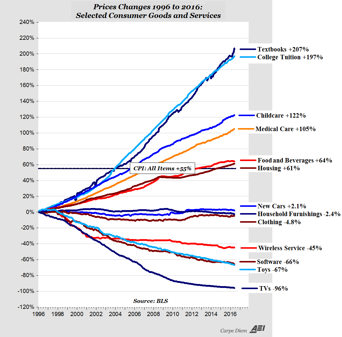
Source: American Enterprise Institute
At least the “huddled masses yearning to breathe free” can afford a cheaper television, but this is little comfort when they cannot afford the house to put it in.
Anti-globalisation takes many forms, from simple regulatory protectionism to aspects of the climate-change lobby. These issues, however, are not the subject of this letter.
Which countries will lose out from protectionism?
It is too early to predict whether all the election promises of President-elect Trump will come to pass. He has indicated that he wants to impose a 35% tariff on Mexican and, 45% tariff on Chinese imports, renegotiate NAFTA (which the Peterson Institute estimate to be worth $127bln/annum to the US economy) halt negotiations of the TPP and TTIP and, potentially, withdraw from the WTO.
Looking at the “Elephant” chart above it is clear that, in absolute per capita terms, the world’s poorest individuals have benefitted most from globalisation, but the largest emerging economies have benefitted most in monetary terms.
The table below ranks countries with a GDP in excess of $170bln/annum by their debt to GDP ratios. These countries represent roughly 95% of global GDP. The 10yr bond yields were taken, where I could find them, on 21st November:-
| Country | GDP | Base Rate | Inflation | Debt to GDP | 10yr yield | Notes |
| Japan | 4,123 | -0.10% | -0.50% | 229% | 0.03 | |
| Greece | 195 | 0.00% | -0.50% | 177% | 6.95 | |
| Italy | 1,815 | 0.00% | -0.20% | 133% | 2.06 | |
| Portugal | 199 | 0.00% | 0.90% | 129% | 3.70 | |
| Belgium | 454 | 0.00% | 1.81% | 106% | 0.65 | |
| Singapore | 293 | 0.07% | -0.20% | 105% | 2.36 | |
| United States | 17,947 | 0.50% | 1.60% | 104% | 2.32 | |
| Spain | 1,199 | 0.00% | 0.70% | 99% | 1.60 | |
| France | 2,422 | 0.00% | 0.40% | 96% | 0.74 | |
| Ireland | 238 | 0.00% | -0.30% | 94% | 0.98 | |
| Canada | 1,551 | 0.50% | 1.50% | 92% | 1.57 | |
| UK | 2,849 | 0.25% | 0.90% | 89% | 1.41 | |
| Austria | 374 | 0.00% | 1.30% | 86% | 0.54 | |
| Egypt | 331 | 14.75% | 13.60% | 85% | 16.95 | |
| Germany | 3,356 | 0.00% | 0.80% | 71% | 0.27 | |
| India | 2,074 | 6.25% | 4.20% | 67% | 6.30 | |
| Brazil | 1,775 | 14.00% | 7.87% | 66% | 11.98 | |
| Netherlands | 753 | 0.00% | 0.40% | 65% | 0.43 | |
| Israel | 296 | 0.10% | -0.30% | 65% | 2.14 | |
| Pakistan | 270 | 5.75% | 4.21% | 65% | 8.03 | |
| Finland | 230 | 0.00% | 0.50% | 63% | 0.46 | |
| Malaysia | 296 | 3.00% | 1.50% | 54% | 4.39 | |
| Poland | 475 | 1.50% | -0.20% | 51% | 3.58 | |
| Vietnam | 194 | 6.50% | 4.09% | 51% | 6.10 | |
| South Africa | 313 | 7.00% | 6.10% | 50% | 8.98 | |
| Venezuela | 510 | 21.73% | 180.90% | 50% | 10.57 | |
| Argentina | 548 | 25.75% | 40.50% | 48% | 2.99 | |
| Philippines | 292 | 3.00% | 2.30% | 45% | 4.40 | |
| Thailand | 395 | 1.50% | 0.34% | 44% | 2.68 | |
| China | 10,866 | 4.35% | 2.10% | 44% | 2.91 | |
| Sweden | 493 | -0.50% | 1.20% | 43% | 0.52 | |
| Mexico | 1,144 | 5.25% | 3.06% | 43% | 7.39 | |
| Czech Republic | 182 | 0.05% | 0.80% | 41% | 0.59 | |
| Denmark | 295 | -0.65% | 0.30% | 40% | 0.40 | |
| Romania | 178 | 1.75% | -0.40% | 38% | 3.55 | |
| Colombia | 292 | 7.75% | 6.48% | 38% | 7.75 | |
| Australia | 1,340 | 1.50% | 1.30% | 37% | 2.67 | |
| South Korea | 1,378 | 1.25% | 1.30% | 35% | 2.12 | |
| Switzerland | 665 | -0.75% | -0.20% | 34% | -0.15 | |
| Turkey | 718 | 7.50% | 7.16% | 33% | 10.77 | |
| Hong Kong | 310 | 0.75% | 2.70% | 32% | 1.37 | |
| Taiwan | 524 | 1.38% | 1.70% | 32% | 1.41 | |
| Norway | 388 | 0.50% | 3.70% | 32% | 1.65 | |
| Bangladesh | 195 | 6.75% | 5.57% | 27% | 6.89 | |
| Indonesia | 862 | 4.75% | 3.31% | 27% | 7.85 | |
| New Zealand | 174 | 1.75% | 0.40% | 25% | 3.11 | |
| Kazakhstan | 184 | 12.00% | 11.50% | 23% | 3.82 | *** |
| Peru | 192 | 4.25% | 3.41% | 23% | 6.43 | |
| Russia | 1,326 | 10.00% | 6.10% | 18% | 8.71 | |
| Chile | 240 | 3.50% | 2.80% | 18% | 4.60 | |
| Iran | 425 | 20.00% | 9.50% | 16% | 20.00 | ** |
| UAE | 370 | 1.25% | 0.60% | 16% | 3.57 | * |
| Nigeria | 481 | 14.00% | 18.30% | 12% | 15.97 | |
| Saudi Arabia | 646 | 2.00% | 2.60% | 6% | 3.97 | * |
Notes
*Estimate from recent sovereign issues
**Estimated 1yr bond yield
***Estimated from recent US$ issue
Source: Trading economics, Investing.com, Bangledesh Treasury
Last month in their semi-annual fiscal monitor – Debt: Use It Wisely – the IMF warned that global non-financial debt is now running at $152trln or 225% of global GDP, with the private sector responsible for 66% – a potential source of systemic instability . The table above, however, shows that many governments have room to increase their debt to GDP ratios substantially – which might be of luke-warm comfort should the private sector encounter difficulty. Interest rates, in general, are at historic lows; now is as good a time as any for governments to borrow cheaply.
If countries with government debt/GDP of less than 70% increased their debt by just 20% of GDP, ceteris paribus, this would add $6.65trln to total global debt (4.4%).
Most Favoured Borrowers
Looking more closely at the data – and taking into account budget and current account deficits -there are several governments which are unlikely to be able to increase their levels of debt substantially. Nonetheless, a sizable number of developed and developing nations are in a position to increase debt to offset the headwinds of US protectionism should it arrive.
The table below lists those countries which could reasonably be expected to implement a fiscal response to slower growth:-
| Country | GDP | Debt to GDP | 10yr yield | Gov. Debt | 70% Ratio | 90% Ratio | 12m fwd PE | CAPE | Div Yld. |
| Saudi Arabia | 646 | 6% | 3.97 | 38 | 452 | 581 | ? | ? | ? |
| Chile | 240 | 18% | 4.60 | 42 | 168 | 216 | 15.6 | ? | ? |
| New Zealand | 174 | 25% | 3.11 | 43 | 122 | 157 | 19.3 | 22 | 4.1% |
| Peru | 192 | 23% | 6.43 | 44 | 134 | 173 | 12.1 | ? | ? |
| Bangladesh | 195 | 27% | 6.89 | 53 | 137 | 176 | ? | ? | ? |
| UAE | 370 | 16% | 3.57 | 58 | 259 | 333 | ? | ? | ? |
| Colombia | 292 | 38% | 7.75 | 111 | 204 | 263 | ? | ? | ? |
| Norway | 388 | 32% | 1.65 | 123 | 272 | 349 | 14.2 | 11.5 | 4.3% |
| Philippines | 292 | 45% | 4.40 | 132 | 204 | 263 | 16.4 | 22.6 | 1.6% |
| Malaysia | 296 | 54% | 4.39 | 160 | 207 | 266 | 15.6 | 16 | 3.1% |
| Taiwan | 524 | 32% | 1.41 | 166 | 367 | 472 | 12.8 | 19 | 3.9% |
| Thailand | 395 | 44% | 2.68 | 175 | 277 | 356 | 13.8 | 17.7 | 3.1% |
| Israel | 296 | 65% | 2.14 | 192 | 207 | 266 | 9.4 | 14.6 | 2.8% |
| Sweden | 493 | 43% | 0.52 | 214 | 345 | 444 | 16.1 | 19.8 | 3.6% |
| Indonesia | 862 | 27% | 7.85 | 233 | 603 | 776 | 14.7 | 19.6 | 1.9% |
| South Korea | 1,378 | 35% | 2.12 | 484 | 965 | 1,240 | 9.6 | 13.1 | 1.7% |
| Australia | 1,340 | 37% | 2.67 | 493 | 938 | 1,206 | 15.6 | 16.1 | 4.3% |
| Mexico | 1,144 | 43% | 7.39 | 494 | 801 | 1,030 | 16.6 | 22.4 | 1.9% |
| India | 2,074 | 67% | 6.30 | 1,394 | 1,452 | 1,867 | 15.9 | 18.6 | 1.5% |
| 4,649 | 8,114 | 10,432 |
Source: Trading economics, Investing.com, Bangledesh Treasury, Star Capital, Yardeni Research
The countries in the table above – which have been ranked, in ascending order, by outstanding government debt – have total debt of $4.65trln. If they each increased their ratios to 70% they could raise an additional $3.47trln to lean against an economic downturn. A 90% ratio would see $5.78trln of new government debt created. This is the level above which economies cease to benefit from additional debt according to Reinhart and Rogoff in their paper Growth in a Time of Debt.
Whilst this analysis is overly simplistic, the quantum of new issuance is not beyond the realms of possibility – India’s ratio reached 84% in 2003, Indonesia’s, hit 87% in 2000 and Saudi Arabia’s, 103% in 1999. Nonetheless, the level of indebtedness is higher than many countries have needed to entertain in recent years – ratios in Australia, Mexico and South Korea, though relatively low, are all at millennium highs.
Apart from the domestic imperative to maintain economic growth, there will be pressure on these governments to pull their weight from their more corpulent brethren. Looking at the table above, if the top seven countries, by absolute increased issuance, raised their debt/GDP ratios to 90%, this would add $3.87trln to global debt.
Despite US debt to GDP being above 100%, the new US President-elect has promised $5.3trln of fiscal spending during his first term. Whether this is a good idea or not is debated this week by the Peterson Institute – What Size Fiscal Deficits for the United States?
Other large developed nations, including Japan, are likely to resort to further fiscal stimulus in the absence of leeway on monetary policy. For developing and smaller developed nations, the stigma of an excessively high debt to GDP ratio will be assuaged by the company keep.
Conclusions and investment opportunities
Despite recent warnings from the IMF and plentiful academic analysis of the dangers of excessive debt – of which Deleveraging? What Deleveraging? is perhaps the best known – given the way democracy operates, it is most likely that fiscal stimulus will assume the vanguard. Monetary policy will play a supporting role in these endeavours. As I wrote in – Yield Curve Control – the road to infinite QE – I believe the Bank of Japan has already passed the baton.
Infrastructure spending will be at the heart of many of these fiscal programmes. There will be plenty of trophy projects and “pork barrel” largesse, but companies which are active in these sectors of the economy will benefit.
Regional and bilateral trade deals will also become more important. In theory the EU has the scale to negotiate with the US, albeit the progress of the TTIP has stalled. Asean and Mercosur have an opportunity to flex their flaccid muscles. China’s One Belt One Road policy will also gain additional traction if the US embark on policies akin to the isolationism of the Ming Dynasty after the death of Emperor Zheng He in 1433. The trade-vacuum will be filled: and China, despite its malinvestments, remains in the ascendant.
According to FocusEconomics – Economic Snapshot for East & South Asia – East and South Asian growth accelerated for the first time in over two years during Q3, to 6.2%. Despite the economic headwinds of tightening monetary and protectionist trade policy in the US, combined with the very real risk of a slowdown in the Chinese property market, they forecast only a moderate reduction to 6% in Q4. They see that growth rate continuing through the first half of 2017.
Indian bond yields actually fell in the wake of the US election – from 6.83% on 8th to 6.30% by 21st. This is a country with significant internal demand and capital controls which afford it some protection. Its textile industry may even benefit in the near-term from non-ratification of the TPP. Indian stocks, however are not particularly cheap. With a PE 24.3, CAPE 18.6, 12 month forward PE 15.9 the Sensex index is up more than 70% from its December 2011 lows.
Stocks in Israel, Taiwan and Thailand may offer better value. They are the only emerging countries which offer a dividend yield greater than their bond yield. Taiwanese stocks appear inexpensive on a number of other measures too. With East and South Asian growth set to continue, emerging Asia looks most promising.
A US tax cut will stimulate demand more rapidly than the boost from US fiscal spending. Protectionist tariffs may hit Mexico and China rapidly but other measures are likely to be implemented more gradually. As long as the US continues to run a trade deficit it makes sense to remain optimistic about several of the emerging Asian markets listed in the table above.
