

Macro Letter – No 83 – 15-09-2017
Is Chinese growth about to falter?
- The IMF revised Chinese growth forecasts higher in July – were they premature?
- Retail sales, industrial output and fixed investment have slowed
- The Real Estate sector is still buoyant but home price increases are moderating
- Narrow money supply growth has slowed, other parts of the economy will follow
China has long been the marginal driver of demand for a wide array of commodities. In an attempt to understand the recent rise in the price of industrial metals, the strength of Chinese demand is a key factor. The picture is mixed.
The chart and commentary below is taken from Sean Corrigan’s August newsletter – Cantillon Consulting – China: Is the tide turning?:-
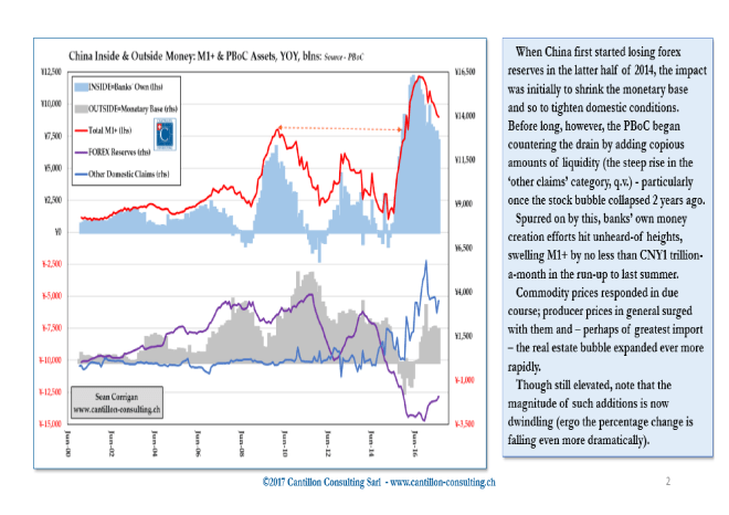
Source: Cantillon Consulting
As Corrigan goes on to say:-
As the deceleration has progressed, the PMI has shown its expected downward response. In due course, company revenues – and ultimately profits – will follow if this is long maintained.
Greater recourse to receivables financing (funded partly by recourse to shadow finance) can delay full recognition of this awhile, but it cannot fail to impair either the magnitude or the quality of earnings as it works through the economy.
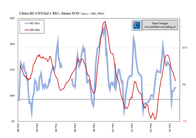
At the heart of the credit equation lies the Real Estate market:-
Source: Cantillon Consulting
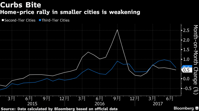
During 2016 property prices in China increased by 19%, new homes by 12.4%, the fastest since 2011, but the market has cooled of late due to government intervention to subdue its speculative excess. New-home prices, excluding government-subsidized housing, gained from the previous month in 56 of 70 cities in July, compared with 60 in June. New Home Sales for August were the weakest in three years at +3.8%, however, investment in Real Estate development increased 7.8% last month – this is hardly a collapse. House prices are still forecast to rise by 6.8% in 2017 with growth driven by continued increases in second and third tier cities:-
Source: Bloomberg
There are concerns that the property market may crash later this year but Chinese authorities seem to be cogniscent of this risk. They lifted restrictions on international bond sales in June, allowing cash strapped property developers to tap international markets. Bloomberg – Indebted China Developers Get Funding Relief as Bond Sales Soar – covers this story in greater detail.
With Real Estate contributing around 15% to GDP this more moderate pace of expansion is expected to temper the pace of growth for the second half of 2017. In Q2 GDP was estimated at 6.9%, the same level as Q1 – this puts nominal growth near to a five year high.
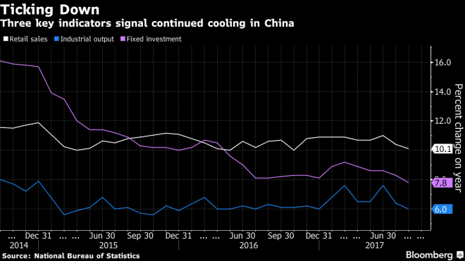
The tide appears to have turned; Industrial output, fixed investment and retail sales all slowed during the summer. Industrial output rose 6% in August, the weakest this year. Retail sales rose 10.1% down from 10.4% and 11% in July and June. Fixed-asset investment in urban areas was up 7.8% in the year to August, the slowest since 1999:-
Source: Bloomberg
In a paper published at the end of August The Kansas City Federal Reserve – Has China’s Growth Reached a Turning Point? provide further support for expectations of a slowdown in Chinese growth. As they note, judging whether the recent rebound in China’s growth is temporary or more sustained, is a complex issue:-
The Chinese economy is undergoing a transition in which economic growth is rising in some sectors of the economy but declining in others. At the same time, China’s official quarterly GDP figures have been criticized for being overly smooth and less informative. Moreover, Chinese government policies have stimulated or cooled the economy at different times, further muddling the signal from economic data.
The authors construct a factor model but find that:-
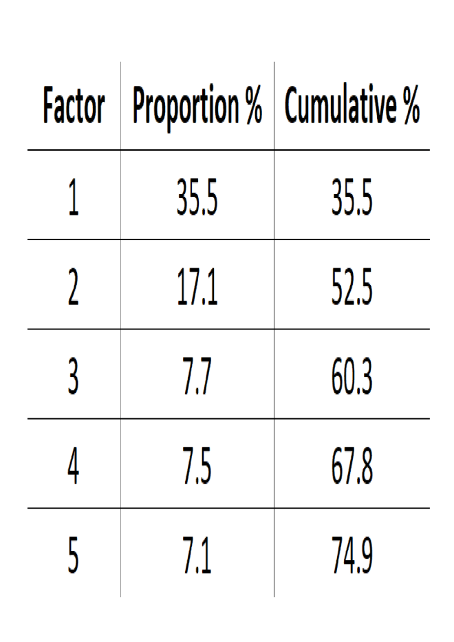
…no single common factor explains the majority of the variation in Chinese activity. This is consistent with the view that the Chinese economy is in a transition, so different sectors are less synchronized. Indeed, our analysis shows that the five most important factors together account for about 75 percent of the total variation in the selected Chinese data.
The heat-map matrix – darker colour = greater importance – is shown below (apologies for the poor resolution):-
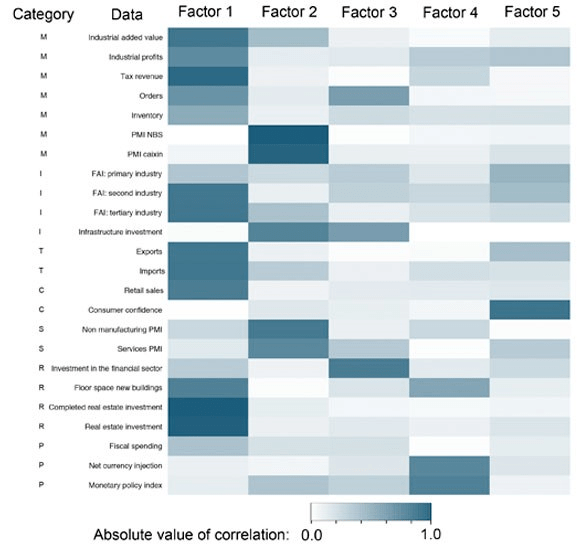
Note: “M” corresponds to manufacturing, “I” corresponds to investment, “T” corresponds to trade, “C” corresponds to consumption, “S” corresponds to services, “R” corresponds to real estate and finance, and “P” corresponds to policy.
(Sources: Wind and authors’ calculations.)
Source: Kansas City Federal Reserve
Here are the weightings which the authors assigned to each factor and the cumulative total:-
Source: Kansas City Federal Reserve
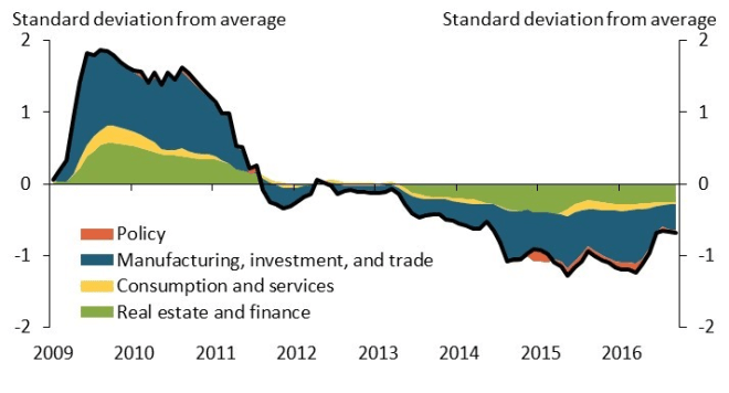
In conclusion the authors look in detail at the evolution of the drivers behind their principal factor – Factor 1:-
Source: Kansas City Federal Reserve
As China is transitioning from an investment- and export-driven economy to a more consumption-driven economy, the recent improvement in the manufacturing, investment, and trade group is likely to be temporary. Indeed, this improvement may reflect the rebound in global commodity prices that led to higher industrial profits and production; an increase in fiscal spending, which supported investment; and improvement in global growth coupled with the depreciation in the Chinese currency at the end of last year, which boosted Chinese exports. These driving forces may prove to be temporary, casting doubts on the sustainability of recent strength in the manufacturing, investment, and trade group.
This suggests that the increase in commodity demand outside China has led to increases in prices and that this has helped boost Chinese GDP growth.
Indian, an economy with a large enough GDP to tip the scales, has been slowing since Q1 2016 so the KCFR conclusion seems like the cart leading the horse, it’s little wonder they express it tentatively.
Which brings me to a recent article from Mauldin Economics – or, more accurately China Beige Book – China: Q2 Early Look Brief in which Leland Miller takes issue with the idea that Chinese growth has peaked, corporate deleveraging is the cause, and that the commodity sector is in slowdown mode.
Here’s an extract which gives a flavour of Miller’s contrarian perspective:-
Why Rebalance When You Can Have Both?
The second quarter saw minimal progress in moving away from manufacturing toward services leadership in the economy. This was an excellent failure, however, since services performed well and manufacturing almost as well. Manufacturing tapered but extended its powerful rally since the first half of 2016. Revenue, hiring, and new orders were all higher on-quarter and sharply higher on-year. Still, services outperformed manufacturing in revenue and profits. Hiring in services has been uneven, but Q2 was solid.
Commodities Surprises to the Upside.
Defying early signs of a slowdown, our biggest Q2 surprise was another robust performance in commodities. Make no mistake, the warning signs look like Times Square: the second quarter saw huge across-the-board jumps in inventory, sliding sales price growth in three of four sub-sectors, and rising input costs. Yet, more firms again saw rising sales prices than input cost hikes, sales volumes accelerated, and cash flow moved from red to black, bolstering balance sheets.
Away from Markets’ Gaze, Aluminum Shines.
Commodities’ unsung hero: aluminum. CBB data show aluminum firms wildly outperforming the current market narrative, seeing broad Q2 gains in revenues, profits, volumes, output, and new orders, as well as cash flow, which jumped into the black for the first time in our survey’s history. The why is less clear than the what, but one obvious possibility is aluminum is the latest recipient of some of China’s excess liquidity. The #moneyball may have struck again.
Miller goes on to admit that Real Estate has slowed, credit conditions have deteriorated (outside the property space) and inventories in manufacturing, retail, and commodities hit all-time highs. By one estimate China’s unused steel capacity equals the output of Japan, India, America and Russia combined. Personally I only take issue with Miller’s spelling of aluminium!
China Beige Book remain more optimistic than the majority of commentators but they end their review on a note of caution:-
China’s attempt at deleveraging has been discussed to no end, but its implications are not well understood. In Q1, corporate reporting to CBB showed credit tightening was limited to interbank markets. In Q2, it hit firms: bond yields and rates at shadow banks touched the highest levels in the history of our survey, and bank rates their highest since 2014. So why did borrowing not collapse, denting the broader economy? One reason is what we call the “Party Congress Put.” While borrowing did see a mild drop for the third straight quarter, companies’ six-month revenue expectations remain robust in every sector save property. Companies assume deleveraging is transient, likely because they are skeptical the Party will allow economic pain in 2017. It will not be until 2018 when we find out whether deleveraging is genuine – because it won’t be until 2018 that it will actually hurt.
This brings me back to the question, what caused the initial increase in commodity prices? Part of the impetus behind the rise has been a deliberate curtailing of supply by the Chinese authorities, however, investors should be wary of equating a rise in prices with a sustainable recovery in demand. The Economist – Making sense of capacity cuts in China described it thus:-
Stockmarkets have been on a tear over the past 18 months. Shares are, on average, up by a third globally. Commodities have rallied. And the optimism has infected corporate treasurers, who, for the first time in five years, are spending more on new buildings and equipment. Plenty of factors have fed into the upturn, from Europe’s recovery to early hopes for the Trump presidency. But its origins date back to a commitment by China to demolish steel mills and shut coal mines.
On the face of it, that is an unlikely spark for a change in sentiment. Normally, growth comes from the investment in new facilities, not the closure of those in use. In fact, China’s case is a rare one. By taking on extreme overcapacity, its cutbacks have provided a boost, for itself and for the global economy. The risk, however, is that the way the country is going about the cuts both disguises old flaws and creates new ones.
In early 2016 China announced plans to reduce steel and coal capacity by at least 10% over five years – equivalent to around 5% of global supply. By 2020 they aim to reduce coal output by 800m tonnes – 25% of Chinese production. Steel capacity is set to be slashed by 100m-150m tonnes – 20% of total output – and aluminium, by 30%.
This is not the first time China has attempted to manipulate global commodity markets, yet previous forays disappointed. This time it’s different – a dangerous phrase indeed! Higher prices for steel are likely to encourage domestic investment in new supply. Iron Ore stocks at Chinese ports have reached record levels. Meanwhile the underlying problem – oversupply – has not been addressed. Signs of a roll-back in policy are already evident in the coal industry, where mines which had their production capped at 276 days in 2016, have been permitted to revert to 330 days production this year.
Conclusion and Investment Opportunities
Returning to my original question – is Chinese growth about to falter? In his recent article for the Carnegie Endowment – Is China’s Economy Growing as Fast as China’s GDP? Michael Pettis writes:-
… I would argue that “the end of China’s stellar growth story” has already occurred, and occurred quite a long time ago. Growth in the Chinese economy has collapsed, but growth in economic activity has not collapsed (let us assume, with Grenville, that somehow the reduction in GDP growth from over 10 percent to 6.5 percent does not represent a slowdown in economic activity). The growth in economic activity has instead been propped up by the acceleration in credit growth and by the failure to write down investments that have created economic activity without having created economic value. In that case, high GDP growth levels simply disguise the seeming collapse of underlying economic growth in a way that has happened many times before—always in the late stages of similar apparent investment-driven growth miracles.
The question which springs from Pettis’s article is, when will the non-performing investments be written off? Given the relatively modest government debt to GDP ratio in China (69%) there is still scope to postpone the day of reckoning, but in the shorter-term, trade tensions with the US and a certain reticence on the part of major Central Banks to embrace infinite QE, risks interrupting the current rebound in global growth over the next two years.
The IMF WEO – July 2017 update left global forecasts for global GDP growth unchanged at 3.5% for 2017 and 3.6% for 2018, but their forecasts for China were revised higher by 0.1% and 0.2% respectively. The increasing levels of debt, inventory build and buoyancy of the Real Estate sector may be sufficient for China to avoid a slow-down in GDP growth, but this will be the result of a further inflating of their debt bubble.
Chinese stocks, which continue to trade on single digit P/E ratios, look inexpensive, but this is how they almost always look. Chinese government 10yr bond yields have risen by more than 1% since October 2016 to 3.67% (14-9-2017). Despite the rhetoric emanating from Washington DC, the RMB has retraced much of the ground it lost during 2016 – since January the RMB has strengthened by 4.7% against the greenback.
An economic slowdown in China will prompt the authorities to provide liquidity, this in turn should feed through to lower interest rates, which in turn will help to support domestic stocks. US pressure, such as economic sanctions or the imposition of regulatory constraints, is likely to lead to a renewed weakening of the Chinese currency. A process lower domestic bond yields will help to accelerate. Chinese equities remain in a technical up-trend, as does the currency, while the direction of bond yields is upward as well. This favours remaining; long stocks, short bonds and long the RMB.
When might things change? It is difficult to forecast – I am a trend follower by inclination. The, possibly apocryphal phrase, attributed to Keynes, that ‘The markets can remain irrational longer than I can remain solvent,’ is etched firmly on my heart. The Chinese edict limiting coal production was, perhaps, the catalyst for present rally. I prefer to trade leaders rather than laggards and will therefore be watching the price of Chinese coal closely. Below is the five year chart:-
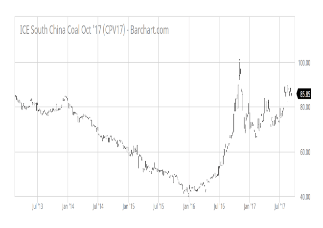
Source: Barchart.com
There is room for a downward correction – to fill a technical gap – but I see no reason to sell industrial commodities on the basis of this price pattern. Notwithstanding Pettis’s more nuanced view, I believe growth, as we understand it on a month to month basis, may slow. If it occurs the slowdown will be gradual, moderate and, if the government intervenes, might be deferred: though, in the long run, not indefinitely.