What are the prospects for UK financial markets in 2016?

400dpiLogo

Macro Letter – No 47 – 04-12-2015

What are the prospects for UK financial markets in 2016?

  • The EU referendum may take place as early at as June next year
  • Financial markets appear to be ignoring the vote at present
  • The tightening of bank capital requirements is almost over
  • Higher tax receipts have tempered the pace of fiscal tightening

In assessing the prospects for UK financial markets next year I will focus on three areas, the EU referendum, the stability of the financial system and the state of government finances.

The EU Referedum

As we head into 2016 political and economic commentators are beginning to focus on the potential impact of a UK exit from the EU would have on the British economy. Given the size and importance of the financial services sector to the economy, I want to investigate claims that a UK exit would be damaging to growth and lead to a rise in unemployment. For a more general overview of the referendum please see my July 3rd post – Which way now – FTSE, Gilts, Sterling and the EU referendum?

In February a report by the UK Parliament – Financial Services: contribution to the UK economy opened with the following statement:-

In 2014, financial and insurance services contributed £126.9 billion in gross value added (GVA) to the UK economy, 8.0% of the UK’s total GVA. London accounted for 50.5% of the total financial and insurance sector GVA in the UK in 2012. The sector’s contribution to UK jobs is around 3.4%. Trade in financial services makes up a substantial proportion of the UK’s trade surplus in services. In 2013/14, the banking sector alone contributed £21.4 billion to UK tax receipts in corporation tax, income tax, national insurance and through the bank levy.

The GVA was down from a 2009 high of 9.3%. For London the GVA was 18.6%. In international terms the UK ranks fourth, behind Luxembourg, Australia and the Netherlands in terms of the size of its financial services sector. As at September 2014, 1.1mln people were employed in the sector. According to research by PWC financial services accounted for £65.6bln or 11.5% of total government tax receipts in 2013-14.

Last week the Evening Standard – ‘Brexit’ would lead to loss of 100,000 bank jobs, says City – cited senior banking figures warning of the potential impact of the UK leaving the EU:-

Mark Boleat, policy chairman at the City of London Corporation, said: “If as a country we were to vote to leave, then London’s position as a leading financial centre would remain but without doubt there would be an impact on our relative size and the jobs we support.”

Confidential client research from analysts at US investment bank Morgan Stanley, seen by the Standard, warned that “firms for whom the EU market is important” would need to “adjust their footprint” in London if the Eurosceptic cause was victorious.

Sir Mike Rake, deputy chair of Barclays and chairman of BT, said: “It is extremely difficult to quantify the number of jobs that would be lost and the time frame over which that might happen but leaving the EU would severely damage London’s competitiveness and our financial services sector.”

There have been growing hints from financial institutions that they are starting to plan for Britain quitting the 28 member club.

Both HSBC, which announced a review of the location of its global headquarters in April, and JP Morgan are reportedly in talks about moving sections of their businesses to Luxembourg in part because of the threat of Brexit.

Deutsche Bank, which employs 9,000 people in Britain, has set up a working group to review whether to move parts of its business from Britain in the event of a UK withdrawal. 

US asset management group Vanguard, which has a City office, has admitted that Brexit would have a “significant impact” on its operation across Europe and has already started planning for it.

Many senior bankers are concerned that they would lose the financial services “passporting” rights enjoyed by fellow EU members.

A fascinating historic assessment of the opinion of the UK electorate towards the EU is contained in this week’s Deloitte – Monday Briefing, they  anticipate a referendum date of either June or September 2016, in order to avoid coinciding with a French (March/April) or German (September) election in 2017:-

Since Ipsos MORI started polling on this issue in 1977 on average 53% of voters in a simple yes/no poll have supported membership and 47% have opposed it. The yes vote reached a low of 26% in 1980 rising, over the following decade, to a peak of 63% in 1991, shortly before the pound’s ejection from the European Exchange Rate Mechanism.

In June of this year Ipsos MORI showed UK public support for the EU, again on a straight yes/no poll, at an all-time peak of 75%. Since then it has fallen away in parallel with heightened UK public concerns about immigration. The most recent Ipsos MORI poll, from mid-October, showed the yes vote at 59%.

More recent polls suggest a further narrowing of the yes lead. Across eight polls carried out in November the yes vote averaged 52% and the no vote 48%.  

The yes vote is, by and large, younger and more affluent than the no. Opposition to the EU rises sharply among the over 40s, an important consideration given that voter turnout is higher among older voters. Conservative voters tend to be more eurosceptic than Labour voters; white voters tend to be more sceptical than non-white voters.

… “don’t knows” averaged around 15% of all voters, more than enough to tip the vote decisively.  

The last referendum on UK membership of what was then the European Economic Community (EEC) was held in 1975, just two years after the UK joined the EEC. The vote was an overwhelming victory for EEC membership, with the electorate voting by 67.2% to 32.8% to stay in.

… In an intriguing paper economists David Bowers and Richard Mylles of Absolute Strategies Research (ASR) outline how the political landscape has shifted in the last 40 years.

… in 1975 the debate was about membership of a trading bloc, the Common Market. For sure, the commitment to “ever closer union” was in the Treaty of Rome, but in 1975 few in the UK, especially in the yes campaign, paid much attention to it. Since then the EU has grown from 9 to 28 members, expanded into Central and Eastern Europe, created the Single Currency and acquired more characteristics of a federal union.

…In 1975 the UK economy was in a shambles, slipping into the role of sick man of Europe. In the previous three years the UK had endured a recession, double digit inflation, endemic industrial unrest and the imposition of a three-day working week to save scarce energy supplies. British voters in 1975 looked enviously to the prosperity and stability of Germany. Today the UK is seeing decent growth, while the euro area grapples with the migration crisis, sluggish activity and the difficulties of building a durable monetary union. On a relative basis the performance of the UK economy looks, for now at least, pretty good.

…The Maastricht Treaty of 1992 established the right of people to live and work anywhere in the EU, but… it was EU enlargement into Central and Eastern Europe in 2004 that caused immigration into the UK to rise markedly, pushing migration up the list of UK voter concerns. More recent migration from North Africa and the Middle East, and the growing problems facing the Schengen nations, have added new concerns.  

The final factor…was the enthusiasm of the majority of the press for the Common Market in 1975. The press gave the then Prime Minister, Harold Wilson, largely uncritical coverage of his negotiations for a “better deal” in Britain’s relationship with the Community. (Historians tend to the view that Wilson actually achieved little in his negotiations with the Community; but he deftly turned meagre result into a public relations triumph). The lone dissenting voice in a general mood of press enthusiasm for the EEC was the Communist Morning Star. This time round it seems likely that a number of major papers will take a euro sceptic line.

The most recent poll, published by ORB last week in the wake of the Paris attacks, found 52% in favour of exit.

Financial Stability

This week saw the release of the Bank of England – Financial Stability Report – December 2015 – it suggests that the UK economy has moved beyond the post-crisis phase, the risks are, once again, external in nature:-

The global macroeconomic environment remains challenging. Risks in relation to Greece and its financing needs have fallen from their acute level at the time of the publication of the July 2015 Report. But, as set out in July, risks arising from the global environment have rotated in origin from advanced economies to emerging market economies. Since July, there have been further downward revisions to emerging market economy growth forecasts. In global financial markets, asset prices remain vulnerable to a crystallisation of risks in emerging market economies. More broadly, asset prices are currently underpinned by the continued low level of long-term real interest rates, which may in part reflect unusually compressed term premia. As a consequence, they remain vulnerable to a sharp increase in market interest rates. The impact of such an increase could be magnified, at least temporarily, by fragile market liquidity.

Domestically, the FPC judges that the financial system has moved out of the post-crisis period. Some domestic risks remain elevated. Buy-to-let and commercial real estate activity are strengthening. The United Kingdom’s current account deficit remains high by historical and international standards, and household indebtedness is still high.

Against these elevated risks some others remain subdued, albeit less so than in the post-crisis period to date. Comparing credit indicators to the past alone cannot provide a full risk assessment of the level of risk today, but can be informative. Aggregate credit growth, though modest compared to pre-crisis growth, is rising and is close to nominal GDP growth. Spreads between mortgage lending rates and risk-free rates have fallen back from elevated levels.

They go on to note that the Tier 1 capital position of major UK banks was 13% of risk-weighted assets in September 2015, below the levels advocated by the Vicker’s Commission but above Basel requirements. The Financial Policy Committee (FPC) are expected to impose a 1% counter-cyclical capital buffer in the near future, but otherwise the fiscal tightening, which has been in train since the aftermath of the financial crisis has finally run its course.

The other risks which concern the Bank are cyber-risks of varying types and, of course, the uncertainty surrounding the EU referendum.

Autumn Statement and Spending Review

Last week saw the publication of the UK Chancellor’s Autumn Statement and Spending Review. Mr Osborne was fortunate; the OBR found an additional £27bln in tax receipts which allowed him to reverse some of the more unpopular spending cuts previously announced. He still hopes to balance the government budget by 2020/2021. Public spending will rise from £757bln this year to £857bln in 2020/21. Assuming the economy grows as forecast, public spending to GDP ratio should fall from 39.7% to 36.5%.

Writing in the Telegraph Mark Littlewood of the IEA said:-

George Osborne has today made a one-way bet. His announcements are based on two predictions: continually low interest rates and sustained strong economic growth, making our debt repayments lower than anticipated and tax revenues higher than expected. These are not unrealistic assumptions, but if either go off course, the savings announced today will not go nearly far enough.

Market Performance

Stocks

Financial markets abhor uncertainty. Concern about collapsing FDI and Scottish devolution due to Brexit, will hang over the markets until the outcome of the vote is known: meanwhile rising rhetoric will discourage investment. Regardless of economic performance UK stocks are likely to underperform.

Back in July I believed the uncertainty about the UK position on the EU would have minimal effect:-

Unless the UK joins the EZ, currency fluctuations will continue whether they stay or go. Gilt yields will continue to reflect inflation expectations and estimates of credit worthiness; being outside the EU might impose greater fiscal discipline on subsequent UK governments – in this respect the benefits of EU membership seem minimal. The UK stock market will remain diverse and the success of UK stocks will be dependent on their individual businesses and the degree to which the regulatory environment is benign.

Here’s how the markets have evolved since the summer. Firstly the FTSE100 vs EuroStox50 and S&P500 – six month chart, at first blush, I was wrong, the FTSE  has underperformed EutoStoxx and the S&P:-

FTSE vs STOX vs SPX 6month

Source: Yahoo Finance

However, the FTSE250 tells a different story:-

FTSE100 vs 250 - 6m

Source: Yahoo Finance

This divergence has been in place for several years as the five year chart below shows:-

FTSE100 vs 250 - 5 yr

Source: Yahoo Finance

Here is the FTSE250 compared to EuroStox50 and the S&P500 – over the same five year period. The mid cap Index has followed the S&P, although in US$ terms its performance has been less impressive:-

FTSE250 vs EurStox and S&P - 5yr

Source: Yahoo Finance

Gilts and Bunds

During the period since the beginning of July the spread between 10yr Gilts and Bunds has ranged between 112bp and 145bp reaching its narrowest during the fall in equity markets in August and widening amid concerns about European growth last month. UK Inflation expectations remain subdued; this is how the MPC – November Inflation Report described it:-

All members agree that, given the likely persistence of the headwinds weighing on the economy, when Bank Rate does begin to rise, it is expected to do so more gradually and to a lower level than in recent cycles.

Sterling

The Sterling Effective Exchange Rate has traded in a relatively narrow range (please excuse the date axis, vagaries of the Bank of England’s data format – this is a one year chart):-

GiltBund JulNov

Source: Bank of England

During  stock market weakness in the summer Sterling strengthened. After weakening in October it rebounded, following the US$, in November.

Back in July I anticipated a weakening of Sterling:-

Ahead of the referendum, uncertainty will lead to weakness in Sterling, higher Gilt yields and relative underperformance of UK stocks. If the UK electorate decide to remain in the EU, there will be a relief rally before long-term trends resume. If the UK leaves the EU, Sterling will fall, inflation will rise, Gilt yields will rise in response and the FTSE will decline. GDP growth will slow somewhat, until an export led recovery kicks in as a result of the lower value of Sterling. The real cost to the UK is in policy uncertainty.

It may be that capital outflows are about to begin in earnest but I start to question my assumptions – the market seems to be caught between the uncertainty surrounding UK membership of the EU and doubts about the longevity of the “European Experiment” as a whole.

Conclusion

Gilts remain below their long run average spread over Bunds but the interest rate environment is exceptionally benign, making any pick up in yield attractive. The FTSE250 index appears to be ignoring concerns about collapsing commodities, slowing emerging markets – especially China – and the prospect of Brexit, but it may struggle to remain detached for much longer. Sterling also appears to have ignored the referendum debate so far. Or perhaps, the UK market is a relative “safe haven” offering exposure to European markets without the angst of Euro membership – either way I remain cautious until the political uncertainties dissipate.

Should we buy Turkey for Thanksgiving?

400dpiLogo

Macro Letter – No 46 – 20-11-2015

Should we buy Turkey for Thanksgiving?

  • Erdogan’s AKP won an unexpected majority in this month’s election
  • The Turkish Lira (TRY) has fallen by 60% against the USD since 2008
  • Turkish stocks look inexpensive by several measures
  • Economic reform appears unlikely

Back in June the AKP failed to achieve a majority in this year’s first general election. Second time around they achieved a resounding victory – though not the “supermajority” required for constitutional reform. The main reason for the loss of confidence earlier in the year was the state of the Turkish economy. Now the AKP has an opportunity to embark on economic reform – this may be easier said than done.

They need to deal with rising unemployment which, having dipped to 9.3% in May, is on the rise again – August 10.1%. Labour participation has been steadily rising – from 43.6 in 2006 to 51.2 today, however it is still low by international standards and female participation is a rather dismal 29%. Youth unemployment has fallen from 28% in 2009 to 18.3% in August, but this does not bode well for their relatively young nation. Of the 77mln population, 67% are notionally working age – 15 to 64. Only 6% are over 64 years. Turks make up 75% of the population whilst Kurds already account for 18%; as this 2012 article from the IB Times – A Kurdish Majority In Turkey Within One Generation? makes clear, substantial cultural challenges lie ahead.

High unemployment has impacted consumer confidence which plunged to 58.52 in September – its lowest level since the global recession of 2009. October saw a rebound to 62.78.

Core inflation remains stubbornly high despite the fall in oil prices. During the summer it dipped below 8% but by October it was 9.3%. The chart below shows the core inflation rate over the last decade:-

turkey-core-inflation-rate

Source: Tradingeconomics and Eurostat

High inflation is primarily due to the weakness of the TRY; the next chart shows USDTRY, but the BIS Effective exchange rate also declined from 100 in 2010 to 70.6 at the end of 2014. The last big TRY devaluation occurred between February and October 2001, the move since 2008 has been of a similar magnitude, albeit with less precipitous haste:-

turkey-currency

Source: Tradingeconomics

Inflation might have been even higher had imports not fallen:-

turkey-imports

Source: Tradingeconomics and Turk Stat

The decline in imports, principally from Russia (10.4%) China (10.3%) and Germany (9.2%) helped reduce the current account deficit to some extent but at -6% of GDP it remains, unhealthy:-

turkey-current-account-to-gdp

Source: Tradingeconomics and Central Bank of Turkey

Turkey is a big energy importer – for a more detailed discussion on energy security for Turkey (and the EU) this working paper from Bruegel – Designing a new Eu-Turkey Gas Partnership is worth perusal.

The current account deficit is matched by the government budget balance, this has remained negative for most of the decade, although the debt to GDP ratio is an undemanding 33%:-

turkey-government-budget

Source: Tradingeconomics and Turkish Ministry of Economics

Meanwhile Turkey’s external debt continues to grow, it now equates to more than half of GDP:-

turkey-external-debt

Source: Tradingeconomics and Turkish Treasury

Much of the external borrowing has been short-term and the private sector accounts for more than two thirds of the total. Since 2002 GDP has increased from $233bln to $800bln – during the same period external debt has tripled. Short-term debt to central bank reserves have doubled. The table below investigates this and other aspects of Turkey’s external debt:-

Turkish Debt

Source: Central Bank of Turkey and Turk Stat

In 2013 Morgan Stanley dubbed Turkey one of the “fragile five”, the others being Brazil, India, Indonesia and South Africa. These countries had high external debt, twin deficits, structurally high inflation and slowing growth. Turkish GDP has been recovering somewhat this year – 3.8% in Q2 2015 – but it remains below its 2002-2011 average of 5.2%:-

turkey-gdp-growth-annual

Source: Tradingeconomics and Turk Stat

Given the weakness of the currency it is surprising that economic recovery has not been more pronounced. This may be due to the parlous state in Turkey’s principal export markets, Germany (9.6%) has seen slow growth and Iraq (6.9%) has been in recession:-

turkey-exports

Source: Tradingeconomics and Turk Stat

In March Morgan Stanley announced that India and Indonesia had made sufficient reforms to be removed from the “Fragile” category. Turkey remains, unreformed, especially in terms of its labour laws – a focal point if they are to reduce structural unemployment.

Turkey has demographic trends on its side but its productivity has been stagnant since the financial crisis. The OECD estimated GDP per hour for 2014 at 29.3 hours – in 2007 it was 28.9 hours.

Financial Markets

Short-term interest rates, which touched 10% last year, have fallen to 7.5%, despite inflation and TRY weakness, but the independence of the central bank has been questioned since Erdogan openly criticised their interest rate policy in March – with the AKP majority restored the problem of inflation may be deferred:-

turkey-interest-rate

Source: Tradingeconomics and Central Bank of Turkey

Reflecting market sentiment better, 10yr Turkish Government bonds, reached 10.78% in October, although they have recovered, in the wake of the election, to yield 9.72% today (Wednesday 18th) here is a five year chart:-

turkey-government-bond-yield 5yr

Source: Tradingeconomics and Turkish Treasury

From a technical perspective bond yields appear to have backed away from the 2014 highs, but considered in conjunction with the continued trend of the TRY, I lack the confidence to buy ahead of real economic reform package. Meanwhile, the US Federal Reserve look set to raise interest rates next month, putting further downward pressure on the TRY and driving short-term US$ financing costs higher.

The Turkish XU100 stock index rallied from 77,776 to 83,692 after the election – today (Wednesday 18th) it stands at 81,274. It has been buoyed by currency weakness:-

turkey-stock-market

Source: Tradingeconomics and Istanbul Stock Exchange

The market valuation is relatively undemanding. A CAPE of 10.3 is higher than its emerging European neighbours, but on a straight PE basis (11 times) and dividend yield (3.4%) it is comparable. On a price to cost, price to book or price to sales basis, however, it is more expensive than Emerging Europe.

The largest stocks in the index are:-

Company Ticker Sector
Garanti Bankası GARAN Banking
Akbank AKBNK Banking
Turkcell TCELL Telecommunications
Koç Holding KCHOL Conglomerate
Türkiye İş Bankası ISATR Banking
Türk Telekom TTKOM Telecommunications
Enka İnşaat ENKAI Construction
Sabancı Holding SAHOL Conglomerate
Halk Bankası HALKB Banking
Efes Beverage Group AEFES Beverage
Vakıfbank VAKBN Banking
Turkish Airlines THYAO Transportation

Source: Istanbul Stock Exchange

Whilst the economy is 25% Agriculture, 26% Industry and 49% Services, the stock market is dominated by banks. At the end of 2013 the weights for the XU100 were 36% Banks, 17% Beverages and 8% Conglomerates – although the fragmented (30 companies) cement industry should be mentioned. It is the largest in Europe and fifth largest globally. Rising bond yields, even though they have fallen since the election, and the weakness of the TRY increase the risk of bank losses. Technically, one should remain long, but I’m not inclined to add aggressively at this stage.

An additional concern is Turkey’s political relations with the EU. According to a 3rd September article from Brookings – Why 100,000s of Syrian refugees are fleeing to Europe:-

Turkey’s is being deeply affected too, in spite of having the largest economy in the region and a strong state tradition. Its resources and public patience are wearing thin. The Syrian refugee issue certainly plays a role in the current political instability in the country. According to UNHCR, Turkey became the world’s largest recipient of refugees (total, including those from Iraq) in 2014. 

The EU’s inability to act on concert to address the migrant crisis, along with the imminent collapse of the Schengen Agreement, is likely to further strain relations. It may not stop existing trade but it is likely to slow new business developments.

Security remains a major issue for the new Turkish government as CFR – What Turkey’s Election Surprise Says About the Troubled Country explains:-

…Turkey now confronts simultaneous conflicts with the PKK and the Islamic State. After a year of intensive American diplomacy, Ankara’s decision last July to provide the United States and coalition forces access to air bases close to the Islamic State’s territory has made Turkey a target.

On a more positive note. The new government is likely to make good on its election promises by increasing fiscal stimulus. That 33% debt to GDP ratio must be burning a hole in Erdogan’s pocket. Stimulus is expected to be directed at infrastructure – the “three R’s”, roads, railways and real-estate. “Grand projects” include a third Airport and a mountaintop mosque for Istanbul, a third bridge and a tunnel across the Bosporus, a canal linking the Black Sea to the Sea of Marmara and a gigantic presidential palace in Ankara.

Conclusion – the currency is key

On balance I think it is too soon to buy Turkish bonds or stocks. The new government seems reluctant to embrace the economic reforms needed to drive productivity growth. External debt will have to be repaid, inflation, subdued and jobs created. Turkish stocks look relatively inexpensive and her bonds may be tempting to the carry trader, but an appreciating TRY is key – should the currency recover, stocks and bonds will follow.

Have technological advances offset the reduction in capital allocated to financial markets trading?

400dpiLogo

Macro Letter – No 45 – 06-11-2015

Have technological advances offset the reduction in capital allocated to financial markets trading?

  • Increases in capital requirements have curtailed financial institutions trading
  • Improved execution, clearing and settlement has reduced frictions in transactions
  • Faster real-time risk management systems have enhanced the efficiency of capital
  • On-line services have democratized market access

Liquidity in financial markets means different things to different participants. A sharp increase in trading volume is no guarantee that liquidity will persist. Before buying (or selling) any financial instrument the first thing one should ask is “how easy will it be to liquidate my exposure?” This question was at the heart of a recent paper by the UK Government – The future of computer trading in financial markets – 2012here are some of the highlights:-

…The Project has found that some of the commonly held negative perceptions surrounding HFT are not supported by the available evidence and, indeed, that HFT may have modestly improved the functioning of markets in some respects. However, it is believed that policy makers are justified in being concerned about the possible effects of HFT on instability in financial markets.

There will be increasing availability of substantially cheaper computing power, particularly through cloud computing: those who embrace this technology will benefit from faster and more intelligent trading systems in particular.

Special purpose silicon chips will gain ground from conventional computers: the increased speed will provide an important competitive edge through better and faster simulation and analysis, and within transaction systems.

Computer-designed and computer-optimised robot traders could become more prevalent: in time, they could replace algorithms designed and refined by people, posing new challenges for understanding their effects on financial markets and for their regulation.

Opportunities will continue to open up for small and medium-sized firms offering ‘middleware’ technology components, driving further changes in market structure: such components can be purchased and plugged together to form trading systems which were previously the preserve of much larger institutions.

The extent to which different markets embrace new technology will critically affect their competitiveness and therefore their position globally: The new technologies mean that major trading systems can exist almost anywhere. Emerging economies may come to challenge the long-established historical dominance of major European and US cities as global hubs for financial markets if the former capitalise faster on the technologies and the opportunities presented.

The new technologies will continue to have profound implications for the workforce required to service markets, both in terms of numbers employed in specific jobs, and the skills required: Machines can increasingly undertake a range of jobs for less cost, with fewer errors and at much greater speed. As a result, for example, the number of traders engaged in on-the-spot execution of orders has fallen sharply in recent years, and is likely to continue to fall further in the future. However, the mix of human and robot traders is likely to continue for some time, although this will be affected by other important factors, such as future regulation.

Markets are already ‘socio-technical’ systems, combining human and robot participants. Understanding and managing these systems to prevent undesirable behaviour in both humans and robots will be key to ensuring effective regulation…

While the effect of CBT (Computer Based Trading) on market quality is controversial, the evidence available to this Project suggests that CBT has several beneficial effects on markets, notably:

liquidity, as measured by bid-ask spreads and other metrics, has improved;

transaction costs have fallen for both retail and institutional traders, mostly due to changes in trading market structure, which are related closely to the development of HFT in particular;

market prices have become more efficient, consistent with the hypothesis that CBT links markets and thereby facilitates price discovery.

While overall liquidity has improved, there appears to be greater potential for periodic illiquidity: The nature of market making has changed, with high frequency traders now providing the bulk of such activity in both futures and equities. However, unlike designated specialists, high frequency traders typically operate with little capital, hold small inventory positions and have no obligations to provide liquidity during periods of market stress. These factors, together with the ultra-fast speed of trading, create the potential for periodic illiquidity. The US Flash Crash and other more recent smaller events illustrate this increased potential for illiquidity.

…Three main mechanisms that may lead to instabilities and which involve CBT are:

nonlinear sensitivities to change, where small changes can have very large effects, not least through feedback loops;

incomplete information in CBT environments where some agents in the market have more, or more accurate, knowledge than others and where few events are common knowledge;

internal ‘endogenous’ risks based on feedback loops within the system.

The crux of the issue is whether market-makers have been replaced by traders. This trend is not new. On the LSE the transition occurred at “Big Bang” in October 1986. The LSE was catching up with the US deregulation which prompted the formation of NASDAQ in 1971.

Electronic trading, once permitted, soon eclipsed the open-outcry of futures pits and traditional practices of stock exchange floors. Transactions became cheaper, audit trails, more accurate and error incidence declined. Commission rates fell, bid/offer spreads narrowed, volumes increased, in an, almost, entirely virtuous circle.

The final development which was needed to insure liquidity, was the evolution of an efficient repurchase market for securities – sadly this market-place remains remarkably opaque. Nonetheless, the perceived need for designated market-makers, with an obligation to make a two-way price, has diminished. It has been replaced by proprietary trading firms, which forgo the privileges of the market-maker – principally lower fees or preferential access to supply – for the flexibility to abstain from providing liquidity at their own discretion.

In the late 1990’s I remember a conversation with a partner at NYSE Specialist – Foster, Marks & Natoli – he had joined the firm in 1953 and sold his business to Spear, Leeds Kellogg in 1994. He told me that during his career he estimated the amount of capital relative to size of the trading portfolio had declined by a factor of five times.

Since the mid-1990’s stock market volumes have increased dramatically as the chart below shows:-

NYSEvolume

Source: NYSE

The recommendations of the UK Government report include:-

European authorities, working together, and with financial practitioners and academics, should assess (using evidence-based analysis) and introduce mechanisms for managing and modifying the potential adverse side-effects of CBT and HFT.

Coordination of regulatory measures between markets is important and needs to take place at two levels: Regulatory constraints involving CBT in particular need to be introduced in a coordinated manner across all markets where there are strong linkages.

Regulatory measures for market control must also be undertaken in a systematic global fashion to achieve in full the objectives they are directed at. A joint initiative from a European Office of Financial Research and the US Office of Financial Research (OFR), with the involvement of other international markets, could be one option for delivering such global coordination.

Legislators and regulators need to encourage good practice and behaviour in the finance and software engineering industries. This clearly involves the need to discourage behaviour in which increasingly risky situations are regarded as acceptable, particularly when failure does not appear as an immediate result.

Standards should play a larger role. Legislators and regulators should consider implementing accurate, high resolution, synchronised timestamps because this could act as a key enabling tool for analysis of financial markets. Clearly it could be useful to determine the extent to which common gateway technology standards could enable regulators and customers to connect to multiple markets more easily, making more effective market surveillance a possibility.

In the longer term, there is a strong case to learn lessons from other safety-critical industries, and to use these to inform the effective management of systemic risk in financial systems. For example, high-integrity engineering practices developed in the aerospace industry could be adopted to help create safer automated financial systems.

Making surveillance of financial markets easier…The development of software for automated forensic analysis of adverse/extreme market events would provide valuable assistance for regulators engaged in surveillance of markets. This would help to address the increasing difficulty that people have in investigating events

At no point do they suggest that all market participants – especially those with principal or spread risk – be required to increase their capital. This will always remain an option. An alternative solution, the reinstatement of designated market-makers with obligations and privileges, is also absent from the report – this may prove to be a mistake.

An example of technological emancipation

In this paper, Review of Development Finance – The impact of technological improvements on developing financial markets: The case of the Johannesburg Stock Exchange – Q3 – 2013 – the authors investigate how the adoption of the SETS trading platform transformed the volume traded on the JSE:-

The adoption of the SETS trading platform was supposed to represent a watershed moment in the history of the Johannesburg Stock Exchange. The JSE is more liquid after SETS. The JSE has nearly doubled its trading activity (volume), trading is cheaper, and there are more trades at JSE after SETS.

Overall, average daily returns are higher. We posit that this is mainly because the returns are increased to the levels demanded for the associated risk. With the new trading platform, it would also be expected that there would be improvements in market efficiency. Higher numbers of investors, more listed companies, faster trading and more trade (evidenced with trading activity and liquidity), all would imply more market efficiency. Contrary to our expectations, however, market-wide and individual-level stock returns are still somewhat predictable; this is a clear violation of market efficiency.

If market participants had been required to increase their capital in line with the increased volume, the transformation would have been far less dramatic. This is not to say that increased trading volume equates to increased risk. Technology has improved access, traders are able to liquidate positions more easily, most of the time, due to improved technology. At any point in the trading day they may hold the same open position size, but by turning over their positions more frequently they may be able to increase their return on capital (and risk) employed.

Federal Reserve concern

The Federal Reserve Bank of New York – Introduction to a series on Liquidity published eleven articles on different aspects of liquidity during the last three months, here are some of the highlights:-

Has U.S. Treasury Market Liquidity Deteriorated? …it might be that liquidity concerns reflect anxiety about future liquidity conditions, with a possible imbalance between liquidity supply and demand. On the demand side, the share of Treasuries owned by mutual funds, which may demand daily liquidity, has increased. On the supply side, the primary dealers have pared their financing activities sharply since the crisis and shown no growth in their gross positions despite the sharp increase in Treasury debt outstanding.

This seems to ignore the effect of QE on the “free-float” of T-Bonds. The chart below shows the growth of the Federal Reserve holdings during the last decade:-

T-Bonds at the Fed - St Louis Fed

Source: St Louis Federal Reserve

Liquidity during Flash Events…all three events exhibited strained liquidity conditions during periods of extreme price volatility but the Treasury market event arguably exhibited a greater degree of price continuity, consistent with descriptions of the flash rally as “slow-moving.”

Unlike the FX and equity market, the US government still appoint primary dealers who have privileged access to the issuer. This probably explains much of the improved price continuity.

High-Frequency Cross-Market Trading in U.S. Treasury Markets. Cross-market trading by now accounts for a significant portion of trading in Treasury instruments in both the cash and futures markets. This reflects improvements in trading technology that allow for high-frequency trading within and across platforms. In particular, nearly simultaneous trading between the cash and futures platforms now accounts for up to 20 percent of cash market activity on many days. Market participants often presume that price discovery happens in Treasury futures. However, our findings show that this is not always the case: Although futures usually lead cash, the reverse is also often true. Therefore, from a price discovery point of view, the two markets can effectively be seen as one.

For many years the T-Bond future was regarded as the most liquid market and was therefore the preferred means of liquidation in times of stress. The most extreme example I have witnessed was in the German bond market during re-unification (1988). The Bund future was the most liquid market in which to lay off risk. As a result, Bund futures traded more than 10 bps cheap to cash and cash Bunds offered a yield premium of 13bps to bank Schuldschein – unsecured promissory notes.

The introduction of electronic trading in T-Bond cash markets has created competing pools of liquidity which should be additive in times of stress. The increasing use of Central Counter Party (CCP) clearing has allowed new market participants to operate with a smaller capital base.

This evolution has also been sweeping through the Interest Rate Swap market, reducing pressure on the T-Bond futures market further still.

The Evolution of Workups in the U.S. Treasury Securities Market. The workup is a unique feature of the interdealer cash Treasury market. Over time, the details of the workup have changed in response to changing market conditions, with the abandonment of the private phase and the shortening of the default duration to 3 seconds. While some market participants may consider it an anachronism, given the increased trading activity in benchmark Treasuries and the tight link to the extremely liquid Treasury futures market, the workup has not only remained an important feature of the interdealer market; it has actually grown in importance, now accounting for almost two-thirds of trading volume in the benchmark ten-year Treasury note.

On the Frankfurt stock exchange each Bund issue is “fixed” at around 13:00 daily. This process creates a liquidity concentration. A similar “clearing” process occurs at the end of LME rings. For spread traders, the ability to “lean” against a relatively un-volatile market – such as during a workup – whilst making an aggressive market in the correspondingly more volatile companion, represents an enhanced trading opportunity. One side of the potential spread price is provided “risk-free”.

What’s Driving Dealer Balance Sheet Stagnation? …The growing role of electronic trading has likely narrowed bid-ask spreads and reduced dealers’ profits from intermediating customer order flow, causing dealers to step back from making markets and reducing their need for large balance sheets. The changing competitive landscape of market making, as manifested by the entry of nondealer firms since the early 2000s, may therefore also play a role in the post-crisis dealer balance sheet dynamics.  …The picture that emerges is that post-crisis dealer asset growth represents the confluence of several issues. Our findings suggest that business-cycle factors (the hangover from the housing boom and bust and subsequent risk aversion) and secular trends (electronification and competitive entry) should be considered alongside tighter regulation in explaining stagnating dealer balance sheets. 

I refer back to my conversation with Mr Foster, the NYSE Specialist; in asset markets – equities and to a lesser extent bonds – as volume increases during a bull-market, the number of market participants increases. In this environment “liquidity providers” trade more frequently with the same capital base. Subsequently, as volatility declines – provided trading volume is maintained – these liquidity providers increase their trading size in order to maintain the same return on capital. When the bear-market arrives, the new participants, who arrived during the bull-market, liquidate. The remaining “liquidity providers” – those that haven’t exited the gene pool – are left passing the parcel among themselves as the return on capital declines precipitously (the chart, some way below, shows this evolution quite clearly).

Has U.S. Corporate Bond Market Liquidity Deteriorated? …price-based liquidity measures—bid-ask spreads and price impact—are very low by historical standards, indicating ample liquidity in corporate bond markets. This is a remarkable finding, given that dealer ownership of corporate bonds has declined markedly as dealers have shifted from a “principal” to an “agency” model of trading. These findings suggest a shift in market structure, in which liquidity provision is not exclusively provided by dealers but also by other market participants, including hedge funds and high-frequency-trading firms.

Given the “quest for yield” and the reduction in T-Bond supply due to QE, this shift in market structure is unsurprising, however the relatively illiquid nature of the Corporate bond repo market means much of the activity is based around “carry” returns. Participants are cognizant of the dangers of swift reversals of sentiment in carry trading.

Has Liquidity Risk in the Corporate Bond Market Increased? …We measure market liquidity risk by counting the frequency of large day-to-day increases in illiquidity and price volatility, where “large” is defined relative to measures of recent liquidity and volatility changes (details are described here). We refer to the illiquidity jumps as “liquidity risk” and to the volatility jumps as “vol-of-vol.” Counting the number of such jumps in an eighteen-month trailing window shows that liquidity risk and vol-of-vol have declined substantially from crisis levels…

…Current metrics indicate ample levels of liquidity in the corporate bond market, and liquidity risk in the corporate bond market seems to have actually declined in recent years. This is in contrast to liquidity risk in equity and Treasury markets…

The Fed methodology is contained in a four page paper A Note on Measuring Illiquidity Jumps. It may be of interest to those with an interest in exotic option pricing. I’m not convinced that I agree with their conclusions about Liquidity Risk – it is difficult to measure that which is unseen.

Has Liquidity Risk in the Treasury and Equity Markets Increased? …While current levels of liquidity appear similar to those observed before the crisis, sudden spikes in illiquidity—like the equity market flash crash of 2010, the recent equity market volatility on August 24, and the flash rally in Treasury yields on October 15, 2014—seem to have become more common. Such spikes in illiquidity tend to coincide with spikes in option-implied volatility, in both equity and Treasury markets…

…we refer to these liquidity jumps as “liquidity risk” and volatility jumps as “vol-of-vol.” Counting the number of such jumps in an eighteen-month trailing window reveals a recent uptick in liquidity risk and vol-of-vol, and confirms the link between them… The evidence that liquidity risk in equities and Treasuries is elevated contrasts with our earlier post, which found no such increase for corporate bonds.

Our findings suggest a trade-off between liquidity levels and liquidity risk: while equity and Treasury markets have been highly liquid in recent years, liquidity risk appears elevated. This change has gone hand in hand with an apparent increase in the vol-of-vol of asset prices, so that illiquidity spikes seem to coincide with volatility spikes. Our findings further suggest that the increase in liquidity risk is more likely attributable to changes in market structure and competition than dealer balance sheet regulations, since the latter would also have caused corporate bond liquidity risk to rise. Moreover, evidence from option markets suggests that this seeming rise in liquidity risk is not reflected in the price of volatility.

Market liquidity in a given market is never constant, the trading volume may remain the same but the market participants, wholly different. In the 1980’s Japanese institutions were a significant influence on the US bond market, today it is the Federal Reserve. Changes, such as minimum price increments and exchange trading hours are significant; the list of factors is long and ever changing. The increase in Liquidity Risk has as much to do with the increase in systematic trading and the relative consistency of approach these traders take to risk management. These traders and their methods have become increasingly prevalent. Whilst cognizant of skewness they see the world through a Gaussian lense. They measure strategy success by Sharpe and Sortino ratio, assessing it by the minute or the hour and being “flat” by market close.

Changes in the Returns to Market Making. We show estimated returns to market making to be at historically low levels—a finding that seems inconsistent with market analysts’ argument that higher capital requirements have reduced market liquidity. The picture that emerges from our analysis is of a change in the risk-sharing arrangement among trading institutions. We uncover a compression in expected returns to market making in the corporate bond market, where dealers remain the predominant market makers, as well as the equity market, where dealers are less important. The compression of market making returns may be tied to competitive pressures, with high-frequency trading competition being important in the equity market.

High-Frequency Equity Market-Making Returns and VIX

Source: Reuters, Haver Analytics

The chart above looks at one minute reversals on the Dow. As long ago as 2003, the HFT customers I dealt with were operating on sub-second reversal time horizons. Nonetheless, the pattern of profitability may be broadly similar.

Redemption Risk of Bond Mutual Funds and Dealer Positioning. Mutual funds’ share of corporate bond ownership has increased sharply in recent years, while dealers’ share has declined substantially. Because mutual funds are subject to redemption risk, this shift in ownership patterns raises the concern that redemption risk might have increased. However, we find no evidence that the net flow volatility of bond funds has increased. Likewise, we uncover no evidence of contrarian behavior by dealers relative to bond fund flows. Therefore, even if we do observe large mutual fund redemptions in the future, our evidence does not suggest that reduced dealer positions will exacerbate the effects on corporate bond pricing and liquidity.

Since the Mutual Fund “Late Trading” scandal of 2003, arbitrage operators have maintained a low-profile. The “flight-to-quality” properties of T-Bonds should also mean mass-redemption is a much lower probability – “mass-subscription” is a higher risk.

The Liquidity Mirage. While low-latency cross-market trading has undoubtedly led to more consistent pricing of Treasury securities and derivatives, there is strong evidence that it has also resulted in a more complex and dynamic nature of market liquidity. Under the new market structure, it has arguably become more challenging for large investors to accurately assess available liquidity based on displayed market depth across venues. The striking cross-market patterns in trading and order book changes suggest that quote modifications/cancellations by high-frequency market makers rather than preemptive aggressive trading are an important contributing factor to the liquidity mirage phenomenon.

In the days of open-outcry trading on futures exchanges “local” traders would frequently cancel and replace bids and offers. These participants were visible, their reliability, or otherwise, was known to the market-place. In an electronic order book there is less transparency. Algorithmic trading solutions have developed, over the last twenty years, to enable efficient execution in this more opaque environment.

“Cost plus” pricing for equity and futures execution is still quite rare outside the HFT world but it has had a dramatic influence on stock market micro-structure and liquidity since the 1990’s.

In a recent speech by Minouche Shafik of the Bank of England – Dealing with change: Liquidity in evolving market structuressuggested that the changes in liquidity are a natural process:-

The reduction in the relative size of dealer balance sheets may also be a natural process of evolution as the market-making industry matures and emphasis is placed on using its warehousing capacity efficiently rather holding lots of inventory. Market making wouldn’t be the first industry to go through such a change: Just In Time management swept through manufacturing in the 70s and 80s with its focus on minimising waste, eliminating inventories, and quickly responding to changing market demand. More recently, supermarkets have reversed their once relentless expansion of retail space, and started moving away from inventory-intensive hypermarkets toward smaller retail units.

Indeed, moving toward smaller in-store inventories is not the only parallel between retailing and market making: both have also been dramatically changed by innovation. Just as the rise of internet shopping has given consumers access to a broader choice of shops and much easier means of price comparison, so has electronic trading facilitated new ways of matching buyers and sellers in financial markets, and added to the data generally available for price discovery.

The Deputy Governor goes on to remind us that the BoE acted as Market-Maker of Last Resort during the last crisis and would do so again.

Conclusion – Financial markets – for the benefit of whom

Financial markets evolve to allow investors to provide capital in exchange for a financial reward. Technology has increased the speed and reliability of market access whilst reducing the cost, however these benefits change the underlying structure of markets, be it co-location of servers in the last decade or block-chain technology in the next.

Politicians seek to encourage long-term investment; high frequency trading is a very short-term investment strategy indeed, but without short-term investors – shall we call them speculators – the ability to transfer of capital is severely impaired. Even the most jaundiced politician will admit, speculators are a necessary evil.

Innovation has democratized financial markets, it has enabled individual investors to create complex portfolios and implement strategies which were once the preserve of hedge funds and investment banks, however the experience has not been an unmitigated success, in the process it purportedly enabled one man from Hounslow to wipe $750bln off the value of the US stock market in May 2010. That this was possible defies credulity for many; I believe it indicates how technology has more than offset the decline in capital allocated to financial market trading, nonetheless, when it comes to financial market liquidity, I concur with Deputy Governor Shakif – “caveat emptor”.

What’s right with the Trans-Pacific Partnership?

400dpiLogo

Macro Letter – No 44 – 23-10-2015

What’s right with the Trans-Pacific Partnership?

  • The TPP may boost real-incomes by $285bln by 2025
  • US Congress should approve the TPP to avoid international political embarrassment
  • The TPP may be expanded to include South Korea, Taiwan and maybe even China
  • Many companies involved in auto, pharma, IT and agricultural should benefit

For Asia-Pacific, the Trans-Pacific Partnership (TPP) is the most substantial trade agreement in history. In this video Cato Institute – Putting the TPP in Perspective: 150 Years of U.S. Trade Policy in Less than 4 Minutes – remind us that this is a “Managed Trade Agreement” rather than a “Free Trade Agreement” (FTA).

The 12 TPP participating countries – Australia, Brunei, Canada, Chile, Japan, Malaysia, Mexico, New Zealand, Peru, Singapore, USA and Vietnam – represent almost 40% of output and 25% of exports of goods and services globally. This makes it the largest regional trade agreement in history.

After five years of “horse-trading” and “turf-wars” the agreement was finally signed on 5th October, yet, with US Congressional enactment still awaited in December, much media commentary has focussed on the weaknesses of the agreement. These include:-

  • Agriculture – Japanese resistance to the elimination of tariffs on agricultural imports, including rice, beef, pork, dairy, wheat, barley, and sugar. Japan’s average most-favoured nation (MFN) tariff for agricultural products is 16.6% – although some tariffs are as high as 700%. The US accounts for 25% of agricultural imports to Japan.
  • Intellectual property rights – Whilst all TPP members agree on high IP standards, the devil is in the detail. The period of data exclusivity for drug tests, protection of trade secrets, and liability of ISPs for transmitting illegal/pirated material all remain contentious.
  • State-owned enterprises – TPP members are committed to levelling the playing field in respect of preferential access to finance or new markets. Problems arise over the length of the transition period before the new rules must be adopted, standardisation of accounting practices, board governance and unbiased procurement processes.
  • Labour – Issues remain around the adoption of ILO Fundamental Principles, prohibiting workplace discrimination and upholding consistent child labour practices.
  • Investor-State Dispute Settlement – Investor-State Dispute Settlement provisions allow international investors to use dispute settlement proceedings against host governments if they believe their property has been expropriated without compensation or regulated in a discriminatory manner. TPP members disagree about the extent of carve-outs from Investor-State Dispute Settlements for health, safety, and environmental regulations.

According to the Independent – TPP trade agreement text won’t be made public for four years – so in the interim here is the USTR Summary.

The Guardian – Wikileaks release of TPP deal text stokes ‘freedom of expression’ fears – provides more details about Chapter 12, covering IP, yet it is not clear whether this is the final version of the document or not.

In attempting to assess the initial deal The Economist – Every silver lining has a cloud – said:-

First, there is the fact that the agreement has been so hard to sell in America. It took months, and several legislative setbacks, before Barack Obama won the authority to fast-track a congressional vote on TPP. The deal may still be voted down, in America or elsewhere. Those who would succeed Mr Obama as president know that TPP holds few votes. This week Hillary Clinton, the Democratic front-runner and once a promoter of TPP, came out against it. The beneficiaries of TPP—consumers, as well as exporters—are numerous, but their potential gains diffuse. By contrast, inefficient firms and farms, about to be exposed to greater foreign competition, are obvious and vocal. Canada, for example, limited the threat to its dairy farmers and doled out a big new subsidy. The saga is a reminder of how hard free trade is to champion.

Second, the TPP deal underscores the shift away from global agreements. The World Trade Organisation, which is responsible for global deals, has been trying, and largely failing, to negotiate one since 2001. Reaching agreement among its 161 members, especially now that average tariffs around the world are relatively low and talks are focused on more contentious obstacles to trade, has proved almost impossible. Regional deals are the next best thing, but, by definition, they exclude some countries, and so may steer custom away from the most efficient producer. In the case of TPP, the glaring outcast is China, the linchpin of most global supply chains.

Third, good news on TPP stands in contrast to bad news elsewhere. Cross-border trade today is as much about the exchange of data as it is the flow of goods and services: this week saw the annulment by a European court of a deal that had enabled American firms to transfer customer data across the Atlantic. Conventional trade faces even stronger headwinds. The volume of goods shipped in the first half of this year was just 1.9% higher than in the same period of 2014, far below its long-term average growth of 5%. This reflects not only China’s soggy demand for imports—a threat to the developing economies that supply it—but also the accumulation of minor measures that silt up global trade.

Deals like TPP are the most effective way to reverse this sorry trend, by reducing tariffs and other obstacles to trade. Optimists hope it can now be expanded, to include China and others. Sadly, experience suggests that will be hard.

Looked at from a more positive perspective, the TPP tops the US trade policy agenda, incorporating President Obama’s “Asia Pivot”. Signatory countries account for 36% of US trade in goods and services. US ratification of this agreement will upgrade a range of existing FTAs stretching back to NAFTA (1994).

With some exceptions – mostly in agriculture – the TPP aims to remove tariff barriers for goods and services. It will also address some “access” issues in areas such as competition policy, direct investment, labour and environmental standards.

Japan and the US will be the principal beneficiaries of the TPP (64% of GDP gains) but it has been estimated that the agreement could boost real incomes of member countries by $285bln by 2025, with exports increasing by $440 billion (+7%) assuming full-adoption.

The TPP could achieve even more since is allows for the future accession of new members. South Korea, possibly regretting its decision not to take part in the initial negotiations, has announced its interest, while Indonesia, the Philippines, Thailand, and Taiwan are evaluating the benefits. It might even form the framework for a bilateral FTA between the US and China. The chart below shows the potential benefit in GDP terms:-

20150725_FNC164

Source: Economist and Peterson Institute

A brief history of free-trade

Richard_Cobden

Source: Mises.org

The liberal idea of free trade sprang from the earliest discoveries in the field of economics. It is the embodiment of the spirit of “comparative advantage” – David Riccardo’s observation that specialisation makes economic sense and that those agents with a natural economic advantage should specialise and trade, rather than attempting to produce all goods to meet their own needs.

There are difficulties in achieving genuine free trade. Consumer organisations are relatively weak in comparison with trade organisations: this iniquity is the flaw at the heart of so many FTAs. Consumers, if consulted, would vote unanimously in favour of cheaper goods. Inflation targeting might prove difficult for central banks but people’s standard of living would improve, all other things equal. This is the benign face of deflation; it is also the reason why productivity growth is critical to economic progress.

Since the time of Sumer, empire building has involved conquest, assimilation and trade. Artefacts of North African and Middle-Eastern origin uncovered at Roman archaeological sites in Britain, bears testament to the wide-spread distribution of goods throughout the Roman Empire.

The Spanish theologian, philosopher and jurist Francisco de Vitoria (1483 – 1546) developed the first ideas about freedom of commerce and freedom of the seas. A forerunner to FTAs, were the “most favoured nation” (MFN) clauses attached to international treaties during the European colonial era – many of these MFN clauses are still in use today – but it was the philosopher Adam Smith, along with Ricardo, who articulated what we would recognise as free-trade theory today.

William Huskisson (1770 – 1830) was appointed President of the Board of Trade and Treasurer of the Navy in 1823. He was part of the Canningite faction of the Tory party, led by George Canning, which formed a brief coalition government in 1827. Perhaps Huskisson’s greatest contribution to free-trade was his reform the Navigation Acts. This allowed other nations full equality and reciprocity of shipping duties, it repealed the labour laws, introduced a new sinking fund, reduced duties on manufactures and foreign imports, and repealed quarantine duties.

Huskisson had also been a member of the committee appointed to inquire into the causes of the agricultural distress of 1821 – this committee proposed a relaxation of the Corn Laws chiefly due to his strenuous advocacy. Sadly it was the potato famine in Ireland that eventually saw their repeal in 1846. It was the campaign to repeal the Corn Laws which eventually led to the next great clarion for free trade, the Cobden-Chevalier Treaty of 1860. The treaty reduced French duties on most British manufactured goods to around 30% and reduced British duties on French wines and brandy. During the next decade the value of British exports to France more than doubled whilst French wine imports increased by 100%.

Richard Cobden (1804 – 1865) had founded the Anti-Corn Law league in 1838. That the current TPP has taken just five years is therefore encouraging. Cobden is a giant in the annals of free-trade, to find out more about this extraordinary man and the relevance of his ideas today please visit The Cobden Centre. A recent post – No more “Free-Trade” treaties: it’s time for genuine free trade – is an excellent example of their important work:-

Murray Rothbard opposed NAFTA and showed that what the Orwellians were calling a “free trade” agreement was in reality a means to cartelize and increase government control over the economy. Several clues lead us to the conclusion that protectionist policies often hide behind free trade agreements, for as Rothbard said, “genuine free trade doesn’t require a treaty.”

The Cobden-Chevalier Treaty spawned a cascade of bilateral FTAs across Europe. By some estimates these agreements reduced tariffs in Europe by 50%. Sadly as the world economy entered a recession in 1873 the enthusiasm for free trade began to wane. The First World War saw the situation deteriorate further, whilst the great depression of the 1930’s heralded an increase in nationalism which went hand in hand with protectionism.

According to the World Trade Organisation (WTO) – established in 1995 in the wake of the NAFTA agreement of 1994 – the General Agreement on Tariffs and Trade (GATT) of 1947 was the starting point for multilateral FTAs, although it was originally agreed between just 23 countries. This followed in the wake of the 1944 Bretton Woods Agreement which had established the IMF, World Bank and Bank for Reconstruction and Development. By 1951 the European Coal and Steel Community had been founded – later to become the EEC (1957).

Many other bilateral and multilateral agreements followed. For a more detailed investigation of the history of free trade, this WTO – Historical background and current trends 2011 – article is worth investigating. One point the WTO make in conclusion is:-

…despite the explosion of PTAs in recent years, 84 per cent of world merchandise trade still takes place on an MFN (Most Favoured Nation) basis (70 per cent if intra-EU trade is included).

Viewed from this perspective, the ideal of “Free Trade” still has far to go.

Other perspectives on the TPP

In this recent article Bruegal – Trans-Pacific Partnership: Should the key losers – China and Europe – join forces? the authors anticipate a Chinese response which could benefit the EU-

The winners are obvious: Obama and Shinzo Abe, arguably also the US and Japanese economies. Obama can leave office with a strong demonstration of the US pivot to Asia, and Abe can finally argue that the third arrow of his Abenomics program is not empty.

The losers are also obvious: China and Europe. China not only has been left out of the deal, but it has been left out on purpose. If anybody had any doubt (at some point China was invited into the negotiations and some still expect China to continue discussing membership in the future), Obama’s official statement on TPP yesterday makes it very clear: “when more than 95 percent of our potential customers live outside our borders, we can’t let countries like China write the rules of the global economy”. For China the issue is not only losing access to the US market but also the fact that its most important trading partners are in the deal, with the notable exception of Europe.

The fact that TPP has not yet being ratified by national parliaments still offers room for doubt as to TPP’s actual economic significance (exemptions from its coverage could spring out in every jurisdiction) but there is no doubt that it will be economically relevant. TPP covers 40 per cent of global trade and spans 800 million people. Not only will trade barriers be reduced to the minimum in virtually every sector (including generally protected ones such as agriculture) but also common standards will need to be used by all participants, be it for investment, environment or labour. In this regard, the primacy of the protection of brand names over the protection of geographical indications of agricultural products, or the priority of the protection of trade secrets over press freedom are cornerstones of the US success in its negotiations with TPP partners, which also shows the price that a country like Japan are willing to pay for US-led security. In the same vein, the high price to pay (in terms of US supremacy on the negotiation table) makes it all the more unlikely for China to seriously consider joining the bloc in the near future: the treatment of state-owned enterprises and data protection are two stumbling blocks. The latter is also a key deterrent for Europe’s TTIP negotiations.

They see a window of opportunity to the EU to negotiate a deal with China.

From a geo-political standpoint Chatham House – For the West, the Trans-Pacific Partnership Must Not Falter – see the TPP providing benefits which go well beyond economics:-

But the economic benefits are only one upside of the deal. While it is by no means assured, there could also be a significant geostrategic impact. The TPP was not the only Asian trade agreement of choice. China, for example, had been supporting an alternative Regional Comprehensive Economic Partnership. But the 12 TPP participants – the US, Australia, Brunei, Canada, Chile, Japan, Malaysia, Mexico, New Zealand, Peru, Singapore and Vietnam –  sent a clear message regarding the kind of standards and rules they believe are best placed to provide the greatest benefit to their populations – from greater transparency and anticorruption to more free and open markets.

Western leadership

The TPP now sets the bar. If successful, in time other states will hopefully join including, most significantly, India, China and South Korea. But this will take time and the TPP has to prove itself first. Prospective member states will have to make extremely tough political choices in order to join and they and their populations will need to see meaningful tangible benefits first. But the door has been left open and if the TPP turns out to realize some of its potential, others could come knocking on the door.

This podcast from CFR – Trans-Pacific Partnership Trade Deal – gives a good global overview from both an economic and political perspective:-

…If you look at the U.S. negotiations with Europe—the Transatlantic Trade and Investment Partnership—if those come to fruition—and they’re on a somewhat slower track—you’re going to reach a position for the United States where two-thirds of its trade is covered under free trade arrangements of some sort of another.

…you’ve had a stalemate in the Doha Round for more than a decade now between the advanced economies—primarily the United States, Europe, Japan to some extent—and the big emerging economies—China, India, and Brazil. And they’re just at loggerheads over a whole series of issues, from, you know, farm subsidies in the U.S. and Europe to the pace of opening up manufacturing markets in the developing countries.

…The Europeans are always very conscious about not losing their relative trade advantages, and the possibility of Japan, and then if Korea docks on to the TPP as well—the possibility of those countries having better access to the U.S. market than European companies would enjoy, I think that will be a spur to action at the—at the U.N.

…Peterson Institute, for example, thinks that Japan is going to gain upwards of $119 billion in absolute gains from TPP.

…TPP is an instrument of Abenomics, the broader structural reorganization inside Japan, and it leverages for Abe all kinds of transformations that would be difficult to accomplish by a Japanese government on its own.

…There’s some loud minority voices of criticism. But overall, the opinion polling in Japan has really embraced this notion of TPP participation.

…The LDP has long been the protector and party that has advocated on behalf of Japan’s farmers. It is now leading this agricultural reform, largely because Japan’s farmers are aging. They’re getting older. And there’s a demand from within the agricultural sector for these reforms and a more competitive-oriented agricultural policy.

Nonetheless, in some parts of Japan Abe’s party still is seen as betraying some of the core interests of its postwar conservative protections, and so he’ll have to tread a little bit carefully to make sure that he can pay off or make sure that the farmers will not be mistreated.

…Initially the rhetoric out of the Chinese government was reasonably hostile to TPP. That has softened in recent months. But clearly, to make the sorts of reforms that would be necessary to join the TPP would be a very big lift for China.

…if Congress rejects the TPP, that’s a slap in the face to 11 other countries, including close allies like Mexico, Canada, Japan, Australia, and New Zealand that have made difficult decisions domestically in order to be able to conclude the deal. So the thinking has always been, at the end of the day, Congress is going to be very reluctant to do that.

Countering the enthusiasm of Chatham House, The Diplomat – Could the TPP Actually Divide Asia? – cautions that there are geopolitical risks that the TPP will increase tensions in the region.

Firstly, South Korea:-

U.S.-Korea free trade agreement (KORUS) came into effect in March 2012. South Korea is undoubtedly a strong candidate to join the group, given that KORUS is seen as a gold standard for free trade deals. Nevertheless, the U.S.-Korea free trade pact largely exempted the politically sensitive Korean rice market. That alone will undoubtedly be a major political issue for all member countries should Korea negotiate entry into the pact, and it will certainly be a source of contention with Japan, a founding member of the TPP that was forced to make concessions on its equally politically sensitive rice market. 

Then, Taiwan:-

The Taiwanese government has made clear that it hopes to be one of the first entrants to the TPP, not only to further its position as a global exporter, but also to encourage domestic reform that is critical if Taiwan is to remain competitive. Given its experience in joining the World Trade Organization, whereby it had to wait until China was ready for accession in 2001 so that it could join at the same time, there is growing concern that Taipei would have to wait again for Beijing to be ready. The frustration of being unable to join a group that is seen as key to Taiwan’s growth will undoubtedly strain cross-Strait relations.

And finally, the undermining of existing agreements:-

The Regional Comprehensive Economic Partnership (RCEP) includes not only all 10 ASEAN countries, but also China, Japan, South Korea, India, Australia, and New Zealand. Critics of the RCEP have been quick to dismiss the pact as aiming at lower standards compared to the TPP, and as focused too heavily on relatively unambitious tariff barrier reductions. Moreover, it is seen as a Chinese-led initiative that does not include the United States. Yet the fact that RCEP brings hitherto unlikely partners such as Burma and Cambodia into the fold of regional trade agreements in itself should be heralded as a significant development that has already achieved what is one of the major longer-term goals of TPP, namely to encourage nations to adopt internationally developed rules and standards. 

To round off the arguments for and against here is Mish Shedlock – Hillary Clinton, Dead Rats, Toilet Paper Politics – he’s definitively unimpressed:-

Every country is a firm believer in free trade for exports, but no country wants free trade for imports. Obviously, that cannot work mathematically, which is precisely why the deal had to be negotiated in secret and has taken five years to produce questionable results. …The New York Times reports “Trans-Pacific Partnership Seen as Door for Foreign Suits Against U.S.“. WikiLeaks analysis explains that this lets firms “sue” governments to obtain taxpayer compensation for loss of “expected future profits.” This agreement is a lawyer’s fantasyland dream come true. Corporations will be suing governments left and right over “expected future profits.” For example, Australia would not sign the deal unless it obtained a waiver for health warnings on cigarette packages that are more stringent than elsewhere. Apparently, all other lawsuits are fair game. And it will be taxpayers who pay the bill. Imagine the lawsuits over GMOs (genetically modified organisms). Monsanto will be suing every country that blocks its GMO products.

…I propose TPP will create a nightmare of worldwide lawsuits at taxpayer expense, while doing nothing that will genuinely advance free trade. Mish Free Trade Proposal As I have stated numerous times, I am in favor of free trade. An excellent free trade agreement would consist of precisely one line of text: “All tariffs and all government subsidies on all goods and services will be eliminated effective immediately”. I maintain that the first country that does that will be the beneficiary, regardless of what any other country does!

Conclusions and investment opportunities

The TPP has 30 chapters to be analysed. It will probably under-deliver as Shedlock indicates, however, perception that large scale, multilateral free-trade negotiation is back on the agenda, after such a long absence – NAFTA was back in 1994 – is likely to be supportive for markets

Country level benefit to financial markets

  • Japan will benefit from the external assistance it lends to the policies of Abenomics. Japanese agriculture will be negatively affected but internal subsidies will mitigate its impact. The TPP should have a strong positive influence on the Nikkei. This will help support JGB yields but is unlikely to cause a significant increase in the JPY if the BoJ continues with its QQE policy..
  • Singapore should benefit, providing goods and services to its Asian neighbours. The Straits Times Index should be supported and the SGD is likely to appreciate.

Sectoral stock market effects

  • US, Canadian, Australian and New Zealand agricultural businesses should reap significant benefits over time – especially Australian sugar refineries – whilst agro-business in Japan will be impaired.
  • Vietnam’s apparel manufactures should have improved terms of trade, as will Malaysian Palm Oil producers.
  • Companies in the Japanese and US auto-industry will benefit.
  • US pharmaceutical companies will benefit.
  • IT companies, especially from the US but also Japan, will benefit.

In the long run, other countries, including South Korea, Taiwan and perhaps even China, may join the TPP. Uncertainty still revolves around final approval of the treaty by the US, but, as more information begins to emerge, investment flows will start to influence equity prices across certain sectors and, more broadly, on a country specific basis.

Will Europe benefit economically from the migrant crisis?

400dpiLogo

Macro Letter – No 42 – 25-09-2015

Will Europe benefit economically from the migrant crisis?

  • The EU is expecting to receive 750,000 asylum applications in 2015 – it may be more
  • Net EU immigrant numbers fell from 748,000 to 539,000 between 2010 and 2013
  • By 2030 the EU will need more than 50mln extra workers to maintain the participation rate
  • Massive infrastructure investment is needed and EU government debt is likely to rise

Last week I met a friend at a café on Hanbury Street, beyond Brick Lane. This is the old East End of London, beyond Spitalfields. I was last there in 1988 – it bears testament to the success of London that an area which was once down at heel, is now clearly on the rise. The ethnic mix is extraordinary, but with a strong Asian bias.

This journey set off a train of thought about the demographic needs of the UK – along with many other European countries – and the current immigrant crisis. Added to this eclectic web of inter-connections are some ideas I’ve been forming about the future of education and healthcare.

The UK – an historical perspective on Refugees and Immigrants

The word refugee was coined during England’s first “refugie” crisis, when Protestant French Huguenots escaped persecution in Catholic France. The “exodus” – clearly this wasn’t the first refugee crisis in history – gathered momentum after Louis XIV revoked the Treaty of Nantes in 1685. As early as October 1681, The Protestant Mercury – a pamphlet distributed in London during the period – reported 600 Huguenots fleeing La Rochelle in four crammed boats. The map below shows the destination of the Huguenot diaspora over the period:-

Hugenot diaspora

Source: The Huguenot Society

The great trading nations of the Netherlands and England, took the lions share (50%).

Of the Protestant Huguenots who came to England, more than half settled in London. Their arrival caused social tension but they had an advantage in that Londoners were, for the most part, fiercely anti-Catholic. The Proceedings of the Old Bailey contains an interesting short history of the period:-

The traditional and virulent anti-Catholicism of Londoners, in combination with propaganda depicting the atrocities committed against Protestants in France, ensured that the refugees had a surprisingly warm welcome. Despite threatened riots against French weavers in the East End in 1675, 1681 and 1683, and vocal opposition to the creation of a new French church at St Martin Ongars, there appears to have been little physical violence directed against the French refugees. More positively, particularly after the Glorious Revolution in 1688 and the accession of William and Mary, Huguenots received a remarkable level of charitable support. At the end of the seventeenth century, for example, some £64,713 was raised by royal brief for their relief, while William and Mary donated £39,000 to help Huguenot resettlement between 1689 and 1693 alone.

At the same time, the concentration of French speaking immigrants in well defined communities ensured the survival of a distinctive culture and identity for several generations. Both their language and fashions set the French apart, and there were complaints about their unfamiliar diet. But they acquired a certain respectability. Even in 1738, William Hogarth could contrast the clothing and behaviour of a French Protestant congregation leaving church with the poverty, squalor and sexual immorality of other Londoners. And many prospective English gentlemen about to set off on the Grand Tour made an initial visit to the East End to polish their language skills.

William_Hogarth_-_Noon_-_1738

Source: William Hogarth collection

If you are interested in the life and times of William Hogarth, I recommend a visit to the small Hogarth Museum, next to Chiswick House, in west London.

I was struck by the length of time it took for the Huguenot’s to become integrated in society. More than 50 years after the revocation of the Treaty of Nantes they still formed a distinct minority – much like the Bangladeshi community today.

Fresh from the Huguenot influx, England rose to the challenge again. In 1709 during the reign of Queen Anne, the Poor Palatines arrived – more than 13,000 – although many were en route to the New World. Towards the end of the 19th century more than 120,000 Jews arrived in Britain, fleeing persecution in Tsarist Russia and Eastern Europe – many settled in the area of London originally inhabited by the Huguenots. In fact the L’Eglise de l’Artillerie near Spitalfields, originally a site of Huguenot worship, built 1766, has been a Synagogue since 1840. This article from the Jewish Museum contains a concise history: –

Between 1881 and 1914 over 2 million Jewish people left Russia, Poland and the Hapsburg Empire. While the majority went to the United States, around 150,000 settled in Britain, mainly in areas near the docks where they had arrived, in the East End of London and in regional centres such as Manchester, Leeds, Glasgow and Liverpool.

Between the first and second world wars, Britain accepted a further 70,000 Jews, fleeing persecution. After 1945, more than 250,000 displaced Europeans became British citizens. From 1968 to 1974 the UK witnessed the arrival of 70,000 Asians, mainly of Kenyan and Ugandan origin. Many of these Asians, together with those from India, Pakistan and Bangladesh, now inhabit distinct areas around Greater London.

One building which epitomises London’s approach to immigration is the Brick Lane Mosque. It is a tribute to the success with which the UK, and our European neighbours, can deal with a constant influx of immigrants – the perennial pattern of, at least, the last 300 hundred years. The building that houses this Mosque was previously the Spitalfields Great Synagogue, however, it was built originally in 1743 as a French Protestant Church. Sadly Europe has an, at best, chequered record on assimilation and acceptance of ethnic minorities.

At the risk of being incendiary, the economic benefits of immigrant workers are always mixed. On average, immigrant workers are more ambitious – they had the courage to leave their home countries in search of a better life. They are inclined to work harder, will encourage their children to achieve more academically and economically: and they value the benefits offered by the government of their new domicile more highly than the indigenous population – theirs’ is not generally a culture of entitlement. All these aspects benefit society as a whole, but, immigrants also bring their own culture which, whilst additive in terms of diversity, may be at odds with the traditions of their adopted country. Immigrants are also more likely to take the jobs of the indigenous population – especially more menial roles. In the short-term they may impose a burden on their adopted country, yet in the long-run they repay the host countries investment with interest.

Carefully planned government policy is essential to minimise the economic and social tensions created by the boon of migrant workers, however, history is littered with examples of failure. For example, the Huguenots became prominent in silk weaving, but as China began to export fine quality cloth, during the second half of the 18th century, the British government passed in the Spitalfields Acts, this article from the Von Mises Institute takes up the story: –

The Spitalfields Act of 1773 mandated that local magistrates in designated silk-manufacturing districts, but not in the country, set the “wages and prices of work” masters could offer journeymen. In practice it actually controlled the piece-rate price of goods produced by labor. The exact rate masters could pay journeymen was set, with no leeway. Paying above or below the price subjected the master to severe fines. Work done with machines was paid at the same rate. One could only have two apprentices, (presumably to keep down the number of workers paid apprentice wages).

I shall leave it to the Von Mises Institute to rail against price controls – suffice to say the Spitalfields Acts, whilst reducing social tension in the short term, heralded the demise of the entire silk weaving industry in the long run. The acts were finally repealed in 1824.

The European Asylum Crisis of 2015

Today’s refugee crisis is the largest Europe has faced since 1945. The Economist – Europe’s migrant acceptance rates – described it thus:-

Not since the second world war has Europe faced refugee flows of such complexity and scale as this summer’s migrant crisis. The protests reported on September 1st involving hundreds of migrants at a railway station in Budapest—after Hungarian police barred their ongoing travel into Europe—were just the latest in a series of recent flashpoints from Calais to the Macedonian border.

The chart, which accompanied this article, says much more about the impact on a country by country basis. The data is from 2014 – this year Germany is expected to receive a four-fold increase.

EU-Asylum acceptance rates

Source: Economist

The map below – from Mish Shedlock – shows the potential number of immigrant/refugees displaced by the Syrian civil war, of whom may be heading for the EU:-

Displaced Refugees Mercury Corp

Source: UNHCR, Global Economic Trend Analysis

Europe’s Demographic Cliff

Many books have been written over the past decade about the ageing of western society. Medical science continues to extend our “three score years and ten” whilst redistributive taxation, combined with house price inflation, among other factors, has helped to discourage procreation. 2013 saw the publication of The Demographic Cliff by Harry Dent – this 2013 Business Insider interview provides a precis:-

Young people cause inflation because they “cost everything and produce nothing.” But young people eventually “begin to pay off when they enter the workforce and become productive new workers (supply) and higher-spending consumers (demand).”

Unfortunately, the U.S. reached its demographic “peak spending” from 2003-2007 and is headed for the “demographic cliff.” Germany, England, Switzerland are all headed there too. Then China will be the first emerging market to fall off the cliff, albeit in a few decades. The world is getting older.

…The worst economic trends due to demographics will hit between 2014 and 2019.

“The everyday consumer never came out of the last recession.” The rich are the ones feeling great and spending money, as asset prices (not wages) are aided by monetary stimulus.

The U.S. and Europe are headed in the same direction as Japan, a country still in a “coma economy precisely because it never let its debt bubble deleverage,” Dent argues. “The only way we will not follow in Japan’s footsteps is if the Federal Reserve stops printing new money.”

“The reality is stark, when dyers start to outweigh buyers, the market changes.” It all comes down to an aging population, Dent writes. “Fewer spenders, borrowers, and investors will be around to participate in the next boom.”

The U.S. has a crazy amount of debt and “economists and politicians have acted like we can just wave a magic wand of endless monetary injections and bailouts and get over what they see as a short-term crisis.” But the problem, Dent says, is long-term and structural — demographics.

Businesses can “dominate the years to come” by focusing on cash and cash flow, being “lean and mean,” deferring major capital expenditures, selling nonstrategic real estate, and firing weak employees now.

The big four challenges in the years ahead will be 1) private and public debt 2) health care and retirement entitlements 3) authoritarian governance around the globe and 4) environmental pollution that threatens the global economy.

Germany has announced that it will take up to 800,000 Syrian refugees this year and is in a position to receive a further half-million per year thereafter. This is not unalloyed altruism, Germany has the fastest ageing population in Europe. Its workforce – 20 to 65 years – will fall from 61% of the total population this year, to 54% by 2030. During the same period her overall population is expected to fall from 82mln to 78mln, whilst life expectancy will rise from 81 to 83 years for men and 83 to 85 years for women. In other words, Germany needs at least 5.5mln people of working age between now and 2030 to make up the shortfall, and her entire workforce need to retire two years later.

The Table below is from 2014 and shows the demographic breakdown of Asylum applicants to the EU-28:-

800px-Number_of_(non-EU)_asylum_applicants_in_the_EU_and_EFTA_Member_States,_by_age_distribution,_2014_(¹)_YB15_III

Source: Eurostat  

Germany stands out in terms of numbers, however, only 67% of these asylum seekers are of working age. For the EU-28 the working age component is 74%, but it must be assumed that a significant proportion of women will not be actively seeking work. At 20mln, non-EU immigrants account for just 4% of the total and 5% of the working age population. This June 2015 document from the EC – Migration in the EU – has a selection of other information which is worth reviewing.

This 2012 article from the Economist – All about taking part – points to some positive trends among the Pakistani and Bangladeshi communities in the UK, but it is now more than 30 years since their arrival in the UK.

Asian Women labour market activity rate UK

Source: ONS, Economist

According to World Bank data, Syrian female labour force participation rates are low at 13%, the second largest source of asylum seekers, Afghanistan, is not much higher at 15%. The table below shows the labour participation rate for females, between 15 and 64, for a selection of countries which have a significant diaspora domicile within the EU:-

Country %
Afghanistan 16
Albania 45
Algeria 15
Bangladesh 57*
Egypt, Arab Rep. 24
India 27
Jordan 16
Lebanon 23
Libya 30
Macedonia, FYR 43
Moldova 38
Montenegro 43
Morocco 27
Pakistan 25
Saudi Arabia 20
Serbia 45
Sri Lanka 35
Syrian Arab Republic 14
Tunisia 25
Turkey 29
United Arab Emirates 47
West Bank and Gaza 15
Yemen, Rep. 25

Source: World Bank

*Bangladesh female participation is high due to agro-micro-finance and the garment industry – see this ILO report

By my rather unscientific estimate, only about 45% of the current influx of immigrants will participate in the labour force – at least initially. The table below shows the main countries of origin of EU asylum seekers in thousands for 2013 and 2014; –

Country 2013 2014
Syrian Arab Republic 50 122
Afghanistan 26 41
Serbia 22 31
Pakistan 21 22
Albania 11 17
Iraq 11 15
Bangladesh 9 12
Iran, Islamic Rep. 13 11
Macedonia, FYR 11 10
Algeria 7 7
Sri Lanka 7 5

Source: Eurostat

Germany would need to accept 800,000 immigrants per annum to address their demographic deficit. These need not – indeed, will not – be exclusively asylum seekers. The gloomiest forecast I’ve encountered, from the U.S. Census Bureau, estimates the EU will experience a 14% decrease in its workforce by 2030 – more than 50mln people – meanwhile the total population of the EU-28 is forecast to grow by 10mln to reach 518mln by 2030. The demographic dividend of immigrants is self-evident, as this Eurostat chart makes clear:-

Immigrants to EU 2013

Source: Eurostat

Sadly the greatest benefit is derived from the addition of female non-residents – the female participation rate of Syria (13%) and Afghanistan (15%) is sub-optimal.

This article from Eurostat – Being young in Europe today – demographic trends – provides more detail on the opportunities and challenges facing the young across the EU.

Messrs. Mauldin and Gartman chimed in this week – in Thoughts From the Front Line – Merkel Opens the Gates – Mauldin writes:-

Merkel’s immigration plan presents huge problems, given Germany’s generous retirement benefits and social programs. For every baby boomer that stops working, the country needs at least one person to start working. The US is in better shape only because we have enough legal immigrants to keep the demographic pipeline flowing. Even so, we will hit the wall at some point unless more and more potential retirees keep working.

Germany is in much deeper trouble on this point, and Merkel knows it. I suspect she wants to bring in quite a few million immigrants, somehow make good Germans out of them, and keep the economy humming.

My good friend Dennis Gartman wrote about this in his September 15 daily report:

But there is a very real demographic reason why Germany is so willing to take a surfeit of these refugees: German’s demographics demand it. Simply put, Germany’s population… and especially its indigenous… population is imploding swiftly and certainly.

Already there are very real shortages of young, skilled workers, and many German companies openly and regularly complain that they cannot hire enough workers to fill job vacancies because there are not enough workers available for those jobs.

Further, Germany needs younger workers to fill those jobs because it needs their salaries for the social welfare programs that Germany is so renowned for. Simply put, there are not enough workers paying into the social programs to pay for them at present, and this problem shall become worse, not better, unless Germany’s population swells measurably in the coming years and decades.

So, Ms. Merkel has a clear ulterior motive for her seeming generosity: she wants the present welfare system in Germany that benefits now and will even more greatly benefit more in the future her normal constituency. If Germans are going to retire they shall need either newly born Germans to take their place and pay into the social security systems or Germany shall need to “import” foreign workers. For now, it is the latter that Ms. Merkel is embracing.

The numbers seeking asylum in the EU rose from 431,000 in 2013 to 626,000 in 2014 – this year it will be higher still – but the total number of immigrants arriving in the EU declined from 748,000 in 2010 to 539,000 in 2013. The table below, from Eurostat, shows the main country origin of migrants to the EU in 2013:-

Country 000s
Morocco 47
China 42
Russia 28
Ukraine 26
India 26
USA 21
Syria 19
Pakistan 18
Brazil 18
Afghanistan 15
Somalia 15
Philippines 14
Turkey 14
Albania 14
Bangladesh 14

In total, emigrants from Turkey and Morocco top the Eurostat list of EU immigrant residents:-

Country 000s
Turkey 1,631
Morocco 1,374
China 737
India 653
Ukraine 608
Russia 562
Albania 521
Pakistan 421

According to the CIA Factbook the average age of the population of Turkey is 29.6, for Morocco 28.1, Syria is younger still at 23.3 whilst in Afghanistan it is 18.1 years. The EU-28 average age is 42.2 years. Turkey, with a population of 75mln, first applied to join what was then the EEC in 1987, the most recent negotiations took place in 2013. Her accession would solve the majority of the EU’s demographic problems, but Turkey’s integration would be a far from simple political and cultural process.

Education

Whilst Europe’s demographic problems could be solved by immigration policy, an unskilled, uneducated workforce will not create the productivity growth required to insure social cohesion. Education is key, as this essay from the European Parliamentary Research Serivce – Higher education in the EU: Approaches, issues and trends – points out. The cost of education in the EU is lower for students than in the US – sadly the cost to the tax payer is higher, and the number of tax payers looks destined to fall unless immigrants fill the gap. The US spends 2.8% of GDP on higher education – the OECD average is 1.6%. Only 36% of US expenditure comes from public sources – the OECD average is 68%. Technology provides a tangible answer to the problem of affordable provision:-

In spite of the fact that the United States is still the global leader with 17% of international students, the EU is increasingly popular with the United Kingdom, France and Germany accounting respectively for 13%, 6%, and 6% of world students.

… While EU universities took more time to develop Massive Open Online Courses (MOOCs), they now account for approximately one quarter of MOOCs in the world and the numbers are constantly rising.

The accompanying March 2015 paper – Higher Education in the EU – provides some fascinating insights. Within the EU, Germany and Sweden have increased educational spending between 2008 and 2014 by more than 10% while the UK, Italy and Spain (among others) have cut expenditure by more than 10% – overall EU spending has declined in inflation adjusted terms. The cost of higher education in the US has surged 1120% over the past 35 years, four times faster than CPI.

Open Educational Resources – the forerunner to MOOCs – began to appear as early as the 1980’s and in 2001 MIT introduced their first free online content. Platforms such as Coursera, developed by Stanford University and eDx, funded by MIT and Harvard University, began to appear in 2011. There are now more than 2,400 MOOCs available, offered by over 400 Universities globally.

In 2013 a Harvard paper by Sergiy Nesterko – Evaluating Geographic Data in MOOCs – produced this registration data:-

Country Registrants
USA 42.30%
India 9.47%
Canada 3.81%
Australia 2.18%
Nigeria 2.11%
Brazil 1.97%
Spain 1.85%
Philippines 1.76%
Pakistan 1.66%
UK 1.41%

Coursera has 36% of the MOOC market – the map below – also from 2013 – shows how the global impact of MOOCs is evolving:-

courseramapoct2013

Source: Cartography Lab

Gary Matkin – UC Irvine presentation at the Open Education Global 2015 conference shows how rapidly technology is transforming the way we learn. He shows that in the two years since 2013 the percentage of US student enrolling in MOOC’s has dropped to 34%, Europe has risen to 26% (with a wider range of language options encouraging enrolment) whilst Asia now accounts for 21% of the total. As of March 2015, Coursera had 249,000 students enrolled in Career Readiness courses and a further 683,000 enrolled in Undergraduate courses. The annual MOOC market, by extrapolation, is already 2.6mln students – and this assumes students take only one MOOC course per annum. This April 2014 article from Forbes – Moore’s Law Touches Education At Last — To Techies’ Delight – suggests I may be overly cautious, they estimate that 7.4mln student enrolled in more than 20mln classes between 2011 and April 2014. At that time only 100 universities were involved, that number has quadrupled in 18 months.

Having taken four of Coursera courses in the last two years, I have been amazed at the incredible diversity of the students enrolled, both in terms of geographic location, ethnic background and level of education – especially students from China, the Middle East and Africa.

MOOCs and other forms of online education have a long way to go in terms of structure and interactivity – they remain a pale substitute to traditional teaching methods, however, the total global market for higher education is forecast to double by 2025 to 262mln. Technology provides an affordable, scalable solution.

Conclusion and Investment Opportunities

In attempting to make predictions about the investment opportunities which will flow from a reversing of the demographic deficit, I see long-term growth in equities and real-estate. Nonetheless, between now and 2030 Europe needs to attract more than 50mln new workers. The challenge this entails is colossal and it is unlikely that the process will be smooth. I call my Macro Letter service “In the Long Run”, nonetheless the investment opportunities below are very long term in nature and I believe, after the recent, interest rate driven, bull-market, there will be better levels to invest over the next decade or so – there’s no rush.

Most commentators expect negative demographic trends in the EU to continue until at least 2060, with the associated economic costs that will involve. Whilst this may happen I believe two strong economic counter-trends are underestimated. Firstly, people will choose to work longer, especially as labour markets become more flexible, and secondly, immigrants will fill the declining workforce void.

Government finances will be stretched far more than is currently predicted. Housing must be provided – which in Germany may be relatively simple, but, for the rest of Europe, will require substantial changes to planning laws. Hospitals and schools will vie for public money more fiercely than in the past. Home schooling will become more common in the primary and secondary sector whilst MOOCs will evolve to fill the gap between university and the workplace. Technology will also help to reduce the cost of healthcare as this article by Stephen Duneier – Doctoring Deflation – explains – I quoted this article quite recently, I make no apology for quoting it again:-

In America, there are roughly 200,000 primary care physicians, plus 56,000 nurse practitioners and 31,000 physician assistants who work to support them. That adds up to 287,000 diagnosticians. They take in information through samples and questionnaires, run the results through their encyclopedic minds, which were developed through years of medical school and on the job experience, and spit out their findings. They then prescribe a course of action, many of which are ignored, and/or medication. For clarity’s sake, let me rephrase that. Primary care physicians and their colleagues collect data, run correlation analyses and present results. Sound like a job typically done by something other than a doctor?

Yes, I’m implying that as a diagnostician, the primary care physician’s role is very similar in nature to that of a computer. Here’s the catch though. Ironically, the very thing that once allowed doctors to add value and charge commensurate fees, namely their encyclopedic knowledge, is now their greatest shortcoming.

The future of medical diagnosis is about to experience a radical shift. The same pocket sized computer which now holds the power to beat any human being at the game of chess, will soon be used to diagnose medical ailments and prescribe actions to follow, far more cheaply and with a whole lot more accuracy.

Europe is heading inexorably into a pensions and healthcare crisis, public borrowing will balloon and developed nation QE will be required to keep these economies from imploding under the burden of debt and interest payments. The prospect is alarming to anyone of a Puritanical bias like myself, but, in these Macro Letters, I write about what I think will happen rather than what I think should.

Bonds

As European governments’ tax base is eroded, they will be forced to borrow more. The ECB will be required to purchase a far larger proportion of the increased issuance. The yield curve may steepen during times of uncertainty, but the Euro will act as the main instrument of economic adjustment for the region. Asian currencies will tend to rise against the Euro and Germany, in particular, will benefit from the competitive advantages of a permanently weak currency. However, Germany will need to continue footing the bill for the profligacy of the rest of Europe – plus ça change. Debt will dampen growth and domestic inflation. Long-term returns will be disappointing, yet there will be plenty of tactical trading opportunities both long and short.

Equities

Near-term – at least the next 15 years – the demographic headwinds will remain unfavourable. Pensioners will draw-down on savings and divest themselves of assets. The young will continue to be discouraged from starting a family because of the escalating cost of childcare and burden of student loans, combined with the excessive cost of housing (excepting Germany) resulting from the artificially low level of interest rates and planning constraints. Finally, after retiree asset repatriation has run its course, currency depreciation will foster import price inflation, meanwhile wages will start to rise relative to capital as the absolute number of people in the workforce declines. Pensioners, having divested themselves of their more liquid stores of wealth, will begin to draw-down on property assets to supplement their inadequate pensions. In 15 to 25 years, depending upon the success of the EU immigration offensive, this demographic dynamic should begin to change.

The official retirement age across the EU will have to rise. More flexible part-time work will become far more prevalent. Retirees will defer asset liquidation for longer. The immigrant community, meanwhile, will begin acquiring assets, saving for their retirement and consuming as they start their own families. Equities will be supported by low interest rates in the near-term – 15 years – and offer value long-term as saving and investment finally rebounds.

What are the bond markets telling us about inflation, recession and the path of central bank policy?

400dpiLogo

Macro Letter – No 41 – 11-09-2015

What are the bond markets telling us about inflation, recession and the path of central bank policy?

  • Since January US Government bond yields have risen across the yield curve
  • Corporate bond yields have risen more rapidly as stock markets have retreated
  • China, Canada and Mexico have seen their currencies weaken against the US$

For several years some commentators have been concerned that the Federal Reserve is behind the curve and needs to tighten interest rates before inflation returns. To date, inflation – by which I refer narrowly to CPI – has remained subdued. The recent recovery in the US economy and improvement in the condition of the labour market has seen expectations of rate increases grow and bond market yields have risen in response. In this letter I want to examine whether the rise in yields is in expectation of a Fed rate increase, fears about the return of inflation or the potential onset of a recession for which the Federal Reserve and its acolytes around the globe are ill-equipped to manage.

Below is a table showing the change in yields since the beginning of February. Moody Baa rating is the lowest investment grade bond. Whilst the widening of spreads is consistent with the general increase in T-Bond yields, the yield on Baa bonds has risen by 30bp more than Moody BB – High Yield, sub-investment grade. This could be the beginning of an institutional reallocation of risk away from the corporate sector.

Bond       Spread over T-Bonds    
08-Sep 02-Feb Change 08-Sep 02-Feb Change
10yr US T-Bond 2.19 1.65 0.54 N/A N/A N/A
Baa Corporate 5.28 4.29 0.99 3.09 2.64 0.45
BB Corporate 5.55 4.86 0.69 3.36 3.21 0.15


Source: Ycharts and Investing.com

The chart below shows the evolution of Baa bond yields over the last two years:-

FRED Baa Corporate bond yield 2013-2015

Source: St Louis Federal Reserve

The increase in the cost of financing for the corporate sector is slight but the trend, especially since May, is clear.

Another measure of the state of the economy is the breakeven expected inflation rate. This metric is derived from the differential between 10-Year Treasury Constant Maturity Securities and 10-Year Treasury Inflation-Indexed Constant Maturity Securities:-

FRED Breakeven Inflation rate 2007-2015

Source: St Louis Federal Reserve

By this measure inflation expectations are near their lowest levels since 2010. It looks as if the bond markets are doing the Federal Reserve’s work for it. Added to which the July minutes of the FOMC stated:-

The risks to the forecast for real GDP and inflation were seen as tilted to the downside, reflecting the staff’s assessment that neither monetary nor fiscal policy was well positioned to help the economy withstand substantial adverse shocks.

This is hardly hiking rhetoric.

The International perspective

The table below looks at the largest importers into the US and their contribution to the US trade deficit as at December 2014:-

Country/Region Imports Deficit
China $467bln $343bln
EU $418bln $142bln
Canada $348bln $35bln
Mexico $294bln $54bln
Japan $134bln $68bln

Source: US Census Bureau

The TWI US$ Index shows a rather different picture to the US$ Index chart I posted last month, it has strengthened against its major trading partners steadily since it lows in July 2011; after a brief correction, during the first half of 2015, the trend has been re-established and shows no signs of abating:-

FRED USD TWI 2008-2015

Source: St Louis Federal Reserve

A closer inspection of the performance of the Loonie (CAD) and Peso (MXN) reveals an additional source of disinflation:-

CAD and MXN vs USD 2yr

Source: Yahoo Finance

Focus Economics – After dismal performance in May, exports and imports increase in June – investigates the bifurcated impact of lower oil prices and a weaker currency on the prospects for the Mexican economy:-

Looking at the headline numbers, exports increased 1.2% year-on-year in June, which pushed overseas sales to USD 33.8 billion. The monthly expansion contrasted the dismal 8.8% contraction registered in May. June’s expansion stemmed mainly from a solid increase in non-oil exports (+6.8% yoy). Conversely, oil exports registered another bleak plunge (-41.0% yoy).

Should the U.S. economy continue to recover and the Mexican peso weaken, growth in Mexico’s overseas sales is likely to continue improving in the coming months.

Mexico’s gains have to some extent been at the expense of Canada as this August 2015 article from the Fraser Institute – Canada faces increased competition in U.S. market – explains:-

There are several possible explanations of the cessation of real export growth to the U.S. One is the slow growth of the U.S. economy over much of the period from 2000-2014, particularly during and following the Great Recession of 2008. Slower real growth of U.S. incomes can be expected to reduce the growth of demand for all types of goods including imports from Canada.

A second possible explanation is the appreciation of the Canadian dollar over much of the time period. For example, the Canadian dollar increased from an all-time low value of US$.6179 on Jan. 21, 2002 to an all-time high value of US$1.1030 on Nov. 7, 2007. It then depreciated modestly to a value of US$.9414 by Jan. 1, 2014.

A third possible explanation is the higher costs to shippers (and ultimately to U.S. importers) associated with tighter border security procedures implemented by U.S. authorities after 9/11.

Perhaps a more troubling and longer-lasting explanation is Canada’s loss of U.S. market share to rival exporters. For example, Canada’s share of total U.S. imports of motor vehicles and parts decreased by almost 12 percentage points from 2000 through 2013, while Mexico’s share increased by eight percentage points. Canada lost market share (particularly to China) in electrical machinery and even in its traditionally strong wood and paper products sectors.

There is fundamentally only one robust way for Canadian exporters to reverse the recent trend of market share loss to rivals. Namely, Canadian manufacturers must improve upon their very disappointing productivity performance over the past few decades—both absolutely and relatively to producers in other countries. Labour productivity in Canada grew by only 1.4 per cent annually over the period 1980-2011. By contrast, it grew at a 2.2 per cent annual rate in the U.S. Even worse, multifactor productivity—basically a measure of technological change in an economy—did not grow at all over that period in Canada.

With an election due on 19th October, the Canadian election campaign is focused on the weakness of the domestic economy and measures to stimulate growth. While energy prices struggle to rise, non-energy exports are likely to be a policy priority. After rate cuts in January and July, the Bank of Canada left rates unchanged this week, but with an election looming this is hardly a surprise.

China, as I mentioned in my last post here, unpegged its currency last month. Official economic forecasts remain robust but, as economic consultants Fathom Consulting pointed out in this July article for Thomson Reuters – Alpha Now – China a tale of two economies – there are many signs of a slowing of economic activity, except in the data:-

With its usual efficiency, China’s National Bureau of Statistics released its 2015 Q2 growth estimate earlier this week. Reportedly, GDP rose by 7.0% in the four quarters to Q2. We remain sceptical about the accuracy of China’s GDP data, and the speed with which they are compiled. Our own measure of economic activity — the China Momentum Indicator — suggests the current pace of growth is nearer 3.0%.

…although policymakers are reluctant to admit that China has slowed dramatically, the recent onslaught of measures aimed at stimulating the economy surely hints at their discomfort. While these measures may temporarily alleviate the downward pressure, they do very little to resolve China’s long standing problems of excess capacity, non-performing loans and perennially weak household consumption.

Accordingly, as China tries out the full range of its policy levers, we believe that eventually it will resort to exchange rate depreciation. Its recent heavy-handed intervention in the domestic stock market has demonstrated afresh its disregard for financial reform.

The chart below is the Fathom Consulting – China Momentum Indicator – note the increasing divergence with official GDP data:-

Fathom_Consulting_China_Momentum_Indicator

Source: Fathom Consulting/Thomson Reuters

A comparison between international government bonds also provides support for those who argue Fed policy should remain on hold:-

Government Bonds 2yr 2yr Change 5yr 5yr Change 10yr 10yr Change 30yr 30yr Change
08-Sep 02-Feb 08-Sep 02-Feb 08-Sep 02-Feb 08-Sep 02-Feb
US 0.74 0.47 0.27 1.52 1.17 0.35 2.19 1.65 0.54 2.96 2.23 0.73
Canada 0.45 0.39 0.06 0.79 0.61 0.18 1.48 1.25 0.23 2.24 1.83 0.41
Mexico 5.01* 4.13* 0.88 5.29 4.89 0.4 6.15 5.41 0.74 6.81 6.1 0.71
Germany -0.22 -0.19 -0.03 0.05 -0.04 0.09 0.68 0.32 0.36 1.44 0.9 0.54
Japan 0.02 0.04 -0.02 0.07 0.09 -0.02 0.37 0.34 0.03 1.41 1.31 0.1
China 2.59 3.22 -0.63 3.2 3.45 -0.25 3.37 3.53 -0.16 3.88 4.04 -0.16

*Mexico 3yr Bonds

Source: Investing.com

Canada and Mexico have both witnessed rising yields as their currencies declined, whilst Germany (a surrogate for the EU) and Japan have seen a marginal fall in shorter maturities but an increase for maturities of 10 years or more. China, with a still slowing economy and aided by PBoC policy, has lower yields across all maturities. Mexican inflation – the highest of these trading partners – was last recorded at 2.59% whilst core inflation was 2.31%. The 2yr/10yr curve for both Mexico and Canada, at just over 100bps, is flatter than the US at 145bp. The Chinese curve is flatter still.

A final, if somewhat tangential, article which provides evidence of a lack of inflationary pressure comes from this fascinating post by Stephen Duneier of Bija Advisors – Doctoring Deflation – in which he looks at the crisis in healthcare and predicts that computer power will radically reduce costs globally:-

The future of medical diagnosis is about to experience a radical shift. The same pocket sized computer which now holds the power to beat any human being at the game of chess, will soon be used to diagnose medical ailments and prescribe actions to follow, far more cheaply and with a whole lot more accuracy.

Conclusions and investment opportunities

The bond yield curves of America’s main import partners have steepened in train with the US – Canada being an exception – whilst stock markets are unchanged or lower over the same period – February to September. Corporate bond spreads have widened, especially the bottom of the investment grade category. Corporate earnings have exceeded expectations, as they so often do – see this paper by Jim Liew et al of John Hopkins for more on this topic – but by a negligible margin.

The FOMC has already expressed concern about the momentum of GDP growth, commodity prices remain under pressure, China has unpegged and the US$ TWI has reached new highs. This suggests to me, that inflation is not a risk, disinflationary forces are growing – especially driven by the commodity sector. Major central banks are unlikely to tighten but corporate bond yields may rise further.

Currencies

Remain long US$ especially against resource based currencies, but be careful of current account surplus countries which may see flight to quality flows in the event of “risk off” panic.

Stocks

At the risk of stating what any “value” investor should always look for, seek out firms with strong cash-flow, low leverage, earnings growth and comfortable dividend cover. In addition, in the current environment, avoid commodity sensitive stocks, especially in oil, coal, iron and steel.

Bonds

US T-Bonds will benefit from a strengthening US$, if the FOMC delay tightening this will favour shorter maturities. An early FOMC tightening, after initial weakness, will be a catalyst for capital repatriation – US T-Bonds will fare better in this scenario too. Bunds and JGBs are likely to witness similar reactions but, longer term, both their currencies and yields are less attractive.

Nigeria and South Africa – what are their prospects for growth and investment?

400dpiLogo

Macro Letter – No 37 – 06-06-2015

Nigeria and South Africa – what are their prospects for growth and investment?

  • The IMF forecast South Africa to grow by only 2% in 2015 and 2.1% in 2016
  • Whilst Nigeria is forecast to grow by 4.8% in 2015 and 5% in 2016
  • Both countries are succeeding in diversifying away from resources
  • Corruption remains the greatest political challenge to their prosperity

To begin my analysis of the two largest economies in Africa here is a table of statistics:-

Indicator Nigeria South Africa
GDP 523 USD Billion – Dec 13 351 USD Billion – Dec 13
GDP y/y 3.96 percent – Feb 15 2.1 percent – Feb 15
GDP per capita 1098 USD – Dec 13 5916 USD – Dec 13
GDP per capita PPP 5676 USD – Dec13 12106 USD – Dec 13
Unemployment Rate 23.9 percent – Dec 11 26.4 percent – Feb 15
Population 174 Million – Dec 13 54 Million – Dec 14
Inflation Rate 8.7 percent – Apr 15 4.5 percent – Apr 15
Food Inflation 9.48 percent – Apr 15 5 percent – Apr 15
Interest Rate 13 percent – May 15 5.75 percent – May 15
Foreign Exchange Reserves 4118713 NGN Million – May 15 470400 ZAR THO Million – Apr 15
Balance of Trade 1145749 NGN Millions – Dec 14 (2513) ZAR Million – Apr 15
Current Account ($158 USD Million) – Nov14 (198000) ZAR Million – Nov 14
Gold Reserves 21.37 Tonnes – Nov 14 125 Tonnes – Nov 14
Crude Oil Production 2520 BBL/D/1K – Jan 14 3 BBL/D/1K – Dec 14
Foreign Direct Investment 1030 USD Million – Nov14 1684 ZAR Billion – Nov 14
Government Budget (1.8) percent of GDP – Dec 13 (3.8) percent of GDP – Dec 14
Government Debt to GDP 11 percent – Dec 13 46.1 percent – Dec 13
Capacity Utilization 60.3 percent – Nov 14 81.5 percent – Nov 14
Corporate Tax Rate 30 percent – Jan14 28 percent – Jan 14
Personal Income Tax Rate 24 percent -Jan14 41 percent – Apr 15
Sales Tax Rate 5 percent – Jan 14 14 percent – Jan 15
Population below poverty line 33.1% (2013 est.) 26.2% (2011 est.)
Labour force 48.57 million (2011 est.) 17.89 million (2012 est.)
Labour force by occupation services: 32%; agriculture: 30%; manufacturing: 11% agriculture: 9%, industry: 26%, services: 65% (2007 est.)
Main industries crude oil, coal, tin, columbite, uranium; palm oil, peanuts, cotton, rubber, wood; hides and skins, textiles, cement and other construction materials, food products, footwear, chemicals, fertilizer, printing, ceramics, steel, small commercial ship construction and repair, entertainment, machinery, car assembly mining (world’s largest producer of platinum), gold, chromium, automobile assembly, metalworking, machinery, textiles, iron and steel, chemicals, fertiliser, foodstuffs, commercial ship repair
Ease-of-doing-business rank 131st 39th
Exports $97.46 billion (2012 est.) $101.2 billion (2012 est.)
Export goods petroleum and petroleum products 95%, cocoa, rubber, machinery, processed foods, entertainment gold, diamonds, platinum, other metals and minerals, machinery and equipment
Main Export Partners  India 12.8%  China 14.5%
   United States 11.1%  United States 7.9%
   Brazil 10%  Japan 5.7%
   Spain 7.1%  Germany 5.5%
   Netherlands 7%  India 4.5%
   Germany 5.1%  United Kingdom 4.1% (2012 est.)
   France 4.7%
   United Kingdom 4.5%
   South Africa 4.2% (2013 est.)
Imports $70.58 billion (2012 est.) $106.8 billion (2012 est.)
Import goods machinery and equipment, chemicals, transport equipement, manufactured goods, foodstuffs machinery and equipment, chemicals, petroleum products, scientific instruments, foodstuffs
Main import partners  China 20.8%  China 14.9%
   United States 11.2%  Germany 10.1%
   India 4.5% (2013 est.)  United States 7.3%
   Saudi Arabia 7.2%
   India 4.6%
   Japan 4.5% (2012 est.)
Gross external debt $10.1 billion (2012 est.) $47.66 billion (31 December 2011 est.)
Public debt 18.8% of GDP (2012 est.) 43.3% of GDP (2012 est.)
Credit Rating (S&P) B+ (Domestic) BBB+ (Domestic)
  B+ (Foreign) BBB- (Foreign)
  B+ (T&C Assessment) BBB+ (T&C Assessment)
  Outlook: Stable Outlook: Stable
Foreign reserves $42.8 billion (2012 est.) $54.98 billion (31 December 2012 est.)

Source: Trading Economics, CIA Factbook, IMF, World Bank, S&P

One additional factor to mention from the outset is the importance of China, and not just as an import partner, although South Africa also exports more to China than it does to any other country. Chinese companies have been aggressively bidding for infrastructure projects across the continent, partly in response to over-investment at home. These companies have also been acquisitive, especially in the resource sector, for several years. Across the continent China now accounts for 20% of infrastructure investment. This has grown from next to nothing in 2002. It has been concentrated in transportation – railways, roads and airports – and, to a lesser degree, in energy; although the decline in commodities prices since 2009/2010 has reduced China’ resource security concerns.

Looking ahead, Chinese investment in Africa has the potential to dramatically improve the prospects for large swathes of the continent. Brookings –   Are Chinese Companies Retooling in Africa? elaborates.

Another major investment trend across Africa has been the growth of private participation in infrastructure (PPI) which now accounts for around 50% of the $30bln per annum – up from $5bln in 2003. This investment is concentrated in telecommunications – 64%, electricity – 18.6% and seaports – 9.8%. Nonetheless, the estimated infrastructure investment gap – $93bln – remains a significant impediment to productivity growth.

Nigeria

Nigeria has just emerged from a general election, the most credible since its return to constitutional government in 1999. The new president, Buhari and his APC party, secured a substantial victory on an anti-terrorist and anti-corruption mandate; it’s worth noting that Muhammadu Buhari is a devout Muslim, his campaign slogan was “new broom”.

The country has overcome some challenges but, as this article from Brookings – Nigeria’s Renewed Hope for Democratic Development – makes clear, there is much still to be done:-

…there is an extensive list of challenges awaiting Buhari and the APC government. They include: ending the Boko Haram insurgency; promoting the socio-economic advance of the largely Muslim and impoverished northern region; overhauling the criminalized petroleum sector; improving the core infrastructures of electricity, water supply, and public transport; drastically reducing corruption in state institutions; and rapidly increasing jobs in agriculture, agro-processing, and light industry.

Chatham House – Nigeria’s New President Pits Hope Against Harsh Realities, takes up the theme:-

This would-be economic powerhouse and Africa’s biggest crude oil producer is running low on fuel. While Nigeria exported around 2.08 million barrels of oil a day in the first quarter of 2015, its three refineries operate at 20 per cent capacity at most. So Nigeria imports its petrol to run cars and diesel to power private generators for homes and businesses. National grid power generation is negligible relative to demand. 

The traders that import refined products are paid by government in cash or crude oil via the byzantine Nigerian National Petroleum Corporation (NNPC). Most foreign suppliers had long stopped supplying on credit as they are owed $1.5 billion in arrears dating back to 2011. Local traders and wholesalers claim to be owed N200 billion in subsidies and are withholding supplies pending some form of settlement.

…In a country that remains dependent on crude exports for fiscal revenue and product imports to function, the cabal-controlled opaque deals that keep the economy running are perhaps at the heart of the corruption that makes people’s lives unnecessarily harsh every day in Nigeria.

But given the parlous state of the economy after crude oil prices halved in six months in 2014, the depreciation of the national currency, the erosion of foreign reserves to under $30 billion, (perhaps four months of external payments), and the political and popular sensitivities around fuel importation and the fuel subsidy, the new government may not have chosen the fuel traders and how to reform the NNPC as the first challenge to tackle. But the traders have forced the issue.

…With ambitions including economic diversification, institutional reform and improving welfare to millions of Nigeria’s poorest, President Buhari and the APC will see their efforts stymied in 2015 by empty state coffers.

Yet it is not the availability of money but the management of it that may effect change in Nigeria. Years of high oil prices and strong GDP growth have not translated into the development, job creation and poverty reduction that they should have. Instead Nigeria is one of the fastest-growing markets for luxury aircraft and champagne, while it ranks 152 out of 187 countries in the Human Development Index.

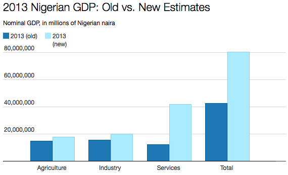
Back in April 2014 the Nigerian Statistics Office rebased GDP for the first time in 20 years, the result was a near doubling of the size of their economy, as this article from the Atlanitic – How Nigeria Became Africa’s Largest Economy Overnight, expalins:-

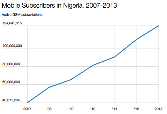
In computing its GDP all these years, Nigeria, incredibly, wasn’t factoring in booming sectors like film and telecommunications. The Nigerian movie industry, Nollywood, generates nearly $600 million a year and employs more than a million people, making it the country’s second-largest employer after agriculture. As for the telecom industry, consider that there are now some 120 million mobile-phone subscribers in Nigeria, out of a population of 170 million. Nigeria and South Africa are the largest mobile markets in sub-Saharan Africa, and cell-phone use has been exploding in the country:

Nigeria mobile subsribers

Nigerian Communications Commission (Datawrapper)

Incorporating the film and telecom industries into Nigeria’s GDP made a huge difference in the services sector, rendering the country’s economy not just bigger but more diversified:

Nigeria GDP estimate

 National Bureau of Statistics (Datawrapper)

This is not the first time an African country’s GDP has risen after rebasing, Ghana saw a 60% increase in 2010. The World Bank and IMF estimates for growth in many frontier markets may prove self-fulfilling prophesies if other frontier economies rebase in a similar manner. Nonetheless, these countries are growing rapidly and present a plethora of investment opportunities in the process.

Between 2000 and 2008 African GDP growth averaged 4.9%, twice the pace of the previous decade. Last August, ahead of the US-Africa Summit, saw the publication of the Cato Institute – Sustaining the Economic Rise of Africa – they gave an excellent summation of the state of the region:-

 …between 1990 and 2010, the share of Africans living at $1.25 per day or less fell from 56 percent to 48 percent, while the continent’s population almost doubled in size. If the current trends continue, Africa’s poverty rate will fall to 24 percent by 2030. Since 1990 the per-capita caloric intake in Africa increased from 2,150 kcal to 2,430 kcal in 2013. Between 1990 and 2012, the proportion of the population of African countries with access to clean drinking water increased from 48 percent to 64 percent. Many African countries have also seen dramatic falls in infant and child mortality. Since 2005, some African countries, such as Senegal, Rwanda, Uganda, Ghana, and Kenya, have seen child mortality decline by an annual rate exceeding 6 percent.

Nonetheless, the continent still lags significantly behind the rest of the world in its income levels and also in many indicators of human well-being. For example, Africa scored a mere 0.502 on the United Nation’s 2014 Human Development Index, measured on a scale from 0 to 1, with higher values denoting higher standards of living. By comparison, the United States scored 0.914, Latin America 0.74, and China 0.719.

The extent of trade protectionism, for example, is large, especially when compared with other regions in the world. Average applied tariffs in Africa remain comparatively high, and the extent of trade liberalization on the continent has not matched that experienced in the rest of the world. While between 1988 and 2010, the average applied tariff in high-income countries in the Organization for Economic Cooperation and Development fell from 9.5 percent to 2.8 percent, Africa saw a reduction from 26.6 percent to 11 percent. That is not a negligible decrease but it still leaves the continent with unnecessarily high tariff protection, which hinders trade.

Cato went on to highlight what Africa needs:-

Needs Examples
The Rule of law Land title, commercial contact enforcement
Improvement in governance Oversight of government contracts
Reduction of red tape Regulatory reforms
Infrastructure investment Electricity generation, transportation
Regional Economic integration Free-trade agreements

Here are the IMF – Selected Issues papersDecember 2014 – South Africa and April 2015 – Nigeria  – which look in more detail at several of these issues.

Whilst Nigeria is not exactly a paragon of virtue when it comes to corruption – ranking 136th out of 175 countries on Transparency International’s Corruption Perceptions Index – this 2011 article from the Economist – Africa’s hopeful economiespoints to real signs of progress, both in Nigeria and across the continent as a whole:-

Her $3 billion fortune makes Oprah Winfrey the wealthiest black person in America, a position she has held for years. But she is no longer the richest black person in the world. That honour now goes to Aliko Dangote, the Nigerian cement king. Critics grumble that he is too close to the country’s soiled political class. Nonetheless his $10 billion fortune is money earned, not expropriated. The Dangote Group started as a small trading outfit in 1977. It has become a pan-African conglomerate with interests in sugar and logistics, as well as construction, and it is a real business, not a kleptocratic sham.

…Severe income disparities persist through much of the continent; but a genuine middle class is emerging. According to Standard Bank, which operates throughout Africa, 60m African households have annual incomes greater than $3,000 at market exchange rates. By 2015, that number is expected to reach 100m—almost the same as in India now.

…Since The Economist regrettably labelled Africa “the hopeless continent” a decade ago, a profound change has taken hold. Labour productivity has been rising. It is now growing by, on average, 2.7% a year. Trade between Africa and the rest of the world has increased by 200% since 2000. Inflation dropped from 22% in the 1990s to 8% in the past decade. Foreign debts declined by a quarter, budget deficits by two-thirds.

…Africa’s population is set to double, from 1 billion to 2 billion, over the next 40 years. As Africa’s population grows in size, it will also alter in shape. The median age is now 20, compared with 30 in Asia and 40 in Europe. With fertility rates dropping, that median will rise as today’s mass of young people moves into its most productive years. The ratio of people of working age to those younger and older—the dependency ratio—will improve. This “demographic dividend” was crucial to the growth of East Asian economies a generation ago. It offers a huge opportunity to Africa today.

Dangote Group may not be a “kleptocratic sham” but it is protected from foreign competition by import tariffs which enable it to make a 62% margin on domestic sales. The Economist article goes on to apply a string of caveats – after all, every silver-lining must have its dark cloud, especially for those trained in the “dismal science”- the authors conclude:-

Africa is not the next China. It provides only a tiny fraction of world output—2.5% at purchasing-power parity. It is as yet not even a good bet for retail investors, given the dearth of stockmarkets. Mr Dangote’s $10 billion undeniably makes him a big fish, but the Dangote Group accounts for a quarter of Nigeria’s stockmarket by value: it is a small and rather illiquid pond.

For corporations wishing to succeed in Africa, Nigeria remains a key market. With roughly 20% of Sub-Saharan Africa’s 930 mln people and population growth of 2-3% per annum, this is a market one can’t ignore. The Economist – Business in Nigeria – takes up the story:-

In 2001 MTN, a fledgling telecoms company from South Africa, paid $285m for one of four mobile licences sold at auction by the government of Nigeria. Observers thought its board was bonkers. Nigeria had spent most of the previous four decades under military rule. The country was rich in oil reserves but otherwise desperately poor. Its infrastructure was crumbling. The state phone company had taken a century to amass a few hundred thousand customers from a population of 120m. The business climate was scarcely stable.

MTN took a punt anyway. The firm’s boss called up colleagues from his old days in pay-television and found they had 10m Nigerian customers. He reasoned that if they could afford pay-TV they could stump up for a mobile phone. Within five years MTN had 32m customers. The company now operates across Africa and the Middle East. But Nigeria was its making and remains its biggest single source of profits.

In the 1980’s, after an oil price collapse threatened to under-mine government finances, I ended up doing business in Nigeria with a subsidiary of Unilever (ULVR). Outside of the Oil and Mining sector, it was one of a very few multi-nationals still operating in the country, however, there had been an, almost catastrophic, deterioration in the operations of the division with which I dealt. This decline had taken place over the two decades since Nigerian independence: it reflected the endemic problems of doing business in the country. Managers privately told me, the principal reason they had not closed down was because this was the only practical way to recoup losses sustained in lending the government money.

Finally Unilever, along with a handful of other firms, are reaping the benefit of their long term investment. According to UN forecasts the population of Nigeria will overtake the population of the US by 2045, as soon as 2020, according to research from Oxford Economics, the population will have topped 200mln making Nigeria the fifth largest country in the world, overtaking Pakistan and Brazil – they should have a very bright future.

Near-term growth has slowed as a result of weaker GDP – 3.96% in Q1 2015 vs Q4 2014 at 5.94%, Q3 2014, 6.23% and Q2 2014 of 6.54%. The marginal effect of a falling oil price is still substantial – especially for the export market 95% of which is in petroleum and petroleum products.

The construction sector has remained robust, growing at around 10% – lower than in 2013 but still impressive. Information and Communications has also shown stability, growing at 8% per annum.

South Africa

South Africa has triple Nigeria’s per capita GDP, it is also endowed with better developed institutions. This does not, however, guarantee prosperity. This article from last week’s South African Independent on Sunday – South Africa’s triple challengemakes that clear:-

We are frequently reminded by the political establishment of South Africa’s triple challenge of poverty, inequality and unemployment. This weighs heavily on the social, political and economic fabric of the country.

This is why the unemployment and economic growth data just released points to South Africa sinking into crisis. Official unemployment, at 26.4 percent, rose to a 12-year high. Growth slumped to 1.3 percent for the first quarter this year, below expectation.

The official unemployment rate is one of the highest in the world. The measure masks a low economic participation rate and excludes discouraged work-seekers. In other words, people who want work but have stopped looking for work due to being discouraged are not counted among the unemployed. If a higher participation rate was factored in and discouraged work-seekers were included in the data, the unemployment rate would be nudging towards 50 percent.

…The economy is not big enough to absorb everyone into it. The solution is a bigger economy. For that, the economy needs growth. Not difficult. But growth has ground down to 1.3 percent and looks set to slow further. At the recent Monetary Policy Committee meeting, the SA Reserve Bank warned the inflation risks were to the downside but the risks to economic growth were on the downside.

The combination of weak economic prospects, along with higher inflation, means unemployment is set to rise even further.

… The underperformance of South Africa has been self-inflicted. It struggles under its triple triple.

First Triple: poverty, inequality and unemployment.

…if South Africa had full employment, then poverty and unemployment would be dramatically diminished as issues. However, by not emphasising this perspective, policy is focused on inequality and poverty but is not resolving unemployment.

The national budget is a case in point where the “rich” (success) are penalised through a very “progressive” tax take. Inequality is reduced by pulling down the top end of earners (in reality right down to the working class).

Poverty is tackled through a very aggressive redistribution spending policy. Through this whole process, unemployment is neglected and perpetuated. Policy focus on poverty alleviation has the effect of transferring economic resources to consumption, which is in complete contrast to poverty reduction that transfers resources to investment.

…This shift of resources to consumption has resulted in the second triple, which has become a major constraint and stumbling block to resolving the first triple.

Second Triple: the triple deficit.

The budget deficit in recent years has led to a multiple downgrade of the credit rating. On the face of it, the government “needs” more taxes to balance its books. Yet households, the core of the tax base, are also in deficit. The cost pressures in recent years and availability of credit has led to households spending more than they have earned. The ability to meet a higher tax bill is simply not there. The tax base is both narrow and shallow.

The high unemployment rate also places pressure in a higher dependency ratio on each salary and wage earner. And the government has very ambitious spending plans and faces at least four expenditure threats where each one can take South Africa to a solvency crisis. These are: the public sector wage bill; National Health Insurance; State Owned Enterprises’ need for capital; and the nuclear deal. So far, indications are that the government is going to commit to all four.

The third deficit is the current account deficit. This has been widening to record levels, especially since 2008. Of particular concern is that the current account deficit has been widening while the economy has been slowing and the currency has been weakening. This is a major concern as it means the country is losing competitiveness at an alarming rate.

Part of the reason for the loss of competitiveness comes down to the third triple:

Third Triple: the triple mistake.

The first mistake is labour unrest. No one invests in labour unrest, and investment is essential to grow the economy. South Africa must find a way to resolve labour disputes without unrest. Labour relations is where South Africa languishes near the bottom of the World Economic Forum’s Global Competitiveness survey. The unemployment crisis needs attraction of investment into labour, not away from it.

The second major mistake is the regulatory tsunami that has hit the business sector. The economy is being attacked by policymakers not nurtured. Companies trying to contain costs in a low growth environment have resources diverted to compliance, leaving less to grow their businesses. The biggest problem is that the regulatory burden requires economies of scale in order to be compliant. This is manageable by big business but debilitating for the SME sector. And it is the SME sector that is the engine of job creation. South Africa should be seeking to make South Africa an easier place to invest and do business not more difficult.

…The third mistake South Africa is making is in taxes. Economic expansion cannot happen without investment. Investment cannot be sustained without savings. The investment rate is currently 19 percent of GDP. This will buy a long-term growth rate of 2 to 3 percent.

Excessive debt, both public and private, a low savings rate and a low investment to GDP ratio – it sounds remarkably like the problems of many developed economies. Before dismissing the above article as a little localised hyperbole it’s worth considering this leader from last week’s Economist – Africa’s second-largest economy is in a huge mess:-

There is little in the way of bright news about South Africa’s economy—and not just because power cuts are plunging neighbourhoods into darkness several times a week. According to figures released on May 26th, annual GDP grew by a mere 1.3% in the first three months of this year, a crawl compared with the 4.1% achieved in the fourth quarter of 2014. Unemployment is soaring. Even using a narrow definition, it stands at 26.4%, the highest since 2003.

“The numbers are saying ‘something has to be done, and done quickly’,” says Pali Lehohla, South Africa’s statistician-general. But where to begin? Power shortages under Eskom, the failing state utility, have dampened manufacturing, drought has hit agriculture and tourism, a rare boon, has been hampered by much-criticised new visa requirements. Rating agencies have warned that South Africa is dancing dangerously close to junk status, though no immediate downgrade is likely.

…Strikes are hurting mining. Talks between unions and gold-mine bosses are due to begin in early June. But with unions opening the bargaining by demanding that basic pay for unskilled mineworkers be doubled, prospects of an early settlement seem poor. Last year similar demands at platinum mines sparked five months of labour unrest. A strike by 1.3m public-sector employees has been averted, but only at the cost of a 7% wage increase, with the money coming from emergency funds.

The weak economy is stoking social unrest and public violence. Foreigners, seen as competition for scarce jobs, were targeted in a recent spate of xenophobic attacks that left at least seven people dead. The IRR, a think-tank in Johannesburg, says that protests have nearly doubled since 2010. Many relate to the provision of basic services such as water and electricity. Inequality remains high. A report by the Boston Consulting Group, a consultancy, placed South Africa 138th of 149 countries for its ability to turn the country’s wealth into well-being for its people.

So far the government of President Jacob Zuma has shown little sign of being able to improve matters. The African National Congress, the ruling party, is bogged down in internal political battles, not least over whether to pursue capitalist or socialist economics. The government’s much-touted National Development Plan, a market-friendly strategy to encourage investment and growth, is largely ignored. Even by the ANC’s own standards, it is failing: only 2% growth is expected in 2015 when the economy needs to expand by at least 5% a year to reduce unemployment.

The country doesn’t score that well on corruption either, ranking 67th out of 175 countries on the Corruption Preceptions Index.

Likewise the Deliotte’s CFO Survey is less than encouraging. Many South African CFO’s expressed anxiety about the future. New investment is overwhelmingly directed towards expanding into other, higher-growth, parts of the continent. Of those companies with no presence elsewhere in Africa, 80% said they wanted to build such a presence within the next year – West and east Africa were their favoured destinations.

Capital Markets and Investment Opportunities

Africa is largely dependent on private capital flows as this May 2015 article explains – Brookings – Private Capital Flows, Official Development Assistance, and Remittances to Africa: Who Gets What?:-

The data also show that private capital flows to sub-Saharan Africa over the period of 2001-2012 have mostly benefited two countries—South Africa and Nigeria—which accounted for 45 percent and 13 percent of total private flows to sub-Saharan Africa, respectively. These two countries have attracted the most flows in part because they are the largest in sub-Saharan Africa, together making up more than half of the region’s GDP.

…Portfolio flows have also been increasing recently, though they remain concentrated in South Africa: That country received 96 percent of the portfolio flows to the region in 1990-2000. However, in 2001-2012, the issuance of sovereign bonds by a number of countries and increased interest by investors has led to a more diversified recipient base for portfolio flows. South Africa’s share of the total fell to 59 percent, whereas Nigeria’s increased to 24 percent, and other countries like Mauritius (14 percent) emerged on the scene.

…From 1990 to 2000, half of total FDI to sub-Saharan Africa went to South Africa (29 percent) and Nigeria (21 percent). This trend has not changed: Between 2001 and 2012, the top 10 recipient countries received 85 percent of the total FDI inflows to the region.

…In terms of volume, Nigeria was the largest recipient of remittances in the region from 1990 to 2012.

I want to turn my attention to more liquid opportunities.

Bonds – South Africa

The SARB – Quarterly Bulletin – March 2015 – sums up the recent price action in South African government bonds:-

South African bond yields moved generally lower from early 2014, in line with US bond yields. Local yields receded further in January 2015, supported by an improved inflation outlook and abundant international liquidity following the announcement of an expanded asset-purchase programme by the ECB and continued quantitative easing out of Japan. Bond yields edged higher in early March 2015 as a reversal in the oil price, the announcement of higher levies on fuel and rand depreciation impacted on inflation expectations. Most money-market interest rates have displayed little movement since the middle of 2014, remaining well-aligned with the repurchase rate of the South African Reserve Bank (the Bank) that had been held steady over this period.

The SARB has left base rates unchanged at 5.75% since July 2014 as a result of the stabilisation of the Rand and falling oil prices. Inflation expectations had been on the downside but as SARB Governor Lesetja Kganyago stated in the 21st May MPC statement:-

The challenges facing monetary policy have persisted, and, as expected, the downward trend in inflation which was mainly attributable to the impact of lower oil prices, has reversed. Headline inflation is expected to breach temporarily the upper end of the target range early next year, and thereafter remains uncomfortably close to the upper end of the target band for most of the forecast period. The upside risks have increased, mainly due to further possible electricity price increases. The exchange rate also continues to impart an upside risk to inflation as uncertainty regarding impending US monetary policy continues. Domestic demand, however, remains subdued while electricity constraints continue to weigh on output growth and general consumer and business confidence.

As the chart below suggests, 10yr Bond yields have risen from their January lows. The upward trend appears to be established, the current 10yr yield is 8.51% which is not far from the January 2014 high of 8.8%. I suspect this level will be breached but not to a substantial extent because the rising interest rate environment will undermine, already weak, growth expectations. If yields approach 9.25% I think this offers a buying opportunity. For the present, remain short. For most retail investors this means using South African bond index futures, but remember, only your P&L will be exposed to currency fluctuations.
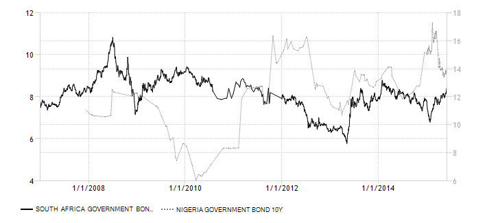
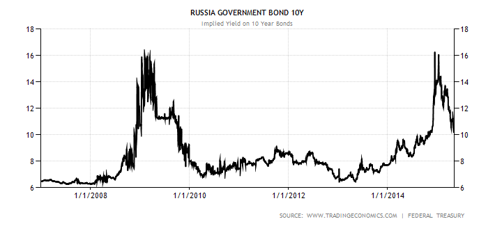
Bonds – Nigeria

Nigerian 10yr Government bonds have behaved in a very different manner to South Africa over the last seven years, as the chart below reveals:-

south-africa-nigeria government-bond-yield

Source: Trading Economics, Central Bank of Nigeria and South African Treasury

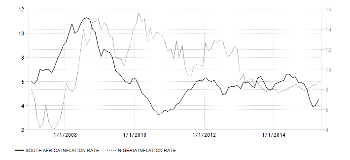
A portfolio of these two bonds would offer an attractive Sharpe ratio. Short South Africa and Long Nigeria 10yr might be another strategy to consider, you may get positive carry, but Nigerian inflation has been substantially higher over this period. Here is a chart:-

south-africa-nigeria inflation-cpi

Source: Trading Economics, National Bureau of Statistics Nigeria and Statistics South Africa

The Central Bank of Nigeria – MPC May 2015 Communique 101 – provides a wealth of information, here are some highlights:-

The Committee expressed concern about the weakening economic momentum but recognized the relative similarity in the condition to the evolving economic environment in virtually all oil exporting economies, suggesting the need for acceleration of various ongoing initiatives to diversify the economic base of the country.

The Committee noted that the uptick in inflationary pressures, year-to-date, was largely traceable to transient factors such as high demand for transportation, food and energy, especially in the period around the general elections as well as the Easter festivities. It also noted the roles played by system liquidity and the pass-through effects of the recent depreciation of the naira exchange rate. When the transient causes are isolated, the Committee observed the decline in month-on-month inflation across all the measures in April as headline inflation moderated to 0.8% from 0.9% in March; core inflation moderated to 0.6% from 0.8% and food inflation moderated to 0.9% from 1.0%.

The Committee reiterated its commitment to price stability noting that given the already tight stance of monetary policy and the transient nature of the incubators of the current inflationary trend, which are outside the direct control of monetary policy, the space for maneuver remains constrained, necessitating the intervention of fiscal and structural policies to stimulate output growth.

…the Committee stressed the need for proactive measures to protect the reserve buffer to safeguard the value of the domestic currency and engender overall stability of the banking system. It was, however, noted that monetary policy is gradually approaching the limits of tightening and would, therefore, require complementary fiscal and structural policies.

…Consequently, the MPC voted to:

(i) Retain the MPR at 13 per cent with a corridor of +/- 200 basis points around the midpoint;

(ii) Retain the Liquidity Ratio at 30 per cent; and

(iii) Harmonize the CRR on public and private sector deposits at 31.0 per cent.

10yr Bond yields have fallen from more than 17% in mid-February to 13.7% today. I believe that the hawkish policy of the Central Bank of Nigeria will insure that inflation falls further. Now the election is over, bond yields will continue to decline as foreign capital flows into the country. As recently as July 2014 yields were at 12% – I think they will go lower even than this despite yield curve inversion. The one major risk to this otherwise promising scenario is a rating agency downgrade. S&P downgraded Niara bonds to +B as recently as March, the election result helps but the new government need to deliver on their promises of reform.

To access the Nigerian bond market you need to contact one of the primary dealers – here is the link to the Nigerian Debt Management Office. You will have to deal with the issues of exchange controls, an alternative would be to be a fixed rate receiver through a Niara interest rate swap. The list of dealers may be a place to start but I suspect this is a strictly institutional option.

Stocks – South Africa

The SARB – Quarterly Bulletin – March 2015 – describes recent developments in South African equities:-

Despite the subdued growth in the economy over the past year, domestic share price entered 2015 on a positive note, recovering from the losses incurred in the second half of 2014 to reach all-time-high levels in March 2015. The domestic share market benefited from sustained accommodative monetary policies in the advanced economies, while lower international oil prices and the depreciation of the rand also boosted some share prices. Corporate funding through the issuance of shares in the primary share market rose considerably in 2014, consistent with the high level of share prices and rising number of companies listed on the JSE Limited.

…The performance of equity funding on the JSE was strong in 2014. Equity capital raised in the domestic and international primary share markets by companies listed on the JSE amounted to R153 billion in 2014, which was 65 per cent higher than the amount raised in 2013. Equity capital raising activity was concentrated in companies listed in the financial and industrial sectors, which dominated equity funding in 2014 with shares of 35 and 41 per cent respectively. Dividing the industrial sector further, as shown in the accompanying graph, more than half of the industrial sector’s equity funding in 2014 was accounted for by companies in the consumer goods subsector. Proceeds were utilised mostly for acquisitions, both abroad and domestically.

Robust funding in the primary share market was consistent with the high level of share prices and rising number of companies listed on the JSE, as new listings exceeded delistings in 2014 for the first time since 2008. The number of company listings came to 329 on the main board at the end of February 2015, while 60 were listed on the Alternative Exchange (AltX) and 3 on the development and venture capital boards. The most prominent method of raising capital was the waiver of pre-emptive rights where shares were issued for cash to the general market or specific investors. Equity financing amounted to R43 billion in the first two months of 2015.

Secondary market trading has remained stable but the P/E ratio, at around 18 times, is above its long term average (1990-2015) of 14.4. The P/E ratio has only broken above 20 once, back in 2010, during the rebound from the global recession – though it came close to these levels in 1993.

The Johannesburg (JSE) and the Nigerian Stock Exchange (NSE) are currently working towards developing a partnership that would benefit both exchanges. In this collaboration, among other things, South African companies would be able to list on the NSE and Nigerian companies on the JSE.

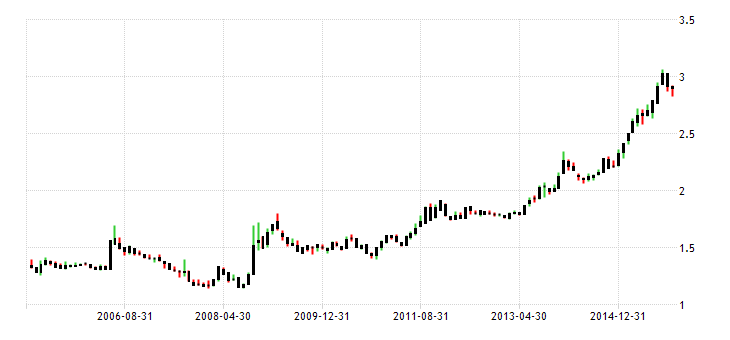
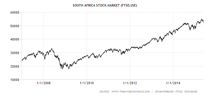
South Africa has the most sophisticated financial markets in Africa, it also acts as a conduit for foreign investment to the rest of the continent. The main stock index – the FTSE/JSE 40 – has traded steadily higher since 2009:-

south-africa-stock-market

Source: Trading Economics and JSE

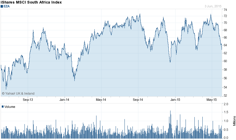
However, this does not take account of the currency risk of investing in the Rand. An alternative is the iShares MSCI South Africa ETF – EZA. Here are the top 10 components:-

Company Symbol % Assets
Naspers Ltd Class N NAPRF.JO 19.44
Mtn Group Ltd MTNOF.JO 9.83
Sasol Ltd SASOF.JO 6.51
Standard Bank Group Ltd SBGOF.JO 5.27
Firstrand Ltd FSR.JO 4.81
Steinhoff International Holdings Ltd SNHFF.JO 4.41
Sanlam Ltd SLMAF.JO 3.46
Aspen Pharmacare Holdings Ltd APNHF.JO 3.43
Remgro Ltd RMGOF.JO 3.28
Bidvest Group Ltd BDVSF.JO 2.63

Source: Yahoo Finance

iShares MSCI South Africa

Source: Yahoo Finance

It is clear from the chart above that South Africa’s main stocks are struggling due to the difficult domestic economic situation, which has led to continuous bouts of currency weakness and bond rating agency downgrades.

For domestic or hedged investors the market trend remains positive, but for international investors the carry costs of hedging undermines the attraction of this market.
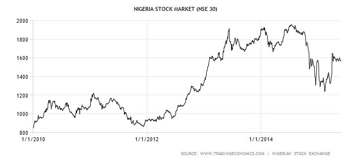
Stocks – Nigeria

Nigerian stocks have recovered from weakness earlier this year. The Central Bank put most of the recent performance down to improvements in earnings, sentiment and the successful conclusion of the election.

nigeria-stock-market 2010 - 2015

Source: Trading Economics and NSE

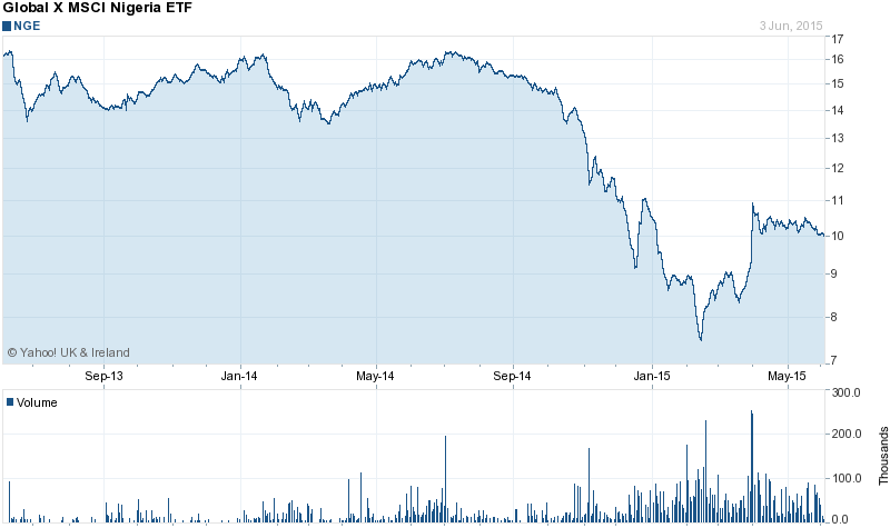
Given the heavy weighting to Dangote in this index (25%) perhaps a more diversified investment would be the Global X MSCI Nigeria ETF (NGE) here are the top 10 constituents:-

Nigerian Breweries PLC 16.41
Guaranty Trust Bank PLC 11.54
Zenith Bank PLC 8.93
Nestle Nigeria PLC 7.06
Ecobank Transnational Inc 4.72
Lafarge Africa PLC 4.66
First Bank Of Nigeria PLC 4.64
Dangote Cement PLC 4.63
Guinness Nigeria PLC 4.48
Stanbic IBTC Holdings PLC 4.37

Source: Yahoo Finance and MSCI

The advantage of the ETF is that you don’t have to deal with the problem of Nigerian exchange controls, however you should keep a close eye on the currency which continues to depreciate against the US$. The technical picture is unclear, I have no direct exposure to Nigeria but it remains on my list of stock markets with significant long-term potential. The current P/E ratio is around 16 times, not cheap like China last year, but worth watching.

NGE 2 yr chart

Source: Yahoo Finance

Currency

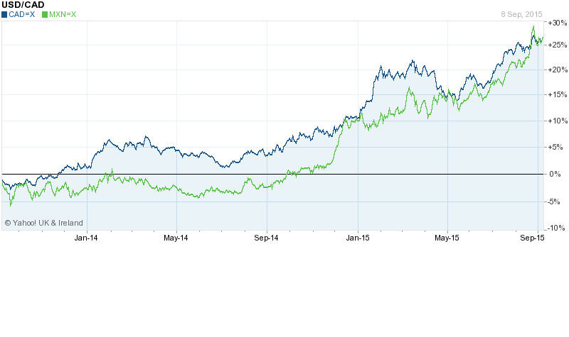
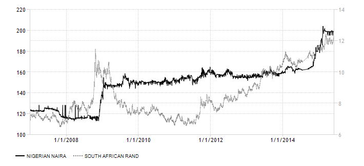
The South African Rand (ZAR) is a freely traded international currency. Daily turnover is roughly 1.1% of the global total – mostly traded in London. The Nigerian Niara (NGN) is subject to exchange controls. It is possible to trade non-deliverable forwards, but liquidity reflects the relative lack of tradability. The chart below compares the two currencies against the US$ since 2007:-

ZAR and NGN vs USD - 2007-2015

Source: Trading Economics

Since H2 2011 the ZAR/USD rate has been weakening. This trend looks set to continue. This is how its recent movements are described in the SARB – Quarterly Bulletin – March 2015 – they highlight the developments during 2014:-

The nominal effective exchange rate of the rand declined, on balance, by 2,8 per cent in 2014, compared with a decline of 18,6 per cent in 2013. The trade-weighted exchange rate of the rand increased, on balance, by 0,3 per cent in the fourth quarter of 2014 following a decline of 2 per cent in the third quarter. The rand did, however, regain some momentum, rebounding by 4,0 per cent in October 2014 supported by a positive Medium Term Budget Policy Statement and portfolio investment inflows. The domestic currency weakened by 0,3 per cent in November 2014 amid South Africa’s credit rating downgrade from Baa1 to Baa2 by Moody’s rating agency as electricity challenges became more acute. In December 2014, the trade-weighted exchange rate of the rand weakened further along with other emerging-market currencies and declined by 3,2 per cent. Sentiment towards emerging-market currencies, including the rand, was generally weighed down by the persistent weakness of the euro area, a slowing Chinese economy and an unexpected Japanese recession.

The USD/NGN has been declining by steps as the Central Bank of Nigeria, in a futile attempt to halt the depreciation, depletes its gross reserves. These have fallen to $28bln from more than $50bln in less than two years. Now that the elections are behind them the currency should be less vulnerable. During mid-April overnight rates hit 90% but have since returned to a more normal range – still a volatile series. It’s unlikely they will drop below 9% with the current hawkish MPC. This makes Long NGN Short ZAR an attractive trade – carry will be around 300bp. However, this should be viewed as a trading position. The Central Bank of Nigeria will probably have to defend the NGN again, when they fail the USD/NGN rate will rapidly head for 230.

Broken BRICs – Can Brazil and Russia rebound?

400dpiLogo

Macro Letter – No 35 – 08-05-2015

Broken BRICs – Can Brazil and Russia rebound?

  • The economies of Brazil and Russia will contract in 2015
  • Their divergence with China and India is structural
  • Economic reform is needed to stimulate long term growth
  • Stocks and bonds will continue to benefit from currency depreciation

When Jim O’Neill, then CIO of GSAM, coined the BRIC collective in 2001, to describe the largest of the emerging market economies, each country was growing strongly, however, O’Neill was the first to acknowledge the significant differences between these disparate countries in terms of their character. Since the Great Recession the economic fortunes of each country has been mixed, but, whilst the relative strength of China and India has continued, Brazil and Russia might be accused of imitating Icarus.

Economic Backdrop

In order to evaluate the prospects for Brazil and Russia it is worth reviewing the unique aspects of, and differences between, each economy.

According to the IMF April 2015 WEO, Brazil is ranked eighth largest by GDP and seventh largest by GDP adjusted for purchasing power parity. Russia was ranked tenth and sixth respectively. Between 2000 and 2012 Brazilian economic growth averaged 5%, yet this year, according to the IMF, the economy is forecast to contract by 1%. The forecast for Latin America combined is +0.6%. For Russia the commodity boom helped GDP rise 7% per annum between 2000 and 2008, but with international sanctions continuing to bite, this year’s GDP is expected to be 3.8% lower.

Brazil’s service sector is the largest component of GDP at 67%, followed by the industry,27% and agriculture, 5.5%. The labour force is around 101mln, of which 10% is engaged in agriculture, 19% in industry and 71% in services. Russia by contrast is more reliant on energy and other natural resources. In 2012[update] oil and gas accounted for 16% of GDP, 52% of federal budget revenues and more than 70% of total exports. As of 2012 agriculture accounted for 4.4% of GDP, industry 37.6% and services 58%. The labour force is somewhat smaller at 76mln (2015).

The Harvard Atlas of Economic Complexity 2012 ranks Brazil 56th and Russia 47th. The table below shows the divergence in IMF forecasts since January. During the period October 2014 and February 2015 the Rouble (RUB) declined by 30% whilst the Brazilian Real (BRL) fell only 9%:-

Country GDP GDP Forecast Forecast Jan-14 Jan-14
2013 2014 2015 2016 2015 2016
Brazil 2.7 0.1 -1 1 -1.3 -0.5
Russia 1.3 0.6 -3.8 -1.1 -0.8 -0.1

Source: IMF WEO April 2015

On March 14th the Bank of Russia published its three year economic forecast: it was decidedly rosy. This was how the Peterson Institute – The Incredibly Rosy Forecast of Russia’s Central Bank described it:-

…the Bank of Russia argues that the huge devaluation of the ruble that took place between October 2014 and February 2015 has a minor effect on economic growth. This claim neglects much empirical evidence that sharp devaluations retard investment activity, for two reasons. First, investment technology from abroad becomes more expensive—nearly 80 percent more expensive in the case of Russia. Second, devaluations increase uncertainty in business planning and hence slow down investment in domestic technology as well. Both effects work to depress economic activity in the short term.

…2017 is presented as the year of a strong rebound, as a result of cyclical macroeconomic forces. In particular, says the Bank of Russia, growth will reach 5.5 to 6.3 percent that year. It is true that the economy was already slowing down in 2012, before last year’s sanctions and devaluation. It is also true that the average business cycle globally has historically lasted about six years. But this is no ordinary cycle—sanctions are likely to play a bigger role than the Bank of Russia cares to admit. The main reason is their effect on the banking sector, where credit activity is already substantially curtailed, and may be curtailed even further once corporate eurobonds start coming due later this year. The devaluation has exacerbated the credit crunch as interest rates spiked in early 2015 to over 20 to 25 percent for business loans. These effects point in one direction: a prolonged recession.

Finally, the Russian government is reducing public investment in infrastructure in this year’s budget to try and cut overall expenditure by about 10 percent. This cutback is going to dampen growth because the multiplier on infrastructure investment is highest among all public expenditures. The Bank of Russia seems to have forgotten to account for this elementary fact of life.

Overall, the economic picture may end up being quite different from what the Bank of Russia forecasts. Instead of economic growth of –3.5 to –4 percent in 2015, –1 to –1.6 percent in 2016, and 5.5 to 6.3 percent in 2017, it may be closer to –6 to –7 percent in 2015, –3 to –4 percent in 2016, and zero growth in 2017. This scenario is worth contemplating, as it would mean that the reserve fund that the government uses to finance its deficit may be fully depleted in this period. What then?

The table below compares a range of other indicators for the two economies:-

Indicator Brazil     Russia    
  Last Reference Previous Last Reference Previous
Interest Rate 13.25% Apr-15 12.75 12.50% Apr-15 14
Government Bond 10Y 12.90% May-15 10.71% May-15
Stock Market YTD* 14.70% May-15 23.20% May-15
GDP per capita $5,823 Dec-13 5730 $6,923 Dec-13 6849
Unemployment Rate 6.20% Mar-15 5.9 5.90% Mar-15 5.8
Inflation Rate – Annual 8.13% Mar-15 7.7 16.90% Mar-15 16.7
PPI – Annual 2.27% Jan-15 2.15 13% Mar-15 9.5
Balance of Trade $491mln Apr-15 458 $13,600mln Mar-15 13597
Current Account -$5,736mln Mar-15 -6879 $23,542mln Feb-15 15389
Current Account/GDP -4.17% Dec-14 -3.66 1.56% Dec-13 3.6
External Debt $348bln Nov-14 338 $559bln Feb-15 597
FDI $4,263mln Mar-15 2769 -$1,144mln Aug-14 12131
Capital Flows $7,570mln Feb-15 10826 -$43,071mln Nov-14 -10260
Gold Reserves 67.2t Nov-14 67.2 1,208t Nov-14 1150
Crude Oil Output ,000’s 2,497bpd Dec-14 2358 10,197bpd Dec-14 10173
Government Debt/GDP 58.91% Dec-14 56.8 13.41% Dec-13 12.74
Industrial Production -9.10% Feb-15 -5.2 -0.60% Mar-15 -1.6
Capacity Utilization 79.70% Feb-15 80.9 59.85% Mar-15 62.04
Consumer Confidence** 99 Apr-15 100 -32 Feb-15 -18
Retail Sales YoY -3.10% Feb-15 0.5 -8.70% Mar-15 -7.7
Gasoline Prices $1.04/litre Mar-15 1.16 $0.68/litre Apr-15 0.61
Corporate Tax Rate 34% Jan-14 34 20% Jan-15 20
Income Tax Rate 27.50% Jan-14 27.5 13% Jan-15 13
Sales Tax Rate 19% Jan-14 19 18% Jan-15 18
*Bovespa = Brazil
*Micex = Russia
** Consumer confidence in Brazil – 100 = neutral, Consumer confidence in Russia – 0 = neutral

Source: Trading Economics and Investing.com

From this table it is worth highlighting a number of factors; firstly interest rates. Rates continue to rise in Brazil despite the relatively benign inflation rate. The rise in the Russian, Micex stock index has been much stronger than that of the Brazilian, Bovespa, partly this is due to the larger fall in the value of the RUB and partly due to the recent recovery in the oil price. PPI inflation in Brazil remains broadly benign, especially in comparison with 2014, whilst in Russia it is stubbornly high – making last week’s rate cut all the more surprising.

Brazilian industrial production continues to decline, a trend it has been struggling to reverse, yet capacity utilisation remains relatively high. Russian industrial production never rebounded as swiftly from the 2008 crisis but has remained in positive territory for the last few years despite the geo-political situation. Remembering that one of Russia’s largest industries is arms manufacture – the country ranks third by military expenditure globally behind China and US – this may not be entirely surprising.

Of more concern for Brazil, is the structural nature of its current account deficit, since the advent of the Great Recession. This combination of deficit and inflation prompted Morgan Stanley, back in 2013, to label Brazil one of the “Fragile Five” alone side India, Indonesia, South Africa and Turkey. Russia, by contrast, has run a surplus for almost the entire period since the Asian crisis of 1998.

The Government debt to GDP ratio in Russia has risen slightly but the experience of the Asian crisis appears to have been taken on board. Added to which, the sanctions regime means Russia is cut off from international capital markets. In Brazil the ratio is not high in comparison with many developed nations but the ratio has been rising since 2011 and looks set to match the 2010 high of 60.9 next year if spending is not curtailed.

A final observation concerns gold reserves. Brazil has relatively little, although they did increase in January 2013 after a prolonged period at very low levels. Russia has taken a different approach, since 2008 its reserves have tripled from less than 400t to more than 1,200t today. There have been suggestions that this is a prelude to Russia adopting a “hard currency” standard in the face of continuous debasement of fiat currencies by developed nation central banks, but that is beyond the remit of this essay.

Are the BRICs broken?

In an article published in July 2014 by Bruegal – Is the BRIC rise over? Jim O’Neill discusses the future with reference to the establishment of a joint development bank:-

Some observers believed that the whole notion of a grouping of Brazil, Russia, India and China never made any sound sense because beyond having a lot of people, they didn’t share anything else in common. In particular, two are democracies, and two are not, obviously, China and Russia.  Similarly, two are major commodity producers, Brazil and Russia, the other two, not. And their levels of wealth are quite different, with Brazil and Russia well above $10,000, China around $ 7-8 k, and India less than $ 2k per head.  And the sceptic would follow all of this by saying, the only reason why Brazil and Russia grew so well in the past decade was simply due to a persistent boom in commodity prices, and once that finished, as appears to be the case now, then their economies would lose their shine, as indeed appears to be the case.  Throw in that China would inevitably be caught by its own significant challenges at some point, which the doubters would say, is now, then all is left is India, and if it weren’t for the election of Modi recently, there has not been a lot to justify structural optimism about that country recently.

…I do believe each of Brazil and Russia have got some challenges to face, that they are not yet confronting, which at the core is to reduce their dependency to the commodity cycle, and while there are many differences between them, they do both need to become more competitive and entrepreneurial outside of commodities and to boost private sector investment.

The development has caused much political jawboning but I suspect its impact will be small in the near-term.

Looking again at the figures for capital flows, Brazil appeared to be in better shape, but Russian FDI has been positive in every quarter since 2008 until the most recent outflow in Q3 2014.

Consumer confidence in Brazil has remained more robust, possibly this is due to innate Latin optimism but it may be partly in expectation of the forthcoming Olympics. The games will take place in Rio, reminding us of the high urbanisation rates in Brazil, 85.4%. This is not dissimilar to Russia at 73.9% but substantially higher than China 54.4% and India 32.4%. Interestingly US urbanisation is 81.4% – but US GDP per capita is significantly higher.

Russia

The Peterson Institute – Russia’s Economic Situation Is Worse than It May Appear from early December 2014 painted a gloomy picture of the prospects:-

The Russian economy suffers from three severe blows: ever worsening structural policies, financial sanctions from the West, and a falling oil price. 

…Russia is experiencing large capital outflows, expected to reach $120 billion. Because of Western financial sanctions, they are set to continue. The large outflows erupted in March as investors anticipated financial sanctions, which hit in July and in effect have closed financial markets to Russia. No significant international financial institution dares to take the legal risk of lending Russia money today. 

Not wishing to be left out of the rhetoric on Russia’s demise, in late December the ECFR – What will be the consequences of the Russian currency crisis?:-

The watershed moment was the imposition of the third round of Western sanctions, which cut Russian companies off from the world’s financial markets. Along with falling oil prices (a key market factor), this caused market players to reassess the risks. Before the introduction of sanctions, the ratio of external debt to foreign exchange reserves (at 1.4) was not particularly worrying. But the fact that companies could no longer refinance their debt on external markets necessitated a rethink. It became clear that, with export revenues falling because of lower oil prices, companies would accumulate excess currency in their accounts. The supply of currency in the market from exporters (many of whom also had large debts) declined sharply, while demand from the debtor companies increased.

In October 2014 the Central Bank was forced to spend another $26 billion to support the rouble. After that, preserving the country’s reserves became the priority, so in November, the bank’s intervention fell to $10 billion. So everything was in place for a currency crisis and this is why the Russian Minister for the Economy called it “the perfect storm”. The storm was only halted by a sharp increase in the Central Bank’s interest rate and by informal pressure on companies that brought about a speedy decline in foreign exchange trading.

…So the double devaluation of the rouble will be felt in rising price and shrinking consumption. According to the Gaidar Institute for Economic Policy, this will add at least 10–12 percentage points to normal inflation, which will reach 15-20 percent. Import substitution options are relatively limited: large-scale import substitution would require significant investment and, at the moment, the resources for this are not there. And a fall in consumption (as a result of the falling purchasing power of households) will cause a decline in production.

According to the Central Bank’s December forecast, GDP in 2015 may fall by 4.5–4.8 percent. This is what the bank calls a “stress scenario”, and it assumes that the oil price will stay at $60 a barrel and Western sanctions will remain in place. In fact, this scenario seems to be the most realistic; any other scenario would involve either the lifting of sanctions or a rise in the oil price to $80 or even $100.

The dismal theme was inevitably taken up by CFR – The Russian Crisis: Early Days in early January:-

The most likely trigger for a future crisis resides in the financial sector. December’s $2 billion bailout of Trust Bank, coupled with news of large and potentially open-ended support for VTB Bank and Gazprombank, highlight the rapidly escalating costs of the crisis for the financial sector as state banks and energy companies face high dollar-denominated debt payments and falling revenues. Rising bad loans, falling equity values, and soaring foreign-currency debt are devastating balance sheets. As foreign banks pull back their support, the combination of sanctions, oil prices, and rising nonperforming loans is creating a toxic mix for Russian banks. So far, a crisis has been deferred by the belief that the central bank can and will fully stand behind the banking system. If any doubt creeps in about the strength of that commitment, a run will quickly materialize.

…Sanctions are a force multiplier. Western sanctions have taken away the usual buffers—such as foreign borrowing and expanding trade—that Russia relies on to insulate its economy from an oil shock. Over the past several months, Western banks have cut their relationships and pulled back on lending, creating severe domestic market pressures. The financial system has fragmented. Meanwhile, trade and investment have dropped sharply. These forces limit the capacity of the Russian economy to adjust to any shock. Russia could have weathered an oil shock or sanctions alone, but not both together.

…Measured by the severity of recent market moves, Russia is in crisis. But from a broader perspective, a comprehensive economic and financial crisis would cause a far greater degree of financial distress for the Russian people. Companies would find working capital unavailable; interest rates of 17 percent (or higher) and exchange rate depreciation would cause a spike in import prices; and capital expenditure would crater. All this would generate sharp increases in unemployment and a far greater fall in gross domestic product (GDP) than we have seen so far.

Chatham House – Troubled Times Stagnation, Sanctions and the Prospects for Economic Reform in Russia – published at the end of February, goes into more depth, concluding:-

Over the past three decades, a precipitous drop in oil prices (and a concomitant sharp reduction in rents) has resulted in economic reforms being undertaken in Russia. Mikhail Gorbachev’s perestroika emerged after the fall in oil prices in 1986. Putin’s earlier, more liberal economic policies were carried out after oil dropped to close to $10 a barrel in 1999. And Dmitri Medvedev’s modernization agenda was strongest in the aftermath of the global recession of 2008–09.

Unfortunately, the prospects for a similar surge in economic reform in Russia today are less good. The unfavourable geopolitical environment threatens to change the trajectory of political and economic development in Russia for the worse. By boosting factions within Russia’s policy elite who favour increased state control and less integration with the global economy, poor relations with the West threaten to reduce the prospects for a market-oriented turn in economic policy. As a result, the prevailing system of political economy that is in such urgent need of transformation may in fact be preserved in a more ossified form. Instead of responding to adversity through openness, Russia may take the historically well-trodden path of using a threatening international environment to justify centralization and international isolation in order to strengthen the existing ruling elite.

Thus, while Western sanctions were not necessarily intended to strengthen statist factions within Russia and force the country away from the global economy, this may prove to be an unintended but important outcome. Consequently, Russia appears to be locked into a path of economic policy inertia, as powerful constituencies that benefit from the existing system are strengthened by the showdown with the West. While Russia may have ‘won’ Crimea, and may even succeed in ensuring that Ukraine is not ‘won’ by the West, the price of victory may be a deterioration in long-term prospects for socioeconomic development.

This is how the USDRUB has performed during the last 12 months, the first interest rate cut (from 17% to 15% took place on 30th January, the RUB fell 3% on the day to around USDRUB 70, since then the RUB has appreciated to around USDRUB 55-55:-

USDRUB 1yr

Source: Yahoo Finance

What caused the RUB to return from the brink was a recovery in the oil price and a slight improvement in the politics of the Ukraine. The Minsk II Agreement, whilst only partially observed, has curtailed an escalation of the Ukrainian civil war. Capital outflows which were $77bln in Q4 2014 slowed to $32bln in Q1 2015. Ironically, the rebound in the currency and appreciation in the Micex index will probably delay the necessary structural reforms which are needed to reinvigorate the economy.

Brazil

At the end of February the Economist – Brazil – In a quagmiredescribed the challenges facing President Rousseff’s weak government:-

Brazil’s economy is in a mess, with far bigger problems than the government will admit or investors seem to register. The torpid stagnation into which it fell in 2013 is becoming a full-blown—and probably prolonged—recession, as high inflation squeezes wages and consumers’ debt payments rise (see article). Investment, already down by 8% from a year ago, could fall much further. A vast corruption scandal at Petrobras, the state-controlled oil giant, has ensnared several of the country’s biggest construction firms and paralysed capital spending in swathes of the economy, at least until the prosecutors and auditors have done their work. The real has fallen by 30% against the dollar since May 2013: a necessary shift, but one that adds to the burden of the $40 billion in foreign debt owed by Brazilian companies that falls due this year.

…Ideally, Brazil would offset this fiscal squeeze with looser monetary policy. But because of the country’s hyperinflationary past, as well as more recent mistakes—the Central Bank bent to the president’s will, ignored its inflation target and foolishly slashed its benchmark rate in 2011-12—the room for manoeuvre today is limited. With inflation still above its target, the Central Bank cannot cut its benchmark rate from today’s level of 12.25% without risking further loss of credibility and sapping investor confidence. A fiscal squeeze and high interest rates spell pain for Brazilian firms and households and a slower return to growth.

Yet the president’s weakness is also an opportunity—and for Mr Levy in particular. He is now indispensable. He should build bridges to Mr Cunha, while making it clear that if Congress tries to extract a budgetary price for its support, that will lead to cuts elsewhere. The recovery of fiscal responsibility must be lasting for business confidence and investment to return. But the sooner the fiscal adjustment sticks, the sooner the Central Bank can start cutting interest rates.

More is needed for Brazil to return to rapid and sustained growth. It may be too much to expect Ms Rousseff to overhaul the archaic labour laws that have helped to throttle productivity, but she should at least try to simplify taxes and cut mindless red tape. There are tentative signs that the government will scale back industrial policy and encourage more international trade in what remains an over-protected economy.

Brazil is not the only member of the BRICS quintet of large emerging economies to be in trouble. Russia’s economy, in particular, has been battered by war, sanctions and dependence on oil. For all its problems, Brazil is not in as big a mess as Russia. It has a large and diversified private sector and robust democratic institutions. But its woes go deeper than many realise. The time to put them right is now.

Earlier this week the Peterson Institute – The Rescue of Brazil summed up the current situation:-

The Brazilian economy has all the characteristics of a country under the tutelage of an International Monetary Fund (IMF) program. The list of its economic imbalances is endless: a rampant current account deficit in excess of 4 percent of GDP, an exchange rate that has long been overvalued but that has collapsed in just a few months, a public debt ratio to GDP in a rapid upward trend, a fiscal deficit of over 6 percent of GDP despite a high tax burden, an annual inflation rate of nearly 8 percent that has unanchored inflation expectations, an accelerated growth of wages well above their very low productivity. The scandal of the oil company Petrobras, the latest in a long series of political corruption scandals, is the straw that could break the back of investors’ patience, the tolerance of Brazilian citizens, and the stamina of the world’s seventh largest economy. The Petrobras scandal has far-reaching ramifications throughout the economy and society, paralyzing activity and collapsing both business and consumer confidence to unprecedented levels. The mass street demonstrations of recent weeks are the most graphic example of this dissatisfaction.

In another Op-ed Peterson – Brazil’s Investment: A Maze in One’s Own Navel the authors point to the relatively closed nature of the Brazilian economy for the lack of international investment:-

Consider the most common explanations for why Brazil’s investment rate shows persistent apathy: Excessive taxes levied on businesses discourage fixed capital formation; poor infrastructure—including ongoing problems in the energy sector—increases production costs; high wages relative to worker productivity weigh on firms, hampering investment; an opaque business environment characterized by obsolete and excessive licensing requirements reduce firms’ incentives to invest; an institutional environment marked by subsidized lending that favors certain firms over others misallocates scarce domestic savings; “state capitalism” and excessive government intervention crowd out the private sector. Evidently, all of these reasons have a role in explaining investment inertia. But, importantly, they are all homegrown.

Perhaps Brazil’s sclerotic investment has something to do with its long-standing lack of openness. It is no mystery that Brazil is one of the most closed economies in the world according to any metric that one chooses to gauge the degree of openness. It is no coincidence that this is also the most striking difference between Brazil and its emerging-market peers: Brazil is more closed than Mexico, Colombia, Peru, and Chile; all members of the Pacific Alliance, their growth rates are higher than Brazil’s. Brazil is also less open than India, China, Turkey, and South Africa.

There is an extensive academic and empirical literature on the relationship between investment and openness (see, for example, the Peterson Institute’s video on trade and investment). Several research papers show that the more open an economy is to international trade, the more foreign direct investment it receives. The more foreign direct investment it receives, the greater the availability of resources for domestic investment. Competition is also crucial: Economies that are more open induce greater competition between local and foreign firms, creating incentives for innovation and investment by domestic companies.

Unfortunately, Brazil is still fairly close-minded when it comes to these issues. Fears of losing market share and the old litany of “selling the country to foreigners” still dominate the national debate.

The weakening of the BRL has continued for rather longer than the decline in the RUB, perhaps as a result of the Petrobras “Car Wash” scandal, but a modicum of stability has been regained since early April, as the chart below shows:-

USDBRL 1yr

Source: Yahoo Finance

Commodity correlation

Both Brazil and Russia are large commodity exporters. The table below is for 2011 but a clear picture emerges:-

Commodity Russia Brazil
Oil & Products $190bln $22bln
Iron Ore & Products $19bln $54bln

Source: CIA Factbook

Platts reported that Iron Ore prices (62% Fe Iron Ore Index) had risen since the end of April to $57.75/dmt CFR North China, up $2.25 on 4th May. It is probably too soon to confirm that Iron Ore prices have bottomed but with oil prices now significantly higher ($60/bbl) since their lows ($45/bbl) seen in March. Copper has also begun to rise – perhaps in response to the performance of the Chinese stock market – rising from lows of less than $2.50/lb in January to $2.94/lb this week.

The chart below shows the relative performance of the CRB Index and the GSCI Index which has a heavier weighting to energy:-

GSCI and CRB 1 yr

Source: FT

The general recovery in commodity prices is still nascent but it is supportive for both Brazil and Russia in the near term. Both countries have benefitted from devaluation relative to their export partners as this table illustrates:-

Russia Exports Brazil Exports
Netherlands 10.70% China 17%
Germany 8.20% United States 11.10%
China 6.80% Argentina 7.40%
Italy 5.50% Netherlands 6.20%
Ukraine 5%
Turkey 4.90%
Belarus 4.10%
Japan 4.00%

Source: CIA Factbook

Asset prices and investment opportunities

Real Estate

Russian real estate prices have been subdued during the last few years, but the underlying market has been active. The lack of price appreciation is due to a massive increase in house building. 912,000 new homes were built in 2013 – the highest number since 1989. Prices are lower in 10 out 46 regions, however, this new supply should be viewed in the context of the housing bubble which drove prices higher by 436% between 2000 and 2007:-

russia-house-prices-2

Source: Global Property Guide

Brazilian property, by contrast, has risen in price. In inflation adjusted terms, prices increased 7.6% in 2013, although these increases are less than those seen during 2011/2012. Rio continues to outperform (+15.2% vs +13.9% nationally) and the forthcoming Olympics should support prices into 2016:-

brazil-house-prices-1

Source: Global Property Guide

Neither of these markets present obvious opportunities. Brazilian prices are likely to moderate in response to higher interest rates whilst increased Russian supply will hang over the market for the foreseeable future. The rental yields in the table are somewhat out of date but clearly offer a less attractive income than government bonds:-

BRAZIL November 16th 2013
SAO PAULO – Apartments
Property Size Yield
80 sq. m. 5.68%
120 sq. m. 4.71%
200 sq. m. 6.15%
350 sq. m. 6.23%
RIO DE JANEIRO -Apartments
60 sq. m. 4.40%
90 sq. m. 3.82%
120 sq. m. 3.91%
200 sq. m. 4.89%
RUSSIA June 24th 2014
MOSCOW – Apartments
Property Size Yield
75 sq. m. 3.84%
120 sq. m. 3.22%
160 sq. m. 3.07%
275 sq. m. 3.42%
ST. PETERSBURG – Apartments
60 sq. m. 6.20%
120 sq. m. 4.36%
175 sq. m. 3.46%

Source: Global Property Guide

Stocks

The chart below compares the performance of Micex and the Bovespa indices over the past year. The devaluation of the RUB has been greater than that of the BRL – this accounts for the majority of the divergence:-

MICEX vs BOVESPA 1yr

Source: FT

Looking more closely at the components of the two indices there is a marked energy and commodity bias, the table below looks at the largest stocks, representing roughly 80% of each index:-

Ticker Stock Weight Sector Free-float
GAZP GAZPROM 15 Energy 46%
SBER Sberbank 14.01 Financial Services 48%
LKOH ОАО “LUKOIL” 13.97 Energy 57%
ROSN Rosneft 5.84 Energy 15%
URKA Uralkali 5.19 Commodity 45%
GMKN “OJSC “MMC “NORILSK NICKEL” 4.79 Commodity 24%
NVTK JSC “NOVATEK” 3.93 Energy 18%
SNGS Surgutneftegas 3.49 Energy 25%
RTKM Rostelecom 3.03 Telecomm 43%
TATN TATNEFT 3.01 Energy 32%
VTBR JSC VTB Bank 2.97 Financial Services 25%
MGNT OJSC “Magnit” 2.22 Commodity 24%
TRNFP Transneft, Pref 2.21 Energy 100%
TOTAL WEIGHTING 79.66
Ticker Stock Weight Sector
ITUB4 ITAUUNIBANCO 10.764 Financial Services
BBDC4 BRADESCO 8.2 Financial Services
ABEV3 AMBEV S/A 7.368 Brewing
PETR4 PETROBRAS 6.045 Energy
PETR3 PETROBRAS 4.416 Energy
VALE5 VALE 3.971 Commodity
BRFS3 BRF SA 3.741 Commodity
VALE3 VALE 3.558 Commodity
ITSA4 ITAUSA 3.433 Financial Services
CIEL3 CIELO 3.37 Financial Services
JBSS3 JBS 2.705 Commodity
UGPA3 ULTRAPAR 2.487 Energy
BBSE3 BBSEGURIDADE 2.47 Financial Services
BVMF3 BMFBOVESPA 2.393 Financial Services
BBAS3 BRASIL 2.344 Financial Services
EMBR3 EMBRAER 1.823 Aerospace
VIVT4 TELEF BRASIL 1.733 Telecomm
PCAR4 P.ACUCAR-CBD 1.663 Retail
KROT3 KROTON 1.49 Support Services
CCRO3 CCR SA 1.48 Transport
BBDC3 BRADESCO 1.445 Financial Services
LREN3 LOJAS RENNER 1.364 Retail
CMIG4 CEMIG 1.207 Energy
CRUZ3 SOUZA CRUZ 1.027 Tobacco
TOTAL WEIGHTING 80.497

Source: Moscow Exchange and BMF Bovespa

The Russian index is clearly more exposed to energy, 48% and commodities, 12%, than the Brazilian index, where the weightings are 14 % each for energy and commodities. It is important to note that the Bovespa index adjusts for the “free-float” for each stock whilst Micex does not, however under Micex rules no stock may account for more than 15% of the index. The free-float adjusted weight of energy and commodities is therefore 18% and 4% respectively.

On the basis of this analysis, currency fluctuation has been the predominant influence on stock market returns, followed by energy and commodity prices. The PE ratios of Micex and Bovespa at roughly 8 times, are undemanding but neither the economic nor the political situation in either country is conducive to long term growth. I expect both markets to continue to recover, although Micex will probably fair best. Longer term, economic reform is required to raise the structural rate of growth.

Although not mentioned in any of the articles quoted above, Russian demographics are unfavourable as this article from Yale University – Russian Demographics: The Perfect Storm – makes clear:-

One measure of an economically secure homeland is women’s willingness to raise children with the expectation of opportunities for good health, education and livelihoods. On that front, Russia confronts a perfect storm – as fertility rates plummeted to 1.2 births per women in the late 1990s and now stand at 1.7 births per women. “Russia’s population will most likely decline in the coming decades, perhaps reaching an eventual size in 2100 that’s similar to its 1950 level of around 100 million,” write demographers Joseph Chamie and Barry Mirkin. The country has high mortality rates due to elevated rates of smoking, alcohol consumption and obesity. Investment on healthcare is low. Over the next decade, Russia’s labor force is expected to shrink by about 15 percent. Other countries with low fertility rates turn to immigration to pick up the slack. While immigrants make up about 8 percent of Russia’s population, the nation has a reputation for nationalism and xenophobia, and fertility rates are even lower in neighboring Belarus, Ukraine and Lithuania, all possible sources of immigration.

Brazil has better demographic prospects in the near term, but its population growth is now not much above the world average and by 2050 it too will be entering a demographic “Götterdämmerung” of declining population. A freer, more open economy is the most efficient method of deflecting the effects of the long term demographic deficits – stock markets reflect this in their risk premiums.

Bonds

Brazilian government bonds offer a real return after adjusting for inflation (10 yr real-yield 4.77%) however, as this March 2015 article from Forbes – With Currency In Gutter And Bad News Galore, Brazil Bonds A Buy makes clear, there are significant risks:-

…the major headwinds against Brazil are domestic. The fact that China is slowing down is no longer a fright factor. What keeps investors up at night is the possibility of Brazil losing its investment grade.  But last month, Standard & Poor’s credit analysts were in Brasilia and left saying that a downgrade to junk was unlikely.

There is the risk of impeachment and the resignation of Finance Minister Joaquim Levy, but that is already priced into the market with local interest rate futures trading over 14.35% compared to the actual benchmark rate of 12.75%.  Moreover, the impeachment of Dilma Rousseff and the resignation of Levy are worse case scenarios with low probabilities. Worries over energy rationing have subsided.

I believe Brazilian bonds offer good value, even at these levels, the central banks has taken a draconian approach to inflation and the BRL has recovered some of the ground it lost during the last year. Exports to the US should improve and signs of a recovery in European growth will benefit the BRL further.

Russian government bonds look less compelling – with headline inflation at 16.9% and 10 yr yields of only 10.71% one might be inclined to avoid them on the grounds on negative real yield – but a case can be made for lower inflation and a resurgence in the value of the RUB as this article from RT – Russia’s ‘junk’ bonds paying off handsomely suggests:-

“It’s very simple advice. Bonds are much more attractive than a year ago. Risks related to the ruble have subsided, inflation is likely to moderate, the BoP (Balance of Payments) and budget situation look reasonably strong and that is why the outlook is quite favorable,” Vladimir Kolychev, Chief Economist for Russia at VTB Capital

“Unless geopolitics interferes, we forecast Russian rates are likely to repeat Hungary’s three-year bull market run in the years ahead,” Bank of America’s head of emerging EMEA economics David Hauner

In a March 11 note, Russia’s Goldman Sachs analysts wrote “Russian bonds are both cyclically and structurally under-priced,” in a big part due devaluation expectations of the ruble stabilizing.

I remain less convinced about the value of Russian bonds but with a low debt to GDP ratio they may perform well.

Here are the recent price charts for 10 year maturities:-

russia-government-bond-yield

Source: Trading Economics

brazil-government-bond-yield

Source: Trading Economics

As inflation declines in both countries their bond markets will continue to rise in expectation of further central bank rate cuts. This will also support stocks but bonds will lead the rally, especially if future growth in Brazil or Russia should disappoint.

Australia and Canada – Commodities and Growth

400dpiLogo

Macro Letter – No 30 – 20-02-2015

Australia and Canada – Commodities and Growth

  • Industrial commodities continue to weaken
  • The BoC and RBA have cut official rates in response to falling inflation and slower growth
  • The RBA has more room to manoeuvre in cutting rates, Australian Bonds will outperform

The price of Crude Oil has dominated the headlines for the past few months as Saudi Arabia continued pumping as the price fell in response to increased US supply. However, anaemic growth in Europe and a continued slowdown in China has taken its toll on two of the largest commodity exporting countries. This has prompted both the Bank of Canada (BoC) and the Reserve Bank of Australia (RBA) to cut interest rates by 25 bp each – Canada to 0.75% and Australia to 2.25% – even as CAD and AUD declined against the US$.

In this letter I will look at Iron Ore, Natural Gas and Coal, before going on to examine other factors which may have prompted central bank action. I will go on to assess the prospects for asset markets over the coming year.

Iron Ore

The price of Iron Ore continues to make fresh lows, driven by weakness in demand from China and Japan and the EU.

Iron Ore Fines 6 yr

Source: Infomine.com

Iron Ore is Australia’s largest export market, significantly eclipsing Coal, Gold and Natural Gas. It is the second largest producer in the world behind China. 2013 production was estimated at 530 Mt. Canada, with 40 Mt is ranked ninth by production but is the fourth largest exporter. Needless to say, Iron Ore production is of significant importance to both countries, although for Canada Crude Oil comes first followed by vehicle and vehicle parts, then Gold, Gas – including Propane – and Coal. It is also worth noting that the two largest Steel exporters are China and Japan – both major Iron Ore importers. The health of these economies is vital to the fortunes of the Iron Ore industry.

Natural Gas

Natural Gas is a more difficult product to transport and therefore the price differential between different regions is quite pronounced. Japan pays the highest price of all the major economies – exacerbated by its reduction of nuclear generating capacity – closely followed by Singapore, Taiwan and South Korea. The US – Henry Hub – and AECO – Alberta – prices are broadly similar, whilst Europe and Japan pay a significant premium:-

Chart-4-Global-Natural-Gas-Prices11

Source: Federal Reserve, World Bank, CGA

Here is an extract from the International Gas Union report – IGU Wholesale Gas Price Survey Report – 2014 Edition:-

Wholesale prices can obviously vary significantly from year to year, but the top two regions are Asia Pacific followed by Europe – both with average prices over $11.00. OPE* remains the primary pricing mechanism in Asia Pacific and still a key mechanism in Europe.

*Oil Price Escalation – in this type of contract, the price is linked, usually through a base price and an escalation clause, to competing fuels, typically crude oil, gas oil and/or fuel oil. In some cases coal prices can be used as can electricity prices.

Canada has significant Gas reserves and is actively developing Liquefied Natural Gas (LNG) capacity. 13 plant proposals are underway but exports are still negligible. It also produces significant quantities of Propane which commands a premium over Natural Gas as this chart shows: –

Chart-5-Energy-Commodity-Prices10

Source: StatsCan, Kent Group, CGA

Australia, by comparison, is already a major source of LNG production. The IGU – World LNG Report – 2014 Edition:-

Though Australia was the third largest LNG capacity holder in 2013, it will be the predominant source of new liquefaction over the next five years, eclipsing Qatari capacity by 2017. With Pluto LNG online in 2012, seven Australian projects are now under construction with a total nameplate capacity of 61.8 MTPA (53% of global under construction capacity).

Coal

Australia is the fourth largest Coal producer globally. According to the World Coal Association, it produced 459 Mt in 2013. Canada did not feature in the top 10. However when measured in terms of Coking Coal – used for steel production – Australia ranked second, behind China, at 158 Mt whilst Canada ranked sixth at 34 Mt.

The price of Australian Coal has been falling since January 2011 and is heading back towards the lows last seen in 2009, driven primarily by the weakness in demand for Coking Coal from China.

Australian Coal Price - Macro Business 2012 - 2014

Source: Macro Business

This is how the Minerals Council of Australia describes the Coal export market:-

Coal accounted for almost 13 per cent of Australia’s total goods and services exports in 2012-13 down from 15 per cent in 2011-12. This made coal the nation’s second largest export earner after iron ore. Over the last five years, coal has accounted, on average, for more than 15 per cent of Australia’s total exports – with export earnings either on par or greater than Australia’s total agricultural exports.

Australia’s metallurgical coal export volumes are estimated at 154 million tonnes in 2012-13, up 8.5 per cent from 2011-12. However, owing to lower prices the value of exports decreased by almost 27 per cent to be $22.4 billion in 2012-13.

Whilst the scale of the Coal industry in Canada is not so vast, this is how the Coal Association of Canada describes Canadian Coal production:-

Production

Canada produced 60 million close to 67 million tonnes (Mt) of coal in 2012. 31 million tonnes was metallurgical (steel-making) coal and 36 million tonnes (Mt) was thermal coal. The majority of coal produced in Canada was produced in Alberta and B.C.

Alberta produced 28.3 Mt of coal in 2012

British Columbia produced 28.8 Mt (most was metallurgical coal) – 43% of all production

To meet its rapid infrastructure growth and consumer demand for things such as vehicles and home appliances, Asia has turned to Canada for its high-quality steel-making coal. As Canada’s largest coal trading partner, coal exports to Asia accounted for 73% of total exports in 2010.

Steel-Making Coal

Global steel production is dependent on coal and more and more the world is turning to Canada for its supply of quality steel-making coal.

The production of steel -making coal increased by 5.5% from 29.5 Mt in 2011 to 31.1 Mt in 2012.

Almost all of Canada’s steel-making coal produced was exported.

Thermal Coal

Approximately 36 million tonnes of thermal coal was produced in 2012.

The vast majority of Canadian thermal coal produced is used domestically.

Currency Pressures

Until the autumn of 2014 the CAD was performing strongly despite weakness in several of its main export markets as the chart below of the Canadian Effective Exchange Rate (CERI) shows:-

CAD CERI - 1yr to sept 2014

Source: Business in Canada, BoC

Since September the CERI index has declined from around 112 to below 100.

For Australia the weakening of their trade weighted index has been less extreme due to less reliance on the US. There is a sector of the RBA website devoted the management of the exchange rate, this is a chart showing the Trade Weighted Index and the AUDUSD rate superimposed (RHS):-

AUD_effective_and_AUDUSD_-_RBA

Source: RBA, Reuters

Taking a closer look at the monthly charts for USDCAD:-

canada-currency

Source: Trading Economics

And AUDUSD:-

australia-currency

Source: Trading Economics

These charts show the delayed reaction both currencies have had to the decline in the price of their key export commodities – they may fall further.

Central Bank Policy

The chart below shows the evolution of BoC and RBA policy since 2008. Australian rates are on the left hand scale (LHS), Canadian on the right:-

australia and canadian -interest-rate 2008 - 2015

Source: Trading Economics

To understand the sudden change in currency valuation it is worth reviewing the central banks most recent remarks.

The BoC expect Oil to average around $60/barrel in 2015. Here are some of the other highlights of the latest BoC monetary policy report:-

The sharp drop in global crude oil prices will be negative for Canadian growth and underlying inflation.

Global economic growth is expected to pick up to 3 1/2 per cent over the next two years.

Growth in Canada is expected to slow to about 1 1/2 per cent and the output gap to widen in the first half of 2015.

Canada’s economy is expected to gradually strengthen in the second half of this year, with real GDP growth averaging 2.1 per cent in 2015 and 2.4 per cent in 2016, with a return to full capacity around the end of 2016, a little later than was expected in October.

Total CPI inflation is projected to be temporarily below the inflation-control range during 2015 because of weaker energy prices, and to move back up to target the following year. Underlying inflation will ease in the near term but then return gradually to 2 per cent over the projection horizon.

On 21 January 2015, the Bank announced that it is lowering its target for the overnight rate by one-quarter of one percentage point to 3/4 per cent.

…Although there is considerable uncertainty around the outlook, the Bank is projecting real GDP growth will slow to about 1 1/2 per cent and the output gap to widen in the first half of 2015. The negative impact of lower oil prices will gradually be mitigated by a stronger U.S. economy, a weaker Canadian dollar, and the Bank’s monetary policy response. The Bank expects Canada’s economy to gradually strengthen in the second half of this year, with real GDP growth averaging 2.1 per cent in 2015 and 2.4 per cent in 2016.

The RBA Statement on Monetary Policy – February 2015 provides a similar insight into the concerns of the Australian central banks:-

…Australia’s MTP growth is expected to continue at around its pace of recent years in 2015 as a number of effects offset each other. Growth in China is expected to be a little lower in 2015, while growth in the US economy is expected to pick up further. The significant fall in oil prices, which has largely reflected an increase in global production, represents a sizeable positive supply shock for the global economy and is expected to provide a stimulus to growth for Australia’s MTPs. The fall in oil prices is also putting downward pressure on global prices of goods and services. Other commodity prices have also declined in the past three months, though by much less than oil prices. This includes iron ore and, to a lesser extent, base metals prices. Prices of Australia’s liquefied natural gas (LNG) exports are generally linked to the price of oil and are expected to fall in the period ahead. The Australian terms of trade are expected to be lower as a result of these price developments, notwithstanding the benefit from the lower price of oil, of which Australia is a net importer.

…Available data since the previous Statement suggest that the domestic economy continued to grow at a below-trend pace over the second half of 2014. Resource exports and dwelling investment have grown strongly. Consumption growth remains a bit below average. Growth of private non-mining business investment and public demand remain subdued, while mining investment has fallen further. Export volumes continued to grow strongly over the second half of 2014, driven by resource exports. Australian production of coal and iron ore is expected to remain at high levels, despite the large fall in prices over the past year. The production capacity for LNG is expected to rise over 2015. Service exports, including education and tourism, have increased a little over the past two years or so and are expected to rise further in response to the exchange rate depreciation.

…Household consumption growth has picked up since early 2013, but is still below average. Consumption is being supported by very low interest rates, rising wealth, the decision by households to reduce their saving ratio gradually and, more recently, the decline in petrol prices. These factors have been offset to an extent by weak growth in labour income, reflecting subdued conditions in the labour market. Consumption growth is still expected to be a little faster than income growth, which implies a further gradual decline in the household saving ratio.

…Prior to the February Board meeting, the cash rate had been at the same level since August 2013. Interest rates faced by households and firms had declined a little over this period. Very low interest rates have contributed to a pick-up in the growth of non-mining activity. The recent large fall in oil prices, if sustained, will also help to bolster domestic demand. However, over recent months there have been fewer indications of a near-term strengthening in growth than previous forecasts would have implied. Hence, growth overall is now forecast to remain at a below trend pace somewhat longer than had earlier been expected. Accordingly, the economy is expected to be operating with a degree of spare capacity for some time yet, and domestic cost pressures are likely to remain subdued and inflation well contained. In addition, while the exchange rate has depreciated, it remains above most estimates of its fundamental value, particularly given the significant falls in key commodity prices, and so is providing less assistance in delivering balanced growth in the economy than it could.

Given this assessment, and informed by a set of forecasts based on an unchanged cash rate, the Board judged at its February meeting that a further 25 basis point reduction in the cash rate was appropriate. This decision is expected to provide some additional support to demand, thus fostering sustainable growth and inflation outcomes consistent with the inflation target.

Real Estate

Neither central bank makes much reference to the domestic housing market. Western Canada has been buoyed by international demand from Asia. Elsewhere the overvaluation has been driven by the low interest rates environment. Overall prices are 3.1% higher than December 2014. Vancouver and Toronto are higher but other regions are slightly lower according to the January report from the Canadian Real Estate Association . The chart below shows the national average house price:-


Canada natl_chartA04_hi-res_en

Source: Canadian Real estate Association

The Australian market has moderated somewhat during the last 18 months, perhaps due to the actions of the RBA, raising rates from 3% to 4.75% in the aftermath of the Great Recession, however, the combination of lower RBA rates since Q4 2011, population growth and Chinese demand has propelled the market higher once more. Prices in Western Australia have moderated somewhat due to the fall in commodity prices but in Eastern Australia, the market is still making new highs. The chart below goes up to 2014 but prices have continued to rise, albeit moderately (less than 2% per quarter) since then:-

Australian House Prices 2006 - 2014

Source: ABS

This chart from the IMF/OECD shows global Price to Income ratios, Canada and Australia are still at the expensive end of the global range:-

House pricetoincome IMF

Source: IMF and OECD

The lowering of official rates by the BoC and RBA will not help to alleviate the overvaluation.

Bonds

This chart shows the monthly evolution of 10 year Government Bond yields since 2008 in Australia (LHS) and Canada (RHS):-

australia-canada-government-bond-yield

Source: Trading Economics

Whilst the two markets have moved in a correlated manner Canadian yields have tended to be between 300 and 100 bp lower over the last seven years. The Australian yield curve is flatter than the Canadian curve but this is principally a function of higher base rates. Both central banks have cut rates in anticipation of lower inflation and slower growth. This is likely to support the bond market in each country but investors will benefit from the more favourable carry characteristics of the Canadian market.

Stocks  

To understand the differential performance of the Australian and Canadian stocks markets I have taken account of the strong performance of commodity markets prior to the Great Recession, in the chart below you will observe that both economies benefitted significantly from the rally in industrial commodities between 2003 and 2008. Both stock markets suffered severe corrections during the financial crisis but the Canadian market has steadily outperformed since 2010:-

canada australian -stock-market 2000-2015

Source Trading Economics

This outperformance may have been due to Canada’s proximity to, and reliance on, the US – 77% of Exports and 52% of Imports. The Australian economy, by contrast, is reliant on Asia for exports – China 27%, Japan 17% – however, I believe that the structurally lower interest rate regime in Canada is a more significant factor.

Conclusions and investment opportunities

With industrial commodity prices remaining under pressure neither Canada nor Australia is likely to exhibit strong growth. Inflation will be subdued, unemployment may rise. These are the factors which prompted both central banks to cut interest rates in the last month. However, both economies have been growing reasonable strongly when compared with countries such as those of the Eurozone. Canada GDP 2.59%, Australia GDP 2.7%.

The BoC has little room for manoeuvre with the base rate at 0.75% but the RBA is in a stronger position. For this reason I believe the AUD is likely to weaken against the CAD if world growth slows, but the negative carry implications of this trade are unattractive.

Canadian Real Estate is more vulnerable than Australia to any increase in interest rates – although this seems an unlikely scenario in the near-term – more importantly, in the longer term, Canadian demographics and slowly population growth should alleviate Real Estate demand pressure. In Australia these trends are working in the opposite direction. Neither Real Estate market is cheap but Australia remains better value.

The Australian All-Ordinaries should outperform the Canadian TSX as any weakness in the Australian economy can be more easily supported by RBA accommodation. The All-Ordinaries is also trading on a less demanding earnings multiple than the TSX.

The RBA’s greater room to ease monetary conditions should also support the Australian Government Bond market, added to which the Australian government debt to GDP ratio is an undemanding 28% whilst Canadian debt to GDP is at 89%. The Canadian curve may offer more carry but the RBA ability to ease policy rates is greater. My preferred investment is in Australian Government Bonds. Both Canadian and Australian 10 year yields have risen since the start of February. The last Australian bond retracement saw yields rise 46 bp to 3.75% in September 2014. Since the recent rate cut yields have risen 30 bp to a high of 2.67% earlier this week. Don’t wait too long for better levels.

The prospects for the UK in 2015 – Stocks, Gilts and Sterling

400dpiLogo

Macro Letter – No 28 – 23-01-2015

The prospects for the UK in 2015 – Stocks, Gilts and Sterling

  • Unlike major Eurozone bond markets, UK 10 year Gilts have yet to make new highs
  • The FTSE has lagged both the S&P500 and the DAX
  • Sterling continues to appreciate against the Euro, but decline versus the UD$
  • UK election uncertainty will dominate and constrain markets until May

Last year the UK stock market trod water while other markets, often with weaker fundamentals, trended higher. Meanwhile UK Gilts headed back towards the multi-year low yields last seen during the Euro crisis in July 2012. UK growth still appears robust when compared to other EU countries; it has broadly kept pace with the US over the course of the last 18 months.

Annualised GDP
Country UK USA
Q1 2013 0.9 1.7
Q2 2013 1.7 1.8
Q3 2013 1.6 2.3
Q4 2013 2.4 3.1
Q1 2014 2.4 1.9
Q2 2014 2.6 2.6
Q3 2014 2.6 2.7

Source: Trading Economics

Earlier this month saw the publication of the Deloitte – Q4 CFO Survey. This influential report is based on a survey of 119 CFO, of which 32 represent FTSE 100 companies. They see a growing divide between good UK fundamentals and UK politics in the run up to the general election in May. The positive domestic environment is also at odds with a number of external risks including the collapse in commodity prices, slowing emerging market growth – especially in China – and the continued weakness and political uncertainty surrounding the Eurozone (EZ).

56% of CFO’s believe now is a good time to invest in their businesses – down from a record high of 71% in Q3. This is still well above the long-term average and the general expectation is that Capital Expenditure will increase 9% in 2015.

The Deloitte report underpins hopes for the return of real wage growth for the first time in six years. The UK employment report, released on Wednesday, may indicate the beginning of a trend: it reveals average weekly earnings rising 1.7% in November – down from 1.9% in October but the third consecutive month of above inflation wage growth. Headline unemployment was 5.8%, down from a previous 6%, but employment growth was muted and the activity rate has declined by 0.5% over the last six months. In other words, less people are participating in the labour market. The rate of private sector pay inflation actually slowed in November from 2.4% to 2.1% – real-wage growth may be distorted by temporary disinflationary factors such as falling energy prices. I think it is safe to suggest that UK living standards are stabilising after a painful period of adjustment.

Last week also saw the publication of UK inflation data. Following a trend seen in a number of other developed markets, it came in at 14 year low of +0.5% – well below the Bank of England (BoE) target of 2%. It is likely that Governor Carney will blame this divergence on external factors when he writes his first letter of explanation to the UK Chancellor. The excuses have already begun; this speech, given yesterday by external MPC member David Miles, opens:-

What can monetary policy be expected to do? My short answer comes in three parts: First, rather a lot less than many people who view inflation targets as too narrow seem to think; those who want to broaden the aims of monetary policy well beyond inflation to include targets for growth, financial stability and even income inequality may seriously over-estimate what policy can realistically achieve. Second, rather a lot more than is implied by many economic models which take a narrow view of the channels through which monetary policy affects behaviour and as a result make the ability of monetary policy to stabilise the economy precarious. Third, the success of monetary policy in achieving stable inflation (or prices) depends crucially on that being consistent with fiscal policy. Monetary policy cannot be expected to achieve price stability in isolation from things fiscal; monetary policy does not hold all the cards – it cannot trump everything.

The fall in inflation has been widespread, as the chart below shows, but this may not be an indication of economic malaise since external factors, such as the fall in oil prices and the continued decline in the Euro, are a significant influence. Nonetheless, as the Economic Research Council observe in their recent commentary, this is the first time on record that all four sub-sectors have experienced an inflation rate of 1% or less in a single month:-

UK_Inflation_-_ONS

Source: ONS and Economic Research Council

A more important gauge of corporate domestic conditions can be gleaned from the BoE – Q4 2014 Credit Conditions Survey – published on 6th January. Here are some of the highlights:-

…The overall availability of credit to the corporate sector was unchanged in Q4 according to lenders, and was expected to remain unchanged in Q1.

…While demand for credit from small businesses was reported to have decreased in Q4, demand from medium-sized companies increased significantly. Demand for credit from large corporates increased slightly in 2014 Q4.

…Spreads on lending to small businesses were unchanged in Q4, while spreads for medium-sized companies and large corporates narrowed significantly. These trends were expected to continue over the next three months.

…Default rates on corporate lending fell in Q4, particularly on lending to small businesses. Losses given default were unchanged in Q4 for small businesses, but fell for medium-sized companies and large corporates.

The minutes of the December MPC meeting showed a unanimous vote in favour of maintaining the stock of assets purchased during the period of QE from September 2009 to July 2012 – £375 bln – despite two members continuing to vote in favour of a 25bp rate increase. On Wednesday the January MPC minutes showed a unanimous accord to leave rates unchanged. Alert to the possibly temporary nature of the positive price shocks of lower oil and a declining Eur, Weale and McCafferty, the two MPC hawks, said their decision was “finely balanced”. The minutes went on to say:-

…the risks to CPI inflation in the medium term might have, if anything, shifted to the upside, but all members were also alert to the downside risk of current low inflation becoming entrenched.

At first sight the Deloitte CFO survey and the BoE Credit Conditions survey appear to be at odds, until one remembers the degree to which corporate sector demand for credit has been stifled by the unconventional monetary policy of the BoE and other central banks over the last few years. Negative real-interest rates distort the credit price discovery mechanism.

Corporates have chosen to issue special dividends or buy back stock rather than borrow at ostensibly attractive rates because of the uncertainty which surrounds the economic consequences of interest rate normalisation.

Nonetheless, in several respects, the UK economy looks robust, especially in comparison to most of the EZ. Six years of falling real wages – down 11% over the period – has allowed average working hours and private sector GDP to push well above the pre-crisis highs of 2007. Productivity, however, remains a problem, real GDP per hour barely moved, suggesting that “low wage – low skill” employment has taken up the slack. This has stimulated an influx of 1.5mln immigrant workers, and stoked divisive political debate, in the process. The economy may have grown but the standard of living of the average voter has not.

UK Public sector finances remain a concern as this chart from the Economic Research Council demonstrates:-

UK_Public_Sector_Finances_-_ERC

Source: Economic Research Council and ONS

Net government borrowing has improved, retreating from its zenith of 10% of GDP in 2009/2010 to less than 6% in 2013/2014, however the total Net Debt to GDP ratio continues to rise – the ERC are forecasting 83% during the 2014/2015 tax year. Ian Stewart – Chief Economist at Deloitte’s – put it succinctly in a weekly note back in November – Recession Over, Deficit Reduction Grinds On:-

The IMF reckons that the UK’s budget deficit will come in at 5.3% of GDP this year. In Europe, only Spain has a bigger deficit. Markets have worried a lot about public sector indebtedness in the euro area in recent years, but the ratio of borrowing to GDP in France, Italy and Greece this year is likely to be around half UK levels.

…Public sector deficits have been falling as a share of GDP in most countries since 2009.

Small nations which endured deep financial crises have been most aggressive in cutting public borrowing. Greece, Iceland, Ireland, Portugal and Latvia top the league table of deficit reduction since 2009. The US and UK also cut borrowing aggressively. But both, ironically, now have deficits which exceed those of Greece, Ireland and Iceland.

The best way of shrinking public deficits is to grow the economy. Yet while the UK has easily outpaced its peers this year progress in reducing the deficit has gone into reverse. In the first seven months of the 2014/15 financial year the deficit was 6% higher than in the same period a year earlier. The official forecast for a 12% reduction in the deficit in 2014/15 looks unattainable.

The long squeeze on public expenditure is actually on track. The problem is that tax revenues have lagged well behind expectations. Several factors are at work.

Much of the growth in UK employment in the last year has been in low wage work, dampening earnings growth and tax revenues. (The positive side of this is that the young and the unskilled are getting back into work. The proportion of young people not in work education or training is at the lowest level in ten years).

Stronger than expected growth in self-employment, where average earnings are below those in the rest of the economy, have also hit government revenues. The Office of National Statistics calculates that the median incomes for the self-employed fell by a whopping 22% between 2008-09 and 2012-13.

The Coalition’s decision to raise the tax free threshold to £10,000 has eaten further into revenues. Meanwhile, a lower oil price has hit North Sea revenues and a cooling housing market means less money for the Treasury from Stamp Duty.

The Coalition’s strategy has been to shrink the deficit mainly through cutting public expenditure. According to the Institute for Fiscal Studies spending cuts account for 71% of the planned fiscal consolidation, reduced interest payments 15% and tax rises just 12%.

Most planned tax rises have taken effect, but two-thirds of the planned cuts to spending on public services still have to take effect.

The UK is over five years through a ten-year programme of deficit reduction. Roughly half of the total planned tightening still lies ahead. The speed and composition of deficit reduction seem likely to remain a central issue in the next Parliament.

But that’s not how voters see things. A recent poll for the Financial Times by Populus found that 60% of voters do not believe that any further cuts in public spending will be necessary in the next Parliament.

Paradoxically, cutting budget deficits may be politically easier in a time of crisis than when the economy is growing. Voters’ concerns are already shifting away from the economy. Five more years of austerity is not a slogan that is likely to appeal to an electorate that has been through the deepest recession in generations.

The hope for whichever party or coalition wins the next election is that tax revenues pick up. Without such a recovery the next government would have to choose between pushing back the timetable for eliminating the deficit or piling on more austerity. The recession may be over, but much of the pain of deficit-reduction still lies ahead. 

The continued deterioration in government finances is one factor which is holding back UK growth, another is the rapid increase in private sector borrowing; primarily mortgages, helped by an extension of the Funding for Lending scheme, and credit cards. According to the Money Charity – January 2015 report:-

People in the UK owed £1.463 trillion at the end of November 2014.

This is up from £1.433 trillion at the end of November 2013 – an extra £591 per UK adult.

The average total debt per household – including mortgages – was £55,384 in November. The revised figure for October was £55,297.

Per adult in the UK that’s an average debt of £28,968 in November – around 115.0% of average earnings. This is up from a revised £28,922 in October.

…Outstanding consumer credit lending was £168.8 billion at the end of November 2014.

This is up from £158.8 billion at the end of November 2013, and is an increase of £199 for every adult in the UK.

These combined public and private sector trends helped to push the current account deficit to a 60 year high of £27bln – 6% of GDP – in Q3 2014, notwithstanding a record service sector surplus of 5.1%:-

current-account-quarterly-2000-2012

Source: economicshelp.org and OBR

The latest Ernst and Young’s ITEM Club forecast was released this week. This revised UK growth since their last estimate in October, from 2.4% to 2.9% for 2015. The revision is mainly due to lower oil prices. This also leads them to predict that inflation will average zero over the course of 2015. The clouds on this decidedly bright horizon are external factors, such as the dismal prospects for EZ growth, the continued slowing of a debt encumbered Chinese economy and the geo-political downside risks for Russia and its acolytes. All these factors would reduce growth but also, barring a dramatic increase in the price of energy, herald lower inflation.

Below is a chart showing annualised UK GDP data over the period 2007-2014:-

united-kingdom-gdp-growth-annual 2007-2014

Source: Trading Economics and ONS

The recovery looks robust until one realises that over the period 1993 to 2007 UK GDP averaged 3.3%. In the last three years it has only managed 0.9%.

I concur with the ITEM Club; BoE rates are unlikely to rise for some while yet – the money markets are not pricing in a rate rise until Q1 2016. As in many other developed countries, the economic recovery has been muted and protracted due to the overhang of debt and the “monetary engineering” of consumption.

Politics

May 7th is the date set for the general election; this event will dominate the political agenda for H1 2015. The latest ICM opinion poll published by The Guardian on Tuesday looks like this:-

ICM_Poll_Parties_200115

Source: Guardian and ICM

An article published last Sunday by British Future – 2015 A Year of Uncertaintysuggest that the election will be the most open in 40 years:-

We don’t even know how many parties will end up forming a government, let alone which ones. New ICM polling for this year’s State of the Nation 2015 report from British Future sheds some light on key issues surrounding the General Election campaign and beyond.

How people predict the outcome of the May 7 election depends very much on who they are, with most party supporters feeling that their team have a good chance: 88% of Conservatives think their party will be in government, while 78% of Labour supporters think theirs will. They can’t both be right. That two-thirds of UKIP supporters think Nigel Farage and co. will be part of the government and 49% of Lib Dems think they will, shows how open a contest it could be.

In an election that may well be dominated by questions about immigration and identity, not everyone is confident that we can emerge from the debate unscathed, with social and community cohesion intact. Our poll finds that only a quarter of Britons believe we can come through the 2015 election campaign with good community relations across our multi-faith and multi-ethnic society. A similar number worry that the tone of the election campaign will damage relations between different communities, while another group of voters wish the gloves would come off more.

…It is the job of politicians to articulate different views, but also to aggregate them. This has become more difficult as our fragmented politics show. But in a fractious society there will also be a greater appetite for politicians who can tell a broader story about what brings us together – one which can engage people in the cities and in coastal towns, across the generations, and build common cause across class, faith and ethnic lines in the Britain we all share.

Asset Market Direction

Uncertainty surrounding the general election will limit price moves for the UK stocks and Gilts until mid-year at the earliest; if anything, there may be capital outflows.

Gilts

Gilts offer higher yields than Bunds or Oats and yet, to a Euro based investor, the currency risk of Gilts, as opposed to the country risk of BTPs or Bonos, makes the carry-trade less than obvious in a UK election year. Here are a selection of 10 year Government bond yields from, post ECB QE announcement at 17:00 GMT on Thursday 22nd:-

Country 10 yr Yield Spread over Bunds
Switzerland -0.19 -0.64
Germany 0.45 0
Finland 0.46 0.01
Netherlands 0.48 0.03
France 0.62 0.17
Ireland 1.18 0.73
Spain 1.42 0.97
UK 1.51 1.06
Italy 1.62 1.17
Portugal 2.36 1.91
Greece 8.89 8.44

Source: Investing.com

The recent actions of the Swiss National Bank (SNB) whilst extreme, are an indication of the potential impact of currency risk both on the value of a bond and its yield. Meanwhile Gilts, like other government bonds continue their inexorable rise. Here is the monthly yield for 10 year Gilts since January 2007:-

united-kingdom-government-bond-yield 2007-2015

Source: Trading Economics

The absolute low in yield was seen in July 2012 at 1.40% during the depths of the last Euro crisis – at that juncture German Bunds were yielding around1.25% – a spread of around 15bp. I believe we will see fresh all-time highs in Gilts over the coming months, although I am not yet ready to short German Bunds against them, even for more than 100bp of positive carry. In absolute terms Gilt yields have halved in the last 13 months. For long-term investors a yield of 1.5% is hardly exciting, but that is what I said this time last year, only to watch fixed income markets have their best period of capital appreciation in many years.

Currency

The BoE decision to embrace aggressive QE early in the aftermath of the Great Recession – mainly during September and October 2009 – meant that the UK economy was the first to recover, however, as the chart below makes clear, the 40% depreciation of the GBP exchange rate versus its main trading partner created the conditions for a rapid export led recovery in economic fortunes:-

EURGBP Month Jan 2007 - Jan 2015

Source: Barchart.com

This month, prompted by the continued strengthening of the US$ and the unpegging of the CHF, has seen EUR/GBP break through the 61.8% retracement level (0.78). It is not inconceivable that the entire move will now be retraced. The 0.70 highs of 2005/2006 look like the next obvious level of support. This will hasten a further deterioration in the current account deficit and allow the EZ to export some of its deflation to the UK.

Against the US$, Sterling has been weakening, as international capital has flowed into the US markets. I expect continued weakness of Cable – it is likely to retest 1.42, a level last reached in May 2010 – together with further Sterling strength versus the Euro.

Stocks

Covering the period since 2010, here is a chart of showing the relative performance of FTSE versus DAX and EuroStoxx 50:-

FTSE EUROSTOXX DAX 5yr

Source: Yahoo Finance

What is clear is that German stocks have benefitted, from the receding of the Euro crisis, significantly more than either the UK or the broader European market. The DAX outperformance of FTSE, however, dates back to the early 2000’s Hartz reforms which have been key to German growth for more than a decade. As often happens, the UK stock market had already anticipated the resurgence in economic growth prior to 2012. In 2014 the FTSE marked-time as mining and commodity stock weakness was offset by stronger performance in other sectors – especially technology.

The continued weakness in GBP/USD may encourage inward capital flows into UK stocks. The upward momentum of the US economy – barring a major correction on the back of an energy sector related debt default – will also benefit UK stocks; the US is still “the Consumer of Last Resort”. The IMF – World Economic Outlook update cut its global growth forecast earlier this week from 3.8% to 3.5% but increased its US forecast from 3.1% to 3.6%. This is their introduction: –

Global growth will receive a boost from lower oil prices, which reflect to an important extent higher supply. But this boost is projected to be more than offset by negative factors, including investment weakness as adjustment to diminished expectations about medium-term growth continues in many advanced and emerging market economies.

Global growth in 2015–16 is projected at 3.5 and 3.7 percent, downward revisions of 0.3 percent relative to the October 2014 World Economic Outlook (WEO). The revisions reflect a reassessment of prospects in China, Russia, the euro area, and Japan as well as weaker activity in some major oil exporters because of the sharp drop in oil prices. The United States is the only major economy for which growth projections have been raised.

The distribution of risks to global growth is more balanced than in October. The main upside risk is a greater boost from lower oil prices, although there is uncertainty about the persistence of the oil supply shock. Downside risks relate to shifts in sentiment and volatility in global financial markets, especially in emerging market economies, where lower oil prices have introduced external and balance sheet vulnerabilities in oil exporters. Stagnation and low inflation are still concerns in the euro area and in Japan.

The FTSE is trading on a P/E of around 16 times earnings: this is not far above its long run average. The Shiller/Case CAPE – a measure of the price versus the last 10 years earnings – suggests the market is relatively cheap. Trading at around 15 times it compares favourably with the 27 times multiple of the US. The chart below shows the evolution over the last 40 years – it is from mid-October 2014 and the FTSE is around 300 points higher since then:-

PF-ftse-cape_3079144a

Source: Hargreaves Lansdown

This metric is underpinned by the following chart, again courtesy of the Economic Research Council, which shows the comparative profitability of the UK services and manufacturing sectors:-

UK_Company_profitability_-_ERC

Source: Economic Research Council and ONS

UK manufacturing sector profitability is hitting a 16 year high – lower energy prices can only help them improve margins further. This may be one of the factors influencing the investment intensions expressed in the Deloitte CFO survey. Perhaps demand for corporate credit might return in earnest after the election.

With politics overshadowing the market until May, I expect an out-performance by UK stocks to be delayed until H2 2015. Of the many external factors, the performance of the US stock market is probably the most important. The US market has outperformed the UK substantially since the mid-2012 Euro crisis:-

SPX vs FTSE 5yr

Source: Yahoo Finance

I envisage latent demand driving the UK stock market in the second half of the year. For those who are concerned that the US equity bull-market may be nearing the end its current cycle, long FTSE short S&P500 could be an interesting relative value play. Technically, however, the S&P500 is still trending higher whilst the FTSE should be bought on a convincing breakout above 6875.