
![]()
Macro Letter – No 108 – 18-01-2019
A world of debt – where are the risks?
- Private debt has been the main source of rising debt to GDP ratios since 2008
- Advanced economies have led the trend
- Emerging market debt increases have been dominated by China
- Credit spreads are a key indicator to watch in 2019
Since the financial crisis of 2008/2009 global debt has increased to reach a new all-time high. This trend has been documented before in articles such as the 2014 paper from the International Center for Monetary and Banking Studies – Deleveraging? What deleveraging? The IMF have also been built a global picture of the combined impact of private and public debt. In a recent publication – New Data on Global Debt – IMF – the authors make some interesting observations: –
Global debt has reached an all-time high of $184 trillion in nominal terms, the equivalent of 225 percent of GDP in 2017. On average, the world’s debt now exceeds $86,000 in per capita terms, which is more than 2½ times the average income per-capita.
The most indebted economies in the world are also the richer ones. You can explore this more in the interactive chart below. The top three borrowers in the world—the United States, China, and Japan—account for more than half of global debt, exceeding their share of global output.
The private sector’s debt has tripled since 1950. This makes it the driving force behind global debt. Another change since the global financial crisis has been the rise in private debt in emerging markets, led by China, overtaking advanced economies. At the other end of the spectrum, private debt has remained very low in low-income developing countries.
Global public debt, on the other hand, has experienced a reversal of sorts. After a steady decline up to the mid-1970s, public debt has gone up since, with advanced economies at the helm and, of late, followed by emerging and low-income developing countries.
The recent picture suggests that the old world order, dominated by advanced economies, may be changing. For investors, this is an important consideration. Total debt in 2017 had exceeded the previous all-time high by more than 11%, however, the global debt to GDP ratio fell by 1.5% between 2016 and 2017, led by developed nations.
Setting aside the absolute level of interest rates, which have finally begun to rise from multi-year lows, it makes sense for rapidly aging, developed economies, to begin reducing their absolute level of debt, unfortunately, given that unfunded pension liabilities and the escalating cost of government healthcare provision are not included in the data, the IMF are only be portraying a partial picture of the state of developed economy obligations.
For emerging markets, the trauma of the 1998 Asian Crisis has finally waned. In the decade since the great financial recession of 2008 emerging economies, led by China, have increased their borrowing. This is clearly indicated in the chart below: –
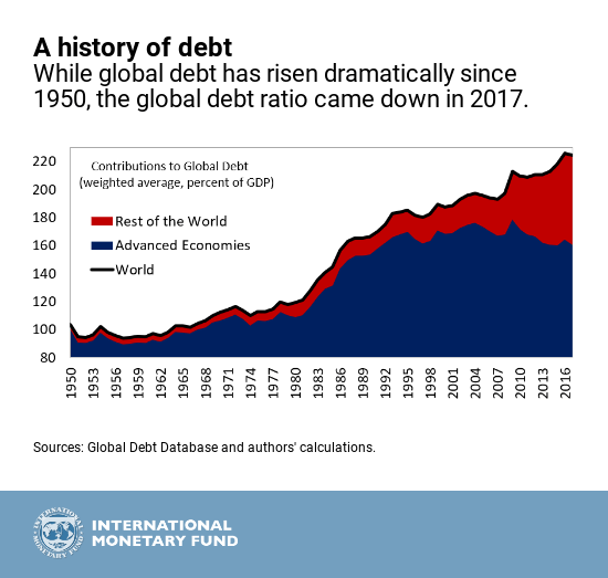
Source: IMF
The decline in the global debt to GDP ratio in 2017 is probably related to the change in Federal Reserve policy; the largest proportion of global debt is still raised in US$. Rather like the front-loaded US growth which transpired due the threat of tariff increases on US imports, I suspect, debt issuance spiked in expectation of a reversal of quantitative easing and an end to ultra-low US interest rates.
The IMF goes on to show the breakdown of debt by country, separating them into three groups; advanced economies, emerging markets and low income countries. The outlier is China, an emerging market with a debt to GDP ratio comparable to that of an advanced economy. The table below may be difficult to read (an interactive one is available on the IMF website): –
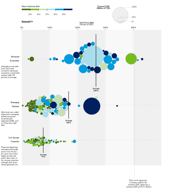
Source: IMF
At 81%, China’s private debt is much greater than its public debt, meanwhile its debt to GDP ratio is 254% – comparable with the US (256%). Fortunately, the majority of Chinese private debt is denominated in local currency. Advanced economies have higher debt to GDP ratios but their government debt ratios are relatively modest, excepting Japan. The Economist – Economists reconsider how much governments can borrow – provides food for thought on this subject.
Excluding China, emerging markets and low income countries have relatively similar levels of debt relative to GDP. In general, the preponderance of government debt in lower ratio countries reflects the lack of access to capital markets for private sector borrowers.
Conclusions and Investment Opportunities
Setting aside China, which, given its control on capital flows and foreign exchange reserves is hard to predict, the greatest risk to world financial markets appears to be from the private debt of advanced economies.
Following the financial crisis of 2008, corporate credit spreads narrowed, but not by as much as one might have anticipated, as interest rates tended towards the zero bound. The inexorable quest for yield appears to have been matched by equally enthusiastic issuance. The yield-quest also prompted the launch of a plethora of private debt investment products, offering enticing returns in exchange for illiquidity. An even more sinister trend has been the return of many of the products which exacerbated the financial crisis of 2008 – renamed, repackaged and repurposed. These investments lack liquidity and many are leveraged in order to achieve acceptable rates of return.
The chart below shows the 10yr maturity Corporate Baa spread versus US Treasuries since March 2007: –
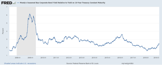
Source: Federal Reserve Bank of St Louis
The Baa spread has widened since its low of 1.58% in January 2018, but, at 2.46%, it is still only halfway between the low of 2018 and the high of February 2016 (3.6%).
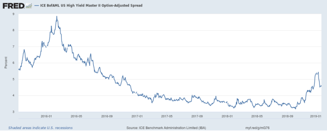
The High Yield Bond spread experienced a more dramatic reaction into the close of 2018, but, since the beginning of January, appears to have regained its composure. The chart shows the period since September 2015: –
Source: Federal Reserve Bank of St Louis
Nonetheless, this looks more like a technical break-out. The spread may narrow to retest the break of 4% seen on November 15th, but the move looks impulsive. A return to the 3.25% – 3.75% range will be needed to quell market fears of an imminent full-blown credit-crunch.
If the next crisis does emanate from the private debt markets, governments will still be in a position to intervene; the last decade has taught us to accept negative government bond yields as a normal circumstance. Demographic trends have even led long dated interest rate swaps to trade even lower than risk-free assets.
A decade after the financial crisis, markets are fragile and, with an ever increasing percentage of capital market transactions dictated by non-bank liquidity providers, liquidity is ever more transitory. Credit spreads have often been the leading indicator of recessions, they may not provide the whole picture this time, but we should watch them closely during 2019.