

Macro Letter – No 10 – 25-04–2014
The limits of convergence – Eurozone bond yield compression cracks
- European bond yields have been converging since 2012 – but for how much longer?
- There are three scenarios – a federal system, a semi-federal system, or a devolved Europe
- Are yields converged under the different scenarios or has it further to go?
Compression cracks, in the geological sense, are a form of brittle deformation. This might be a good way to describe the political process that has driven European government bond yields since the Euro crisis of 2012.
Since the beginning of 2014 the “Convergence Trade” – buying higher yielding Eurozone government bonds and selling German Bunds – has continued to be one of the most profitable fixed income opportunities, as the table below illustrates:-
Country 15/01/2014 16/04/2014 Change
Yield Spread Yield Spread
Germany 1.82% N/A 1.50% N/A N/A
Netherlands 2.13% 0.31% 1.83% 0.33% +0.02%
France 2.47% 0.65% 1.97% 0.47% -0.18%
Ireland 3.27% 1.45% 2.87% 1.37% -0.08%
Spain 3.82% 2.00% 3.09% 1.59% -0.41%
Italy 3.88% 2.06% 3.11% 1.61% -0.45%
Portugal 5.25% 3.43% 3.80% 2.30% -1.13%
Greece 7.93% 6.91% 6.46% 4.96% -1.15%
Source: Bloomberg
The two charts below show this process over a longer time horizon. The first, from True Economics, looks back to the period of convergence prior to the introduction of the Euro. It shows the extraordinary stability, both in terms of absolute yield and spread differentials, for the period from 1999 until the Lehman default in 2008. The subsequent divergence is more clearly captured by the second chart which also shows Gilt yields; they might be regarded as a surrogate for the global bond market’s reaction to the financial crisis and subsequent Euro crisis.
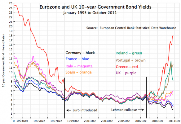
Source: Trueeconomics.com
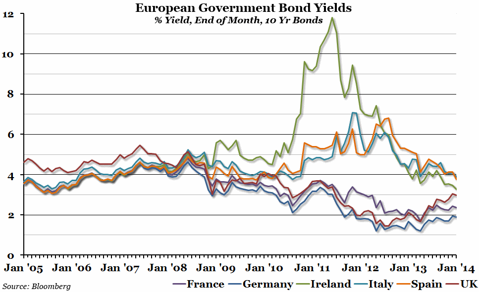
Source: Bloomberg
What is clear from both charts is the bond market’s sudden realisation, after 2008, that the ECB and the EU Commission might not be in a sufficiently strong position economically and, more importantly, politically, to avert a break-up of the Euro.
Whilst Irish Gilt yields had already begun to decline in 2011, due to their adoption of radical measures in response to economic depression, the turning point, from divergence to convergence, for the rest of the EZ, commenced after Mario Draghi’s speech on 26th July 2012 in which he said “Within our mandate, the ECB is ready to do whatever it takes to preserve the euro. And believe me, it will be enough.”
The European Commission had been analysing EZ bond spreads for some time before the 2011 Euro crisis as this paper from November 2009 shows – Determinates of intra-euro area government bond spreads during the financial crisis. The paper noted that the average spread over German Bunds between 1999 and mid-2007 had been 18bp. They concluded: –
Although conditions on government bond markets have been easing considerably since spring 2009, it seems unlikely that spreads will revert to pre-crisis levels in the near future. A number of elements suggest this. First, the strong rise in financing costs by sovereign issuers since September 2008 may, to a certain extent, be explained by the correction of abnormally narrow spreads in the pre-crisis period, when domestic risk factors resulted in small yield differentials. Second, it can be expected that government bond yield spreads will remain elevated compared to the pre-crisis period as debt levels have increased significantly in a number of countries (relative to the German benchmark) and the contingent liabilities assumed by the public sector in rescuing the financial sector will continue to weigh on the outlook for public finances.
Looking further ahead, greater market discrimination across countries may provide higher incentives for governments to attain and maintain sustainable public finances. Since even small changes in bond yields have a noticeable impact on government outlays, market discipline may act as an important deterrent against deteriorating public finances.
Three scenarios for Eurozone bonds
I believe we should consider three possible scenarios with very different outcomes for yield differentials.
1. Full Banking Union and further Federalization of Europe
Under this scenario the ECB becomes the “back-stop” to all members of the Eurozone. The European Parliament wrests partial control of spending from the individual state governments, but, in the process, becomes an unofficial guarantor of the obligations of EZ member states.
In this environment yield spreads will reflect a possible default risk and a liquidity risk. I see a parallel with the US Treasury market yield differential for On-the-run and Off-the-run issues but with an additional small default premium – unless the EU guarantee becomes de juro.
A fascinating study of this phenomenon is Liquidity ‘life cycle’ in US Treasury bondswhich was published in January 2012 by the European Financial Management Association – the table on page 26 analyses the period 1996-2006. For 30 year bonds the mean yield differential is 13 bp with a range of -34 to +93 dependent upon the issue.
A prior paper on this subject was published in the January 2009 by the Journal of Financial Economics – The on-the-run liquidity phenomenon. This proposes an interesting model for measuring and forecasting the phenomenon. They conclude: –
Our evidence indicates that (i) the resulting off/on-the- run liquidity differentials are large, even after controlling for several differences in their intrinsic characteristics (such as duration, convexity, repo rates, or term premiums), and (ii) an economically meaningful portion of those liquidity differentials is linked to strategic trading activity in both security types. The nature of this linkage is sensitive to the uncertainty surrounding auction shocks and the economy, the intensity of investors’ dispersion of beliefs, and the noise of the public announcement. In particular, and consistent with our model, off/on-the-run liquidity differentials are smaller immediately following bond auction dates and in the presence of (high-quality) macroeconomic announcements, and larger when the dispersion of auction bids is higher, when fundamental uncertainty is greater, and when the beliefs of sophisticated traders are more heterogeneous.
These findings suggest that liquidity differentials between on-the-run and off-the-run securities depend crucially on endowment uncertainty in the former and the informational role of strategic trading in both.
2. Full Banking Union but limitation of Federalization
Persuading German voters to bail-out the “profligate sons” of Europe is a tall order; however, a collapse an subsequent exit of the countries of the periphery would cause catastrophic damage to the German banking system. A constructive compromise would be to allow limited outright monetary purchases (OMT) together with limited issuance of “Euro Bonds”. This is a slippery slope but, in the consensual world of European politics, I think it is the most likely outcome. After all, the European Financial Stability Fundhas already helped to bail-out Greece, Ireland and Portugal and the European Stability Mechanismcontinued its bail-out of Cyprus this month bringing the total support for Cyprus to Eur 4.5bln.Here is the latest statement from Klaus Regling – MD of the EMS.
The idea that government bonds of individual states are not underwritten bears some similarity to US state issuance in the municipal bond market. Muni bonds have certain tax advantages which makes absolute yield comparison with US Treasuries difficult but their lack of a federal guarantee makes them a useful comparator.
With the exception of Puerto Rico (BB+) all US state Muni bonds are currently rated from AAA to A-. On 10th April 2014 the generic yield on 10 yr Muni Bonds was as follows: –
Rating Yield Spread
AAA 2.37% N/A
AA 2.57% 0.20%
A 3.06% 0.69%
Source: Morgan Stanley
During the depths of the post Lehman crisis in 2008 the spread between AAA and A widened to 160bp. Anecdotally, the last time I looked at Muni Bond spreads as a surrogate for European bonds was in 1998 – the differential between highest and lowest rated state was 109bp. At that time I felt European yields had already converged too much and advocated the “Divergence Trade”, but, as JM Keynes once remarked “The markets can remain irrational longer than I can remain solvent.” I’m glad I didn’t bet the ranch!
3. Eurozone break-up
I don’t think this scenario is likely because too much political investment has been made in the “European Project”; they will do “whatever it takes”. However, for the purposes of comparison, it is useful to consider where yield differentials might be for European governments once they have been relieved of their Euro straightjackets.
Here is a table of some European 10 year bond yields for non-EZ countries, together with their spread over German Bunds, taken on 16th April 2014, I’ve also added their World Bank GDP ranking: –
Country Yield Spread GDP
Switzerland 0.87% (0.63%) 20
Denmak 1.52% 0.02% 33
Czech Rep 1.99% 0.49% 51
Sweden 2.00% 0.50% 22
UK 2.65% 1.15% 6
Norway 2.86% 1.36% 23
Latvia 3.00% 1.50% 93
Lithuania 3.30% 1.80% 83
Bulgaria 3.30% 1.80% 75
Slovenia 3.63% 2.13% 79
Poland 4.14% 2.64% 24
Croatia 4.87% 3.37% 70
Romania 5.24% 3.74% 56
Hungary 5.74% 4.24% 58
Iceland 6.71% 5.21% 121
Turkey 9.95% 8.45% 17
Source: Bloomberg
The yield differentials of these countries reflect several factors including inflation, debt levels and growth expectations, however there are some useful observations.
Firstly the Swiss National Bank has been intervening to halt further appreciation in the CHF exchange rate. They have also been combating deflationary forces for an extended period.
The UK economy has been exhibiting some of the strongest growth in Europe this year but has also been beset by above target inflation for a protracted period until very recently.
Turkey, whilst it is the second largest economy in the table, is less “European” in structure; it may remain interested in joining the EU but it is culturally and politically “another country”.
Iceland is the smallest economy in the table but it is also a “post-crisis” country and therefore reflects lenders perceptions of a country’s credit worthiness, post-default.
Yield spreads – where are they now and where will they go?
Returning to the EZ countries, I want to narrow my analysis to Spain, Italy, Portugal and Greece. These are the countries with reasonably liquid government bond markets which are also benefitting most clearly from the brittle yield compression of the EZ. Where are their yields today and where might be fair-value under the three scenarios outlined above.
Country Yield Spread GDP
Spain 3.09% 1.59% 13
Italy 3.11% 1.61% 9
Portugal 3.80% 2.30% 46
Greece 6.46% 4.96% 42
Source: Bloomberg
Firstly, a leptokurtic excuse – in my estimates below I am ignoring times of economic crisis since these are “Black Swan” events with highly unpredictable outcomes.
Scenario 1. 100bp
Where individual EZ states receive a tacit guarantee from Brussels; I would expect a maximum spread of 100bp. This makes all the above issuers still look attractive from a yield enhancement perspective.
Scenario 2. 200bp
Where individual EZ states are not guaranteed: and therefore subject to the discipline of the market; I would expect the maximum spread to reach 200bp. This still makes Portugal and Greece look relatively cheap. Italy and Spain may head towards the levels of France (49bp) but this is unlikely to be sustainable unless they radically change their attitude towards deficit spending. Alternatively, French yield premiums may rise up to meet them.
Scenario 3. 500bp
Where the single currency area breaks up; I would imagine the individual currencies taking much of the strain through devaluation and estimate a maximum spread of 500bp. However, the inflationary effects of currency devaluation may lead to a significant rerating – a glance at the first chart showing Greek Bond yields in the mid-1990’s is an example of the additional premium high-inflation countries have to pay. In 1990 Greek CPI averaged 19.8% by 1995 CPI had fallen to 9.3% whilst its long-term interest rates still averaged 17.4%, a legacy of the high-inflation years; its Debt to GDP ratio was 110% – remaining at around this level up to their adoption of the Euro. The bond markets are slow to forgive inflationary and profligate tendencies.
In the analysis above I have made one critical assumption, which is that German Bund yields remain broadly at there current level (1.5% – 2.0%). During the “honey-moon” period from 1999 to 2007 yields on 10 year German Bunds ranged between 4% to 6% – other EZ issuers paid an average 18bp premium. If Bund yields return to the 4% to 6% range, but inflation remains around the ECB target, I would expect lenders to demand an additional premium of between 50bp and 100bp under the first two scenarios.
Conclusion
The convergence trade in European bonds looks set to continue but the attraction of this carry trade is steadily diminishing. I think Scenario 2 – Full Banking Union but limitation of Federalization – to be the most likely: in other words, limited Eurobond issuance. Under these circumstances Spanish and Italian bonds appear fairly valued. Their outperformance may continue since much of the demand has emanated from their own domestic banks. However, with impending BIS regulations on bank capital being watered down, these domestic institutions may begin to lend to borrowers other than their own governments. Signs of stronger economic recovery in Spain and Italy will be the catalyst for a sharp reversal in this particular version of the carry trade. Portugal and Greece still offer value but if the reversal begins in Spain and Italy I would expect these markets to suffer from contagion. Carry trades represent “easy money” they become crowded and inevitably unwind with a vengeance.


